GETTING STARTED
Usages
Fundamentally, when starting a development of almost whatever app — you'll need a database and an admin panel, and those combined are the huge slice of the overall time, costs and efforts — often many tens of percents, so here is where Indi Engine AI kicks in to be used for:
- Instant prototyping of apps — based on your natural language prompt and with ingestion of any attached PDF files, Google Docs, Notion documents (planned), GitHub contents (planned) or Figma designs (planned), so that AI model will generate all the relevant entities, fields, data-views, role, permissions, and fill all this with the sample data, so that it will be possible to explore the working app immediately, i.e. in the matter of minutes.
- Specialized domain software — specialized industries often need tools that can't be served by generic SaaS. Indi Engine AI lets you design database apps for niche workflows — whether for voice ads recording, DNA / heredity lab tests or superhero birthday events for children — by ability to tailor data models and UIs.
- Data-scraping and storage apps — you can configure an Indi Engine app to be a storage for your parsed data to make it previewable / filterable / navigable / versionable / exportable for yourself and also generally better deliverable for your end clients, so they can evaluate the job you've done.
- BIM and engineering data systems — those kinds of projects produce complex, multi-layered data that traditional tools struggle to present. With Indi Engine AI, you can configure realtime interfaces for complex, structured, multi-dimensional datasets with simplified navigation, enabling users to browse, filter, and collaborate.
Any Indi Engine AI app is built on a standard MySQL database that you fully own and control, and you can enable external access from any 3rd party tool, framework, or front-end using regular MySQL credentials — whether that’s a public web application, a mobile client, a REST API service, or anything else. Also, you can extend container setup by integrating the needed services directly into the Indi Engine’s Docker Compose setup. Anyway, you get a ready-to-use database and admin panel that are the backbone for any system or interface you need.
Installation
Technically, Indi Engine is designed to run as a Git-based Docker Compose project, and it's recommended to have at least 1x3 GHz CPU, 3GB RAM and 10GB disk space, so once you have that with Git and Docker installed — execute the following 3 commands:
git clone https://github.com/indi-engine/newapp myapp
cd myapp
source start
source ./start (instead of source start) as otherwise Windows will interpret it as its own start command which will open a new C:\Windows\system32\cmd.exe window instead of executing the start bash file from the repo you've cloned.
3rd command will ask you to define at least 4 configuration variables (further saved to .env file) before starting getting your Indi Engine instance up and running, and typically it takes around 5 minutes to reach the point where the instance is ready - this will be indicated by one of the following messages depending on values you've defined for APP_ENV and LETS_ENCRYPT_DOMAIN variables:
Message | APP_ENV | LETS_ENCRYPT_DOMAIN |
| Production or Staging (both VPS) | mydomain.com |
|
| |
| Development (local) |
|
---
 ▶05:03 ▶05:03 | 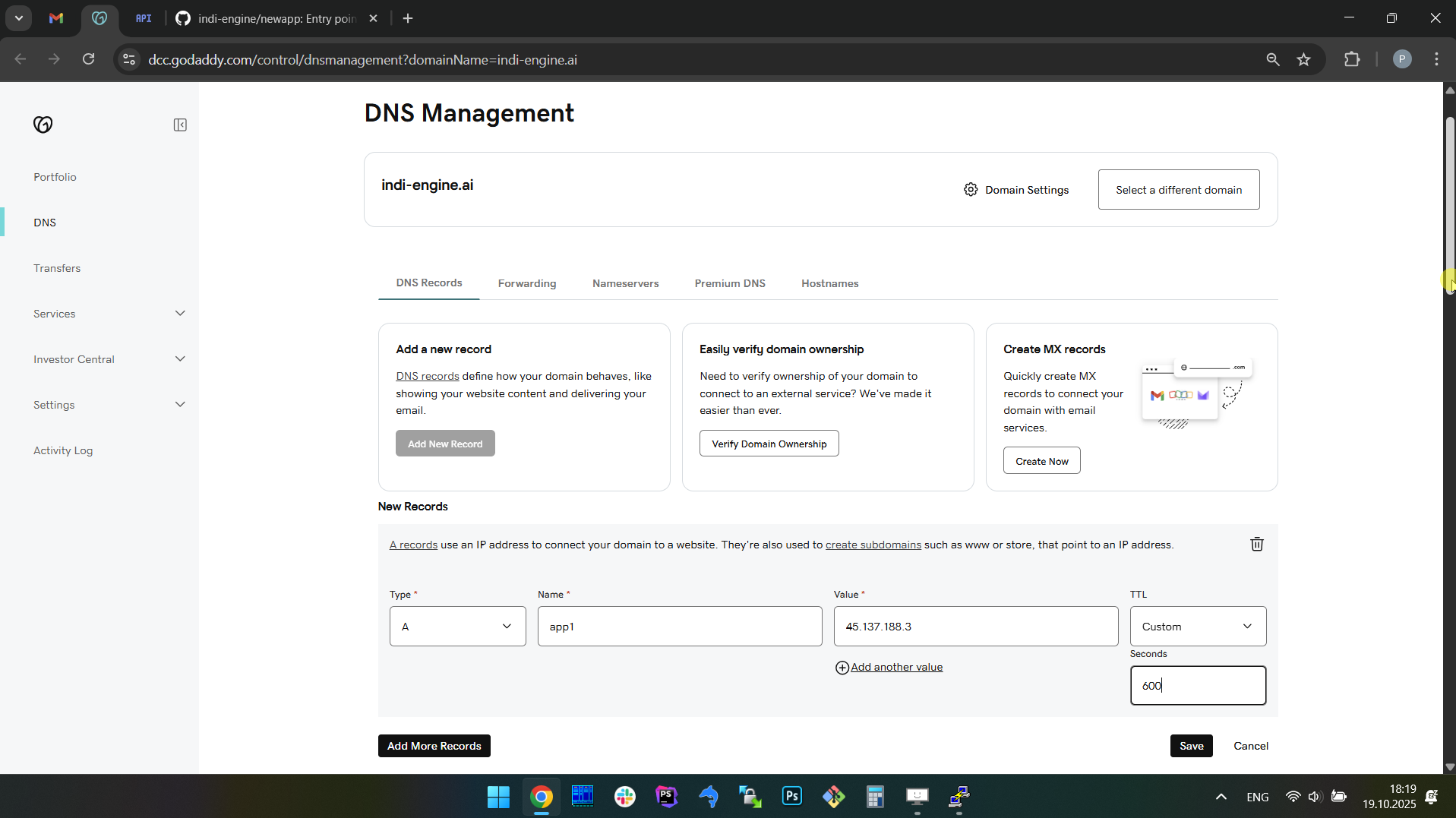 | 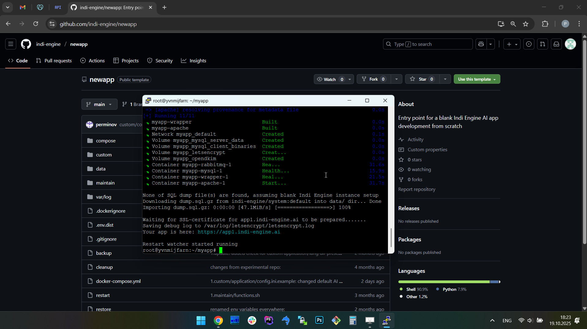 | 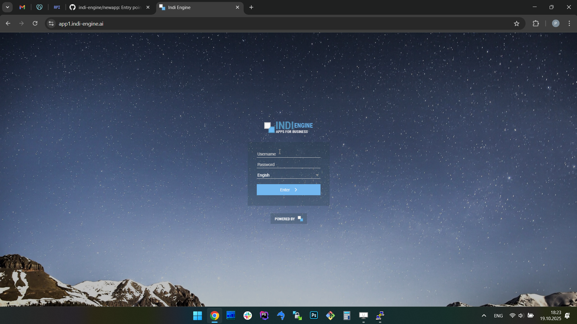 | 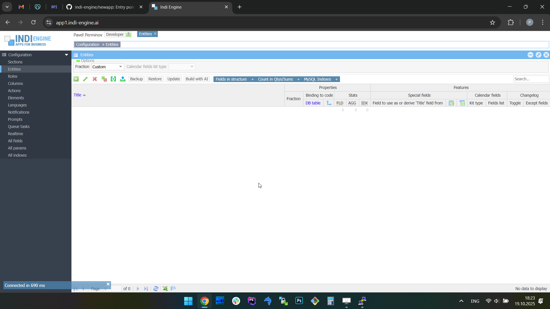 |
On the screencaptures above it is demonstrated how the installation process looks like for a staging deployment on a VPS server at whatever cloud, with an SSL certificate for your arbitrary subdomain, which assumes you’ll have to create a special DNS record in your domain name management service like GoDaddy or other. Anyway, once installation is done, you should open the URL printed by installation script and then you'll see the Indi Engine login screen where you should use dev both as username and password, and press or click Enter.
FLAGSHIP FEATURES
AI prompt-to-app. With sample data.
Building new apps from scratch
Indi Engine's AI prompt-to-app feature allows you to build an entire database app from just a few plain text sentences and attached files (optionally), so the system generates a database schema relevant for your prompt along with the realtime data-views on top, organized into a foreign-key based hierarchies preloaded with sample data to showcase the resulting app in a natural way — all in minutes.
To do that, you should do the following steps:
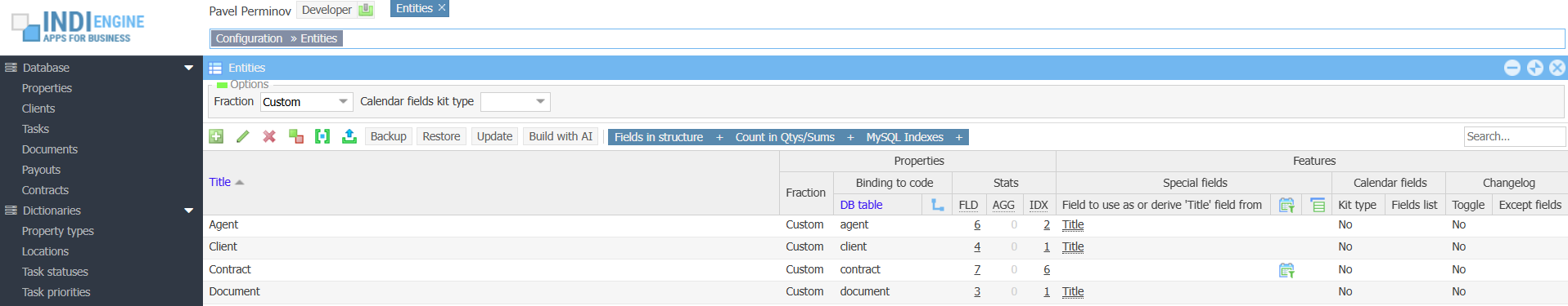
- Navigate to Entities-section,
- Open the Build with AI-dialog by clicking on the corresponding button
- Optionally attach some files from your device or Google Drive
- Describe the app you need in a textarea field, e.g. "I need a zoo management app" or "I need a zoo management app based on attached docs"
- Select some model in the AI model-dropdown (optional, keep as it is to use the default model)
- Press OK-button
Once OK-button pressed, Indi Engine will do the remaining steps:
- Preparing background process
- Getting app design from AI model - mm:ss
- Importing app design: 100%
- Getting sample data from AI model - mm:ss
- Importing sample data: 100%
Those steps are indicated as bottom-left messages, with AI request duration timers and importing progress percentages.
Once those steps are completed, you can explore the resulting app, as well as refine and extend it because it remains fully editable using a wide range of other Indi Engine's zero-code capabilities, specifically designed to handle high on-screen data-density, along with a flexible access system.
Example 1: Zoo management app
- Prompt: “i need a zoo management app based on attached docs”
- Attached docs:
- Functional specification.docx
- Staff & ticketing reports.xlsx
- Food supplier invoice.pdf
When you use an AI model of a certain vendor for the very first time, Indi Engine will ask you to provide the corresponding API key either when you submit the prompt or when you attach the file(s) - whatever happens first. In the latter case the API key is prompted at the point when the first file is already uploaded into your Indi Engine app filesystem, but is not yet uploaded to the AI model.
 ▶04:37 ▶04:37 | 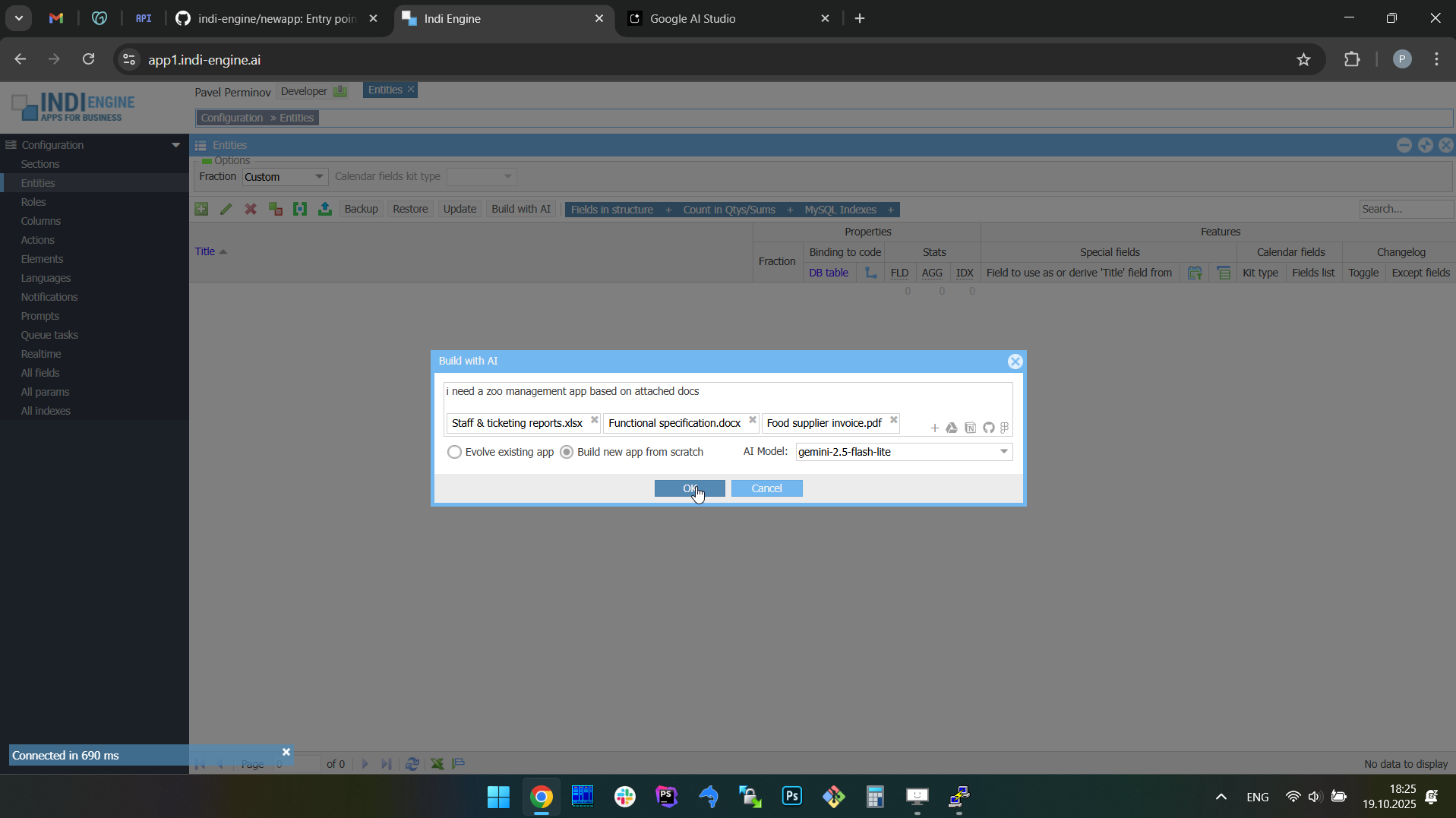 | 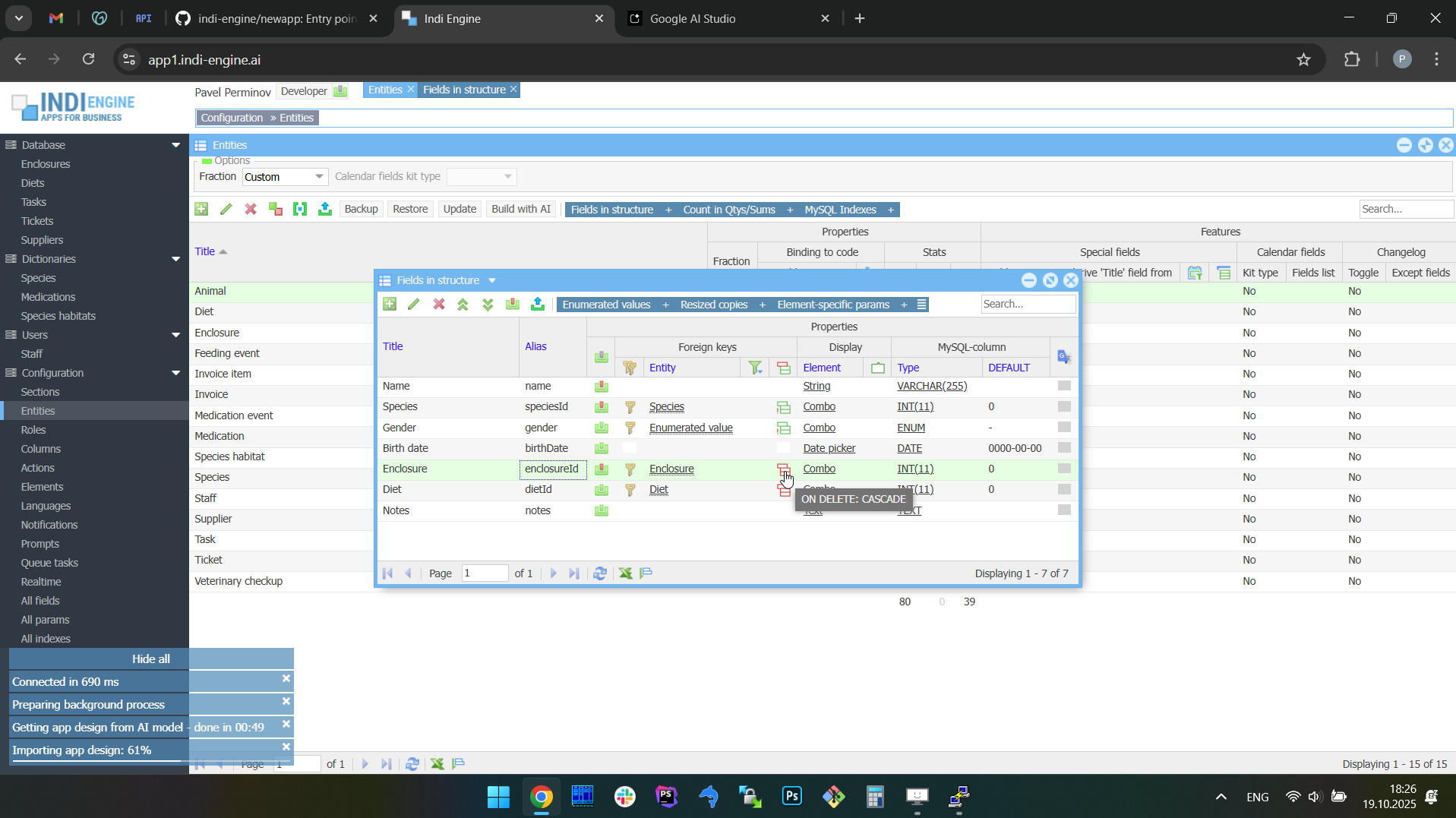 | 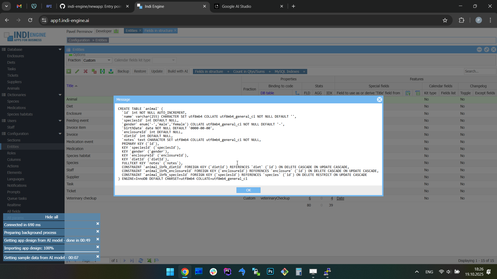 | 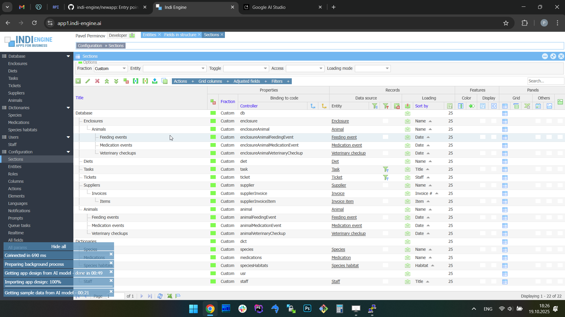 | 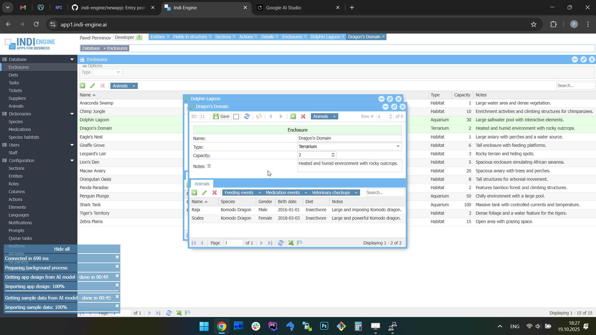 |
BTW, at the timecode 03:39 within the first screencapture above, you may notice some data-changes happened, e.g. the animal name for one of two Comodo Dragons changed from “Raja” to “Big Raja”, and this was done to demonstrate a different flagship feature than the current one, and that is why the corresponding chunk was cut out of the above video - to be further shown in the different paragraph.
Example 2: Real estate company app
- Prompt: “i need an app for a real estate company”
- Attached docs:
- Functional specification.docx
- Property inspection checklist.pdf
- Agents payouts.xlsx
 ▶04:29 ▶04:29 | 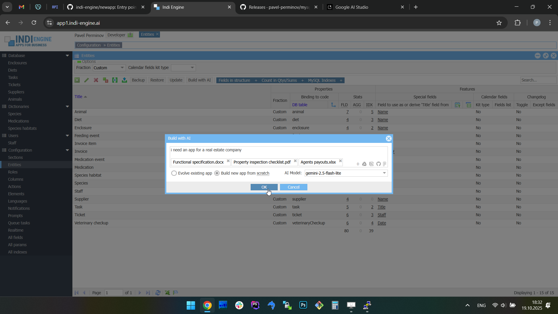 | 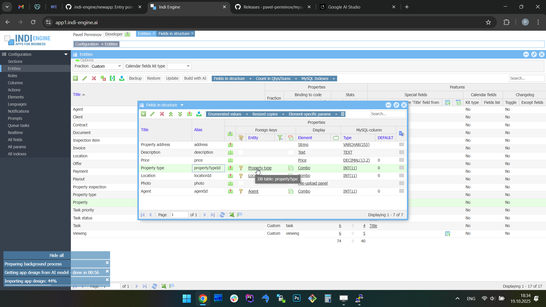 | 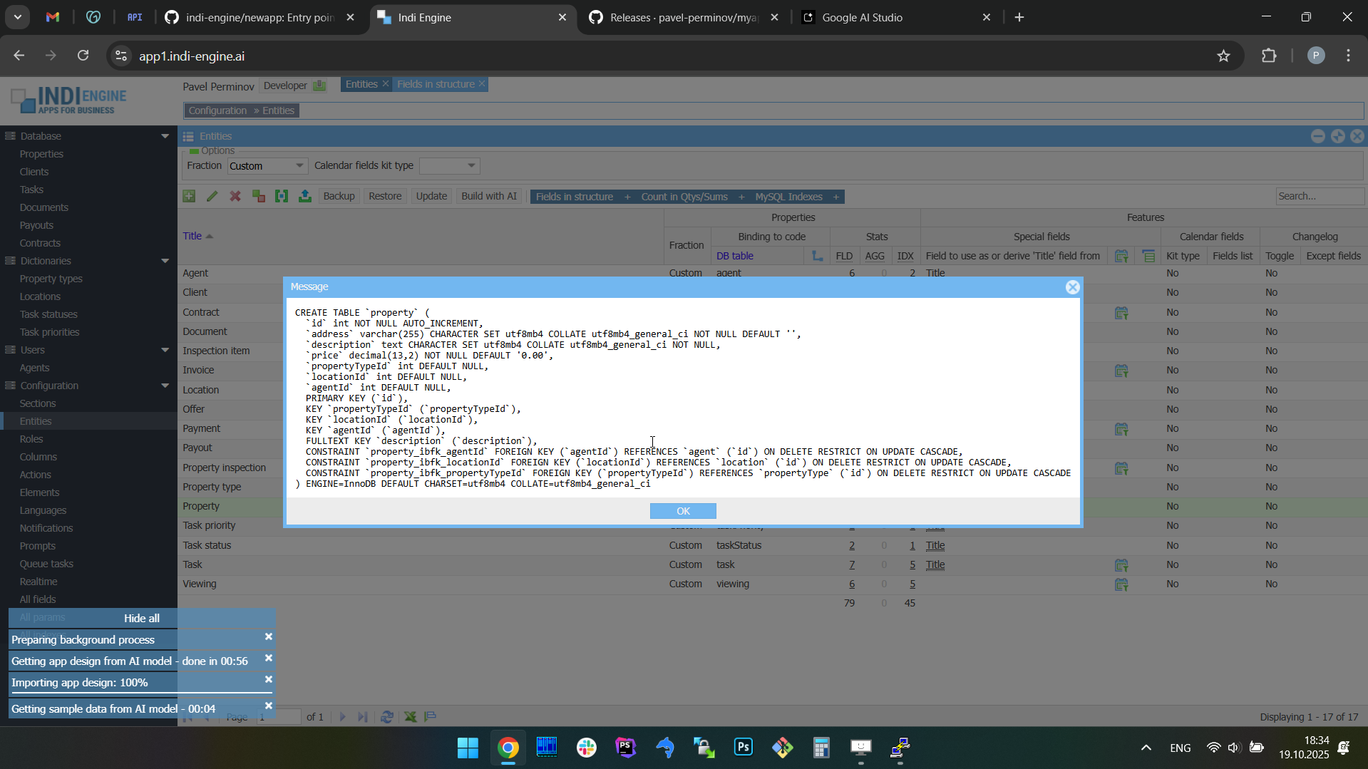 | 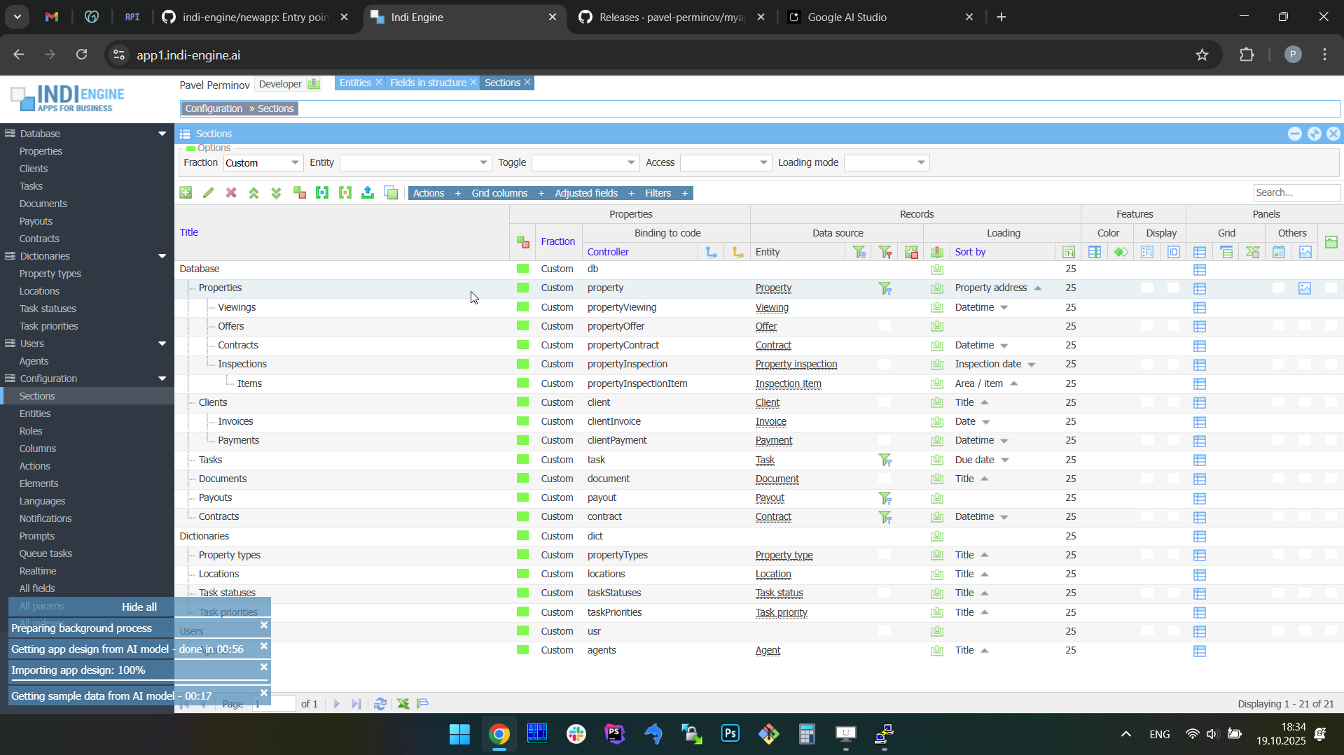 | 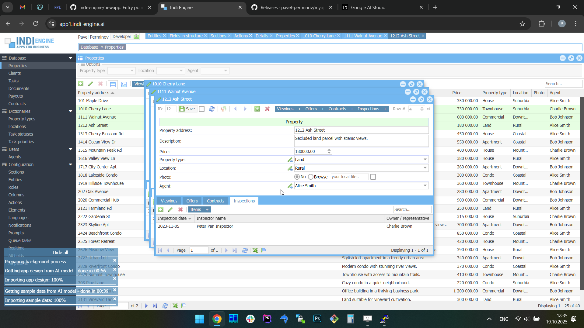 |
Also, you can try to submit the same prompt again (or another prompt) and then decide which attempt's resulting app is better for your needs, read Restoring apps from AI response history paragraph for more details.
Context ingestion / attachments
When prompting the AI model, you can also attach context such as PDF documents, Google Docs or Figma designs (planned), allowing the AI to make the resulting app design to be much more accurate and relevant to your requirements. This approach turns weeks of early-stage work into minutes, giving the individuals and teams a fast track to usable prototypes.
This allows you to feed the AI model with functional specifications, UI mockups or other docs you have prepared by yourself and / or received from your client, and this dramatically reduces the gap between business requirements and working software, enabling faster prototyping, client demonstrations, and iteration with reduced traditional development cycles.
PDF files
This is the primary format currently supported for being fed to the AI model, and it's possible to attach multiple PDF documents to an individual prompt. This goes beyond simple text extraction due to using native vision to understand entire document contexts, so it allows to analyze and interpret content including text, images, diagrams, charts, and tables, even in long documents up to 1000 pages.
Technically, you can attach files of other types to be ingested, like TXT, Markdown, HTML, XML, etc. However, document vision only meaningfully understands PDFs. Other types will be extracted as pure text, and the model won't be able to interpret what we see in the rendering of those files, so any file-type specifics like charts, diagrams, HTML tags, Markdown formatting, etc., will be lost.
Also, keep in mind that the combined size of the attached documents plus the text prompt itself must stay within the selected model's context window limitations, which is different for different models.
Google Drive files
Indi Engine AI has an integration with Google Drive and this allows users to attach their existing documents there - to the AI prompt when generating apps. Whether it’s a functional specifications and requirements document, an operational or financial reports, or a planning file, Drive attachments will guide the Indi Engine AI to create more accurate entities, forms, relationships and data-views on top.
This reduces friction: instead of exporting or reformatting data, users can attach familiar files to their prompts, letting the AI align the generated app with real business documentation. The feature ensures a smoother path from planning documents to working software, accelerating adoption across teams, as the existing knowledge sources will directly drive the development of usable applications.
Notion documents
Planned Notion integration will let Indi Engine AI interpret workspace content as structured context for backend generation. Many teams already use Notion to organize specifications, feature outlines, and data models — and this integration will turn that planning material into a practical input source for building apps.
By analyzing attached Notion pages or databases, Indi Engine AI will be able to recognize entities, relationships, and field structures directly from written documentation or table layouts. Instead of starting from a blank prompt, users will leverage the work they have already captured in Notion to accelerate the creation of database schemas and admin panels.
GitHub contents
Planned GitHub integration will allow Indi Engine AI to attach repositories or selected source files as contextual input for backend generation, so users will be able to connect existing projects and let the AI interpret their structure to propose database schemas and admin panels that match the project’s logic.
The AI model will scan the code for recognizable data structures — such as entity definitions, ORM models, SQL schemas, or migration scripts — and infer how those structures can be represented within a database. By understanding models, migrations, or other files within a repository, Indi Engine AI will be able to produce a compatible backend foundation with minimal manual setup.
Figma designs
Planned support for Figma will let Indi Engine AI use design prototypes as intelligent context for backend generation. Instead of producing pixel-perfect front-end code (which other tools already handle well), Indi Engine will interpret Figma layouts to auto-generate a matching database schema and admin panel.
The result will be a backend that is immediately usable and closely aligned with the design vision. This approach accelerates development by turning early design artifacts into functional data systems. Teams will gain a working backend even before front-end coding begins, while still retaining full freedom to build the client-side experience separately.
Restoring apps from AI response history
As previously mentioned, when you submit a prompt to the AI model via Build with AI-dialog, under the hood Indi Engine makes two requests to the AI model — first for getting app design, and second for getting sample data.
However, it might be the case that the resulting app is not good enough from your perspective, or is, but you still want to do some more experiments (possibly with different prompts and/or attachments) - to take a look at further resulting apps and decide which of them are better than others.
This is why Indi Engine has Configuration » Prompts-section where the history of all your prompts is saved each with a pair of AI responses, so you can select some record there and click on Restore-action to switch to the any app design and sample data you have previously received from the AI model. Also, you can mark certain resulting apps that are better than others by clicking on the color-box in the Result ↴ Candidate to proceed-column.
 ▶01:40 ▶01:40 | 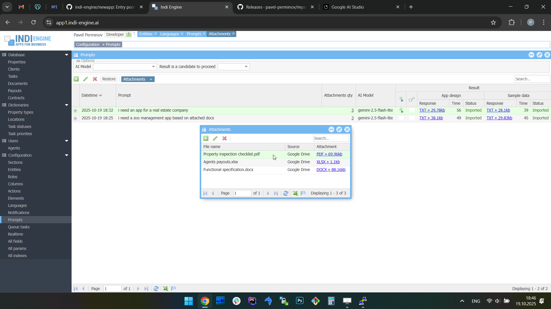 | 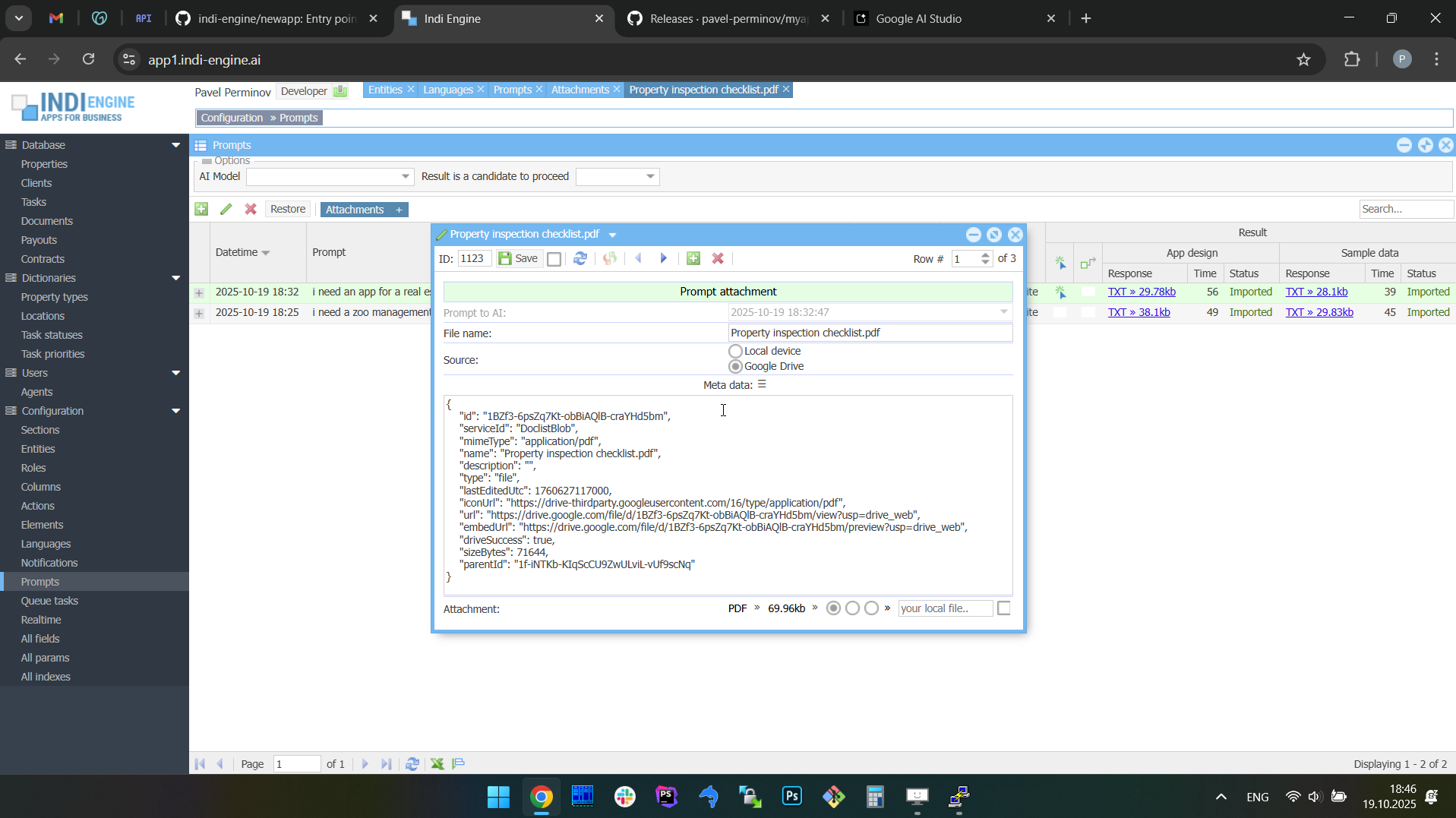 | 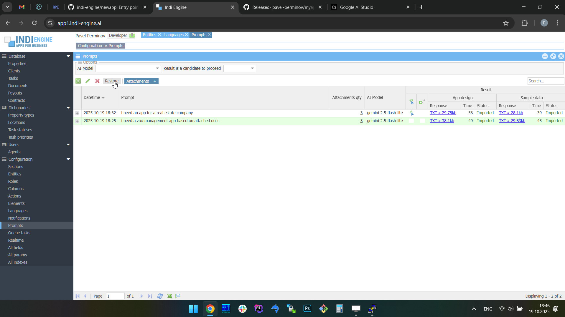 | 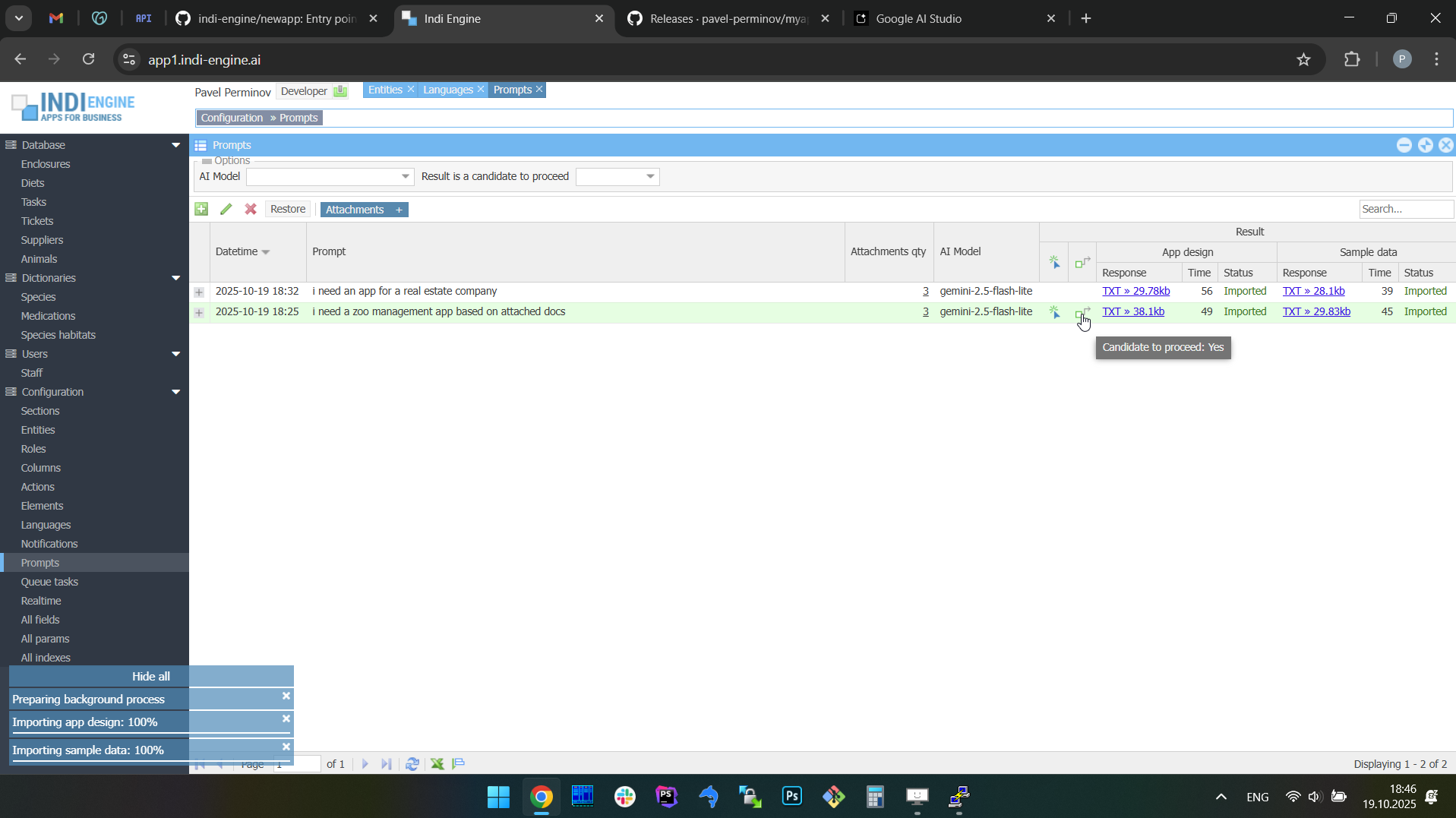 | 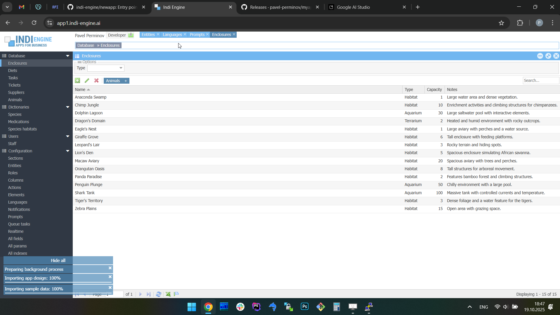 |
However, there are two things to keep in mind about the screencaptures above. The first one is that the demonstration above - is starting at the chronological point where we already have two records in the AI response history, and the last one of them (appears at the most-top of the list) is the one that is currently imported into the Indi Engine app instance shown there - it is the real estate company app.
Also, the above demonstration is demonstrating how AI responses received for completely different apps (i.e. prompts) are re-imported to the Indi Engine instance - just for the restore results to be much more visually recognizable here in docs. But, in real life usage, you’ll likely be re-importing AI responses received based on the same or similar AI prompts. This will be that way for the reason, already outlined before: the resulting app might not be good enough from your perspective, or might, but you still want to do some more experiments to take a look at further resulting apps and decide which of them are better than others.
Supported AI models
Indi Engine AI works with all the major AI model families/vendors where document-based context input is supported: Gemini, Claude, ChatGPT and Grok, so you can select any of the AI models shown (grouped by vendors) in the AI Model-dropdown in the Build with AI-dialog. You can add more models for any of these vendors in Configuration » AI models-section. For example, you can add gemini-3-pro-preview once Google makes it available on their free tier (or if you have a paid one).
However, keep in mind that Indi Engine AI does not bundle or resell AI usage: instead, the AI interaction is based on BYOK model, which stands for Bring Your Own Key, so on a very first attempt to use some AI model of a specific vendor — Indi Engine AI will ask you to provide API key which you should obtain from that vendor, and will hint you with a corresponding clickable URL, which will be a one of below:
- Gemini - https://aistudio.google.com/app/apikey
- Claude - https://platform.claude.com/settings/keys
- ChatGPT - https://platform.openai.com/api-keys
- Grok - https://console.x.ai/team/default/api-keys
Once you provide the API key for a specific AI vendor, it is then saved locally in myapp/custom/public/application/config.ini and is never sent elsewhere, except to the API endpoints provided by that vendor, to make the requests to the corresponding AI models.
It’s recommended to start with Google Gemini AI, as there are the following awesome things about it:
- Native vision for PDF attachments up to 1000 pages of a combined size (already mentioned before)
- Their free tier is sufficient for usage with Indi Engine AI — for example, for their Gemini 2.5 Pro and Gemini 3 Flash Preview models
- Huge limit of 1,048,576 input tokens for almost all of their models — including Gemini 2.5 Pro and others
- Fast response time — typically under 60-120 seconds
Evenmore, everything previously written about using PDF files as context attachments — is 100% relevant only for Gemini AI models, and is sourced from the Document understanding page in their docs. For AI models of other vendors, these are nuances and limitations - see below:
AI vendor | Has free tier for API usage | Limit | ||
Individual context-file size | API request size (incl. contex-files) | Total qty of PDF pages | ||
Gemini | Yes1 | 50MB | Context window size | 1000 |
Claude2 | No | Not specified | 32MB | 1003 |
ChatGPT | No | 50MB | 50MB | Not specified |
Grok | No | 20MB / 48MB 4 | Context window size | Not specified |
1 For Gemini, there might be various restrictions and limits applied for usage of AI models under the free tier, but the only one that has ever popped up so far on local development Indi Engine AI app instance — was the Requests per day limit, which might be different for different models, but was solvable with using VPN connection from another country (i.e. different IP-address) back then, though.
2 For Claude, you’ll have to make sure the total sum of your payments history to Claude — is not less than 40 USD, as otherwise you’ll hit the ITPM (Input Tokens Per Minute) limit on Indi Engine’s step where an AI model is asked to generate sample data (for the database schema already generated at the previous step). Keep in mind that this aspect is observed as of Feb 2026, may differ per region, and may be changed by Claude in future.
3 For Claude, you’ll have to make sure the total number of PDF pages across all of your AI context-files (if any attached) for a single prompt — is not greater than 38 pages, due to Indi Engine AI docs (in PDF format) being internally auto-attached as well — to serve as a knowledge for AI model. The original version of that PDF docs file used for non-Claude models is 140+ pages in standard A4 format, but it was converted to another version having 62 pages in A2 format — to make it compatible with Claude. Also, keep in mind that all non-PDF document files, such as DOCX, XLSX and many others — are internally converted to PDF for use as AI context, and therefore their resulting PDF page quantities are counted as well from Claude’s 100-pages PDF limit perspective.
4 For Grok, 20MB limit is applied for image-files attachments (jpg/jpeg or png) and 48MB limit for other files.
You may click on the links below if you want to get more info about all these and other possible restrictions and limitations that are introduced by different AI vendors:
- Gemini
- Claude
- https://platform.claude.com/docs/en/api/errors#request-size-limits
- https://platform.claude.com/docs/en/build-with-claude/pdf-support
- https://platform.claude.com/docs/en/build-with-claude/files#file-types-and-content-blocks
- ChatGPT
- Grok
- https://docs.x.ai/developers/files#limitations
- https://docs.x.ai/developers/model-capabilities/images/understanding#image-input-general-limits
Hallucinations handling
Hallucinations are the major problem popping when dealing with AI responses, and they were really underestimated at the early versions of how the interaction between Indi Engine and AI models was implemented. Back then, there was a hope that this would be solvable just by improving the AI prompt with something like:
- "Please define entities before they're used in foreign keys"
- "Please use camelCase instead of snake_case for background names"
- "For multi-word foreground names of entities, fields, etc - please capitalize only the first word."
- "For elementId use 'calendar' instead of 'date'"
- "Please do NOT use the following db table names for entities, because they are already in use by Indi Engine internally: ..."
- "If section have a foreground name ending with 'types' or 'categories' - then it must be added under 'Dictionaries' menu"
- "Always create filters for all foreign-key fields that exist in data-source entities used by top-level sections (i.e. left menu ones)"
- "Please make sure the PHP code syntax is valid in your response"
- etc
But it turned out that relying on "don't do that", "do this that way', "do first this and then that" — just does not work, as AI models can follow the X% of instructions on attempt #1 but Y% on attempt #2, with unpredictable intersection between X and Y, no matter how precise and detailed the instructions are.
This means that the only reliable way was to:
- Parse the raw AI response using regular expressions to prepare a draft of an initial database schema (or sample data),
- Validate it for logical inconsistencies and other hallucinations
- Fix hallucinations, fill the gaps and enrich with some useful defaults where possible
- And only then — import to Indi Engine.
In addition, when working with models having low output tokens limit, the responses can be just interrupted when limit reached, so you get an incomplete response with syntax error just because it was cut somewhere in the middle. For sure, this could be solved by auto-prompting the AI model again with original prompt plus original response and an appeal to continue from where we’ve interrupted, but this is not implemented so far.
Basically, the resulting app for an individual AI prompt is consisting of the following 3 parts, so the following AI requests in the earlier versions of Indi Engine AI were made:
- Request 1:
- Data-structures (entities with fields, foreign keys, etc)
- Data-views hierarchy (sections with grid columns, filters, access, etc)
- Request 2:
- Sample data
However, hallucinations, output token limit and the response time — were the main reasons of why the implementation was later changed in a way that the only responsibilities of the AI model — became to suggest the database schema relevant for user prompt, and to suggest sample data relevant for the pre-sanitized schema.
This means that Indi Engine AI still relies on the general idea of how the database schema should look like (i.e relevant for the user prompt) from the AI model perspective, and still relies on the suggested sample data, but does NOT rely anymore on the actual PHP/SQL code that the AI model responded with, on either request.
Also, the part 1.b (Data-views hierarchy) — is now completely moved out of the AI model's responsibility, so all the sections, grid columns, filters and user roles and permissions — are generated by Indi Engine itself according to a fixed algorithm.
AI-assisted evolution for existing apps
Today, Indi Engine apps can already be evolved manually through its zero-code UI: developers can add fields, adjust forms, or restructure hierarchies at any time. Planned support for AI-driven evolution will take this further by allowing users to refine an existing app with follow-up prompts.
This means you'll be able to ask AI model to "add a payments section" or "extend the customer entity with contact history," and Indi Engine will update the existing app accordingly, allowing to leverage the AI for iterative database app development, so apps can grow alongside the business while keeping data intact, turning such a development into a natural, low-effort process.
Realtime desktop-style multi-window UI
Indi Engine uses MySQL binary log, RabbitMQ and WebSocket for realtime data updates across multi-window UI that feels like a native desktop application, so data changes made by any user, script or pure SQL query are immediately reflected in all relevant grids and forms for all users in all currently opened browser tabs — enhancing collaboration and efficiency.
So, unlike traditional single-page web apps, Indi Engine's multi-window interface brings the power of desktop software into a modern web app. Users can open and arrange multiple floating (or maximized) windows at once, each neatly auto-sized and connected to live data that updates in realtime. This means no more losing focus, navigating back and forth or reloading pages when switching between todos.
Desktop-style: windows and taskbar
Just like in any modern desktop environment, Indi Engine has a taskbar — at the very top of the UI, so that each floating, maximized or minimized window currently opened in the Indi Engine has the corresponding button in this taskbar. It provides a quick overview of all currently opened windows, allowing users to easily switch between them or close unnecessary ones with a single click.

For the taskbar and each UI window to behave much like a window in a desktop environment — the natural focus and layering needs to be maintained, and that is why Indi Engine automatically manages the z-index (stacking order) of all open windows. Whenever a user clicks or interacts with a specific window, that window is brought to the front while preserving the relative order of all others. See that in the screencaptures below, as that is where the above screencapture was cropped from.
 ▶00:32 ▶00:32 | 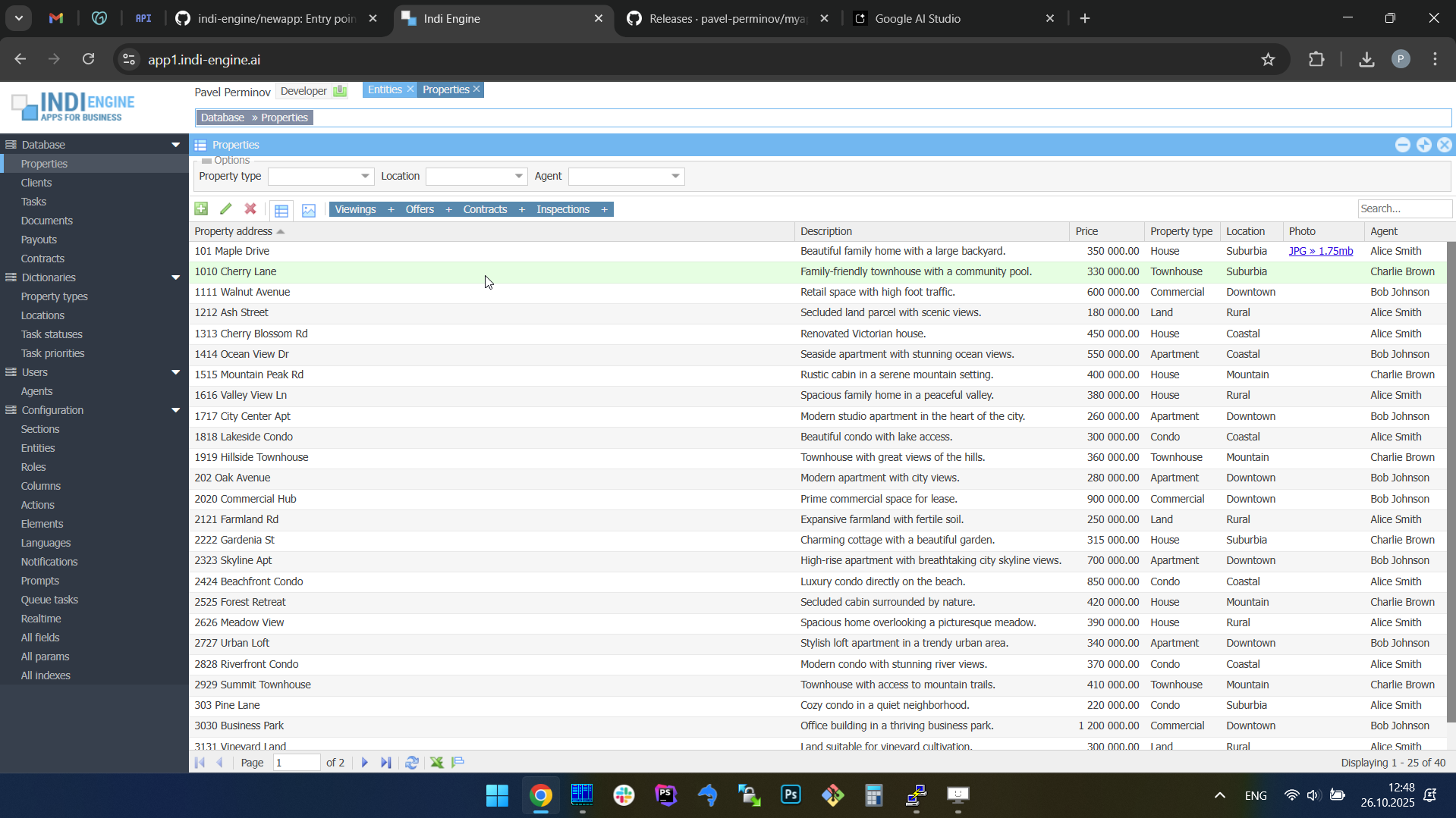 | 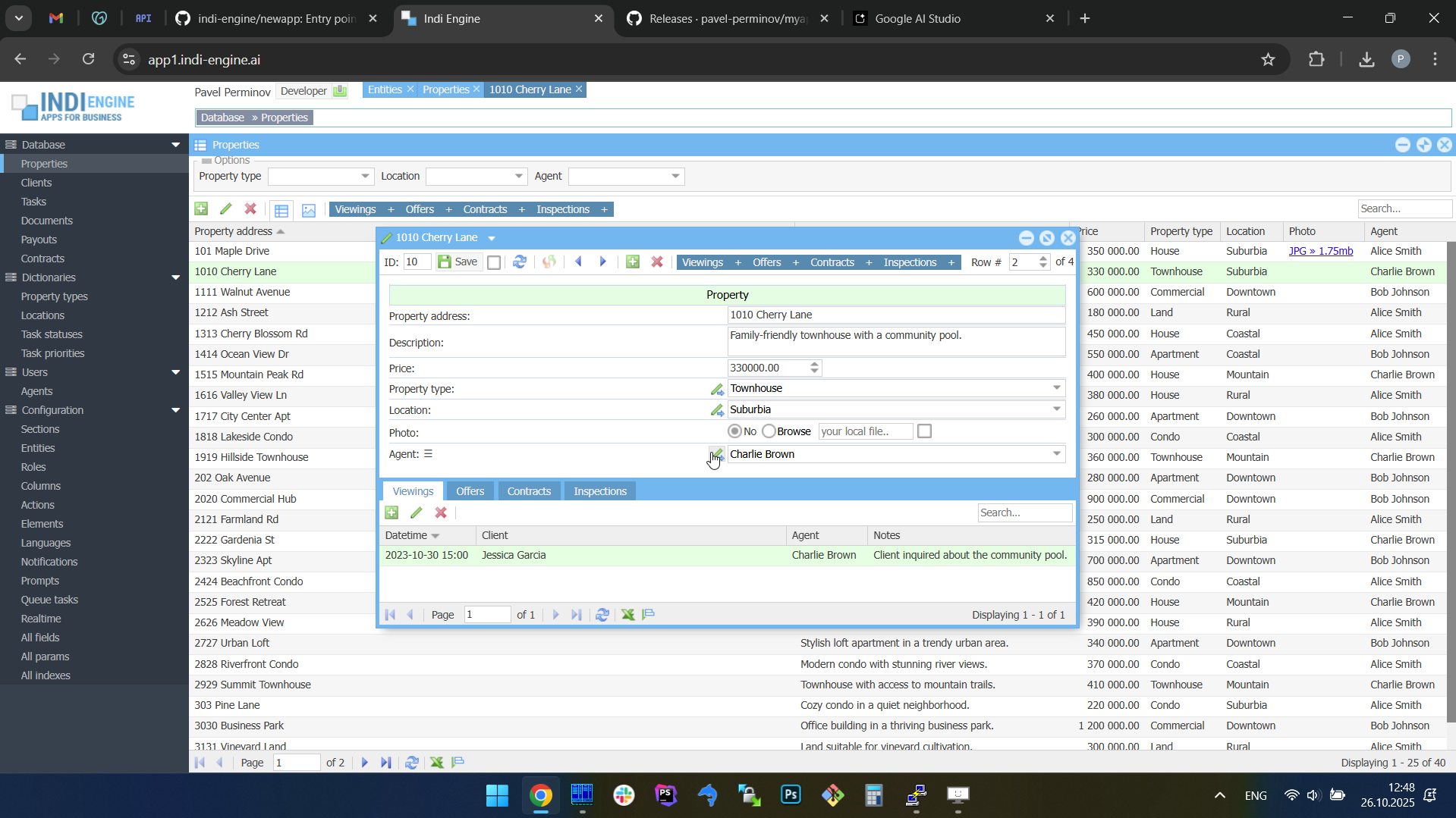 |  |  | 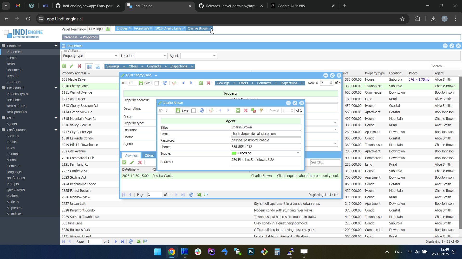 |
This ensures a predictable, intuitive experience — the active window is always visually prioritized, yet previously opened windows remain accessible in the background. The z-index system also works seamlessly with batch window opening, so when several Details-windows are opened in a cascade, their z-index values are assigned in sequence so each next window mostly overlaps the previous one, preserving both visual depth and usability. See below.
Batch opening / cascading windows
Just like on a real desktop, Indi Engine allows you to open multiple windows at once. For example, when several records are selected and the Details-action is triggered, each record opens in its own floating window (or maximized one if its contents takes too much space). The floating ones appear with a slight offset on the X and Y axes, forming a cascading layout.
As you can see above, batch opening assumes more than one record needs to be selected. Also, apart from the support for Details-action, it is also supported for Index-action — in cases when you are opening some child section for multiple selected records in parent section - you can see that on the screencaptures below.
 ▶00:27 ▶00:27 | 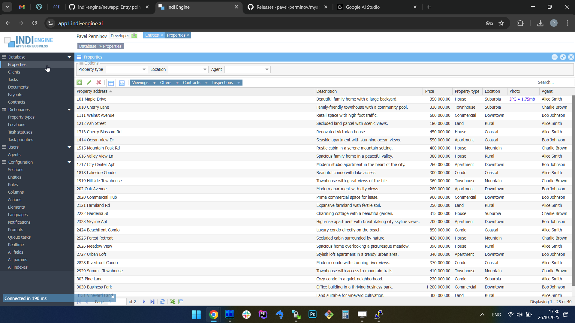 |  | 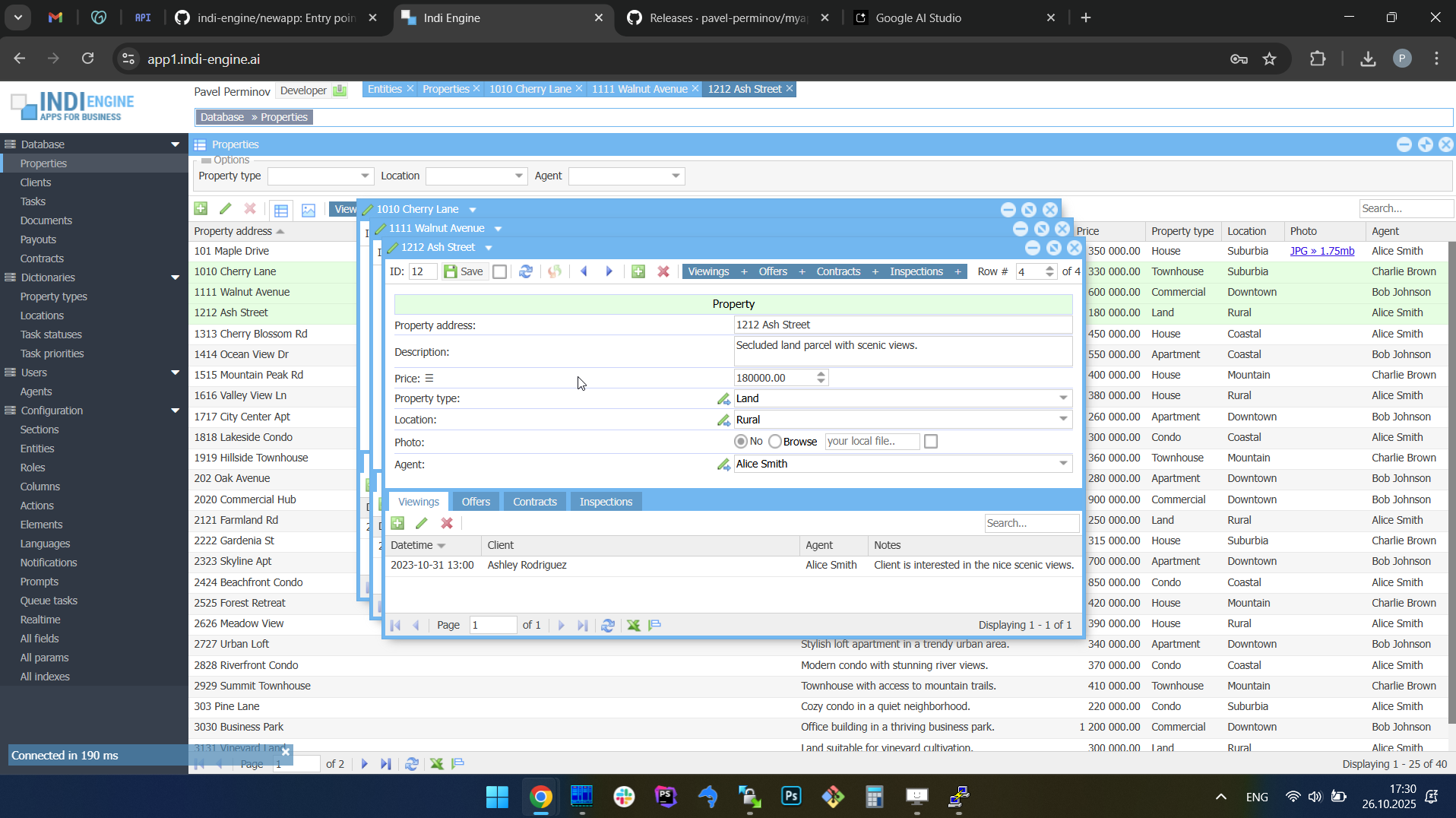 |  | 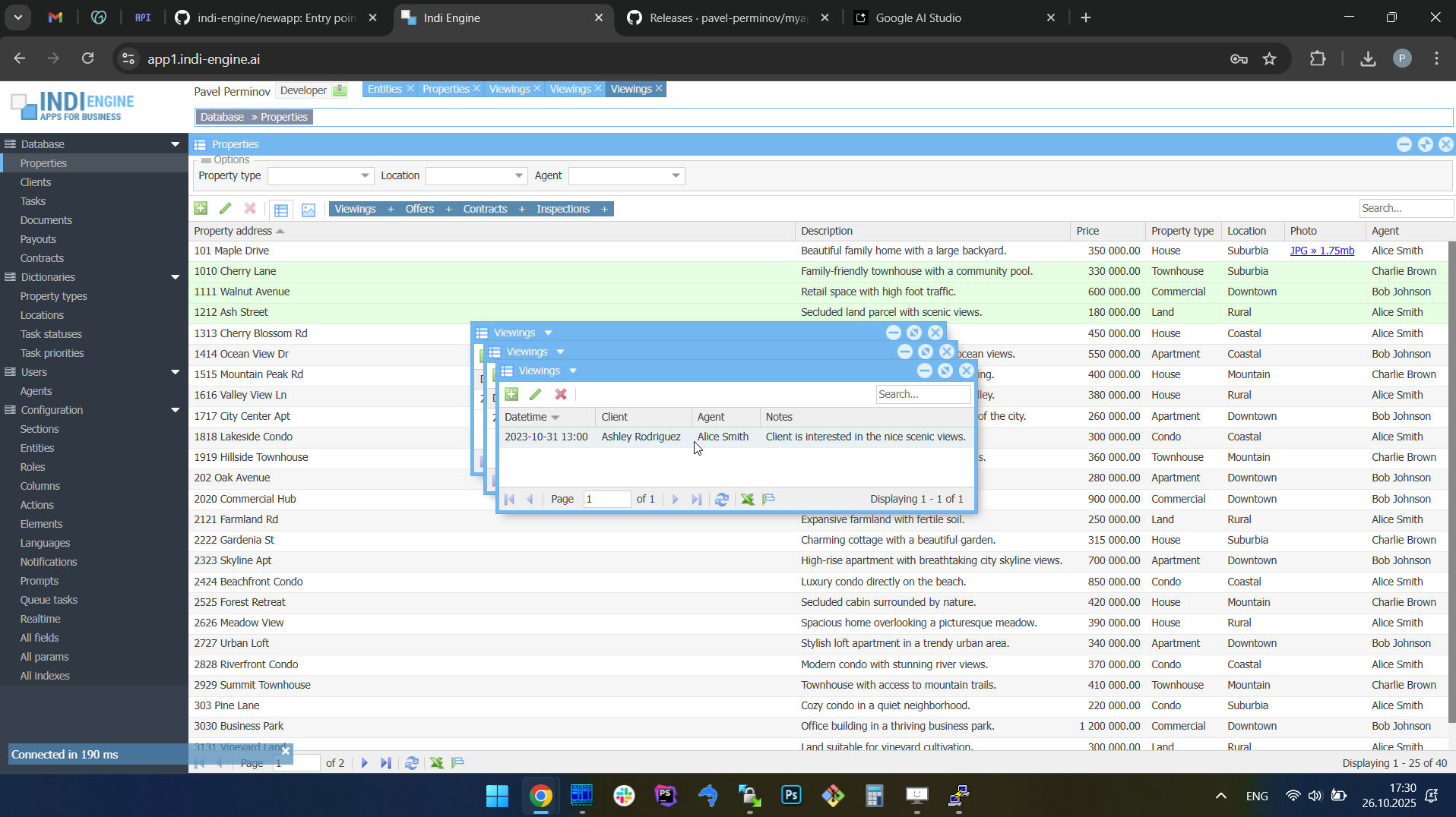 |
This behavior not only feels natural for multitasking but also helps you visually distinguish between multiple opened entities without losing context.
However, keep in mind that you can’t open more than 15 windows in total, but you can change that limit via Maximum number of windows-field for any needed Role.
Auto-sizing based on content
Indi Engine automatically adjusts each floating window to fit its content precisely. The system measures the actual vertical and horizontal space usage by every UI element — including grid multi-level column headings and cell values, form field labels and inputs, toolbars and their items, and even nested child tabs, e.g. Viewings, Offers, etc tabs inside a Property-record Details-window in real estate company app (see at the screencapture #4 above).
This dynamic sizing ensures that windows always appear neatly proportioned, without unnecessary empty space or scrollbars. The result is a clean, well-balanced interface that feels as if every window was manually arranged by a designer — but it all happens automatically, and you’ve highly likely noticed that already in the tens of the screencaptures above.
Also, whenever records are changed, added or removed from a grid, Indi Engine recalculates the inner layout and updates the window height and width accordingly. The adjustment happens smoothly and in real time, preserving the visual balance of the entire workspace. To see how it works, take a look at Example 2 in the next paragraph.
However, for those changes to be reflected for the Indi Engine users in their browser tabs opened - some preliminary things are set up by Indi Engine, see below.
Change data capture / CDC
Change Data Capture (CDC) is a mechanism that continuously monitors the database for insert, update, and delete operations and streams those changes to the desired or intermediate destinations. In Indi Engine, this job is done by Zendesk’s Maxwell Daemon which is a Java process that connects to MySQL as a Replication client and streams any data-changes written to the database - into the RabbitMQ exchange for further transformation and delivery to the end users’ UI.
To be able to deliver changes only to the relevant data-views, Indi Engine keeps track on everything involved — starting from how many sessions using which languages each user has, and ending with what filtering, sorting and paging is currently applied for each data-view along with which records and their data-fields are currently shown there.
With that in mind, Indi Engine consumes the data-changes stream from RabbitMQ, transforms that stream into a format compatible with Indi Engine interface components and delivers the transformed data into the relevant browser tabs opened by the users — via WebSocket connections.
For both of the below examples, you might notice that the changes on the screencaptures are made via pure SQL queries rather than via interaction with Indi Engine interface, and this is done that way to emphasize that any data-changes made to the database - are all pure SQL queries in the end, no matter whether those changes are made by users via interface or any scripts.
Example 1: reflecting data-changes for records affected by a sequence of pure SQL UPDATE queries (zoo management app)
 ▶01:55 ▶01:55 |  |  | 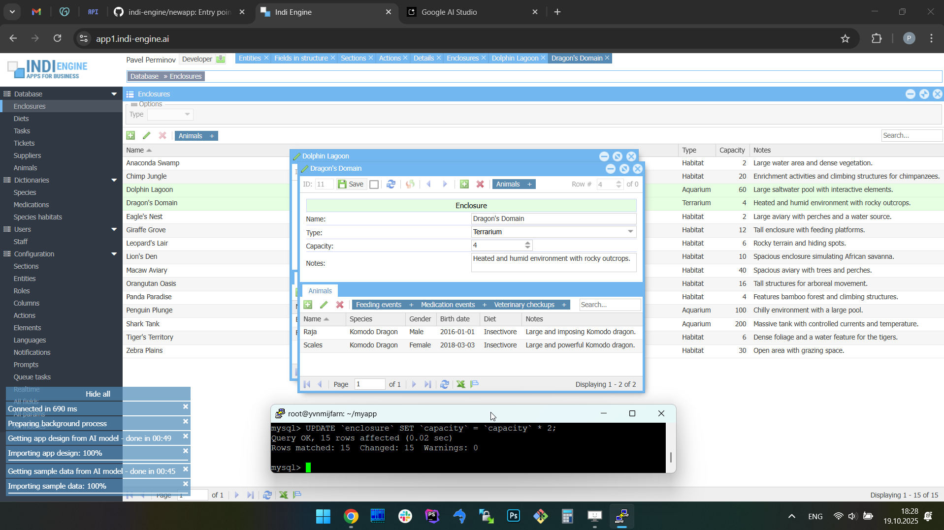 |  |  |
In the above screencaptures its shown how the SQL UPDATE queries were used to modify the data within our first example app (i.e. zoo management app): to multiply the values of Capacity-field by 2 for all Enclosure-records, to change the type of a certain enclosure from “Terrarium” to “Cage” and to rename the certain animal from “Raja” to “Big Raja”.
Example 2: auto-sizing of a floating window based on records creation and deletion via pure SQL INSERT and DELETE queries (real estate company app)
 ▶00:48 ▶00:48 | 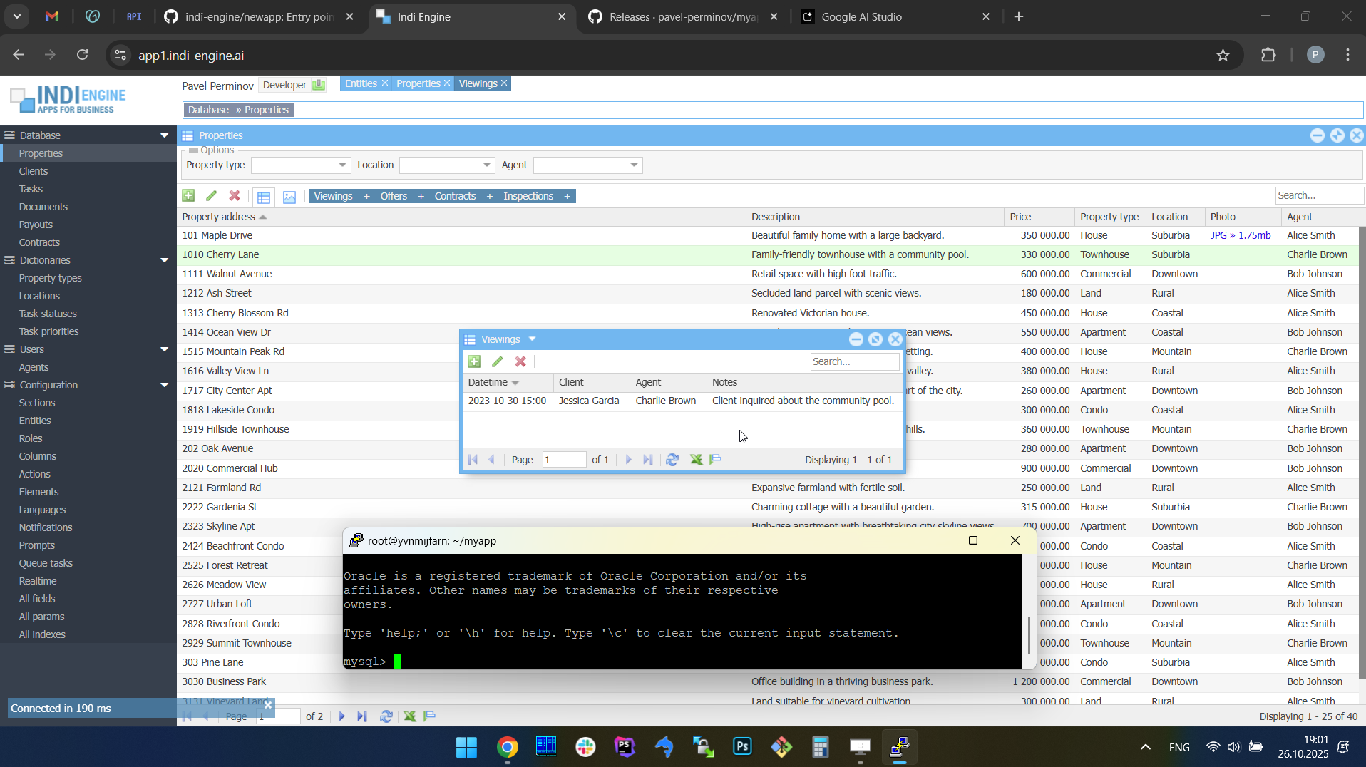 | 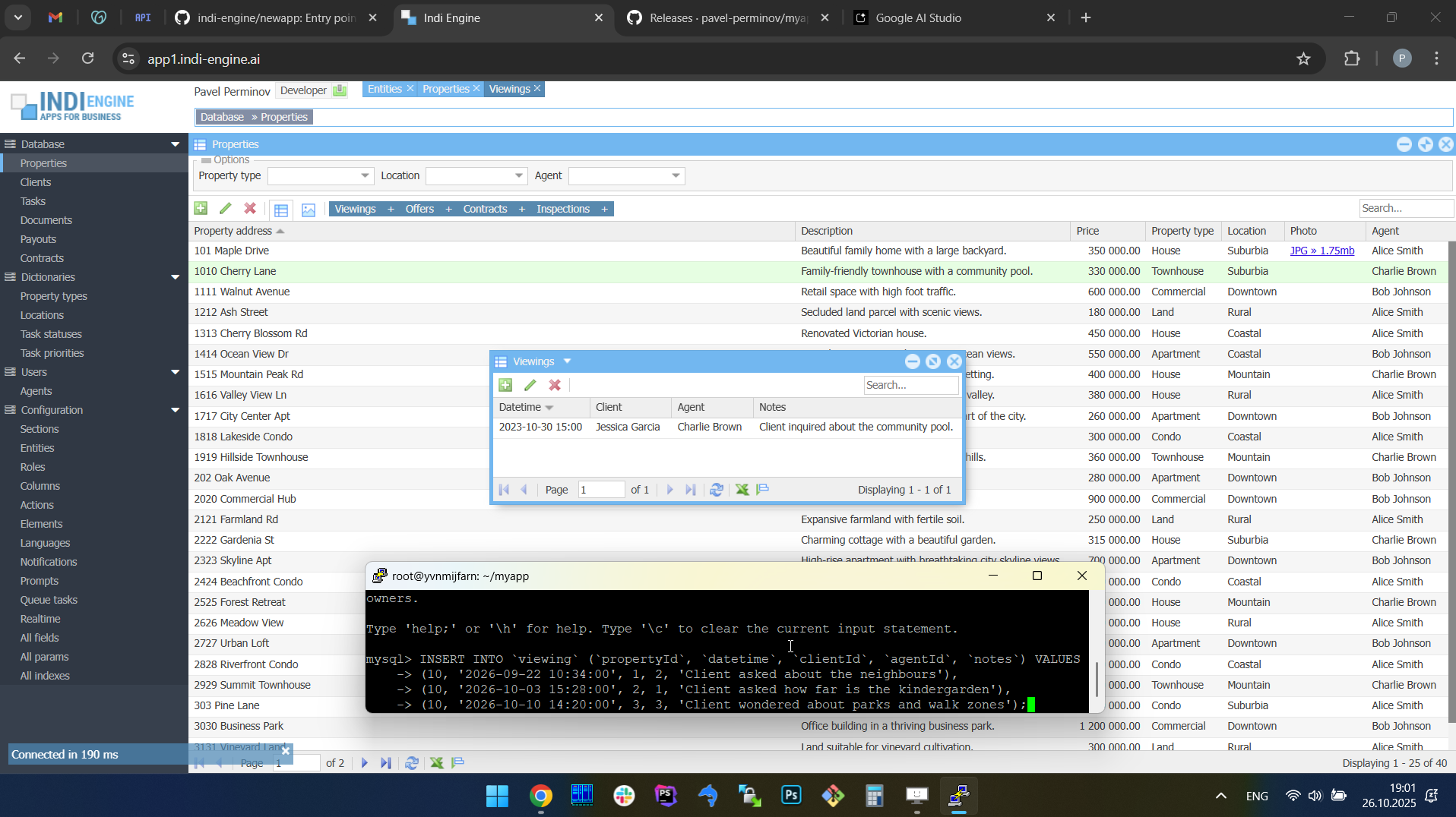 |  | 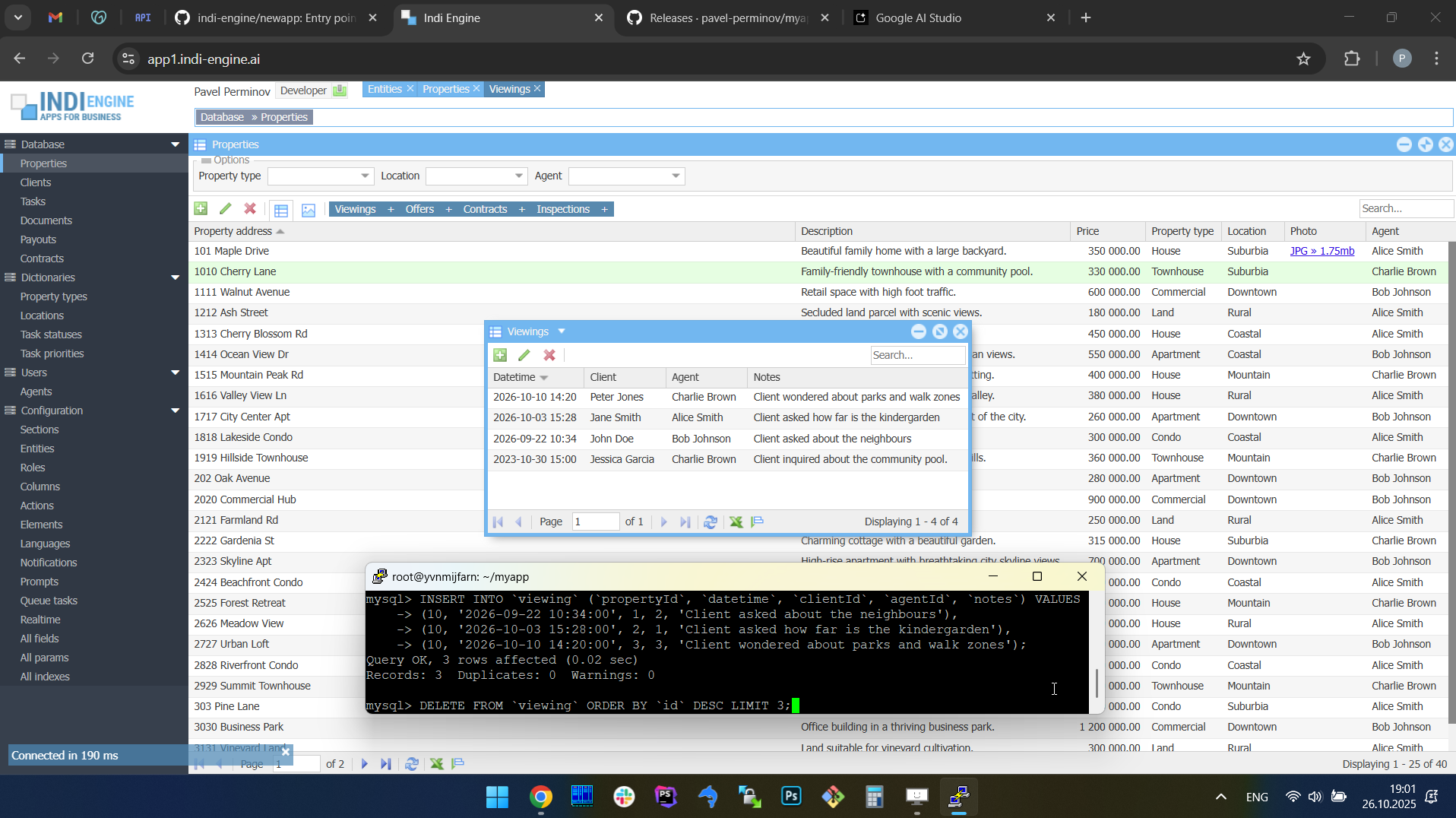 | 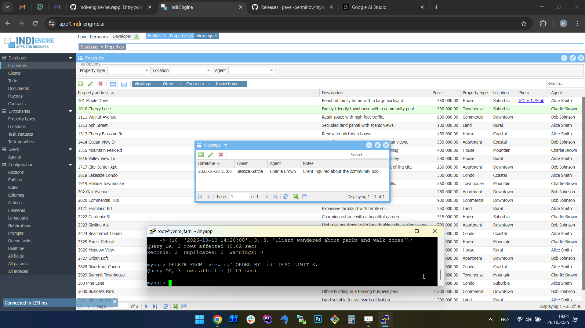 |
In the above screencaptures it is shown how in our second example app (i.e. a real estate company app) the Viewings-section’s Index-window (opened for a certain Property-record) adjusted its size to fit the new Viewing-records that were created via pure SQL query for that Property-record. Also, when those records were deleted - the viewings window reduced its size again to stay fit.
WebSocket connections
From a user perspective, 'realtime' means that any data changes made by no matter who and for whatever reason - are immediately reflected in the UI. So, as long as the UI is shown within the browser tab — the changes must be somehow delivered to each browser tab opened by each user, and in Indi Engine this job is done by RabbitMQ Web STOMP plugin, which allows to deliver realtime updates directly to users’ browser tabs over standard WebSocket connections.
STOMP (Simple Text Oriented Messaging Protocol) is a lightweight, text-based protocol that allows clients (i.e. browser tabs) to subscribe to message queues and receive updates in a standardized way. When the Web STOMP plugin is enabled, RabbitMQ acts as a WebSocket server, translating between WebSocket frames and STOMP messages, so to make any message to be delivered to a browser tab — Indi Engine has just to push that message to a certain queue.
In Indi Engine’s architecture, this plugin forms the final bridge between backend change events and the frontend interface. After Indi Engine prepares and publishes user-specific JSON updates into the relevant per-tab RabbitMQ queues, the Web STOMP plugin ensures that each connected browser tab receives those updates in real time — without requiring any polling or page reloads. This makes the communication channel persistent, allowing the UI to stay continuously synchronized with the backend as soon as data changes occur.
You can read more technical details here, including how Indi Engine decides which data-changes should be delivered to which users.
Free GitHub backups, up to 1.9TB each
Indi Engine backup/restore system rely on GitHub, which means you'll have to create your own repo there and create a fine-grained personal access token granted with read-write access to that repo, so Indi Engine will ask you to specify those on attempt to make the very first backup, no matter if your attempt will be made via CLI (i.e. source backup command) or via UI (i.e. Backup-action in Entities-section).
Example 1: very first backup - with preliminary setup of GitHub repo and access token. In this example it’s the backup for the zoo management app.
 ▶02:07 ▶02:07 | 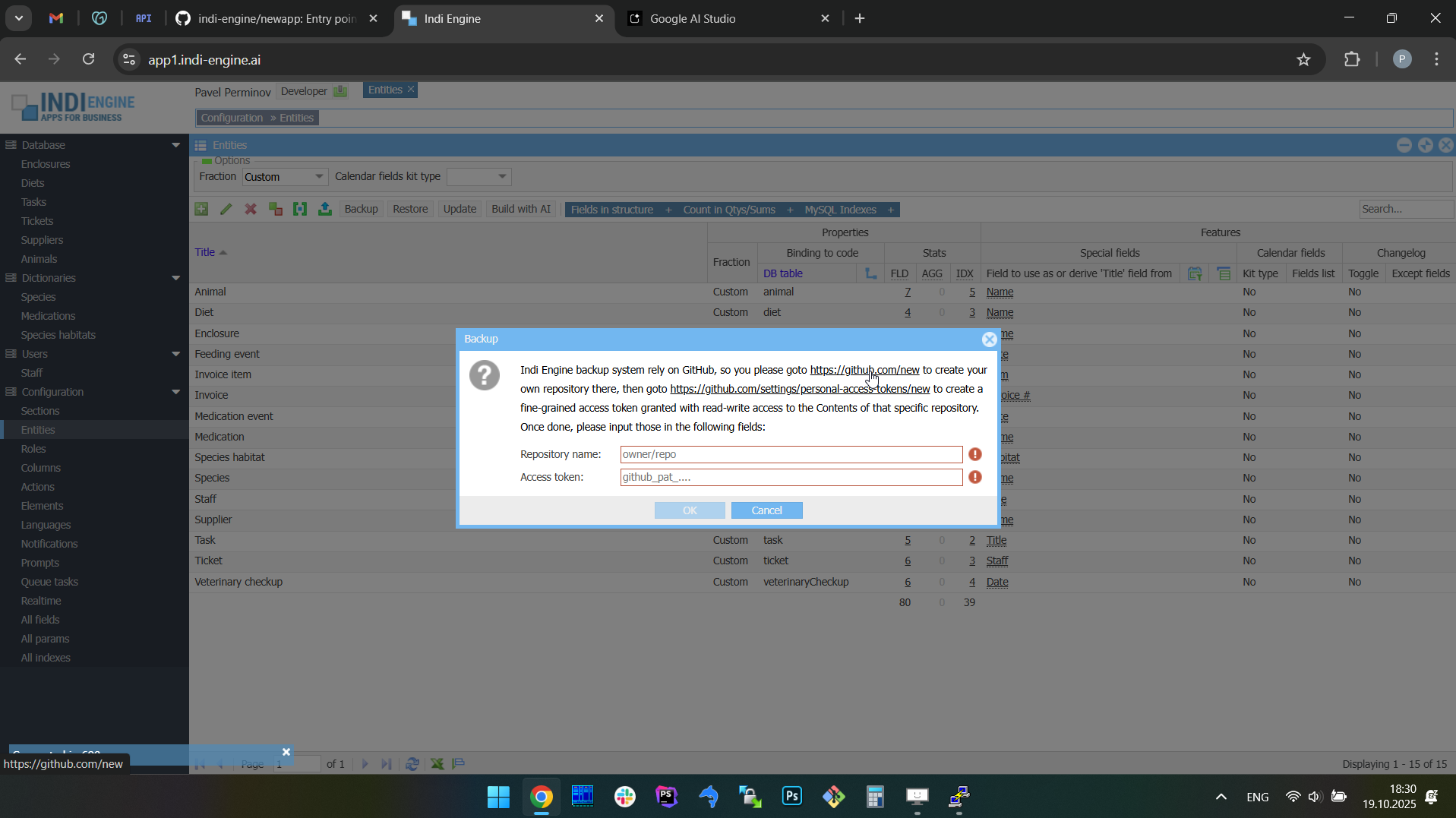 | 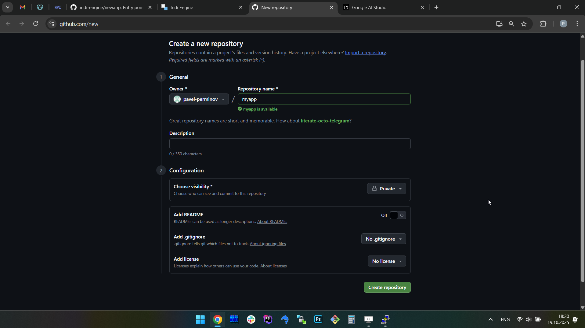 | 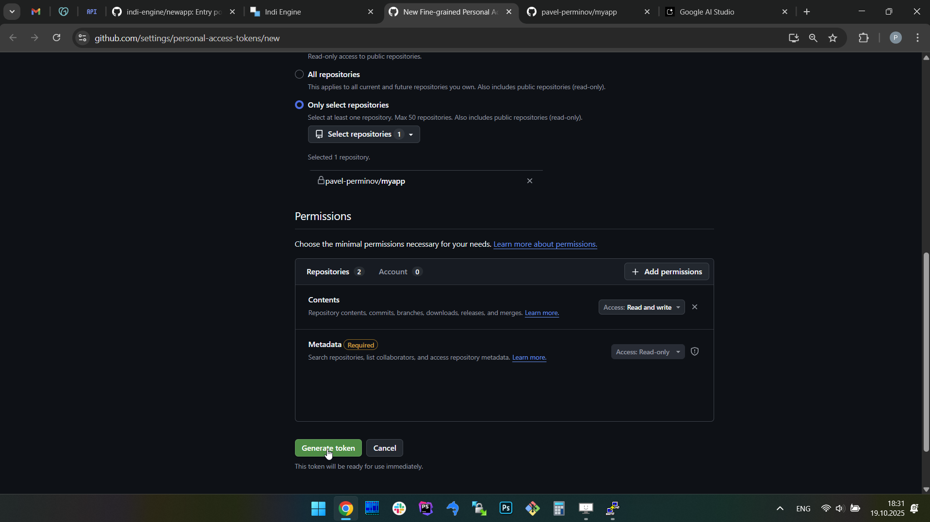 | 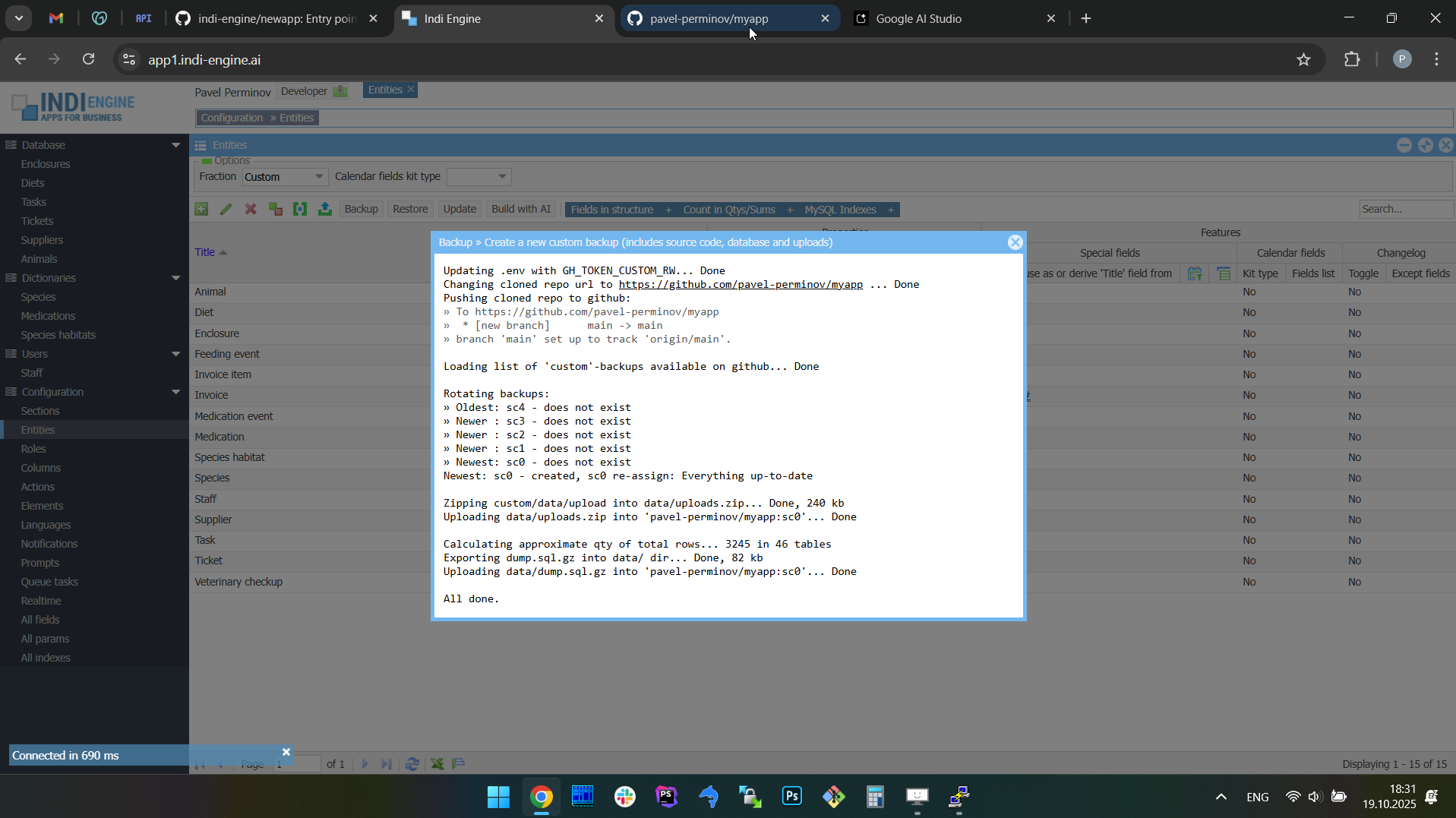 | 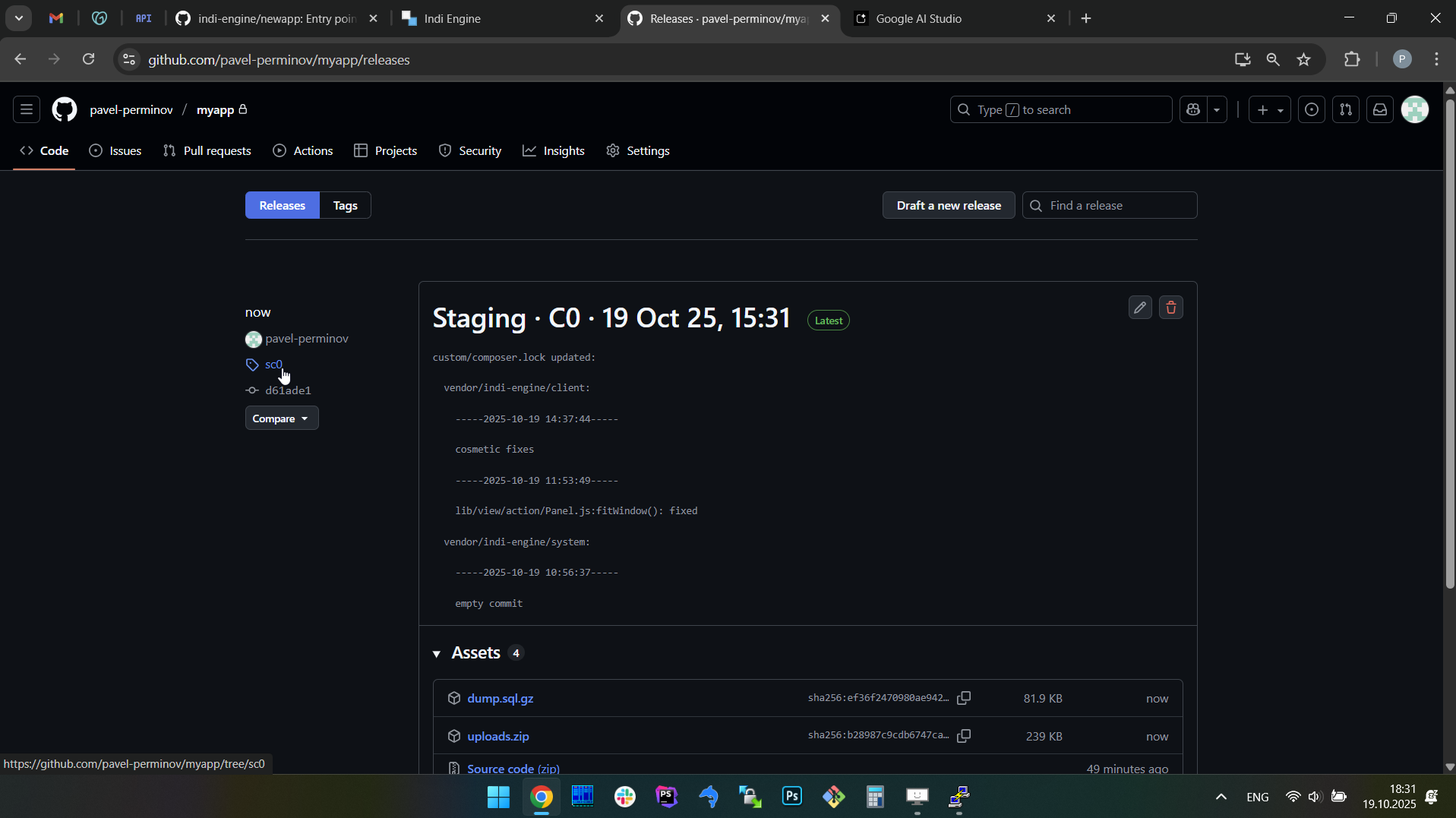 |
Example 2: second (or any further) backup. In this example it’s the backup for the real estate company app.
 ▶00:44 ▶00:44 | 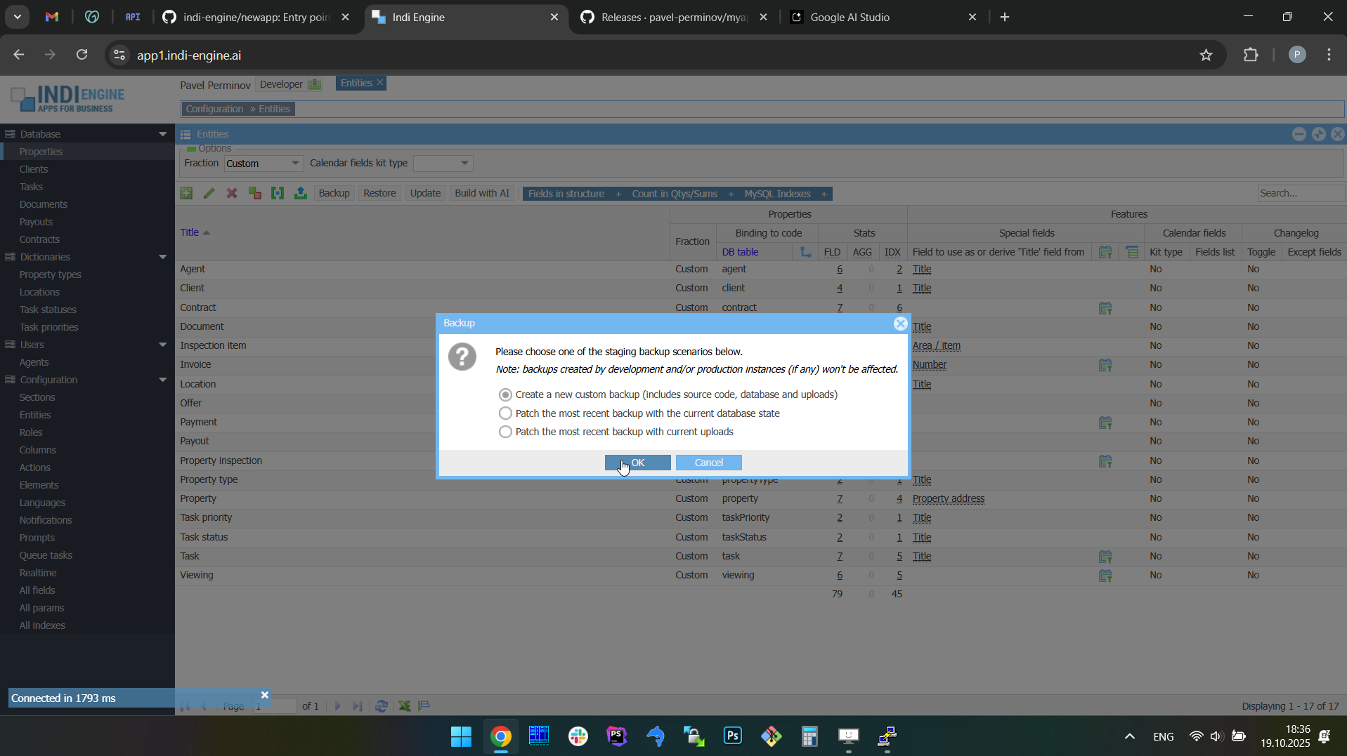 | 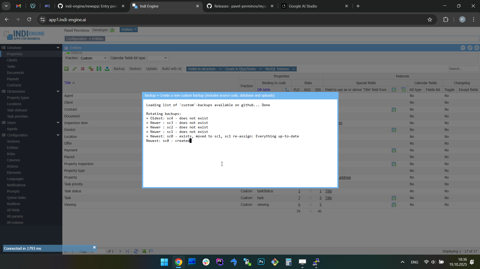 | 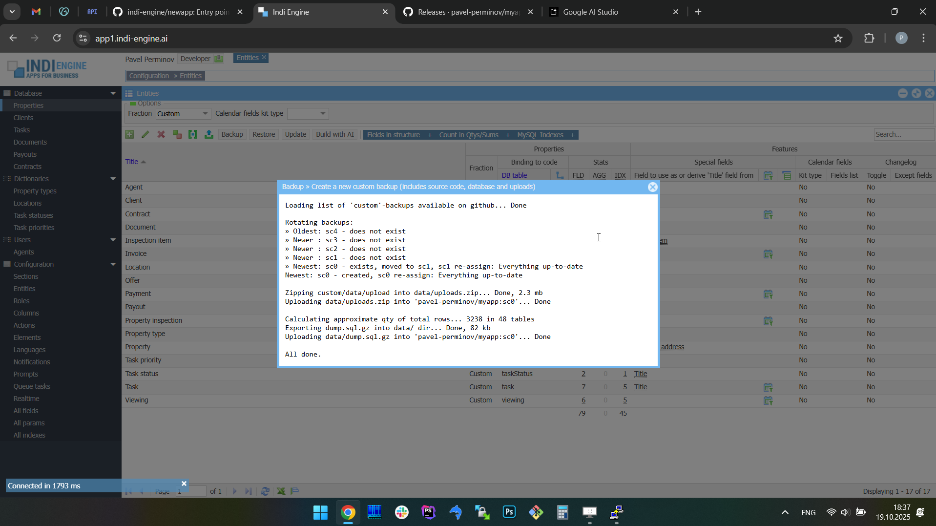 | 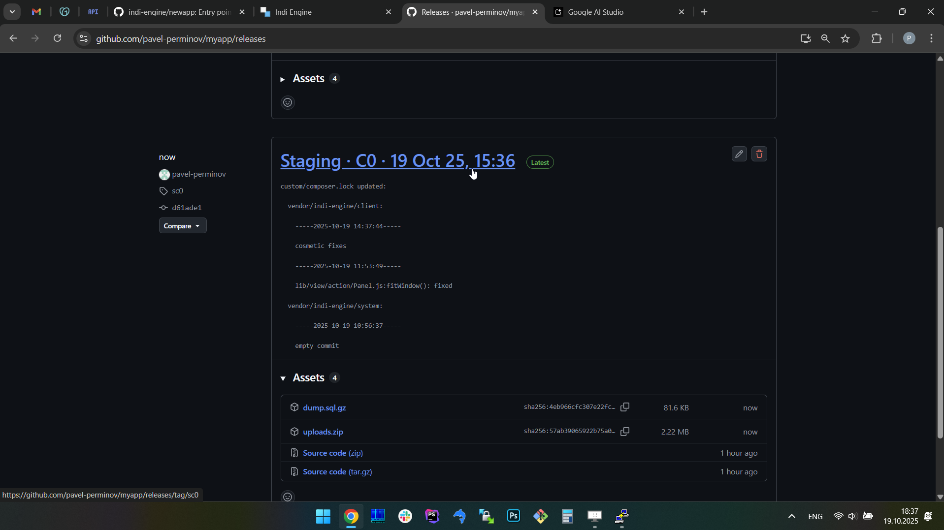 |  |
Rotation
By default, any Indi Engine app instance uploads and keeps 0 'hourly', 7 'daily', 5 'weekly', 12 'monthly', 5 'custom' and 5 'before' backups on GitHub, but for sure you can amend those numbers by editing BACKUPS variable in .env file.
|
As you can notice, the last two kinds of rotated backups - are not periodical ones (unlike the first four):
- Custom - those are the backups that you create by yourself - either via CLI (i.e.
source backupcommand) or via UI (i.e. Backup-action in Entities-section)
- Before - those are backups created by Indi Engine each time you commit a restore, to make it possible to get back to 'before restore' version, You can read more here about how restore works.
Environment isolation
Any Indi Engine app instance can be one of 3 environment types (production, staging or development) and it is mandatory to choose the environment during initial setup, so your choice is then written to APP_ENV variable in .env file
|
So, as outlined in the comment for the APP_ENV variable above, backups environment isolation is implemented to prevent collisions between the backups uploaded on GitHub by different instances of your Indi Engine app.
This is useful in cases when you have a production instance of your app which is up and running somewhere, and you want to work on some improvements on your local development instance, but you want to get the most recent production app state locally before you start your work, and for sure you don't want backups uploaded by your local development instance to conflict with the production ones.
Limits and chunking
Each backup created by Indi Engine is then uploaded on GitHub as a release, and there is no limit for how many releases can be created for a repository. However, there are some limits applied by GitHub to assets (i.e. non-source-code files) of a release, and those are:
- Maximum 1000 assets per release
- Maximum 2GB per asset
However, the real maximum size per asset is 2000mb rather than 2GB (=2048mb), because GitHub fails with HTTP Code 500 on attempt to upload a 2048mb asset, and this is why GH_ASSET_MAX_SIZE variable is set to 2000mb in .env file
|
So, the real size limit for an individual backup is 1.9TB, and this is the combined limit for database dump and uploaded files.
Chunking
When you create a backup in Indi Engine, this actually means that minimum two files are created locally and then uploaded on GitHub:
- data/dump.sql.gz - the gzipped sql dump created by
mysqldumpandgzipCLI tools - data/uploads.zip - the zipped (but not compressed) contents of custom/data/upload directory
However, if any of those are getting bigger than GH_ASSET_MAX_SIZE during creation - then they are chunked into pieces to comply with GitHub requirements, and yeah — chunking is done during creation rather than after creation, so there is no double disk space usage needed.
- If your database gzipped dump is, for example, 3GB, then the chunks are:
- data/dump.sql.gz01 - 1.95GB
- data/dump.sql.gz02 - 1.05GB
- If the size of your custom/data/upload directory is, for example 5GB, then the chunks are:
- data/uploads.z01 - 1.95GB
- data/uploads.z02 - 1.95GB
- data/uploads.zip - 1.1GB
Timing and progress tracking
How fast are backups and restores? That mostly depends on your local (or VPS) host disk I/O and internet connection bandwidth.
For example, let's take a look at the numbers in the table below that are from the VPS host having:
- 1x3 GHz CPU Core
- 6 GB RAM
- 60 GB disk space
- 250Mbps bandwidth
Database | Uploads | ||||
Backup | |||||
Original size (~13 mln records) | 21 GB | wrapper:/var/lib/mysql | Original size (~27 k files) | 11 GB | host:custom/data/upload |
Exporting as data/dump.sql.gz | 428 MB | 7 minutes | Zipping as data/uploads.zip | 2 minutes | |
Uploading to GitHub | 23 seconds | Uploading to GitHub | 22 minutes | ||
Restore | |||||
Downloading from GitHub | 428 MB | 20 seconds | Downloading from GitHub | 11 GB | 8 minutes |
Importing in MySQL | 20 minutes | Unzipping | 3 minutes | ||
As mentioned above, a 21GB database having ~13 mln records can be exported to a 428MB gzipped sql dump in ~7 minutes and the rest is up to your internet connection bandwidth. But at the same time, the re-importing of such a gzipped sql dump takes 20 minutes, which is almost 3 times slower than exporting time.
However, in most cases the size of your uploads directory - is really the main aspect that relies on bandwidth from the timing perspective: for 250Mbps bandwidth it usually takes around 22 mins to upload and 8 minutes to download chunked 11GB backup into/from GitHub.
Progress tracking
For every time-consuming operation such as exporting (with gzipping) / uploading / downloading / importing for database dump, as well as zipping / uploading / downloading / unzipping for file uploads - the progress bars are shown, so you can track what's going on and where you are at the moment. For the full backups - you might already have seen that on the screencaptures above, and for the other two backup scenarios along with restore ones - you can see that below.
Backup scenarios
Indi Engine supports 3 backup scenarios, which are shown when Backup-action is clicked in Entities-section:
- Create a new custom backup (includes source code, database and uploads)
- Patch the most recent backup with the current database state
- Patch the most recent backup with current uploads
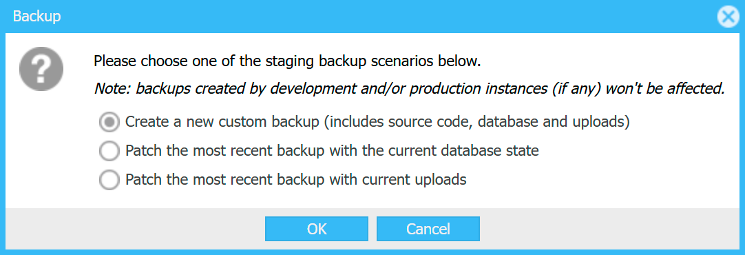
So, as you can see, apart from the full backup which is itself pretty clear (and has been already demonstrated by the screencaptures at the very beginning of the current chapter), it's also possible to patch some already existing backup with database dump or uploads from your current Indi Engine app instance.
PATCH THE MOST RECENT BACKUP WITH THE CURRENT DATABASE STATE
This is useful in cases when you want to apply some fix or improvement for a database dump within a backup already existing on GitHub, but you don't want to create a new backup due to, for example, you don't want to wait for zipping and uploading on GitHub a big-sized contents of your local custom/data/upload directory which will be exactly the same as you already have there.

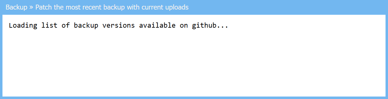
PATCH THE MOST RECENT BACKUP WITH CURRENT UPLOADS
This is useful in cases when you want to apply some fix or improvement for the zipped uploads within a backup already existing on GitHub, but you don't want to create a new backup due to, for example, you don't want to wait for exporting and gzipping of an SQL dump for a big database which will be exactly the same as you already have there.
However, when triggering either of these patch-scenarios via UI, for security reasons it's only possible to patch the most recent backup created by your current instance, so backups created by other instances, if any - won't be affected, except if those instances have the same APP_ENV as your current one. If there are no patchable backups yet - a very first full backup from your current instance will be created instead.
Also, you can do a patch via CLI by executing source backup dump or source backup uploads commands, and in that case Indi Engine will ask you to choose the backup to be patched.
Restore scenarios
Similar to backups, Indi Engine supports 3 restore scenarios, which are shown when Restore-action is clicked in Entities-section, so you can trigger a needed scenario for any backup already existing on GitHub:
- Full restore (source code, database and uploads)
- Restore only database state
- Restore only file uploads
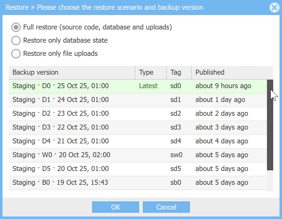
FULL RESTORE
This restore scenario assumes that not only database and uploads, but also the source code will be restored at the version you choose. However, the DevOps-files will still be at the latest version, ensuring you have the freshest Docker Compose setup and Bash scripts, so that only the contents of custom/ directory (where your app-specific source code resides) will be really restored at the version you select.
Example 1: full restore from the state representing one app (real estate company app) to the state representing another app (zoo management app).
 ▶01:32 ▶01:32 | 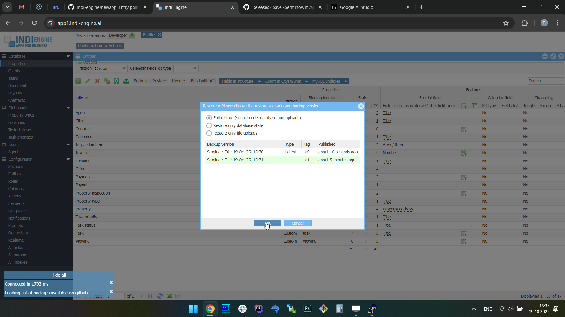 | 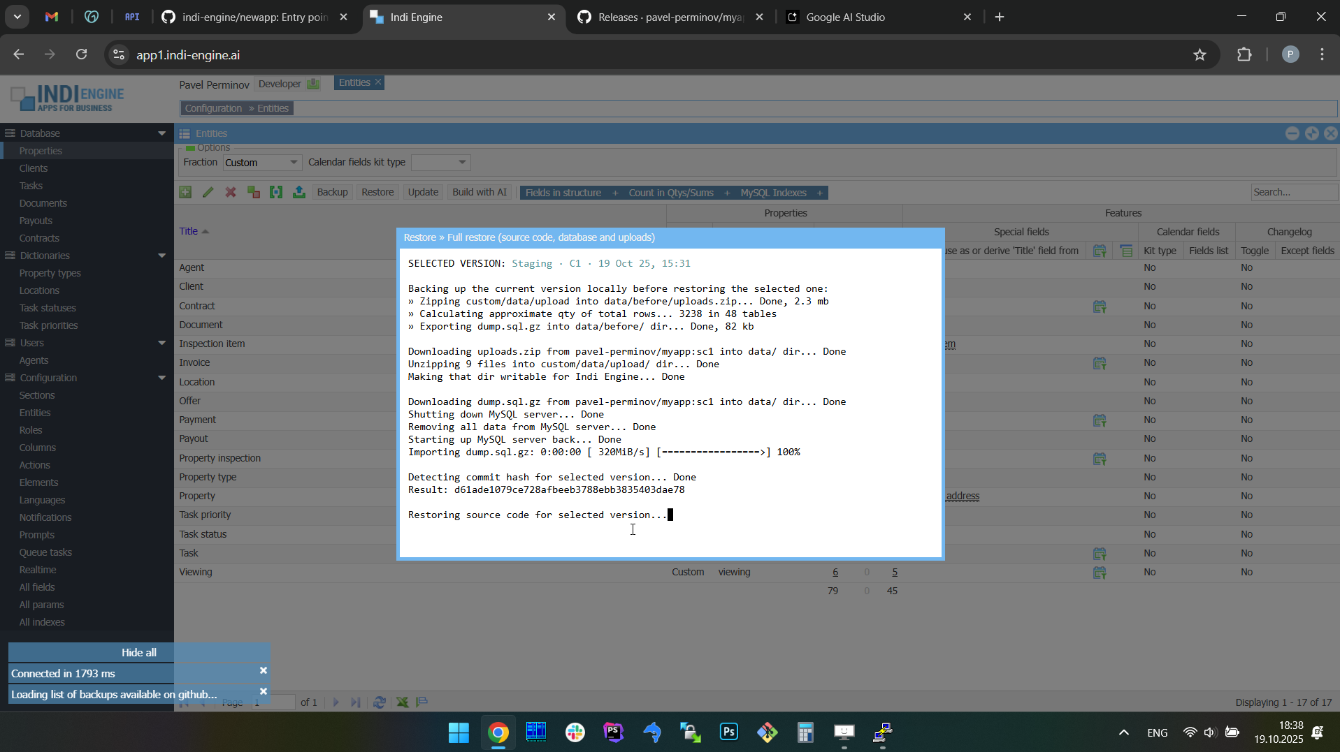 |  | 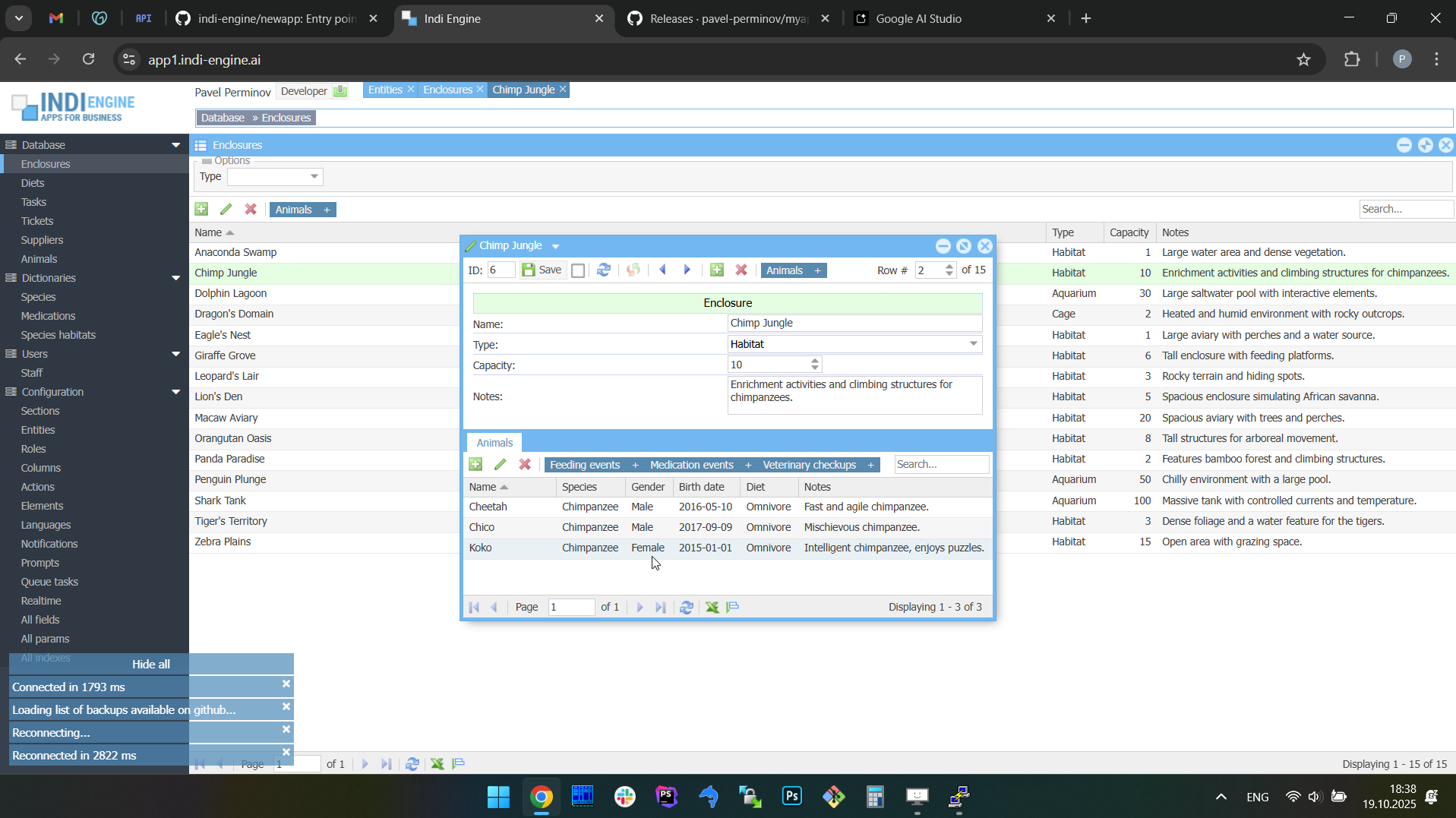 |  |
In the screencaptures above it’s shown how the Indi Engine instance is restored from its whatever current state (in this example it is an app for a real estate company) to some version representing another state for which you have a backup on GitHub (in this example it is a zoo management app).
Example 2: full restore from the app state with Chinese UI translations to the app state without these translations.
 ▶01:28 ▶01:28 | 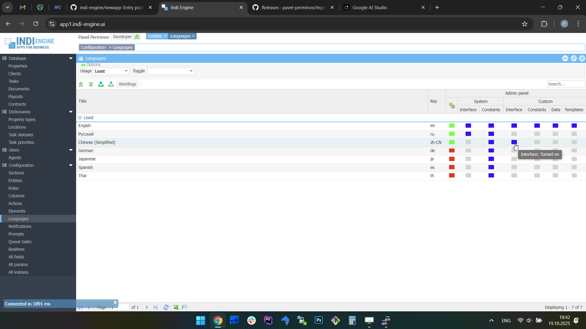 | 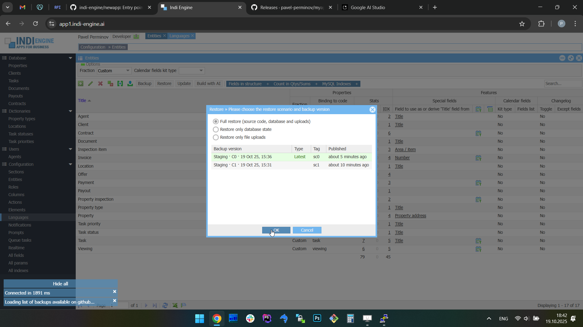 |  | 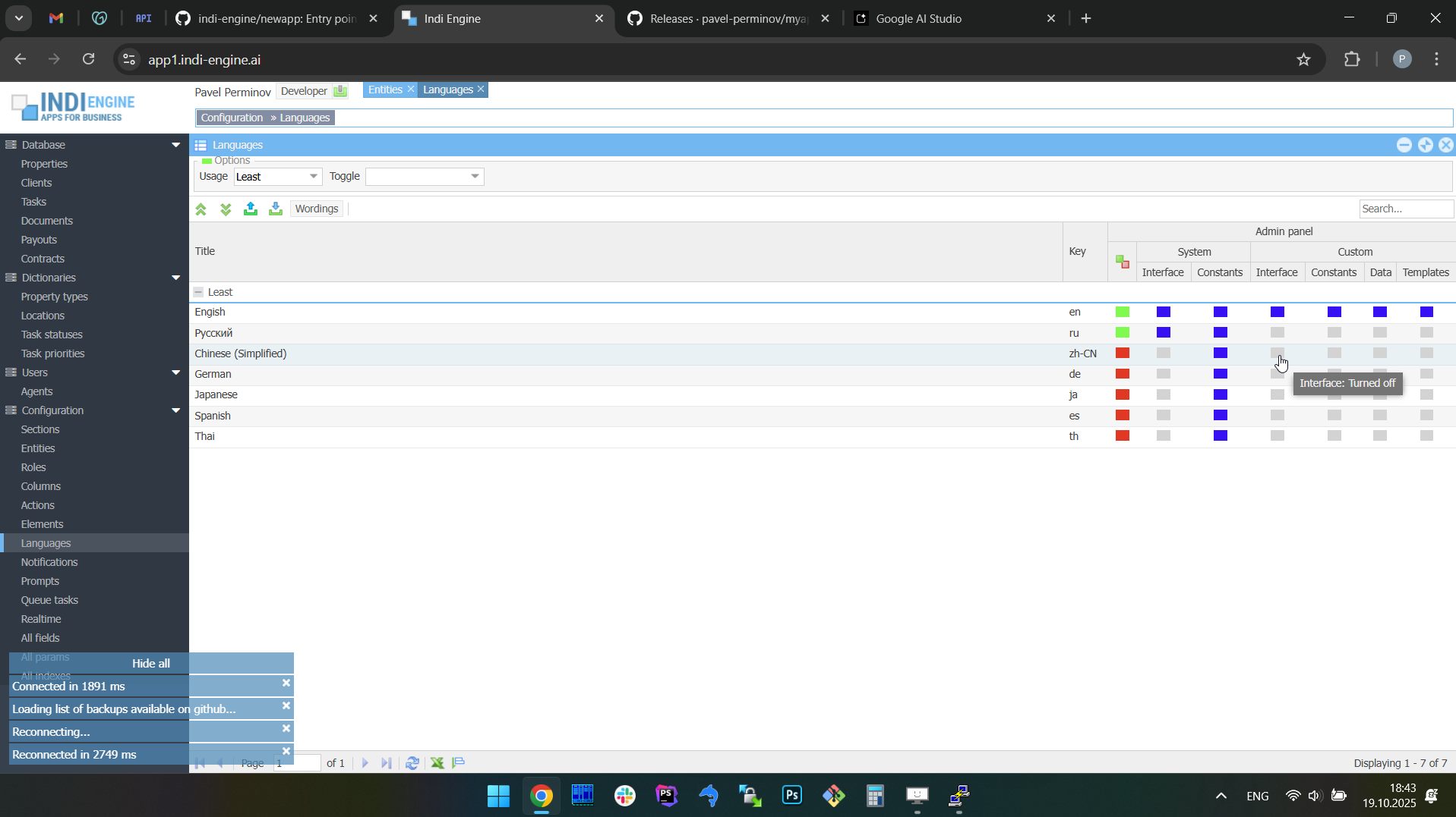 | 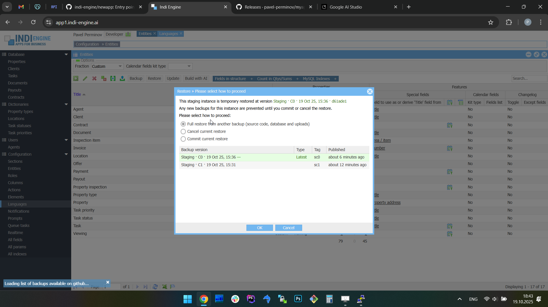 |
In the screencaptures above you may notice the Languages grid indicating that Chinese translations are enabled for app’s custom UI before the full restore, and are not yet enabled after the restore is done, because when we do a restore it means we switch the app to some preliminary backed-up state, so some changes (e.g. translations) might not yet happened compared to the point from where the restore was triggered. Also, keep in mind that the process of UI translation to Chinese is not itself demonstrated in the above screencaptures, because that’s the different topic, and that is why you can see that in the Localization chapter rather than here.
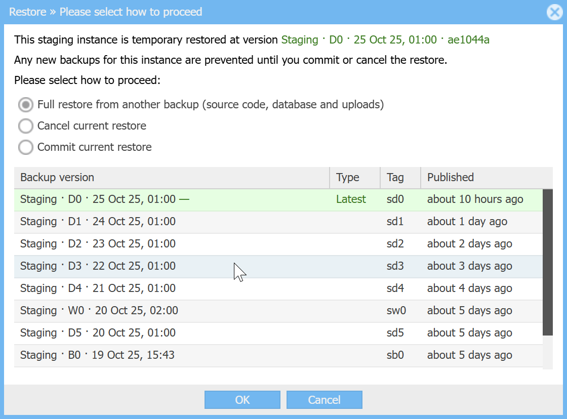
Switching between versions | Commit or cancel a full restore | |
When you do a full restore, your Indi Engine app instance will enter into an 'uncommitted restore' state, so you can look around and decide whether the version you've just restored - is REALLY the right one for keeping your instance at and for auto-restoring (not yet implemented) other instances to, if any, once any updated. If so - you can commit the current restore, else you can either restore (i.e. switch to) another version, or cancel the restore to get back to the original version that Indi Engine saved locally before restore.
However, keep in mind that creation of ANY new backups for your instance - will be prevented until you commit or cancel your current restore.
Example 1: Cancel the full restore.
In this specific example, the full restore from the above Example 1 - is used for cancellation demonstration. The cancellation itself is switching the Indi Engine instance back to the ‘before restore’ state, which was backed up locally within the Indi Engine instance’s filesystem, as otherwise the restore cancellation wouldn’t be possible.
 ▶01:10 ▶01:10 | 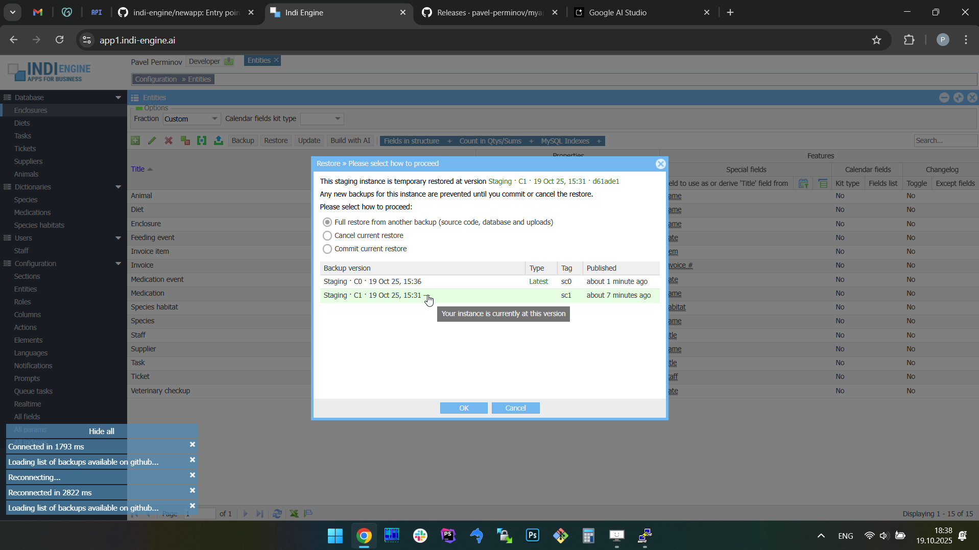 | 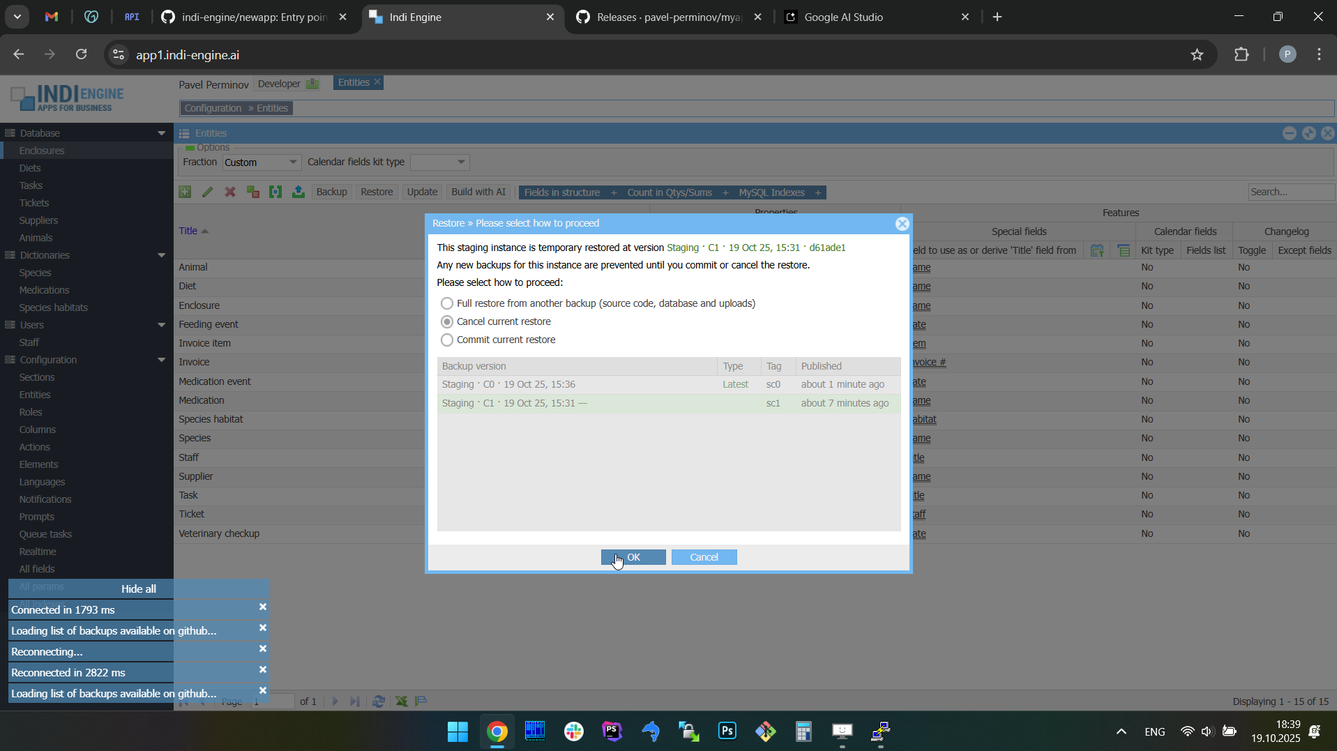 | 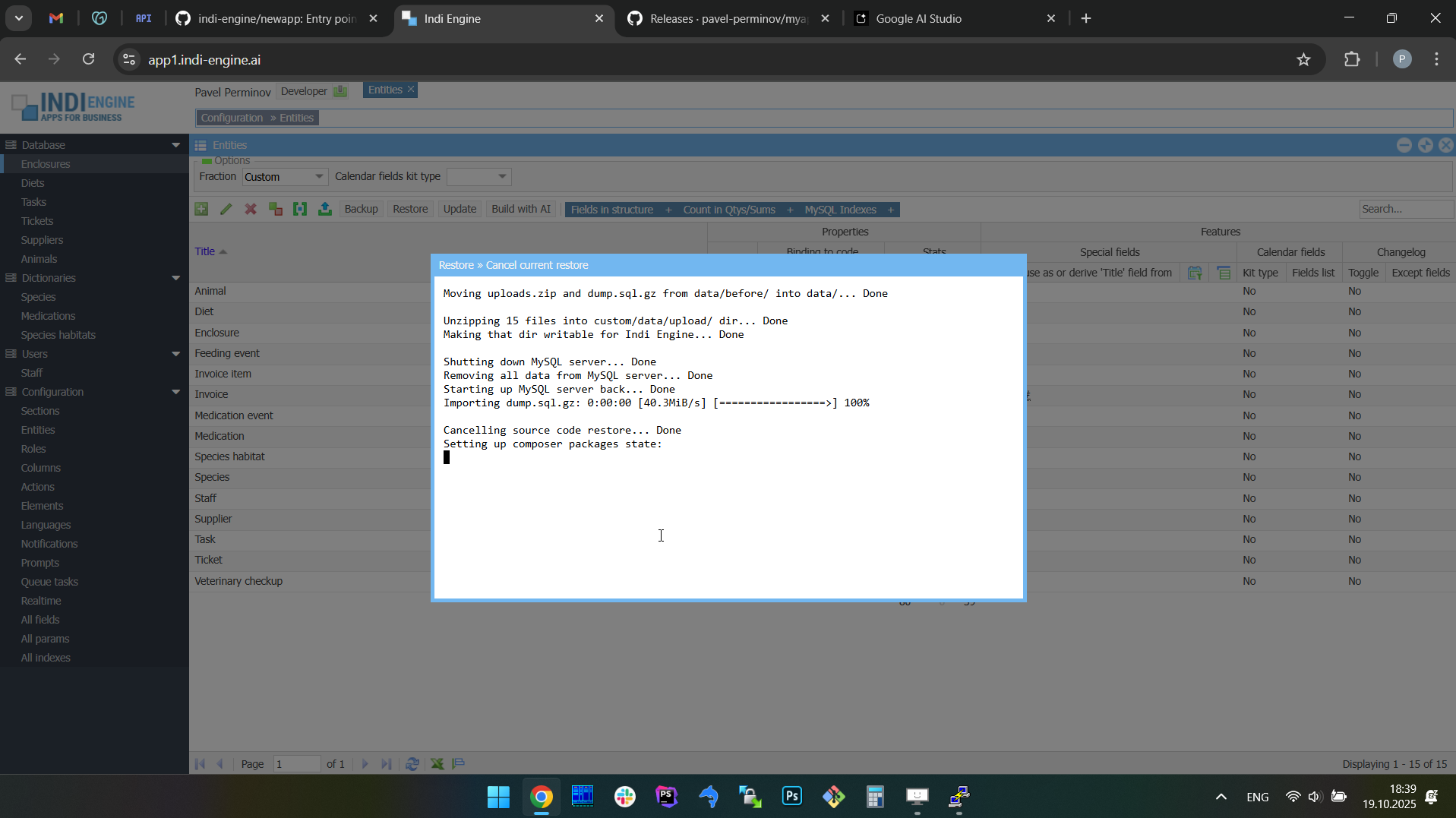 | 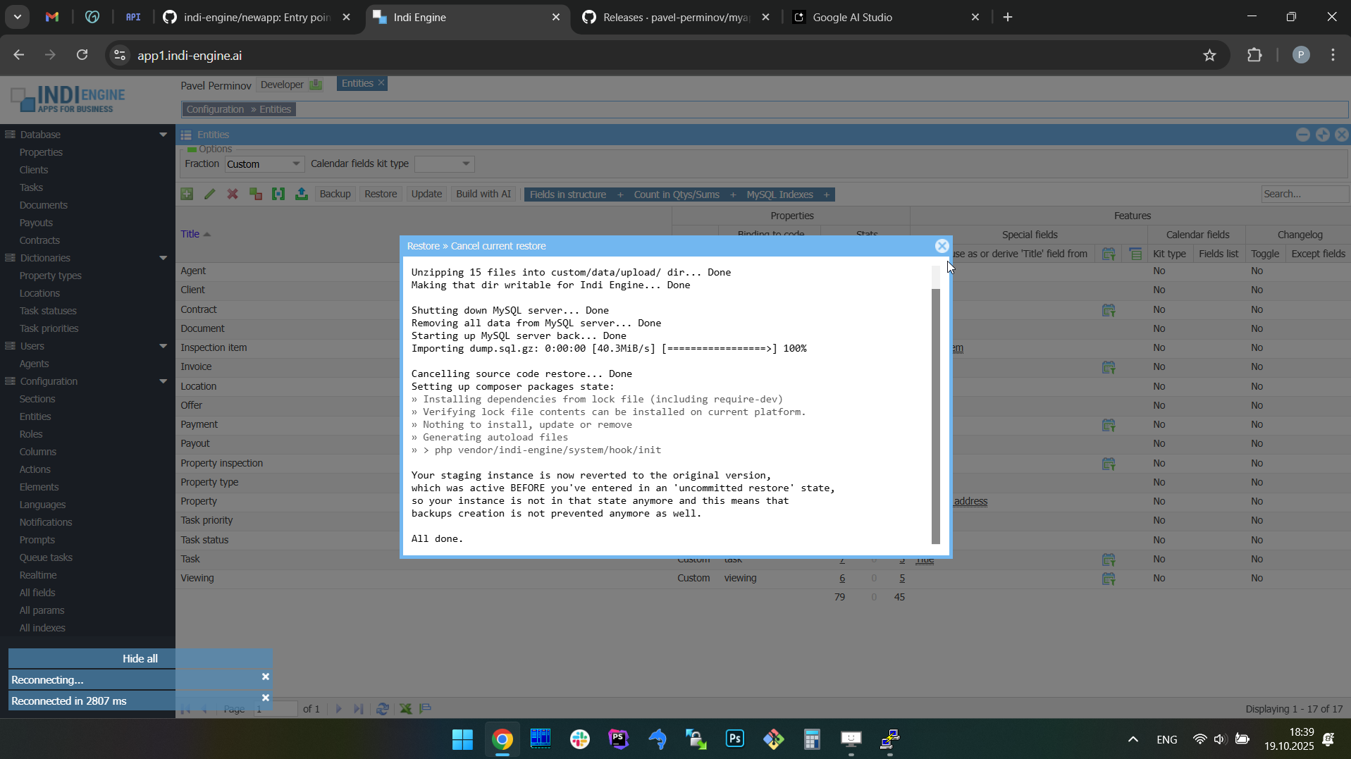 | 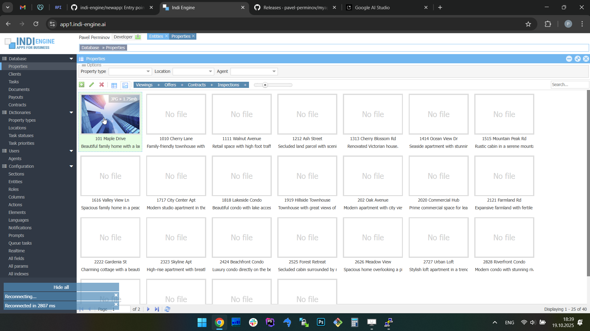 |
Example 2: Commit the full restore.
In this specific example, the full restore from the above Example 2 - is used for demonstration of full restore commit, so the restore to the app state where no Chinese translations are there yet - will be committed. At the same time, the locally created ‘before restore’ version with Chinese translations - will now be backed up on GitHub for being also restorable, if needed further.
 ▶01:29 ▶01:29 | 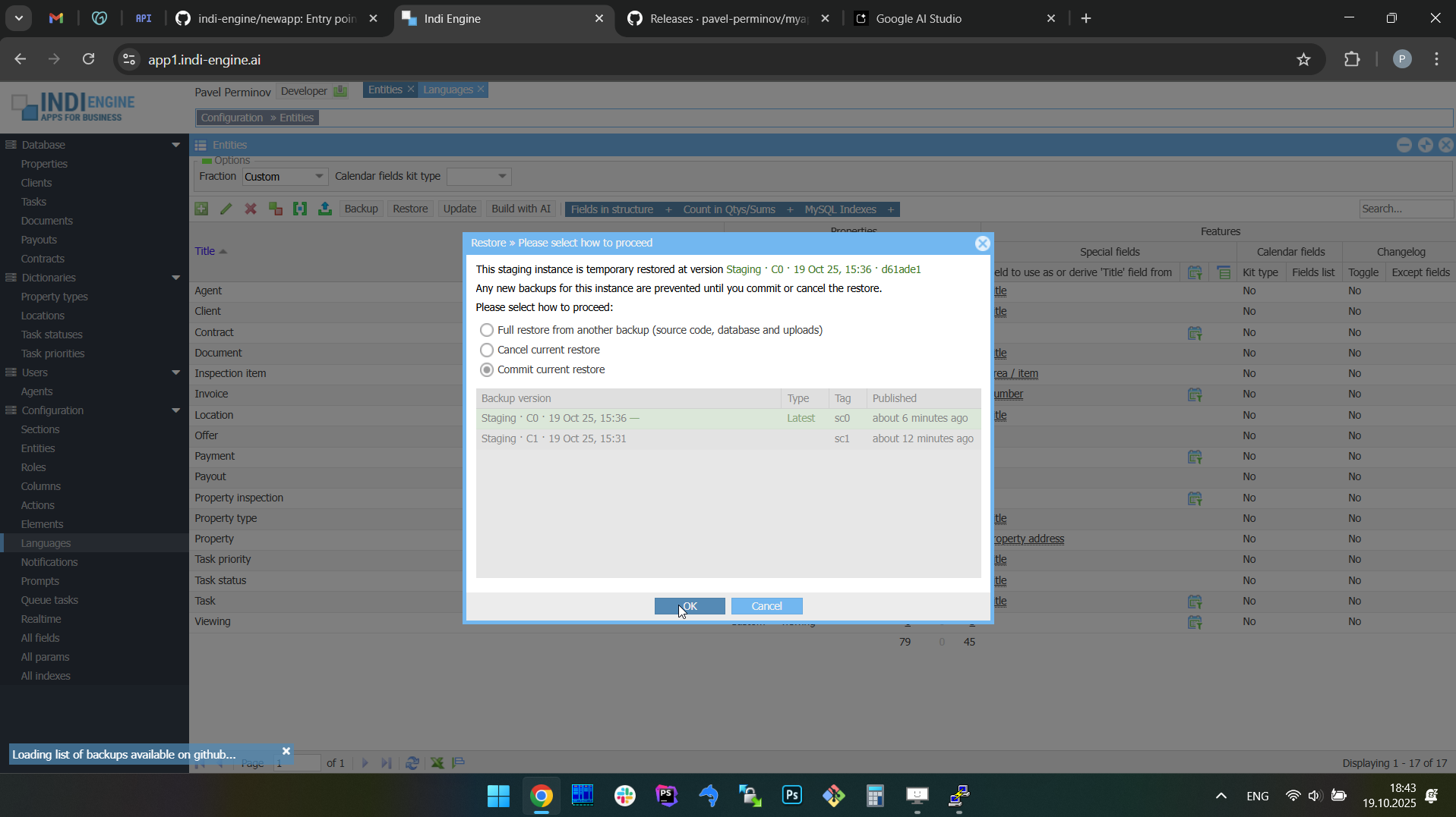 | 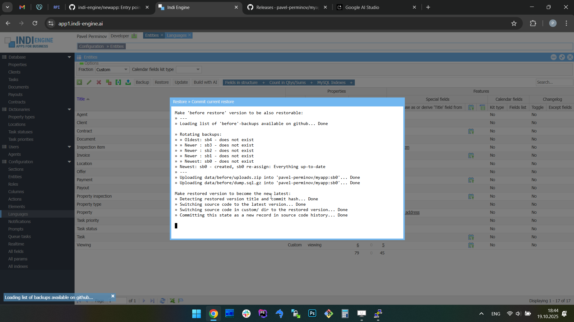 | 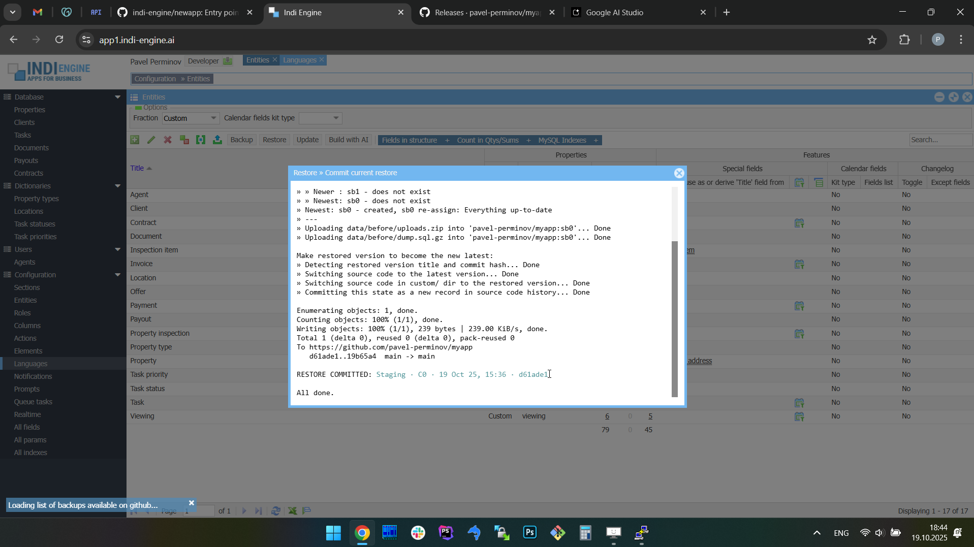 | 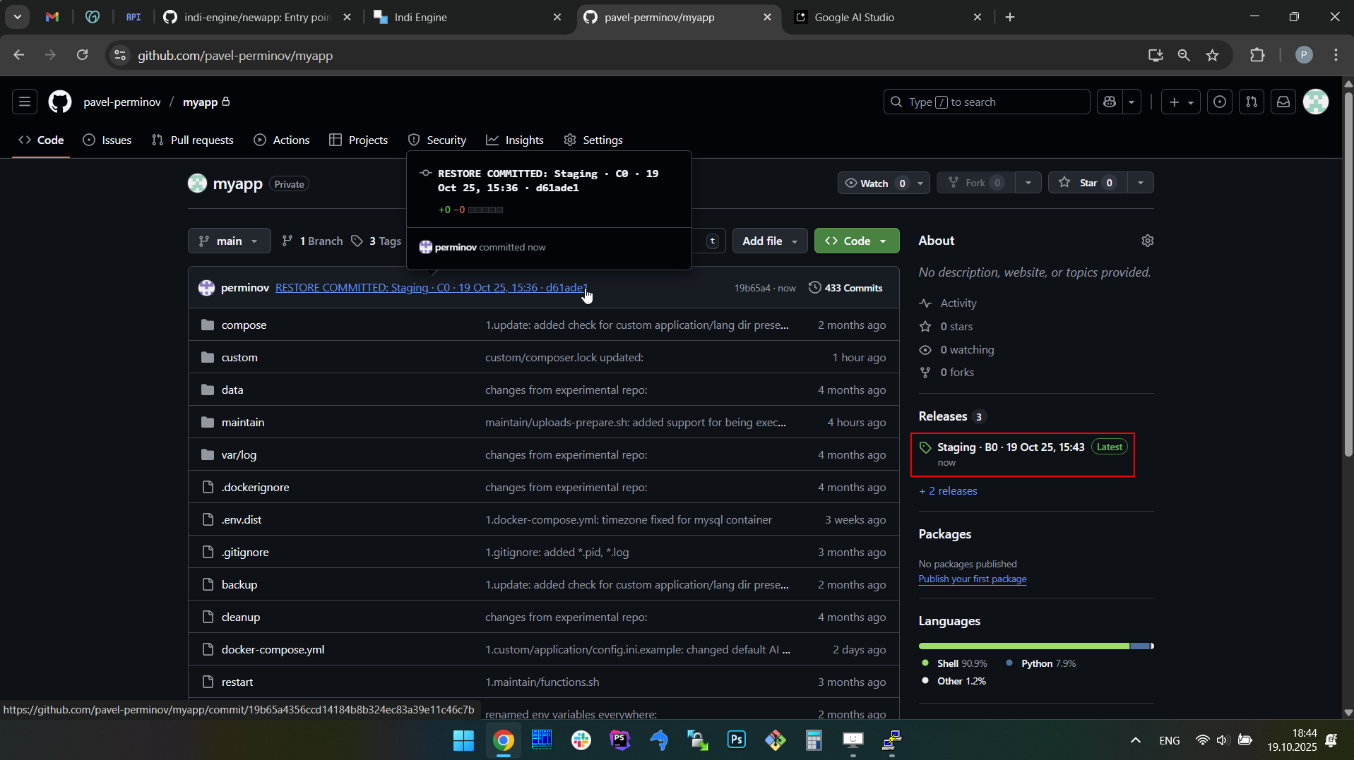 |  |
As you can see, once you commit your restore, two things will happen:
- The local 'before restore' version - will be uploaded on GitHub, to make it to be also restorable
- An empty new commit will be added to your app's GitHub repository with the message like this:
RESTORE COMMITTED: Staging · C0 · 19 Oct 25, 15:36 · d61ade1
to make it traceable which versions created when have been restored when.
Restore only database state or uploads
RESTORE ONLY DATABASE STATE
This restore scenario allows you to patch your Indi Engine app instance with the database state from a backup you choose among the ones already existing on GitHub. This can be useful in cases when there are no differences in source code and/or uploads between your current instance and the version from which you want to restore, or there are differences but they're not meaningful for you right now.
For example, this can be the case when you have a production instance of your app which is up and running somewhere, and you want to work on some improvements on your local development instance, but you want to get the most recent production database state locally before you start your work, and you don't want to do a full restore from the latest production backup as there is no need neither for an 'uncommitted restore' state for your local instance nor need for wasting time on downloading production instance's uploads from GitHub.
RESTORE ONLY FILE UPLOADS
This restore scenario allows you to patch your Indi Engine app instance with the file uploads from a backup you choose among the ones already existing on GitHub. This can be useful in cases when there are no differences in source code and/or database state between your current instance and the version from which you want to restore, but your instance's file uploads are outdated and you want to sync them to make them to be matching the production database state.
For example, in the further explained sample app, this can be the case when you have production instance up and running, and you do some ongoing development on your local instance, but in the meantime some new Teacher-records were added each with a photo, and you want to have those photos on your local instance in addition to those new Teacher-records.
Percona XtraBackup
Indi Engine also plans to integrate with Percona XtraBackup, a high-performance hot backup tool for MySQL that enables full and incremental backups without slowing down the database or interrupting normal operations.
Unlike mysqldump, XtraBackup works directly at the physical file level, making backup and restore operations significantly faster, more efficient, and far more suitable for production environments.
This will be especially valuable for large installations, reducing downtime while minimizing the impact on running applications, as this approach will improve the backup / restore timing drastically, but may increase upload / download durations, since physical backups are generally less compressible compared to logical ones.
Encryption
Indi Engine also plans to secure backups using a hybrid encryption model. Each backup will be encrypted with a randomly generated AES key for speed and efficiency, and that AES key, in its turn, will be then encrypted with the user's public key, and the encrypted key will be then stored alongside the backup.
On restore, the matching private key will be required to unlock the AES key, which in turn decrypts the backup data. This design will allow backups to be created safely in any environment with only the public key, while keeping restores strictly limited to private key holders. For key storage, it's planned to support local files, interactive prompts, and enterprise systems such as HashiCorp Vault.
This feature will add another layer of security to Indi Engine's GitHub-based backup system, so backups will be piped via an encryption algorithm when exporting to data/dump.sql.gz and data/uploads.zip — i.e. even prior written to disk. This ensures sensitive information remains protected even if backup files are copied directly from the data/ directory or if GitHub release assets are exposed.
This will help businesses strengthen data protection and compliance, meeting requirements such as GDPR or HIPAA by guaranteeing that sensitive information remains unreadable outside authorized systems. Once implemented, it will complement Indi Engine's existing backup mechanism, reinforcing trust for storing sensitive or mission-critical data.
Sharding with Vitess
The next major step in Indi Engine's evolution is the integration of Vitess — the cloud-native horizontal scaling engine originally built by YouTube to manage MySQL at massive scale. Vitess orchestrates tens of thousands of MySQL nodes today and is trusted by GitHub, Slack, Shopify, and other global platforms.
This means apps built on Indi Engine will be able to scale seamlessly from millions to tens of billions of records without hitting single-database limits. Developers will also be able to configure sharding strategies directly inside Indi Engine, unlocking enterprise-grade scalability with zero-code simplicity.
With Vitess, Indi Engine will inherit proven resilience features such as automatic failover, traffic routing, and online schema management, ensuring high availability even under heavy load. By embedding Vitess into the platform, Indi Engine will offer not just a zero-code experience but also the same backend scalability techniques trusted in the cloud-native ecosystem.
Modern UI for legacy databases
Many businesses still rely on legacy databases that may have obsolete look and feel but are expensive to replace or upgrade, and here is where Indi Engine will be able to help — scan the legacy database and generate a bright modern multi-window UI on top.
So, instead of being locked into outdated admin tools or planning risky migrations, organizations will be able to get a clean, intuitive UI automatically generated from their schema. Developers can refine data-view hierarchies and layouts, if needed, but the heavy lifting will be done by Indi Engine's zero-code system.
THINGS TO KNOW
.env variables
Any Indi Engine installation comes with a .env.dist file, which is copied line-by-line to .env file when running source start command for the very first time, and there are more than 10 variables. However, values for not every variable are asked from the user during setup, and values for some of those are asked only in specific circumstances.
This is done that way to simplify the initial setup, so that the variables not needed for the initial setup - are not asked:
- Always asked on initial setup:
- GH_TOKEN_SYSTEM_RO
needed for Composer ability to install private indi-engine/* packages
- APP_ENV
needed to decide whether LETS_ENCRYPT_DOMAIN and EMAIL_SENDER_DOMAIN should be asked as well, which is the case when APP_ENV is 'production' or 'staging'
- MYSQL_EXPOSE_PORT
needed to define whether external connections should be allowed, and if yes - you must specify port number, e.g. 3306, 13306, or other
- MYSQL_ROOT_PASSWORD
needed to setup MySQL-level privileges and pre-restore graceful shutdown, but can be left empty if you want to have it randomly generated
- Asked on initial setup, but only in specific circumstances:
- GH_TOKEN_CUSTOM_RW
needed if the repo you've cloned — is a private one (i.e. it's not the indi-engine/newapp repo, and is not a public repo), so this means the access token is needed to check if there is at least one backup on GitHub to import database dump and uploads from — to get your instance up and running.
- GH_TOKEN_PARENT_RO
needed if the repo you've cloned — was generated or forked from some private parent repo. The latter case means you are a developer who joined the existing project so you are setting up your own instance but you need to import database dump and uploads from a backup that belongs to the parent repo.
- LETS_ENCRYPT_DOMAIN
asked if APP_ENV is 'production' or 'staging', but can be kept empty
- EMAIL_SENDER_DOMAIN
asked if APP_ENV is 'production' or 'staging', but can be kept empty
- Not asked on initial setup, but asked by 'source update' and 'source restore commit' commands:
- GIT_COMMIT_NAME
- GIT_COMMIT_EMAIL
- Not asked at all because of non-empty default values already present
- BACKUPS
- GH_ASSET_MAX_SIZE
- MYSQL_DUMP
- DOC
Basically, the only variable you may want to change — is BACKUPS, to enable hourly backups, for example. In that case you can just do that — with no need to recreate or restart the containers for a change (for this specific variable) to take effect.
See below the contents of .env.dist file with variables usage explanations:
Enable external access
As already mentioned, any Indi Engine AI app is built on a standard MySQL database that you fully own and control. Therefore, you may choose to make this database accessible from any external tool, framework, or front-end using regular MySQL credentials — whether that’s a public web application, a mobile client, a REST API service, or anything else.
To enable external connections to Indi Engine’s internal MySQL server, you will have to specify a port number in the MYSQL_EXPOSE_PORT variable during installation. By default, these connections require the MySQL server’s root password, so you must either define it explicitly using the MYSQL_ROOT_PASSWORD variable or leave it empty to have a strong password generated automatically. In both cases, the password will be stored in the .env file for further use.
Extend container setup
As an alternative to connecting external frameworks (e.g. Laravel, Django), mobile clients, or REST API services, you can integrate them directly into Indi Engine’s Docker Compose setup by defining additional services in the custom/docker-compose.yml file, which is automatically merged with the default configuration. This approach allows you to extend the default setup with any additional services you need and/or customize existing ones.
Sample app to explain features
To explain and clearly illustrate the hundreds of Indi Engine's features and concepts, it became obvious that some kind of a sample app needs to be introduced, which should be:
- enough simple for everyone to get a clue on what's going on under the hood, but at the same time
- enough complex to contain the relevant use cases for as many features and architecture concepts as possible to be applicable and demonstrable.
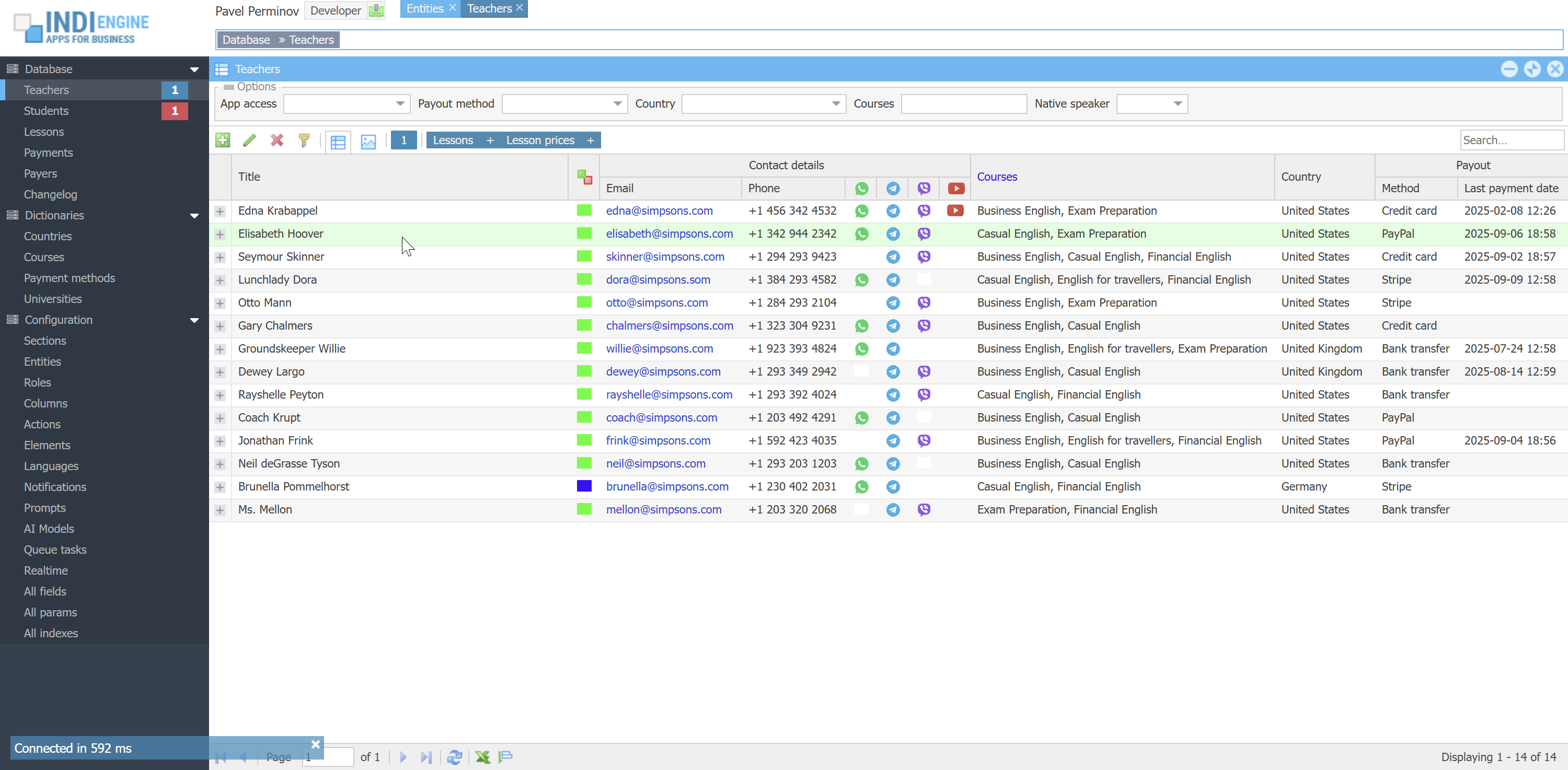
For such an app, starting from now, a lightweight version of a language school app will be used, because the subject area involved here is quite clear, as it consists of the things everyone knows: Students, Teachers, Lessons, Courses, Attendance, Payments etc. To install sample app, you can execute the following commands:
git clone https://github.com/indi-engine/sample
cd sample
source start
 ▶00:37 ▶00:37 |  ▶00:56 ▶00:56 | 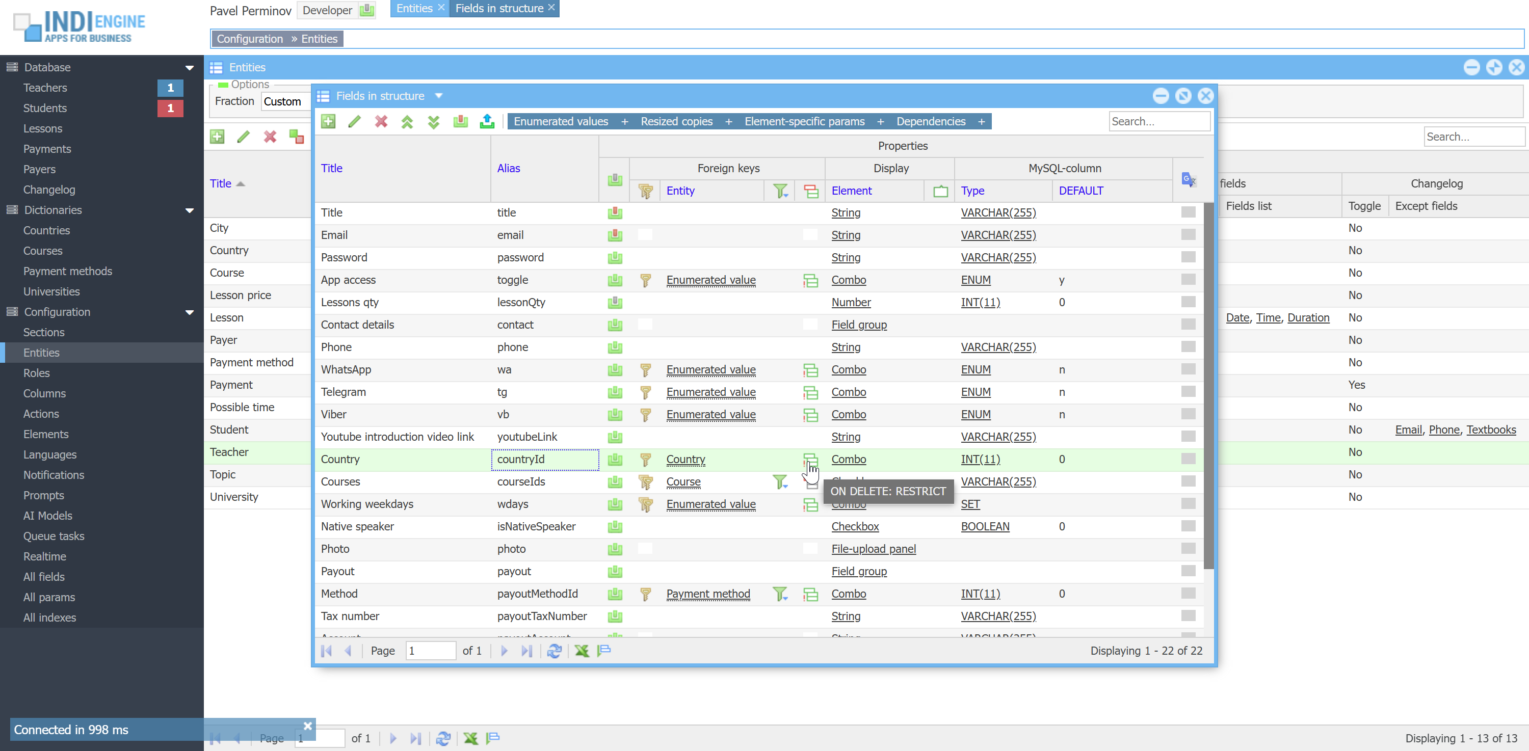 | 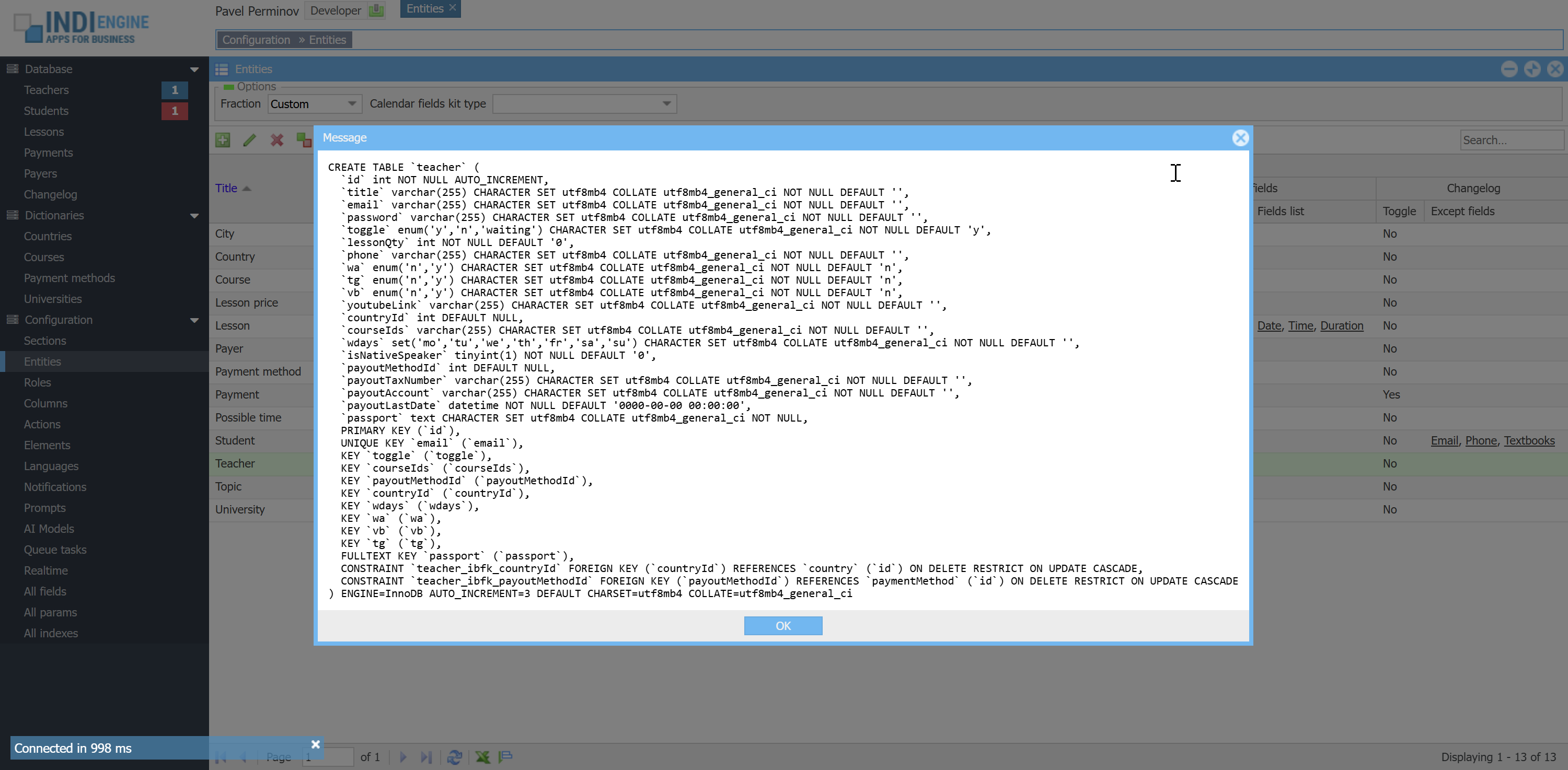 |  | 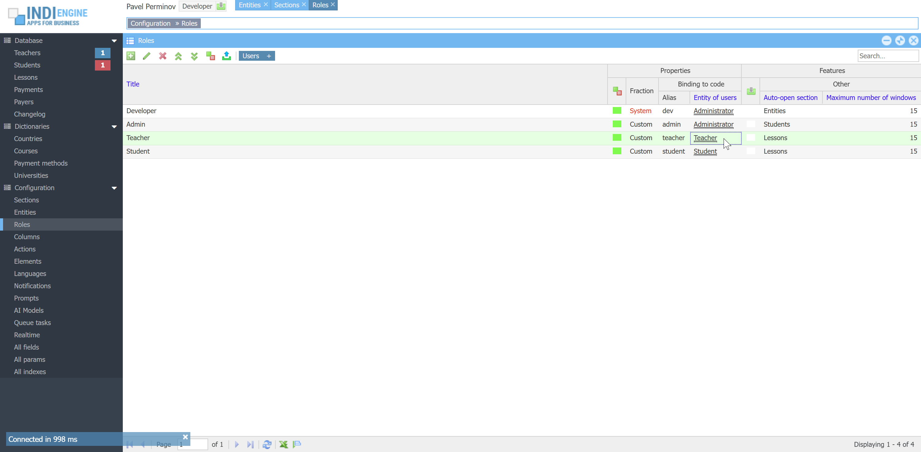 |
Users, roles and access
Indi Engine's access system consists of answers on two main questions:
WHO CAN DO WHERE AND WHAT?
This is similar to well-known ACL concept, however it does not follow that precisely, as there are several major differences:
Difference 1: Only one role per one user, so if some user has Admin-role, that user can't have Teacher-role or Student-role
Difference 2: Users having different roles can be stored in different database tables. This is defined by Entity of users-field in the Role-record properties, where you can choose which entity should be used as a storage for the credentials data of users having that role. For example, any teacher's credentials are stored in `email` and `password` columns in `teacher` table, but for each student - in the same-named columns in the `student` table in the database.
who - means a user having certain role, for example any user having Teacher-role
can do what - means certain action, for example Index, Details, Save, Delete
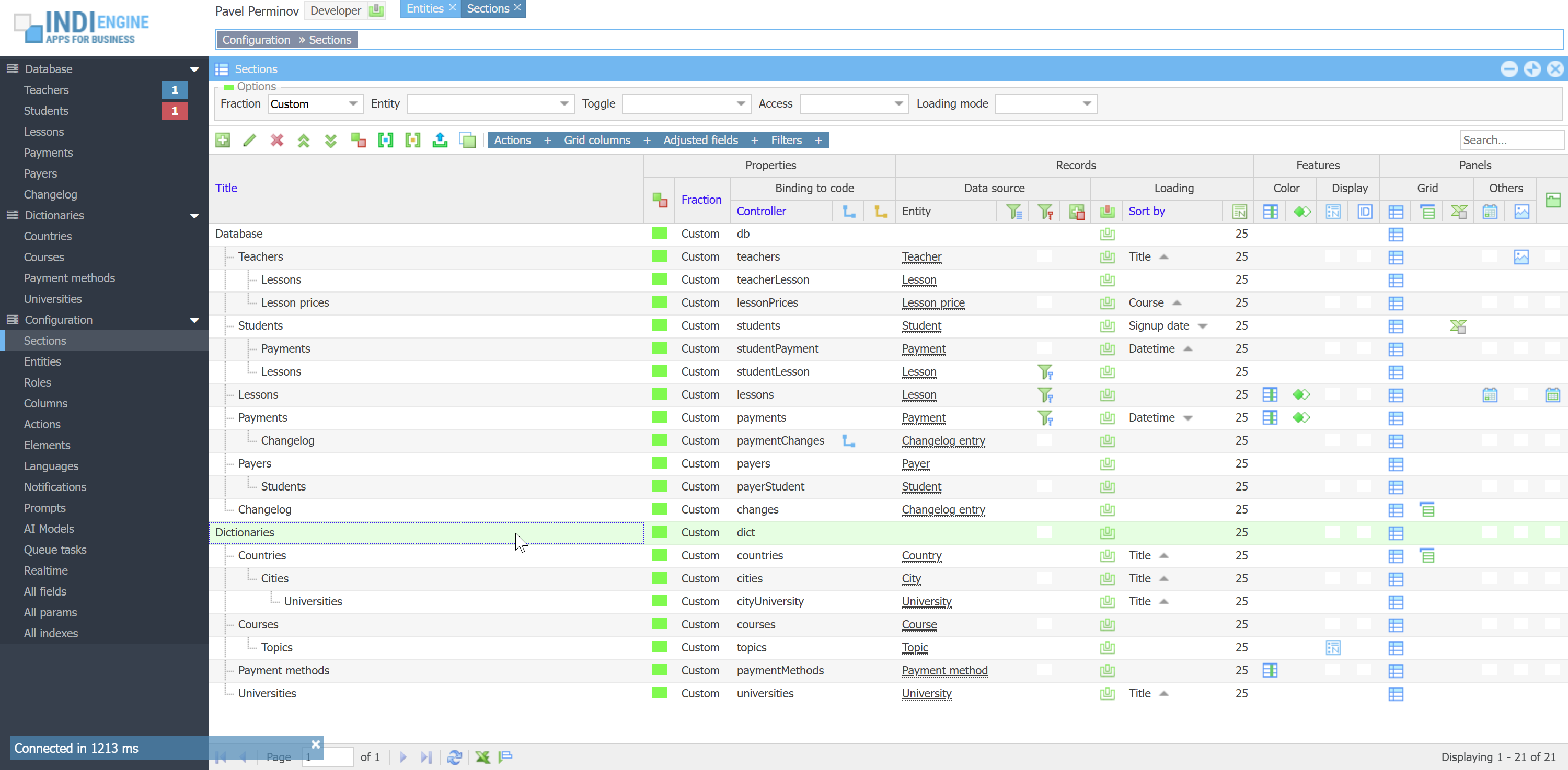
can do where - means the certain section within the data-views hierarchy, for example Teacher-user can do all of the above mentioned actions in Lessons-section, but can only do Index and Details actions in Students sections (i.e can't do Save and Delete there)
If we compare this to the ACL concept, this would mean rights=actions, and resources=sections, so you define a Section, and then you define which Actions would be available there and for which Roles
 ▶00:39 ▶00:39 | 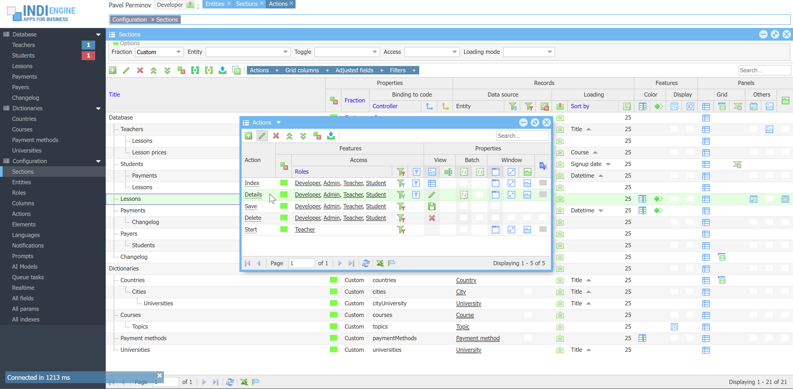 | 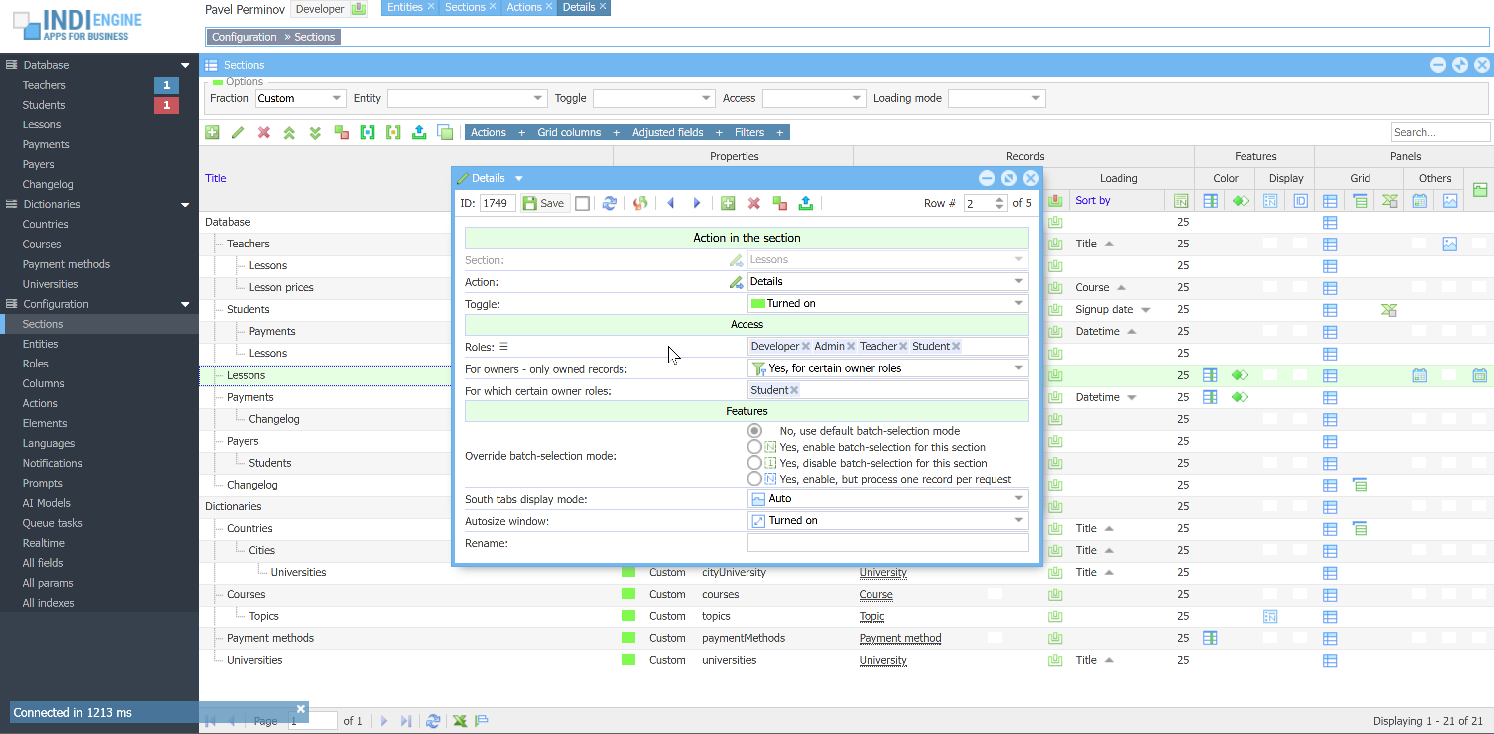 |  | 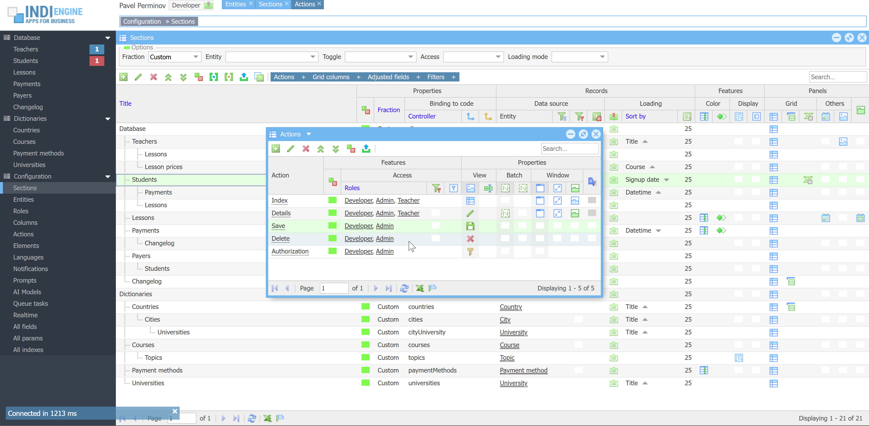 |
WHAT ABOUT THE OWNERSHIP?
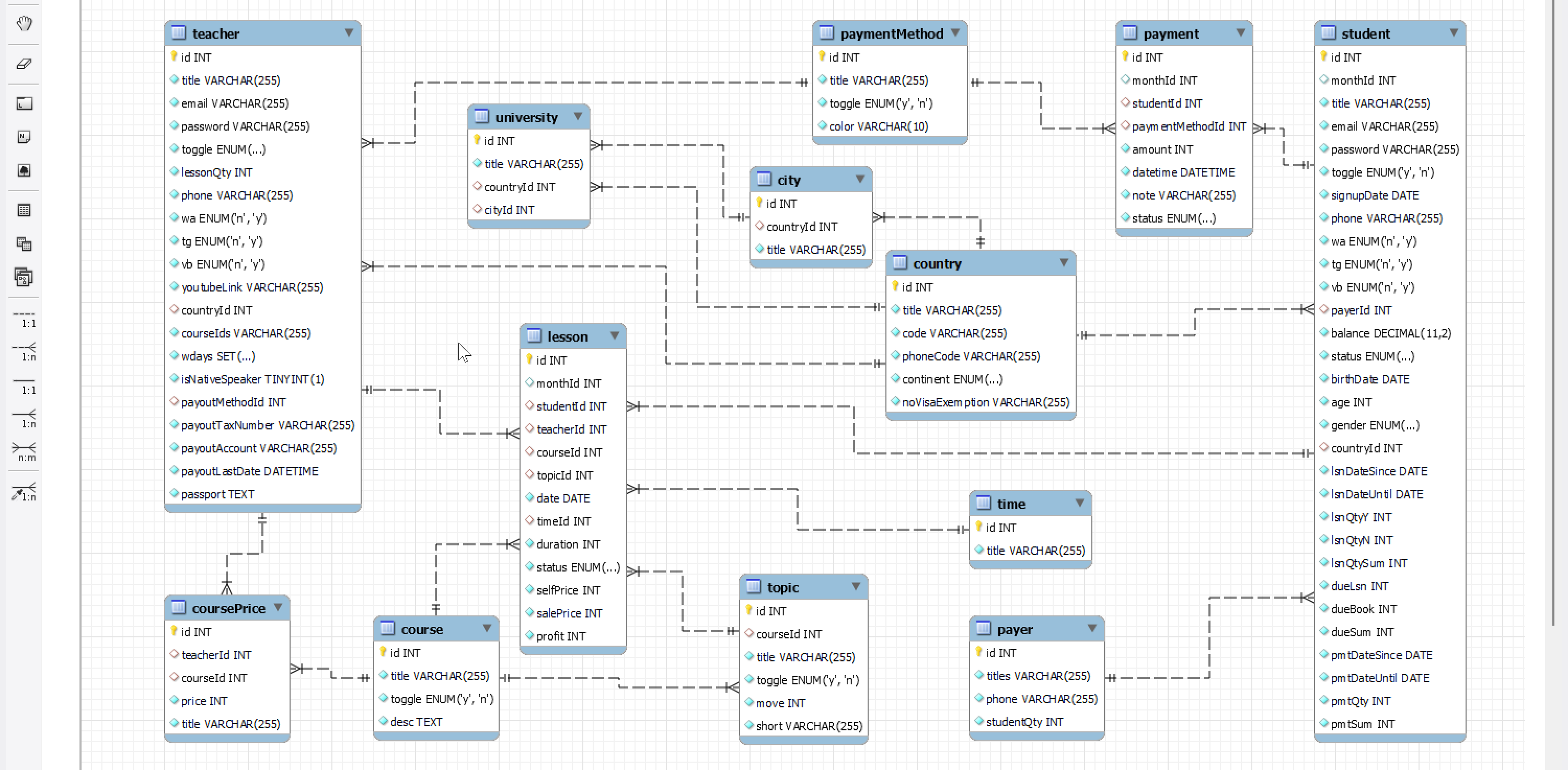
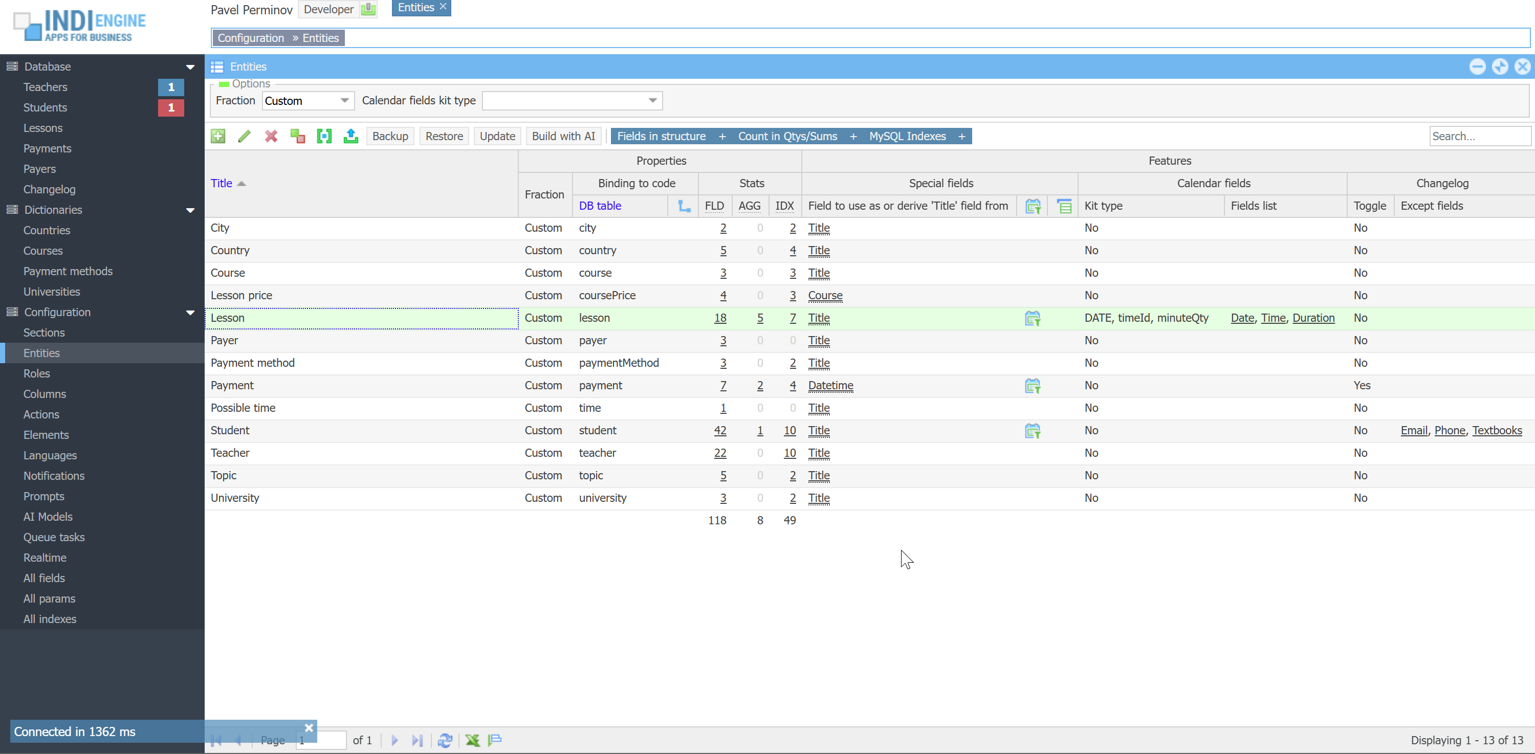
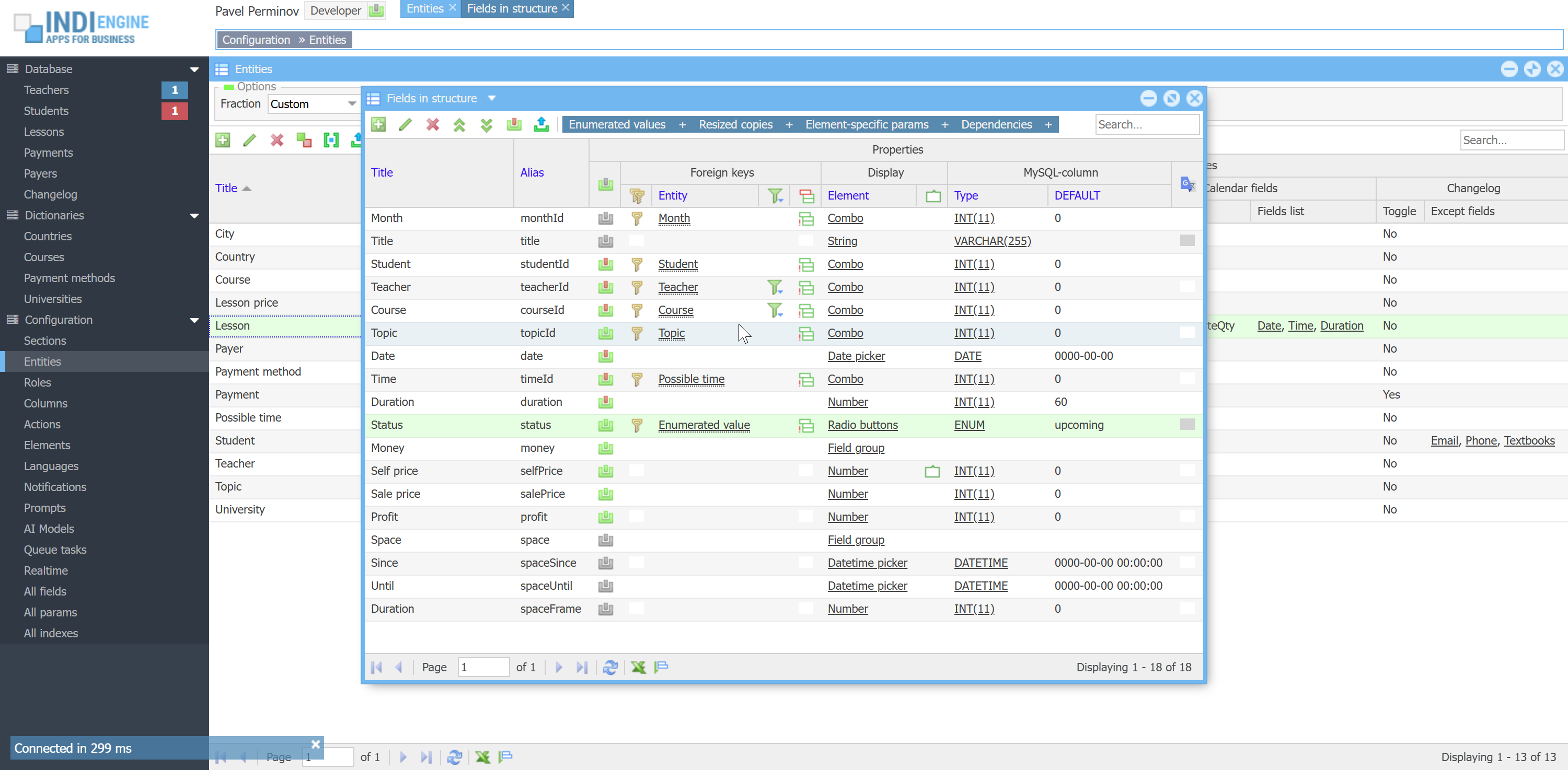
At first let's clarify what does the ownership mean, and we'll do that - yes, using an example: we have Teacher, Student and Lesson entities with the following fields in their structures:
- Teacher (id, title, email, password, toggle, countryId)
- Student (id, title, email, password, toggle, countryId)
- Lesson (id, teacherId, studentId, date, time, duration, selfPrice, salePrice, profit)
Ownership means there should be a connection between user and owned record defined as a foreign-key field within the record's data structure, and this means there might be multiple owners for the same record. In this particular case each Lesson-record can have 2 owners: one is the Teacher and another one is the Student.
By default, Indi Engine does not apply any restrictions for non-owners, unless you want to explicitly define the behavior to be applied, and if yes - you may use For owners – only owned records-field which is definable:
On Section level having the following choices:
- No
- Yes, for all actions
- Yes, for certain actions
On Action in the section level having the following choices:
- No
- Yes, for all owner roles
- Yes, for certain owner roles
All of the above means that you can, for example, define the complete inaccessibility of the records in Lessons-section for Student-users who are NOT mentioned in studentId of those lessons i.e. Student-users will see only their own lessons, and at the same time you can define all lessons to be visible for any Teacher-users but writable only for the ones who are owners.
 ▶00:41 ▶00:41 | 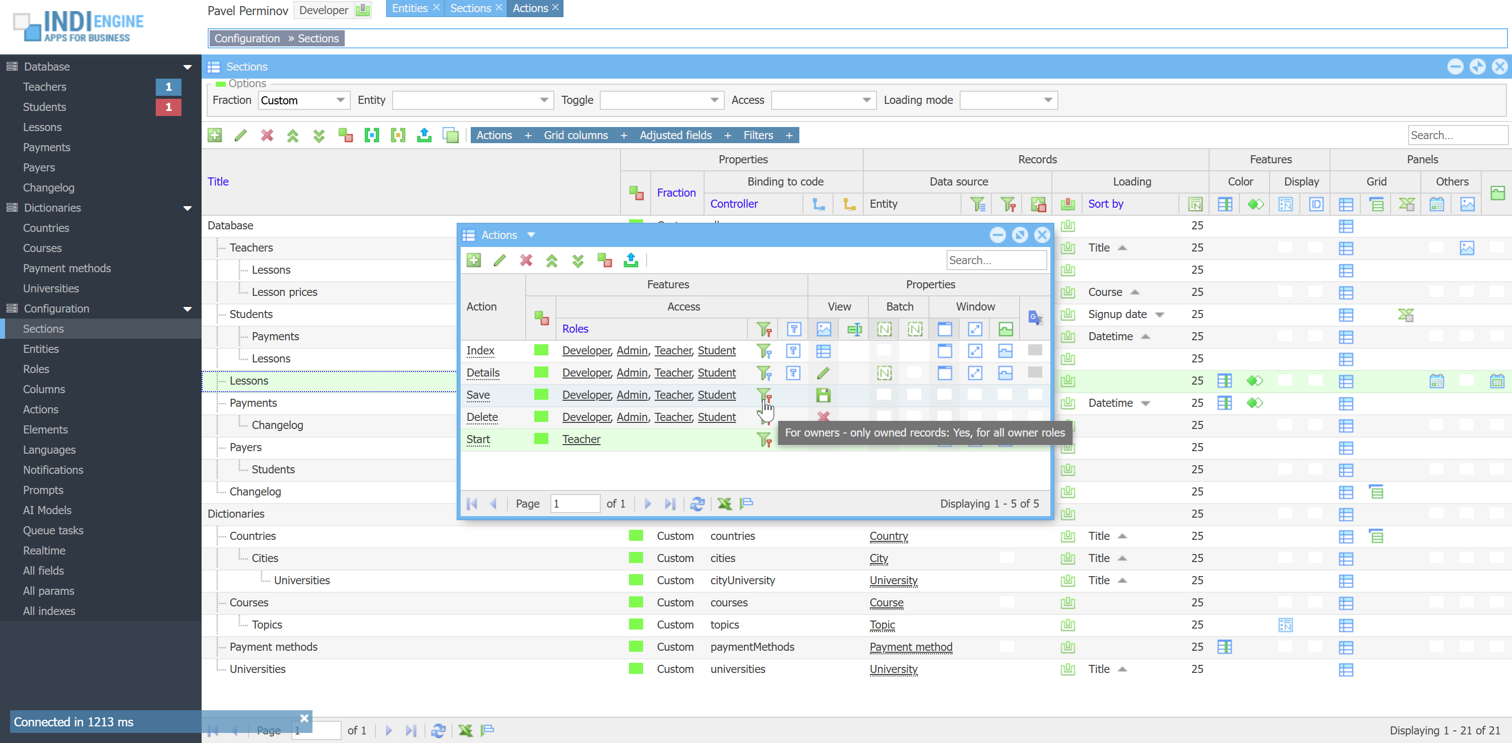 | 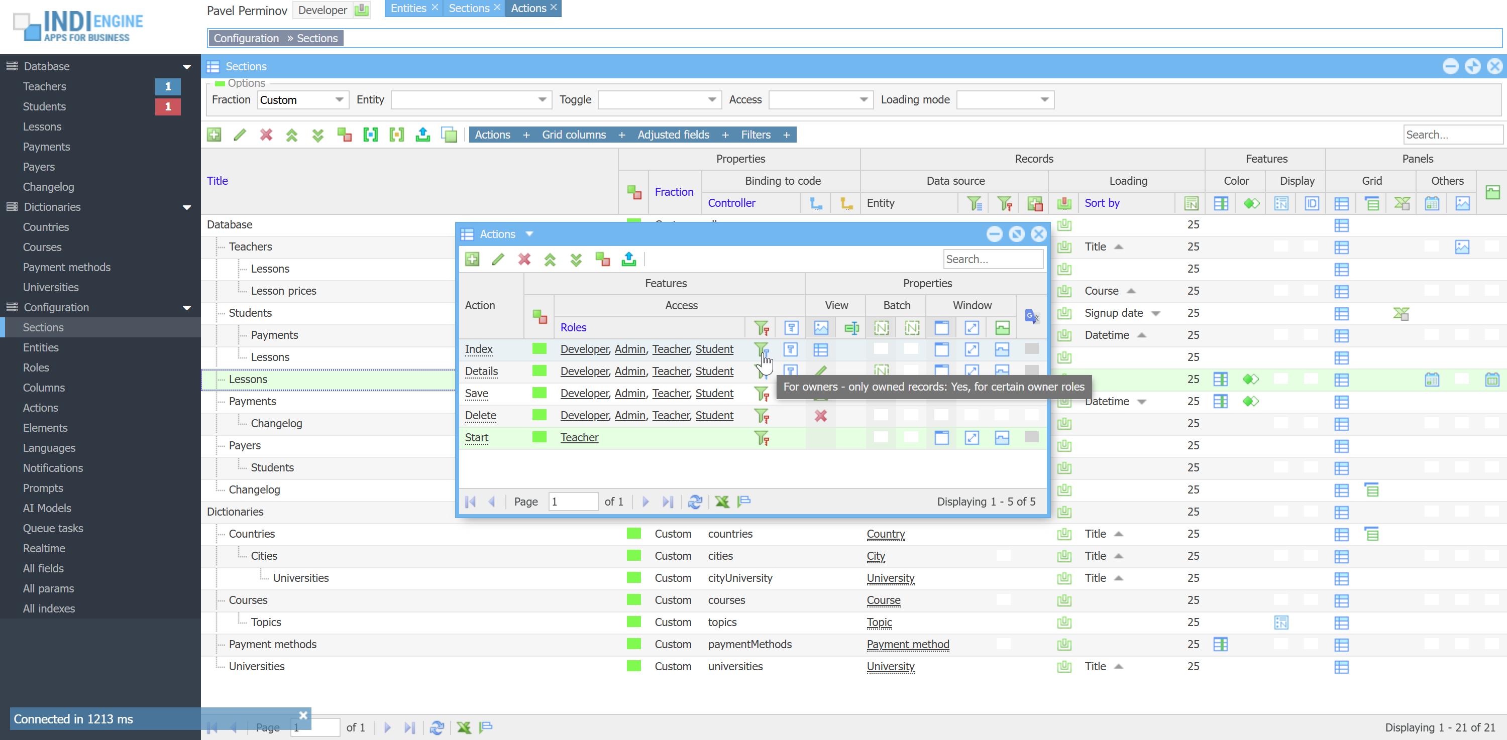 | 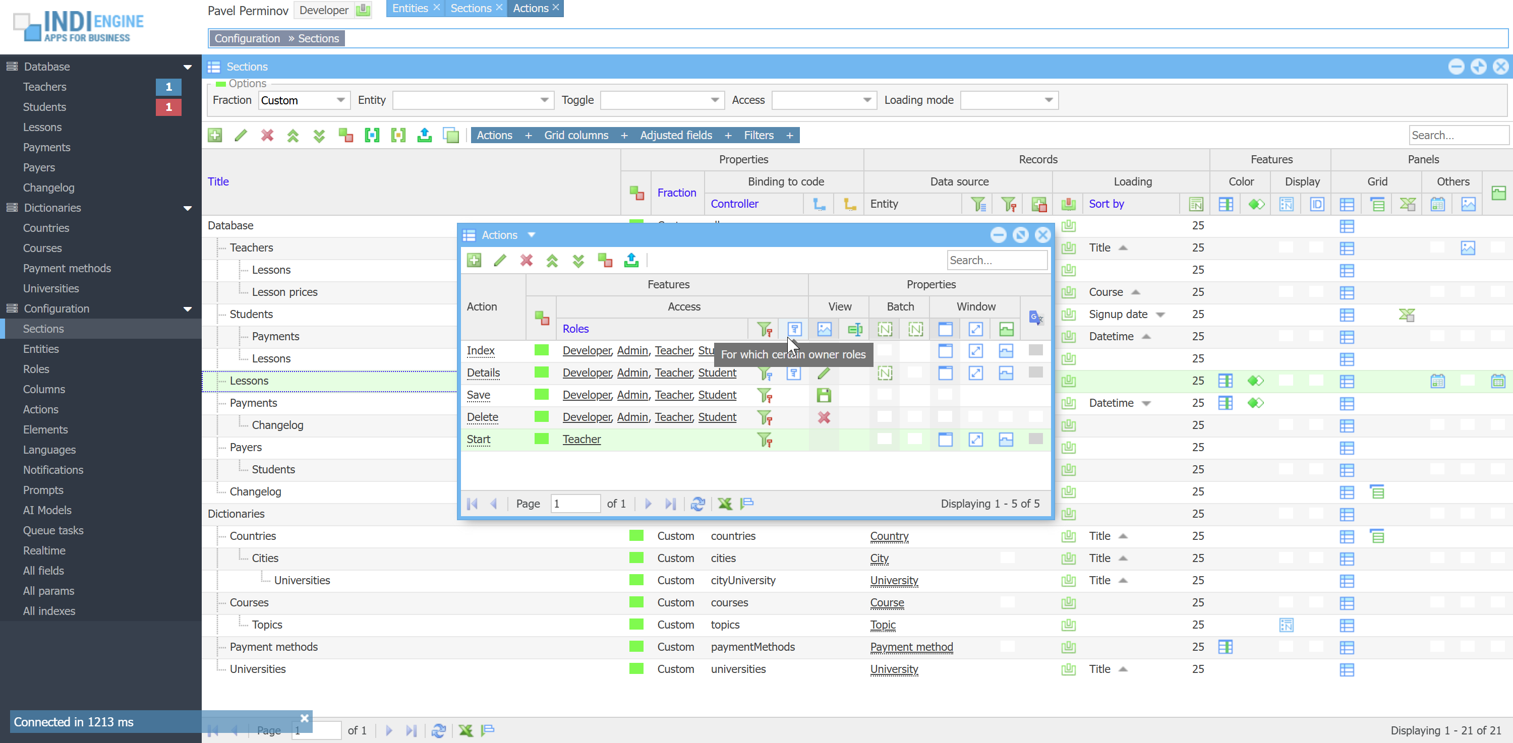 | 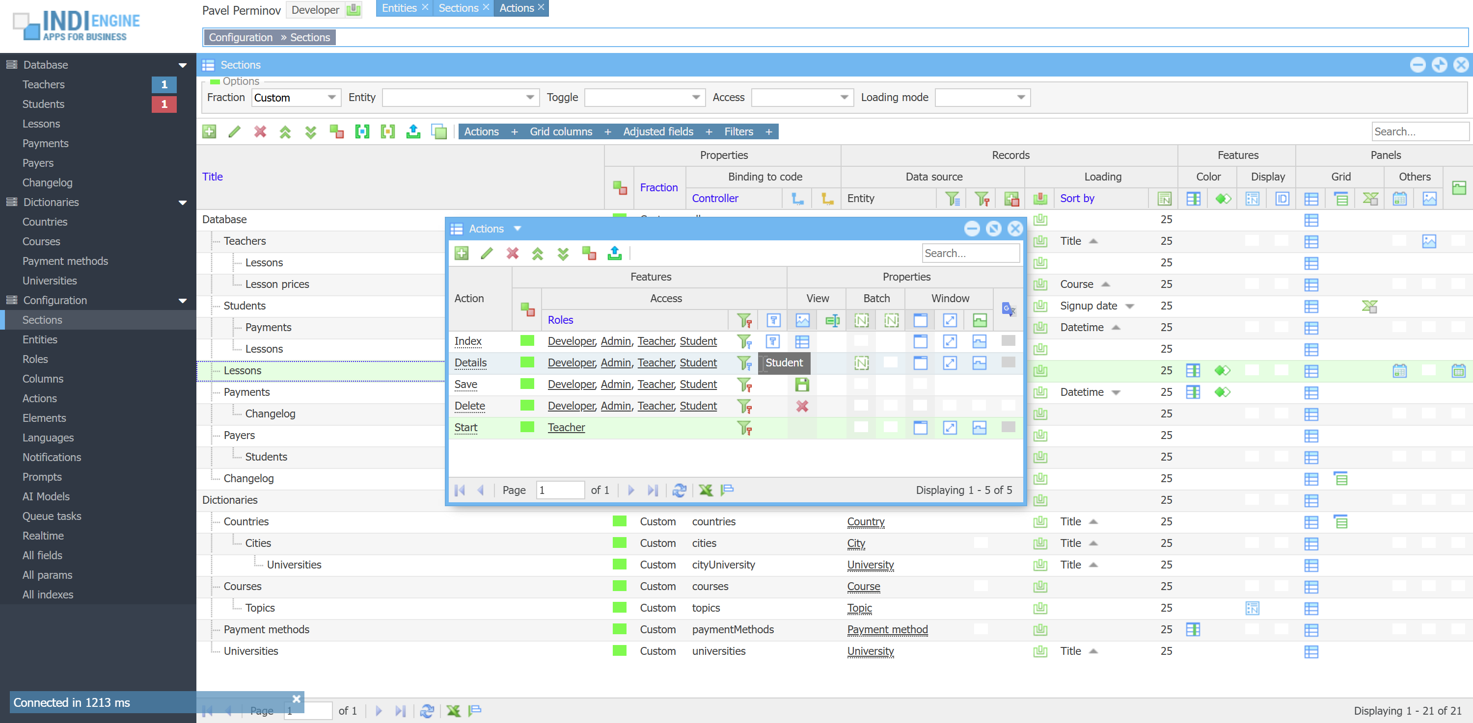 |
As you can see on the screencaptures above:
- Index and Details actions are accessible
- For Teacher-users - any Lesson-records
- For Student-users - only students’ own Lesson-records, because of:
- For owners - only owners records = Yes, for certain owner roles
- For which certain owner roles = Student
- Save and Delete actions are accessible:
- For Teacher-users - only teachers’ own Lesson-records
- For Student-users - only student’ own Lesson-records
- both because of:
- For owners - only owned record = Yes, for all user roles
`teacherId` = YOUR_ID, so lessons of other teachers would be available only in read-only mode for you in the Lessons-section, if you configure this that way.
`teacherId` column in `lesson` table as ownership-column to be checked for Teacher-users as those users are stored in mysql `teacher` table, and there is no zero-code way to define other db column to be used as an ownership-column, so please follow that ownership-column naming convention for this to work out of the box. FYI, there is an SDK-way to define other db column to be used for ownership check, but that's another story.
It's also possible to define access restrictions for certain roles on certain data-columns. For example, you can configure Self price to be hidden for Student-users, Sale price to be hidden for Teacher-users, Profit to be hidden for both, but all visible for Admin-users. Read Grid columns ↴ Access roles and Adjusted fields ↴ Access roles for more details.
Quick UI editing
Quick UI editing means you can do some things either right where you currently are or via a quick jump straight to the right window where configuring is possible.
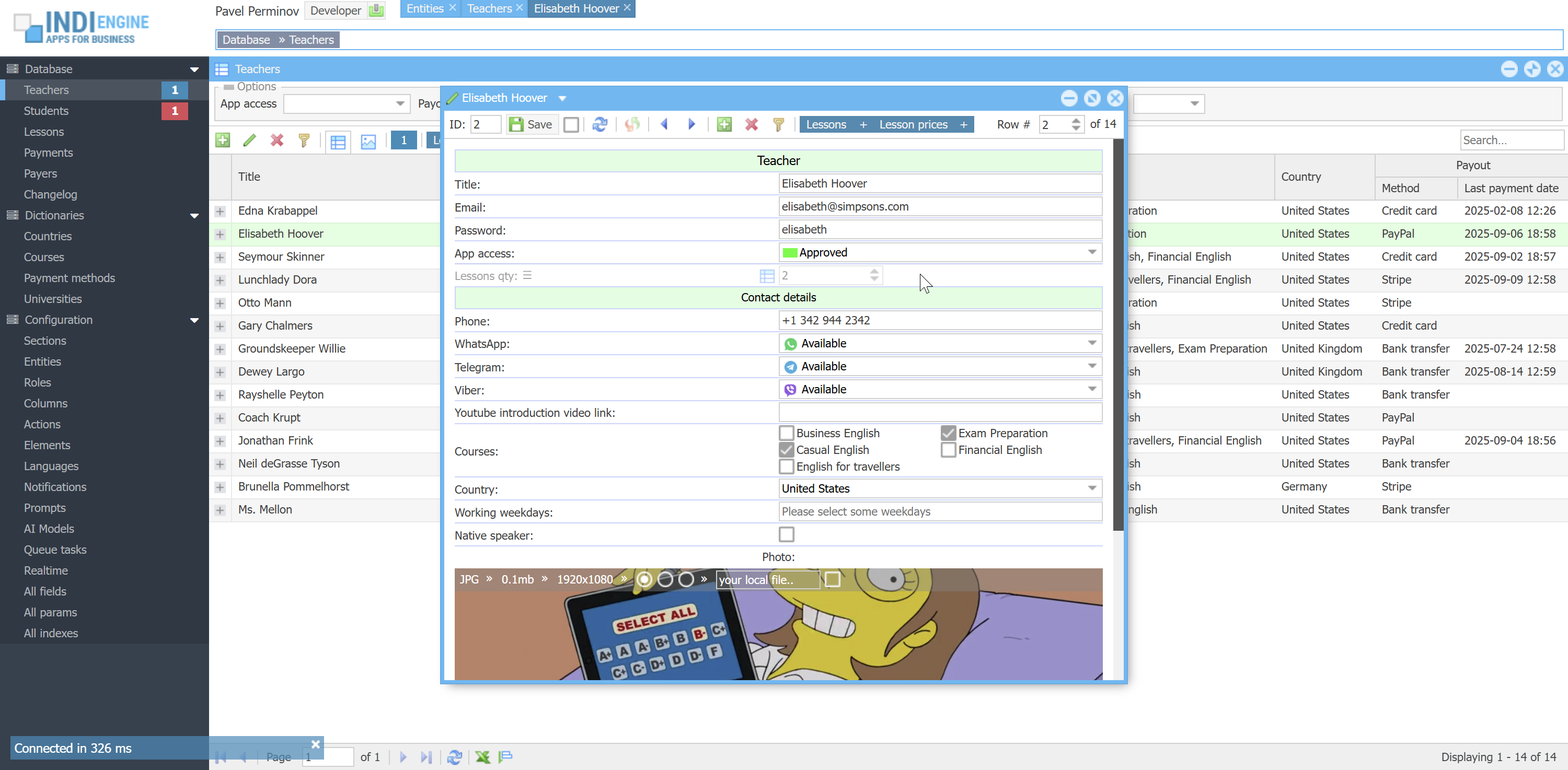
If you are not a Developer-user, then the only thing you can do is renaming the titles and tooltips for certain UI elements. For example, you can rename Native speaker-field to Is native speaker-field right there in the Details-window of any certain Teacher-record, or you can rename Teacher-entity to be, let’s say, Tutor-entity. Also, you can rename titles and tooltips for grid columns, titles for filters, and titles for actions having icons
BTW, if you complete your renaming for grid title/tooltip with Shift+Enter (instead of just Enter) - then this new title will be propagated on the field behind that grid column instead of on just that grid column itself - this is helpful when you have that column in more than one section, so you can rename once and all usages will be affected.
 ▶01:03 ▶01:03 |  | 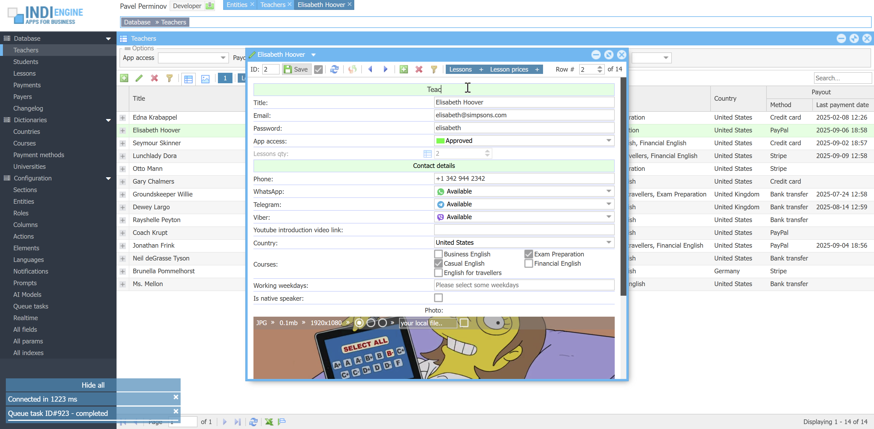 |  | 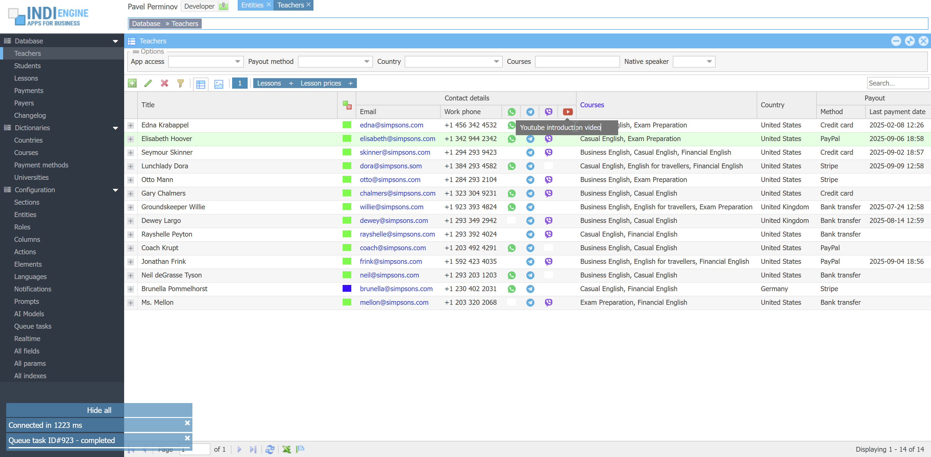 |  |  |
But, if you are Developer-user, then in addition to the above you can also do the following:
- If you are in Details-window (for example with details of certain Teacher-record):
- Jump to Details-window of the current entity (in our example it's Teacher-entity)
- Jump to Details-window of an any field (for example Email-field)
- Reorder fields using drag and drop
- Jump to the Altered fields for your current section (in our example it's Teachers-section), so you can add some adjustments that will be applied only in the current section and, if needed, only for the roles you choose. For example, you can adjust Mode for Password-field to be Hidden for Student-users in teacher details. See Adjusted fields to see all the possible adjustments
 ▶00:55 ▶00:55 | 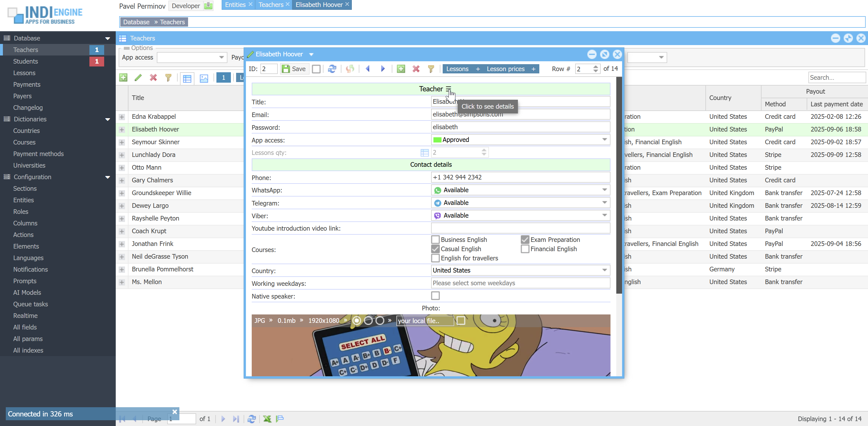 | 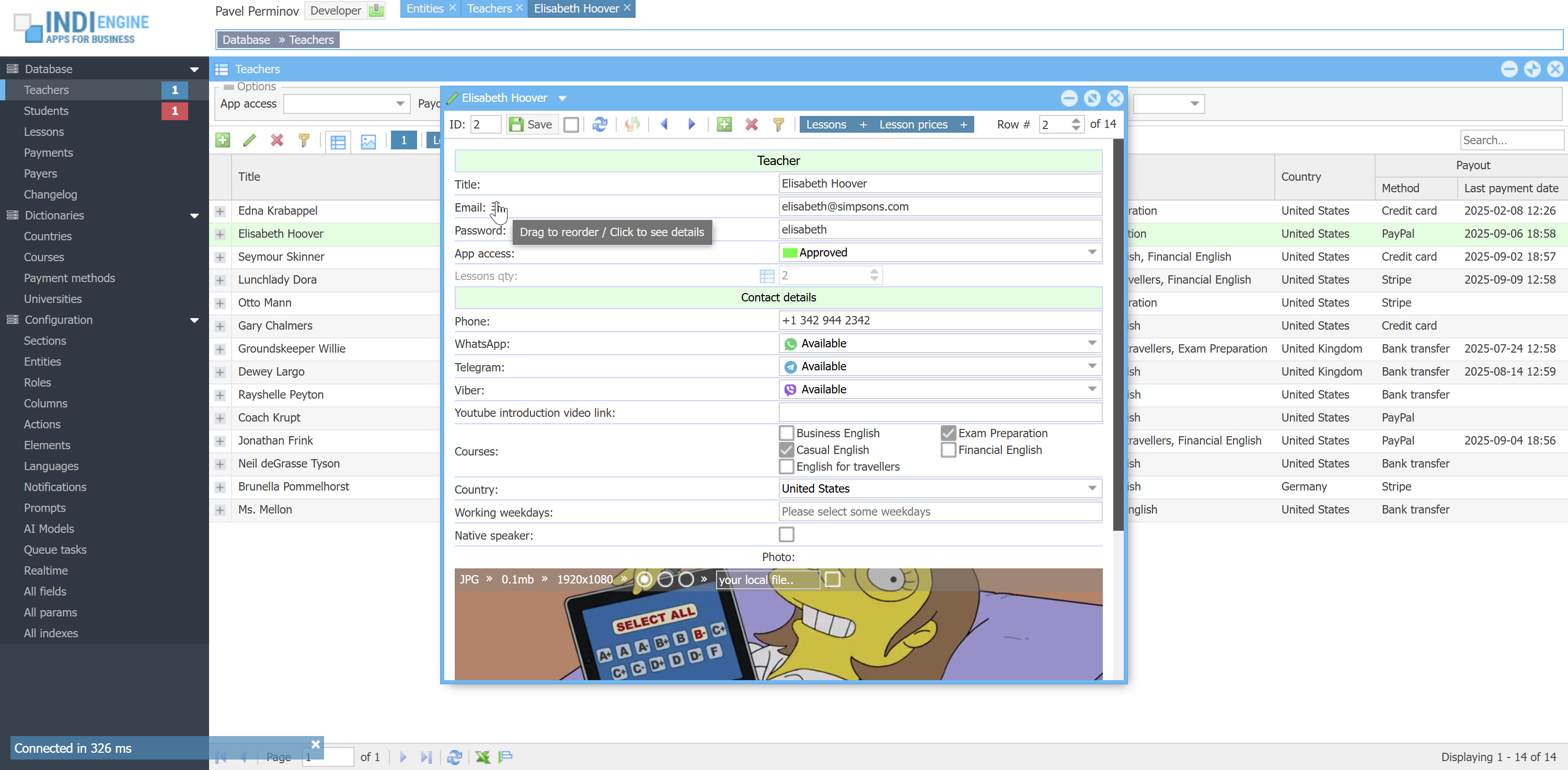 | 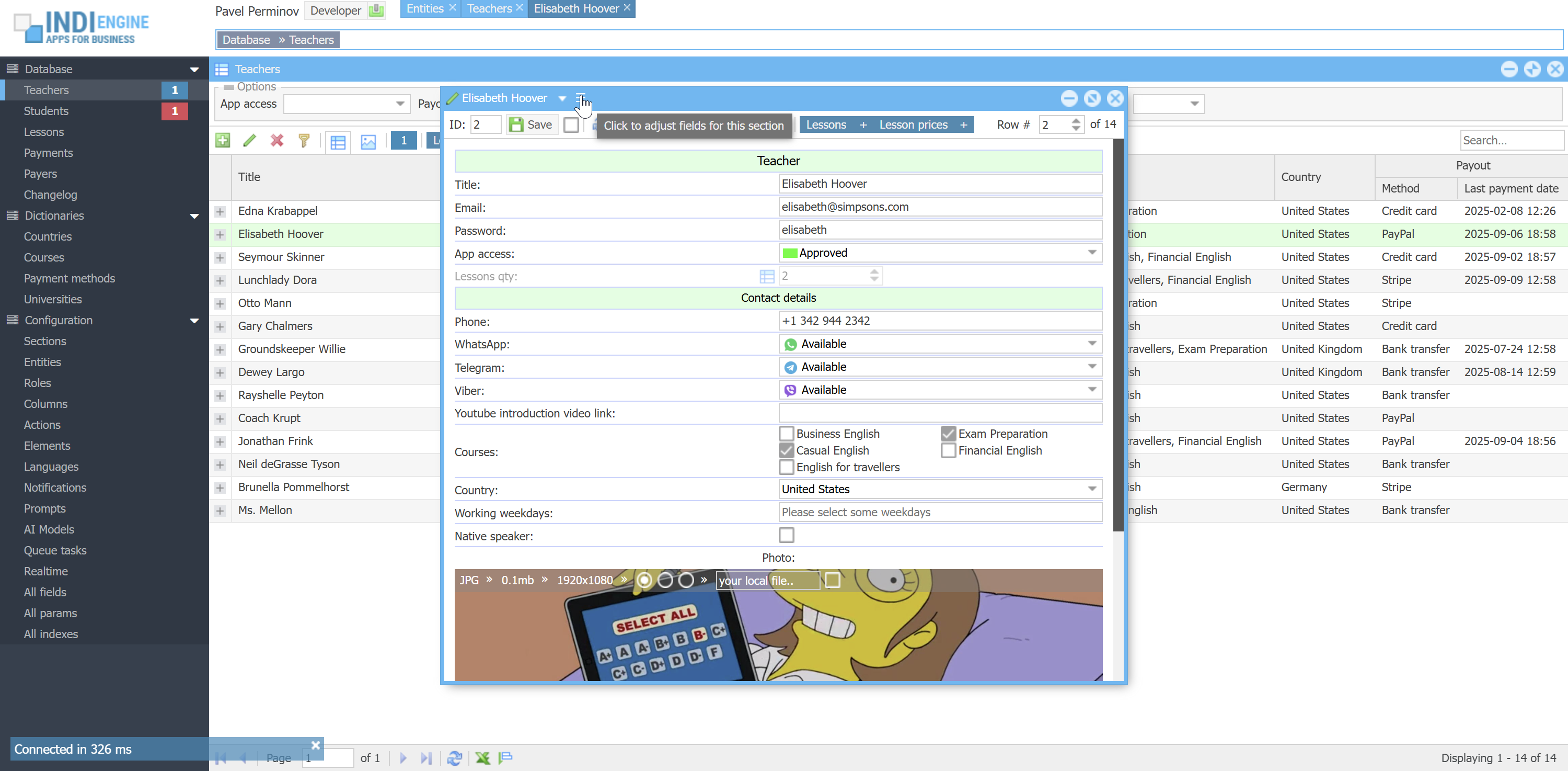 | 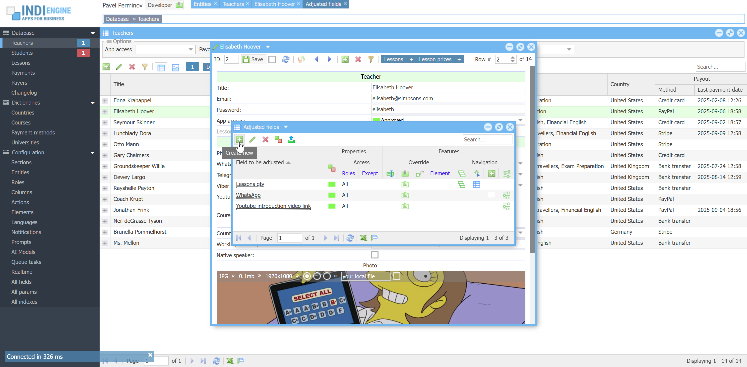 | 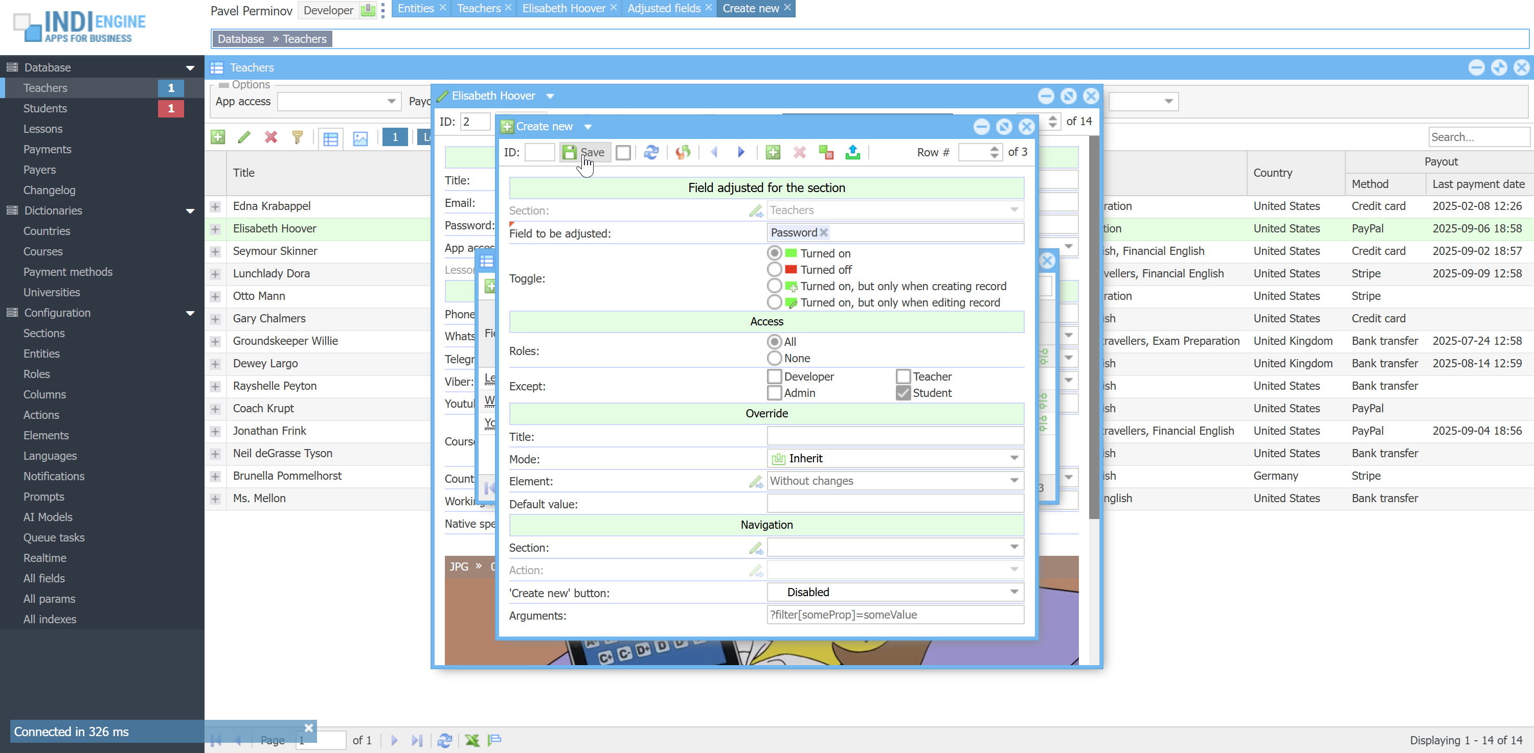 | 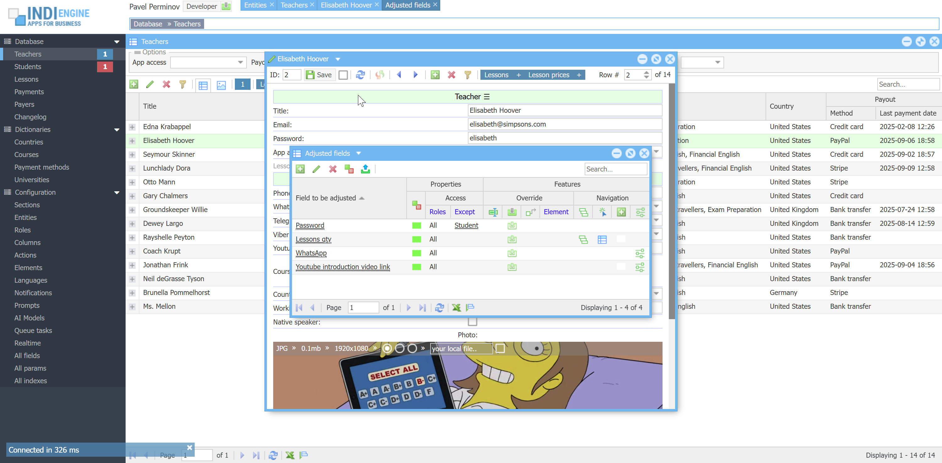 |
- If you are in Index-window (i.e. you see the grid of Teacher-records in Teachers-section):
- Jump to Details-window of the current section (i.e. Teachers-section, so you can amend default sorting, enable records numbering, etc)
- Jump to Details-window of a selected column (for example Youtube introduction video link-column, so you can amend column header style, navigation, values template, etc)
- Jump to Index-window having all columns definitions for current section
- Create new column right after selected column, respecting selected column's parent column and locked-state, if any
- Delete selected column
- Lock/unlock selected column (means same as freeze column at the left side in Excel)
 ▶01:09 ▶01:09 | 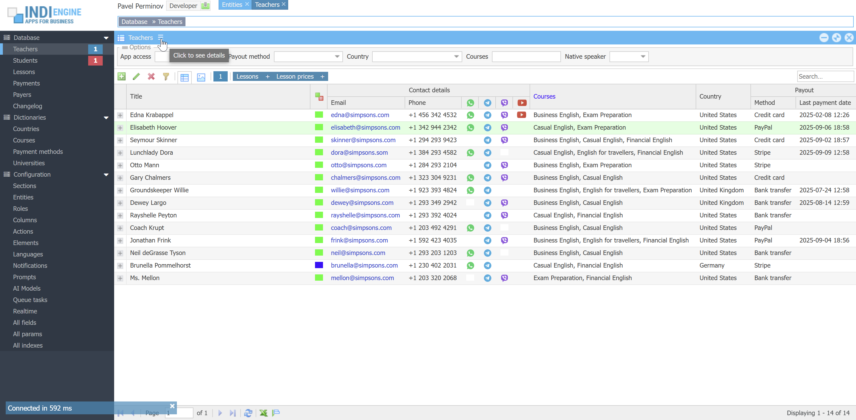 |  | 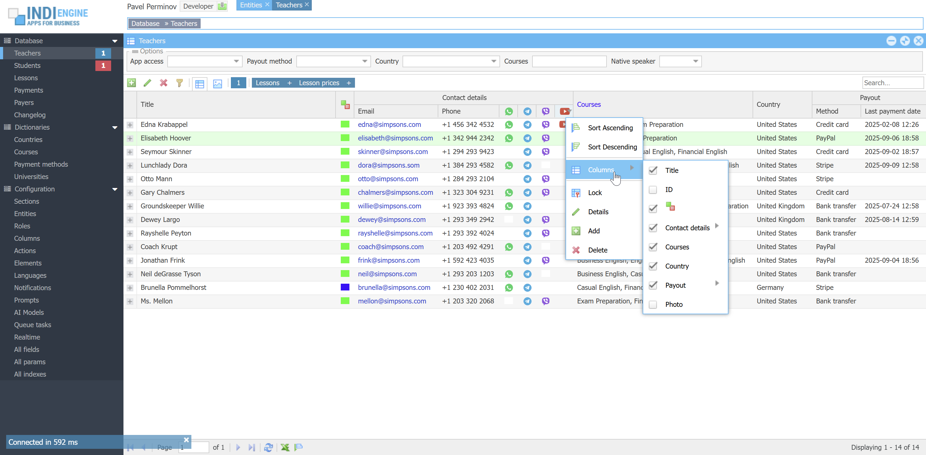 | 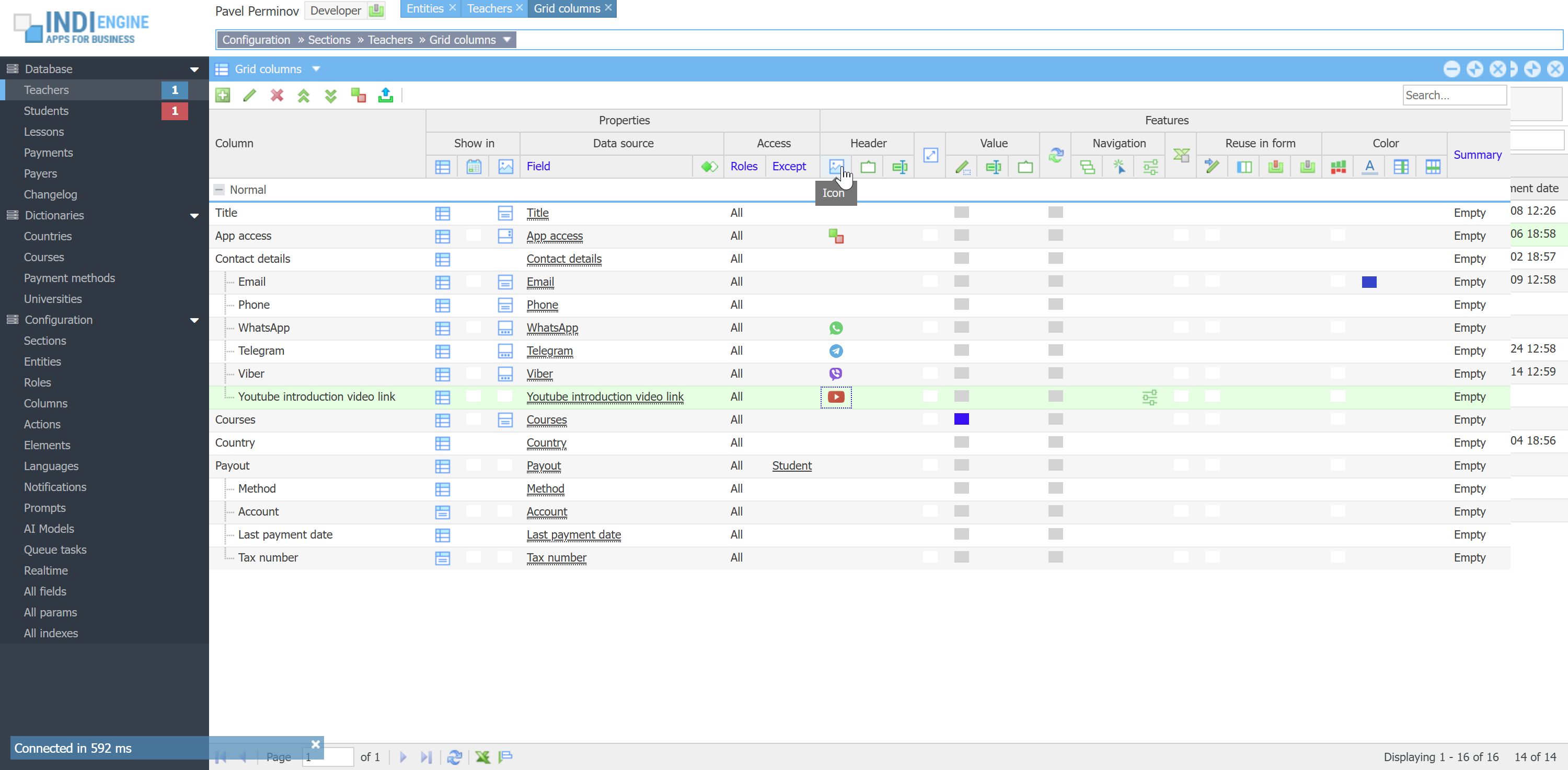 | 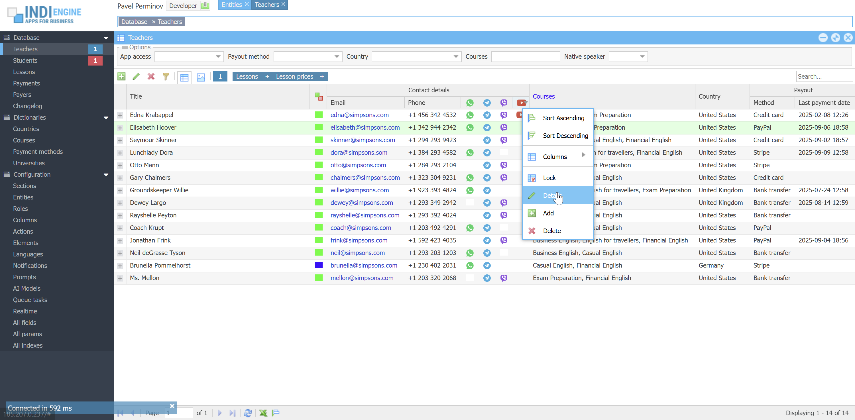 | 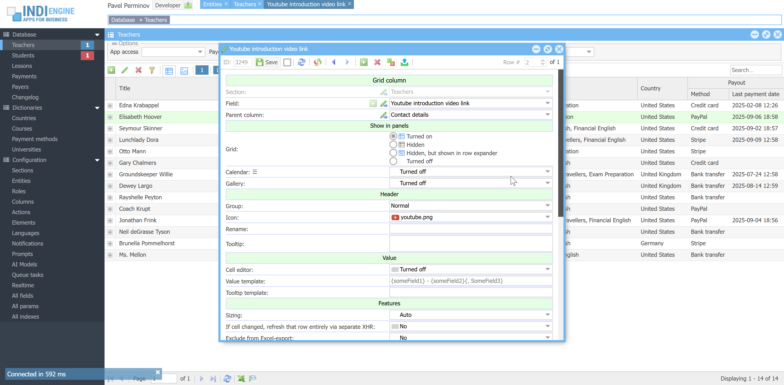 |
In most cases there would be no need to enable UI editing for any roles other than Developer-role, but there might be scenarios when you would need that, for example if you translated UI titles from English to German, but you aren't enough good at German to check those auto-translations made via Google Cloud Translate API, so you asked some German native-speaking person to login as some Teacher-user, take a look and re-phrase some UI titles where needed.
How realtime works
Here is the list of tools that are involved:
- MySQL is writing all the data-changes into binary logs, and this is enabled by default in MySQL since version 8
- Zendesk Maxwell daemon is running as java-process within apache-container and is reading data-changes from MySQL binary logs and writing them into a RabbitMQ-exchange
- Indi Engine
- create a RabbitMQ-queue for data-changes to be streamed into there out of RabbitMQ-exchange
- is reading data-changes from that RabbitMQ-queue in JSON format (format that Maxwell daemon use for writing)
- is preparing changes' json-data to be compatible with Indi Engine's UI panels
- is pushing prepared json-data into the RabbitMQ-queue(s) created on browser tab(s) opened by user(s)
- RabbitMQ is reading that prepared json-data from those RabbitMQ-queues and is delivering that data to the corresponding browser tabs via WebSocket connections, maintained by RabbitMQ Web Stomp plugin
From the user perspective, 'realtime' means that any data changes made by no matter who and for whatever reason - are immediately reflected in the UI for that user. For example, if some Teacher-user has opened the Lessons-section (e.g Lesson-records are shown in the grid or calendar), but then some Student-user created a new Lesson-record - this new Lesson-record should immediately appear in the Lesson-records grid shown for Teacher-user. For sure, this should work not only when a new record is created, but when it's updated or deleted.
More examples:
- If some Teacher-user has NOT yet opened Lessons-section, it means any data-change event that happened for any Lesson-record should NOT be delivered to that Teacher-user.
- If Admin-user changed the value of Sale price-field for a certain Lesson-record, but Sale price-column is disabled for Teacher-users - then updated sale price should NOT be delivered to Teacher-user even despite that teacher might have already opened Lessons-section with that specific Lesson-record shown.
- If Admin-user changed value for Note-field for a certain Lesson-record having Status = Completed, but Teacher-user did apply a Status = Upcoming filter to the grid in the opened Lessons-section - then no delivery of updated value should happen as well.
To be able to handle all those (and many more) cases, Indi Engine know which users are currently logged in, how many sessions using which languages each user has, how many browser tabs each user did open within each session, what data-views (grids / forms / etc) are currently opened within each browser tab, what filtering, sorting and paging is currently applied for each data-view and which records and their data-fields are currently shown in each data-view.
All this makes it possible to check whether some data-change event should be reflected in some data-view(s), and if yes - calculate the exact way of how it should be reflected. For example, if our paging is that we're on page #3, but a record from any previous page was deleted by someone, it means the first record on our current page should disappear because now it's the last record on the previous page, and at the same time - first record on the next page should become the last record on our current page. So to make this work, Indi Engine calculates whether that was the previous, current or next page from where the record was deleted. The simplest is when a record was deleted from one of the next pages - when we simply decrement the Total counter shown in the right bottom corner of the grid.
INFO: Previously, MySQL binlog and Maxwell daemon were NOT involved, so the data-changes were captured by the Indi Engine on PHP-level rather than on MySQL-level, and this was NOT working as a separate background process, so if you simply updated the value of Note-field for some Lesson-record, you had to wait until Indi Engine prepare and deliver that change to all currently opened browser tabs including the one from where you pressed Save-button in lesson Details-window. This is working ok, but is not really scalable, and that is why the current binlog-based solution was implemented.
Foreign keys / ORM
Indi Engine allows to define some fields to be foreign key-fields, and this means that the background values in such fields - are IDs of records from some other tables (or from the same table, if the current entity is intended to represent a hierarchy).
When you create a new single-value foreign key field dealing with ordinary (i.e non-enumerated) values within some entity, Indi Engine creates a new CONSTRAINT for that entity's underlying database table, as this is natively supported by MySQL.
For example, if you create Teacher-field in Lesson-entity, this would mean any Lesson-record itself won't keep the full info about the teacher, but just an ID of a certain Teacher-record instead.
Foreign key fields definitions in MySQL are coming with the ON DELETE rule, which gives an answer on what should happen with the usages of the record we're trying to delete. For example, if we have some teacher, who had some lessons already, but at some point we try to delete that teacher from our database — then the question is: what should happen with those lessons? Here are the alternatives:
- CASCADE: Teacher-record is deleted, but the Lesson-records of that teacher - are preliminary deleted as well
- RESTRICT: Teacher-record is prevented from deletion, so if you still want to delete - you must delete lessons at first
- SET NULL: Teacher-record is deleted, but the Lesson-records of that teacher - are preliminary become orphaned by setting empty value into their Teacher-field
 ▶00:40 ▶00:40 | 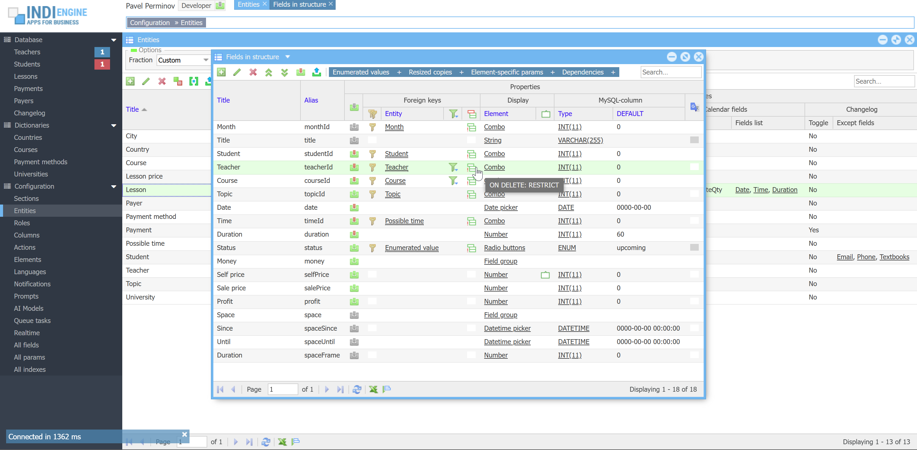 | 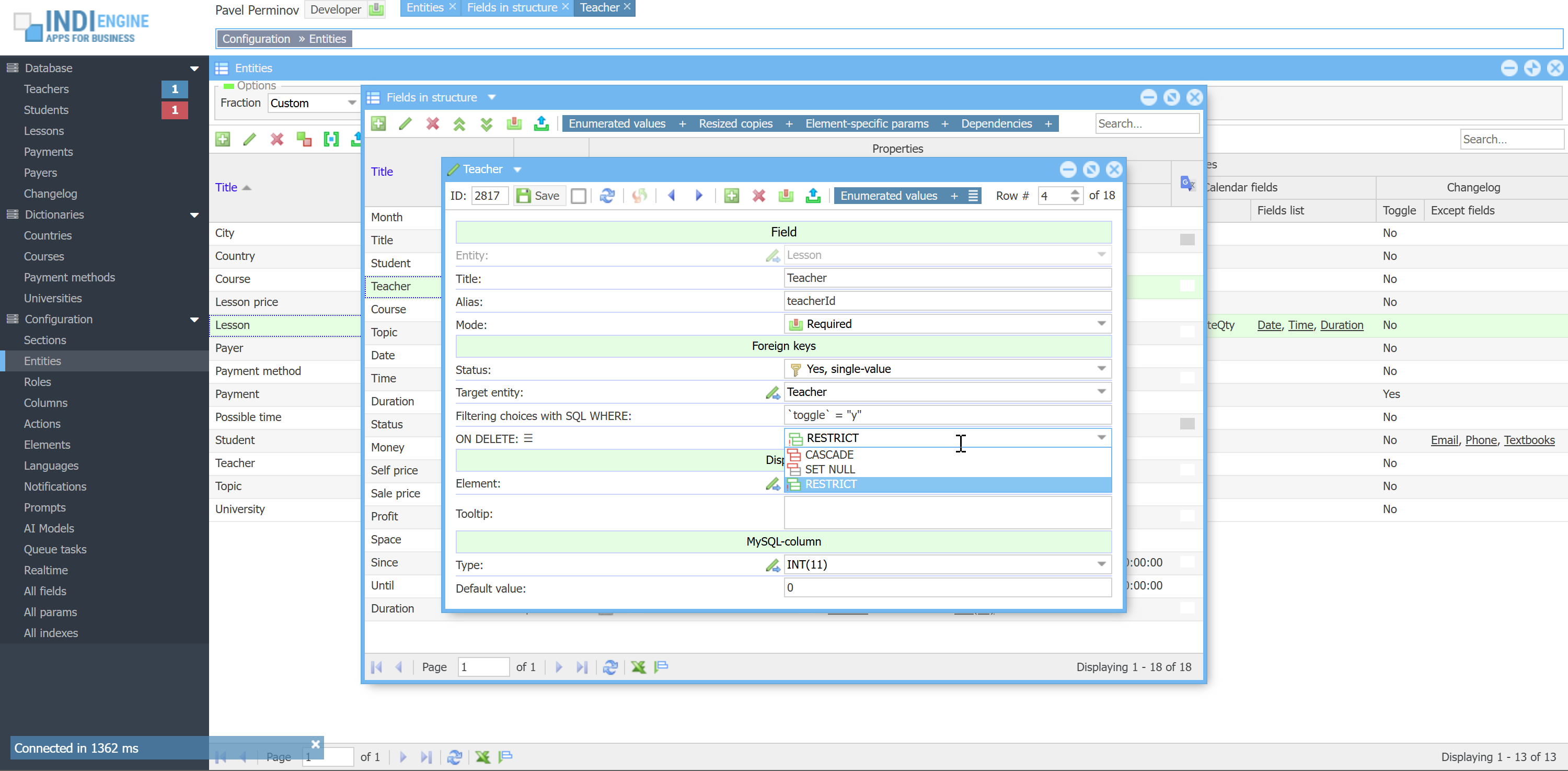 | 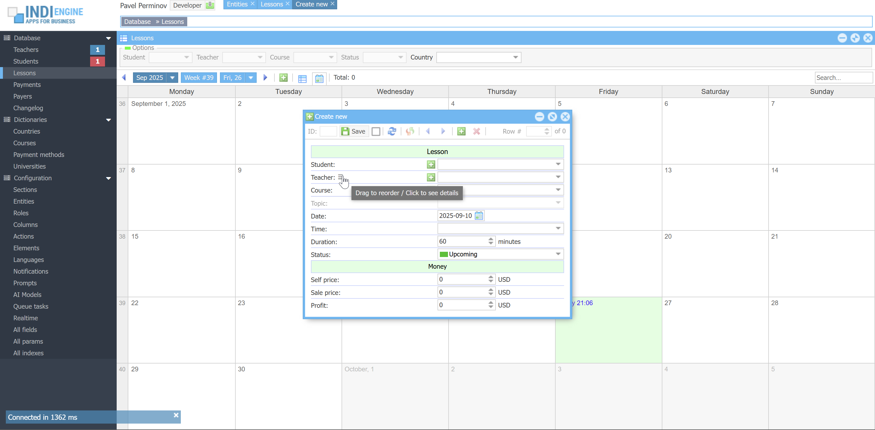 | 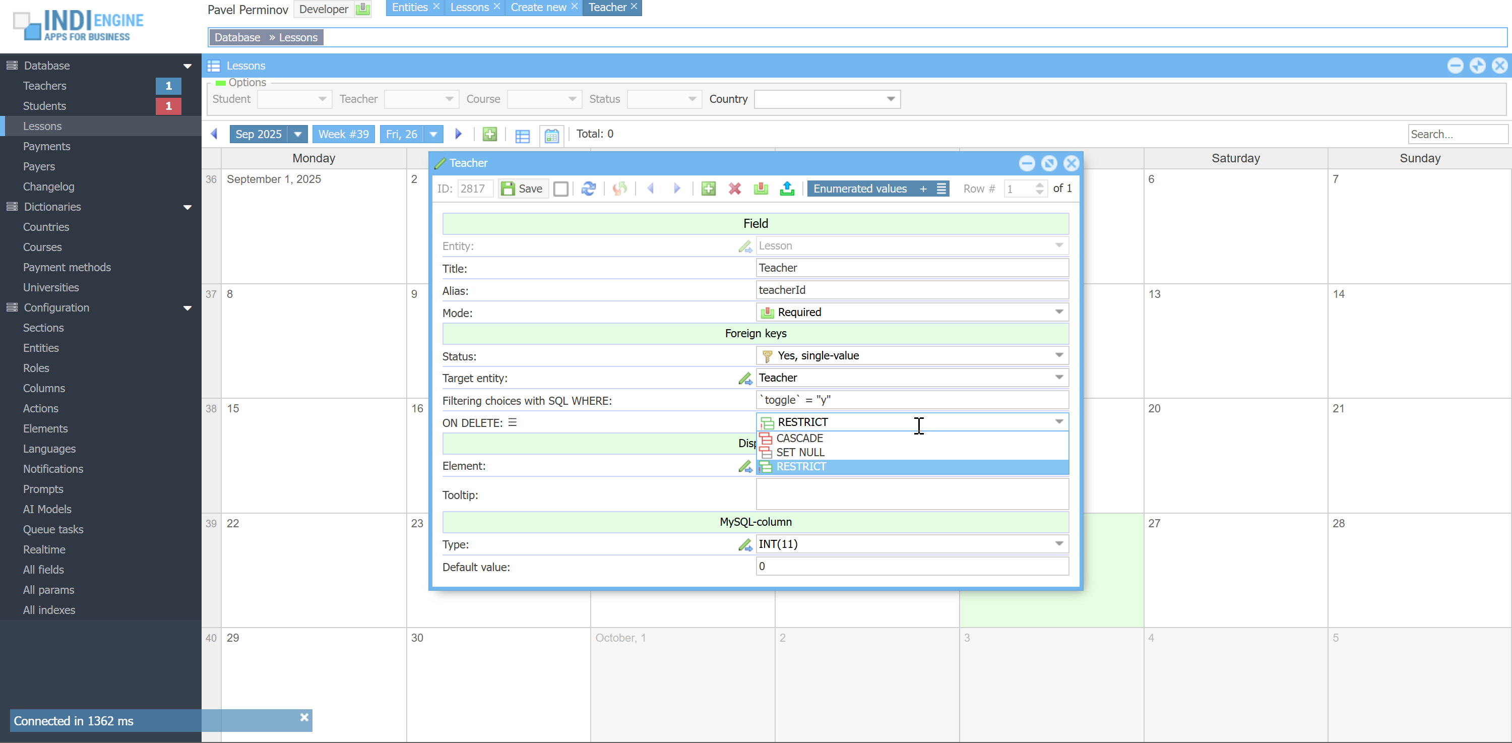 |
However, the life made it clear that the foreign keys support that MySQL has natively - is not always sufficient in certain use cases:
ENUMERATED VALUES
For example, we have Lesson-entity and we have Status-field there, with the following possible foreground values:
Upcoming, Completed, Cancelled, Absence. On the MySQL level, this field is represented by `lesson` table's `status`-column defined as ENUM('upcoming','completed','cancelled','absence') NOT NULL DEFAULT 'upcoming', but in the real-life those background-values by themselves are not sufficient, as you might need to apply different foreground values for different UI-languages and apply different styling as shown above. To be able to handle that, Indi Engine is treating those background values as keys or IDs of records where foreground values and styles are stored, and Indi Engine has a special system Enumset-entity for that purpose
 ▶00:36 ▶00:36 | 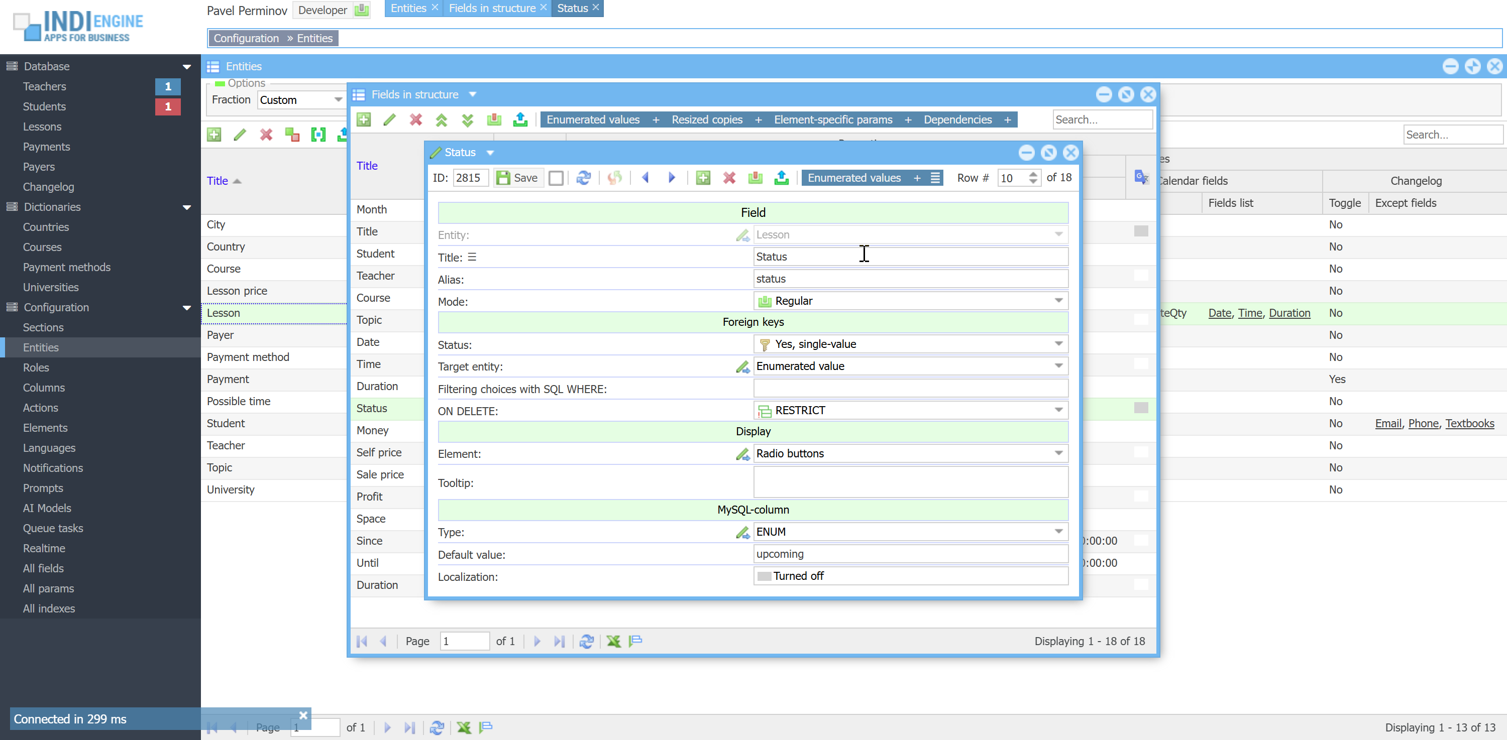 | 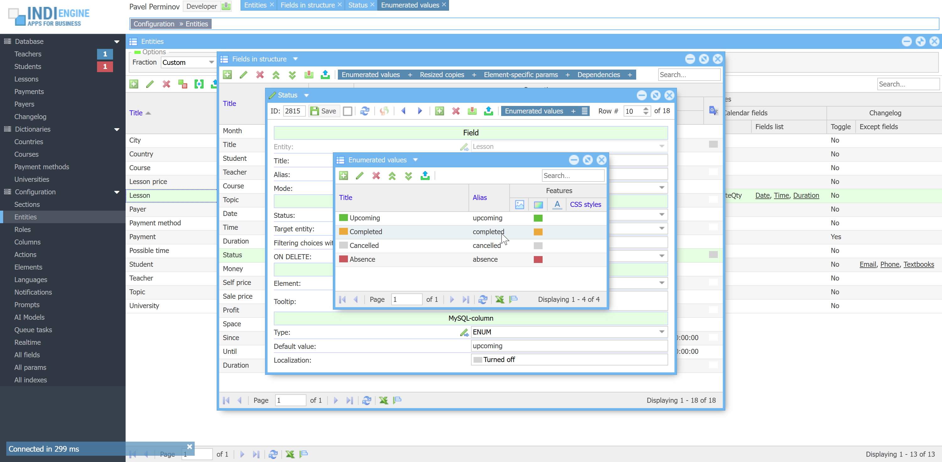 | 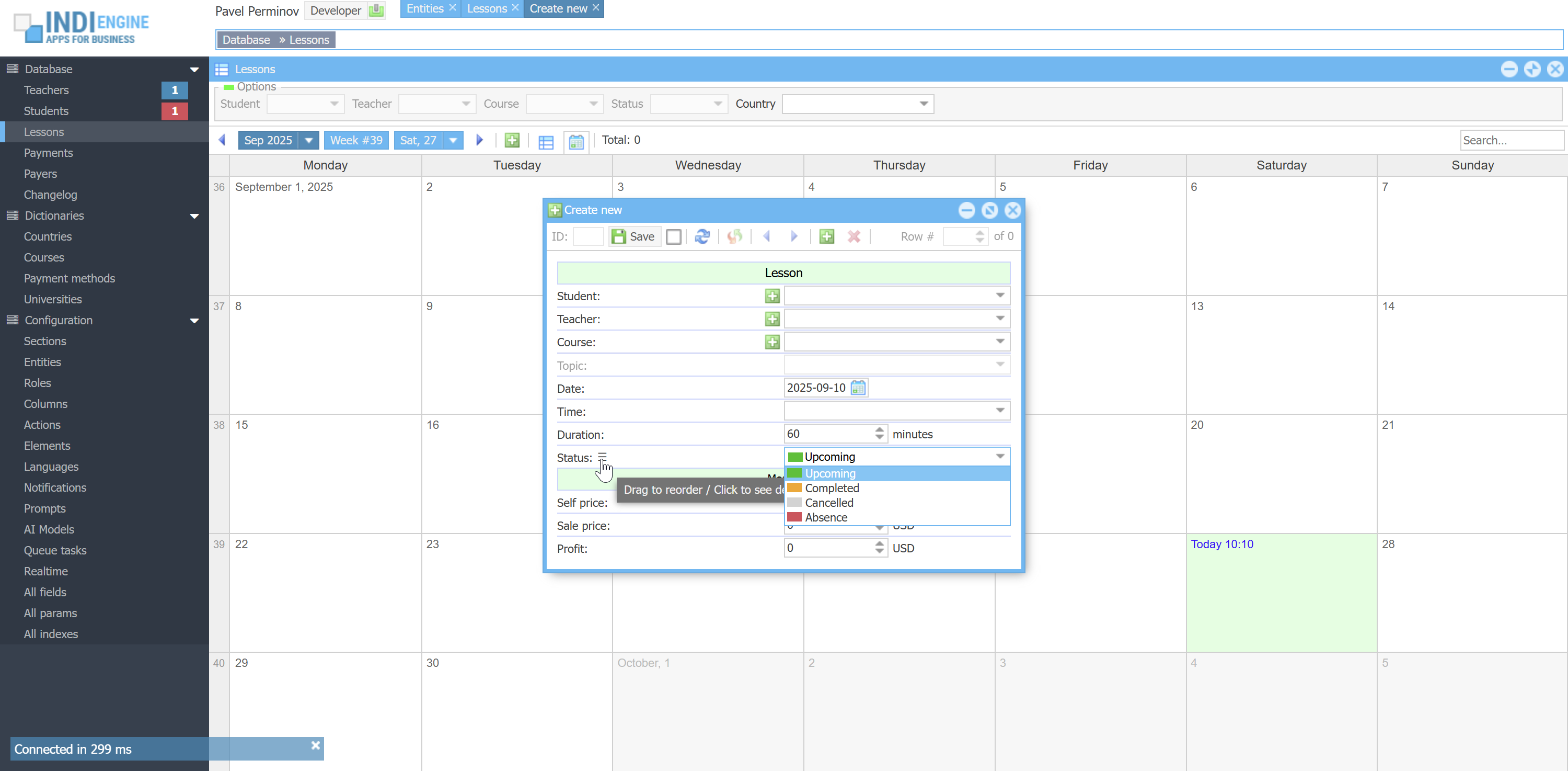 |  |
COMMA-SEPARATED VALUES
For example, we have Teacher-entity and we have Courses-field there, for it to be possible to choose the courses that a certain teacher is able to teach, so we have Course-entity and 3 Course-records:
- Casual English
- Business English
- Exam preparation
If for some teacher we choose both Business English and Exam preparation in Courses-field, this would mean the background value of `teacher`-table's `courseIds`-column for that teacher would be 2,3. So here we have foreign key field where multiple comma-separated IDs are stored.
 ▶00:35 ▶00:35 | 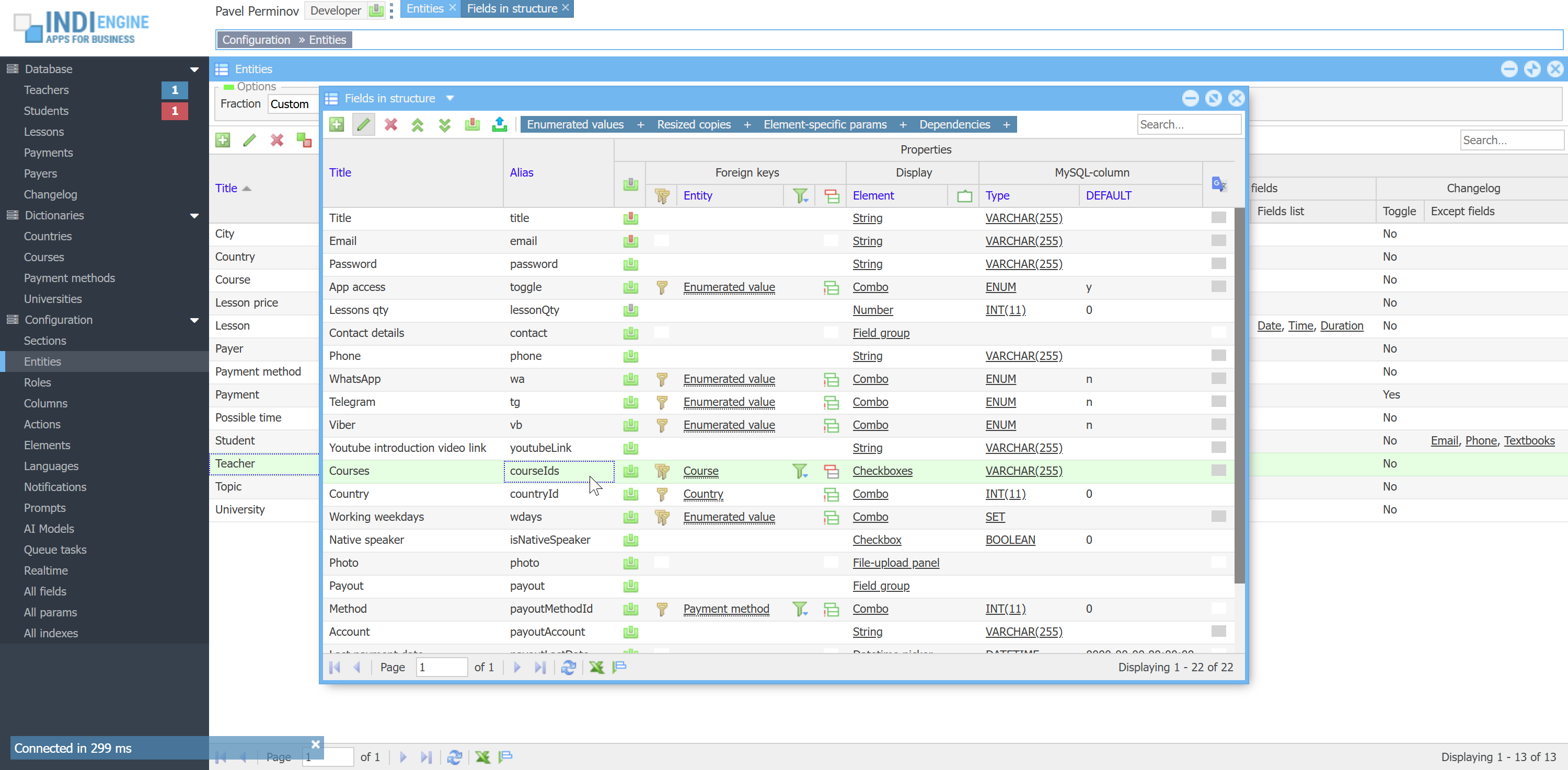 | 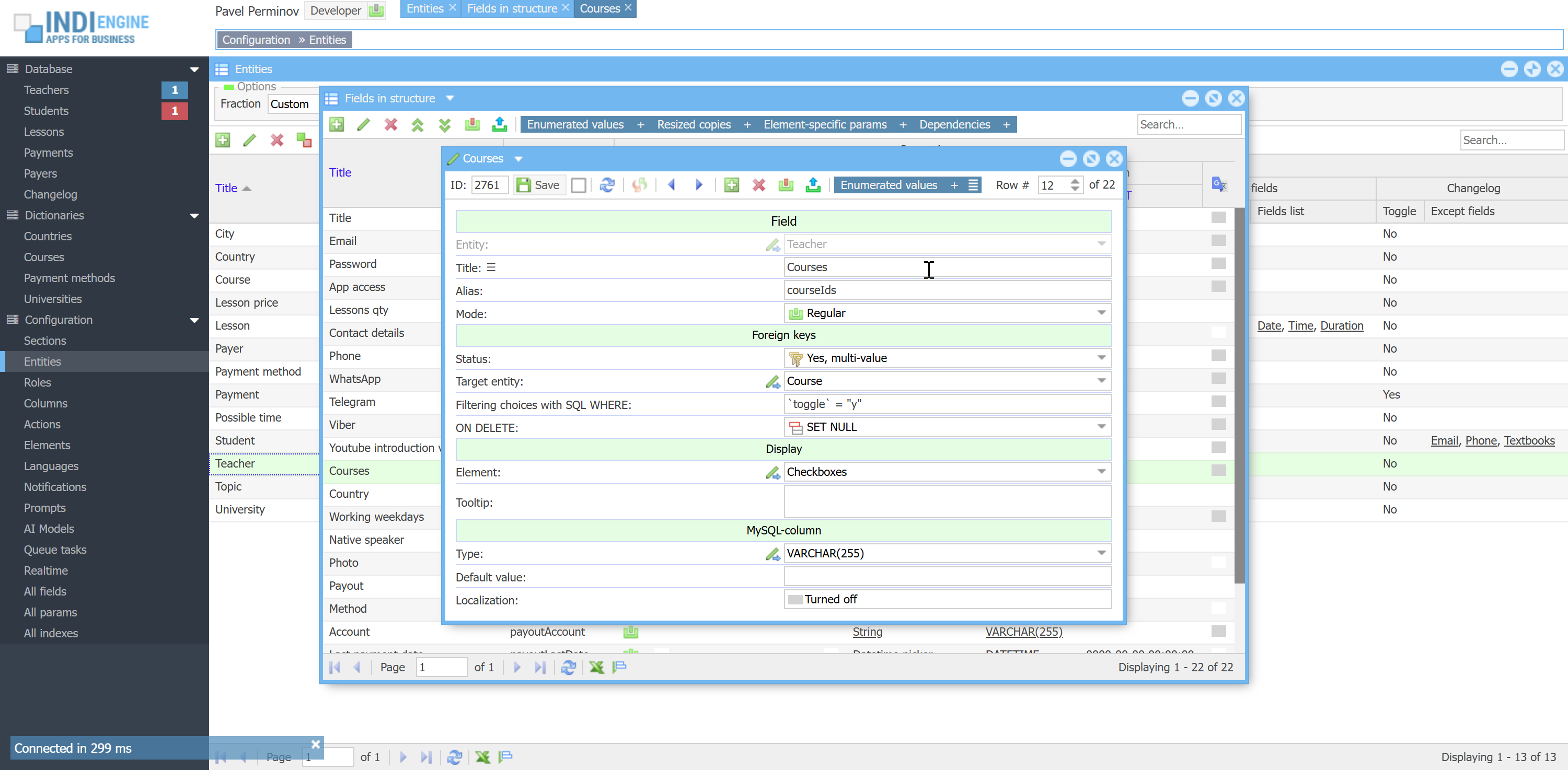 |  | 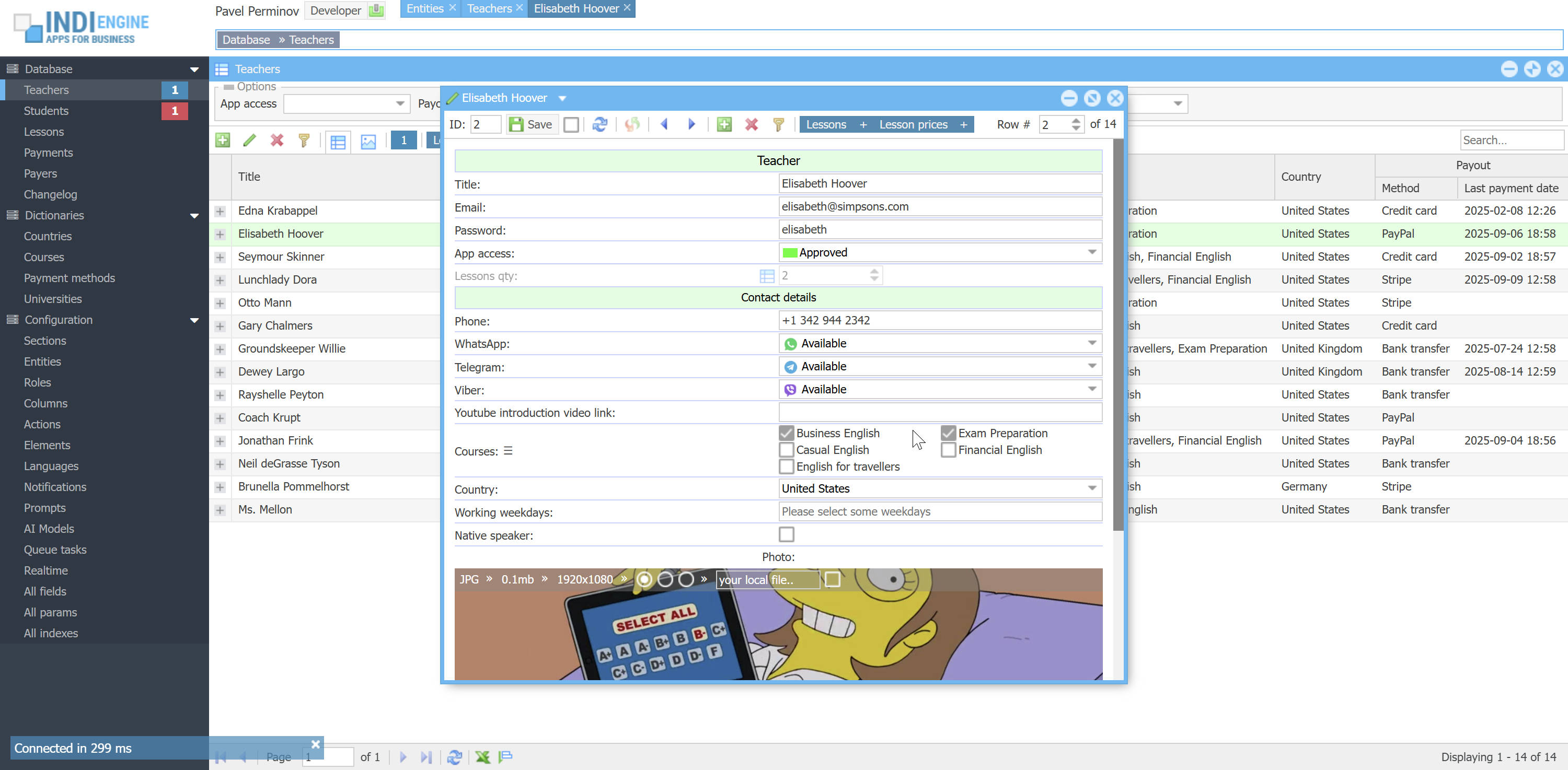 |
ENUMERATED COMMA-SEPARATED VALUES
For example, we have Teacher-entity and we have Working weekdays-field there, shown as checkboxes or combobox options with the following possible foreground values: Monday, Tuesday, Wednesday, Thursday, Friday, Saturday and Sunday. On the MySQL level, this field is represented by `teacher` table's `wdays`-column that might be defined as SET('mo','tu','we','th','fr','sa','su') NOT NULL DEFAULT '', so if you check Monday, Tuesday and Wednesday checkboxes, it would mean the background-value is going to be 'mo,tu,we'.
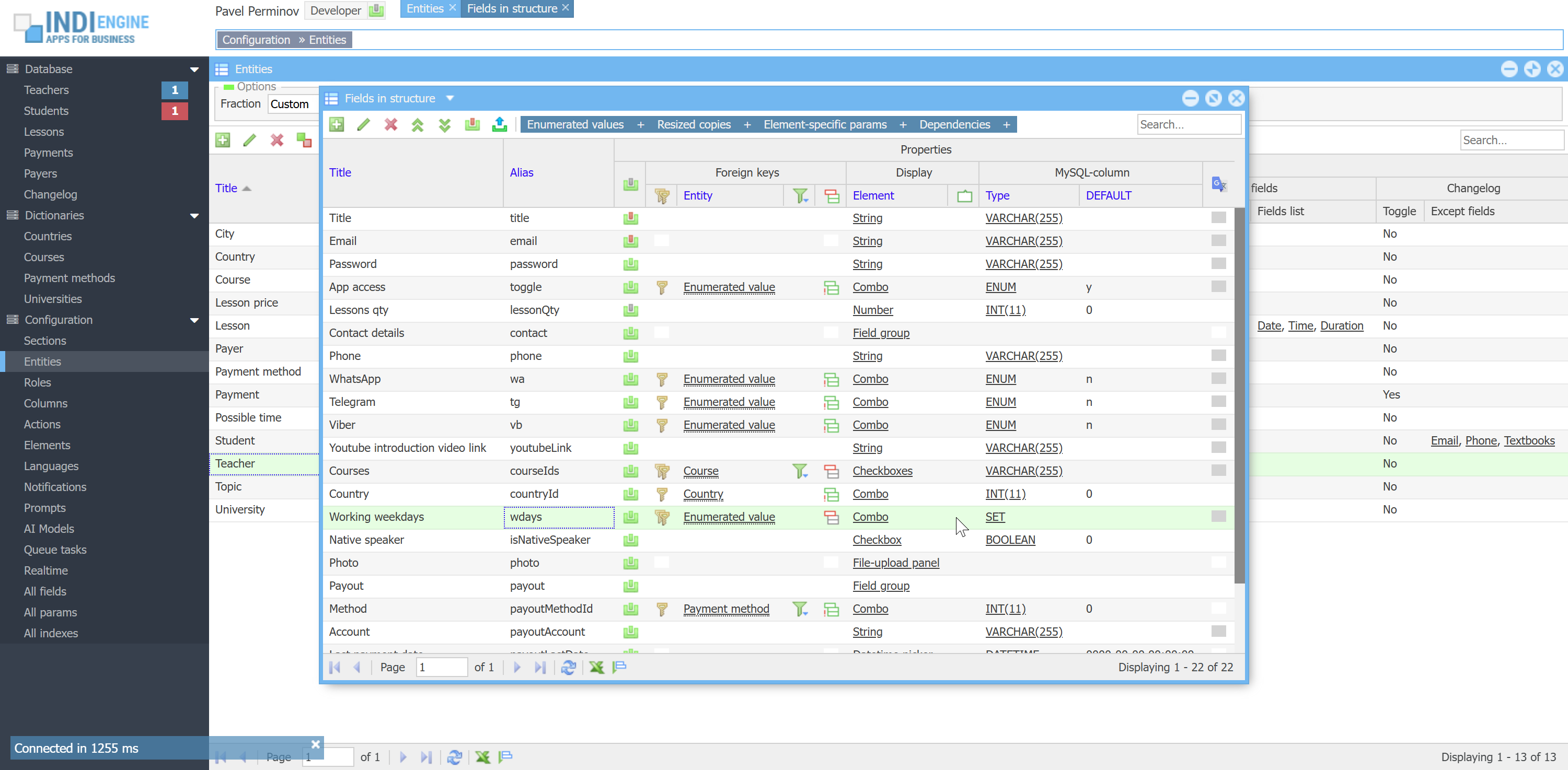 ▶00:36 ▶00:36 | 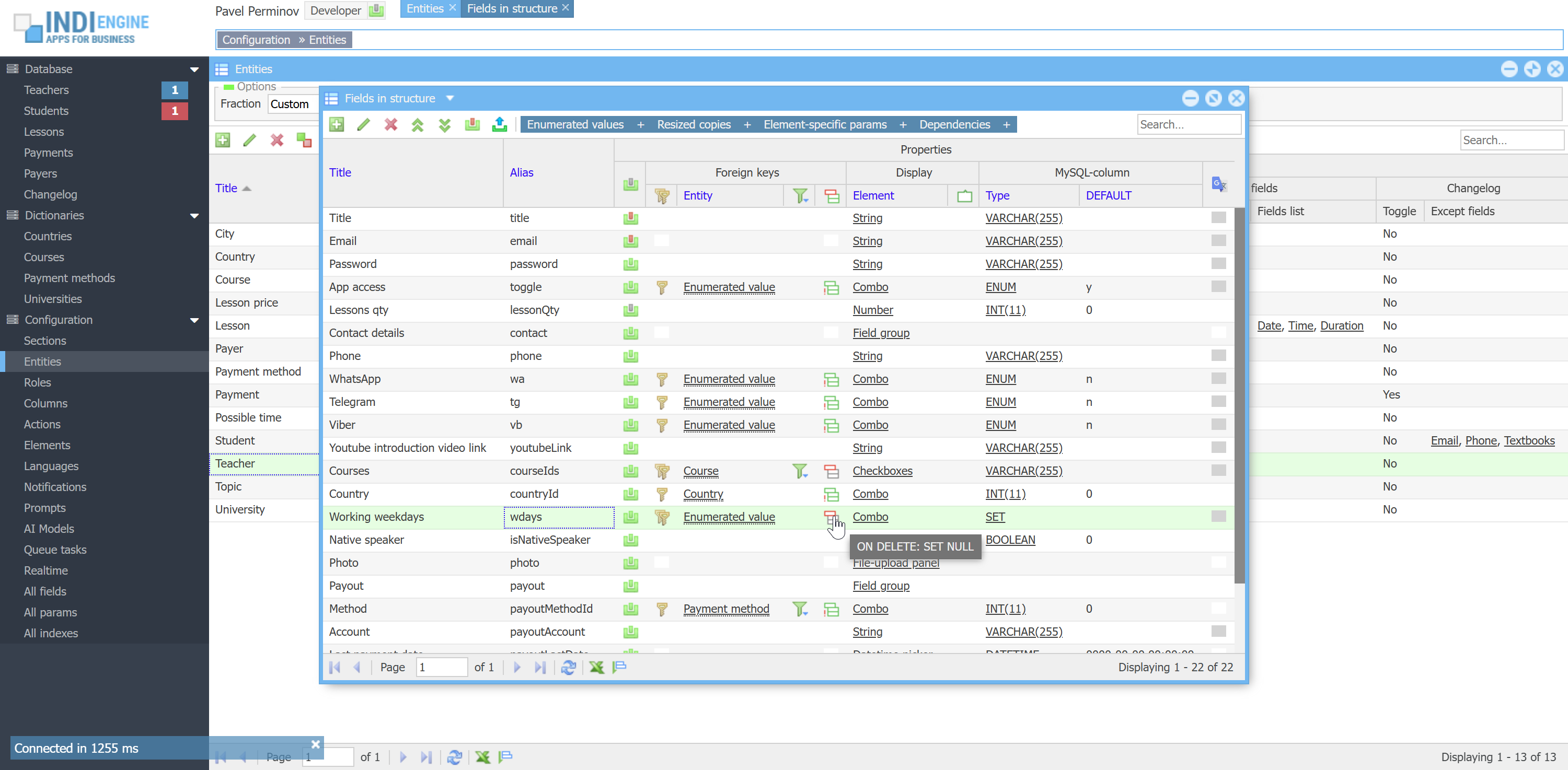 | 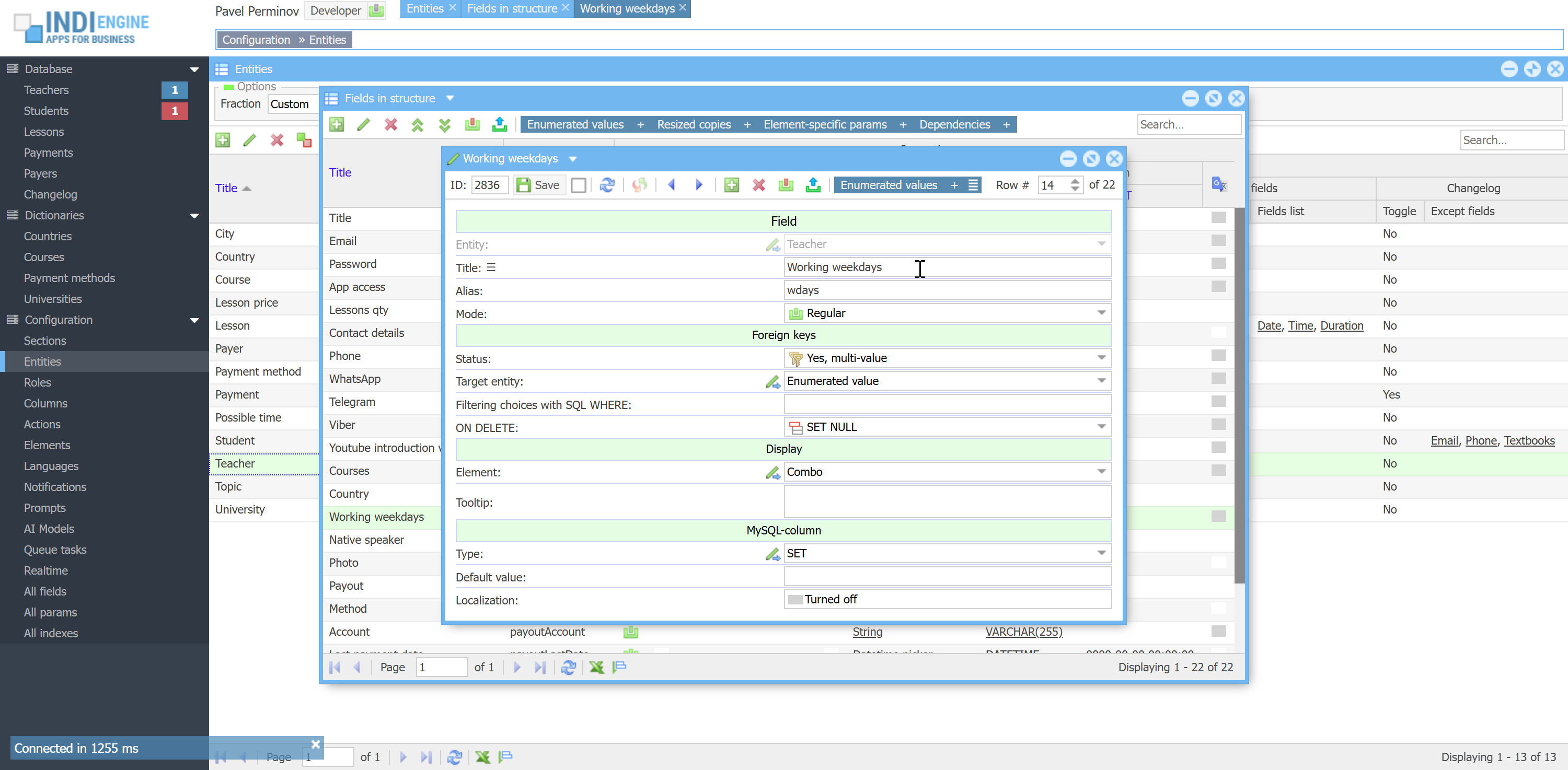 | 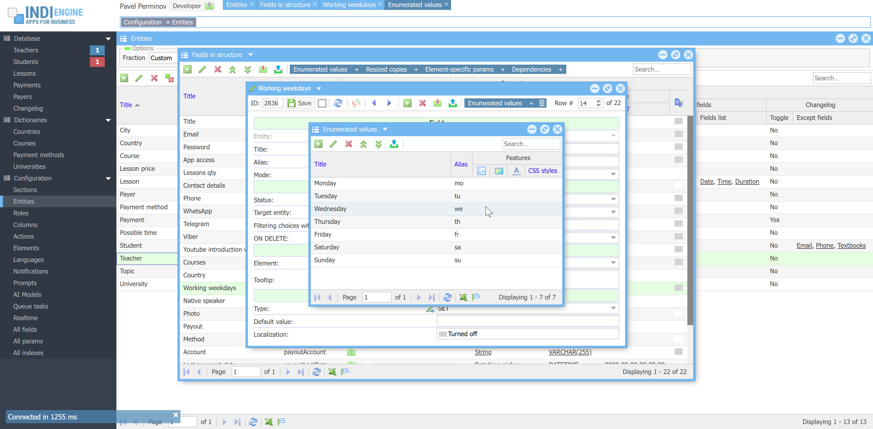 | 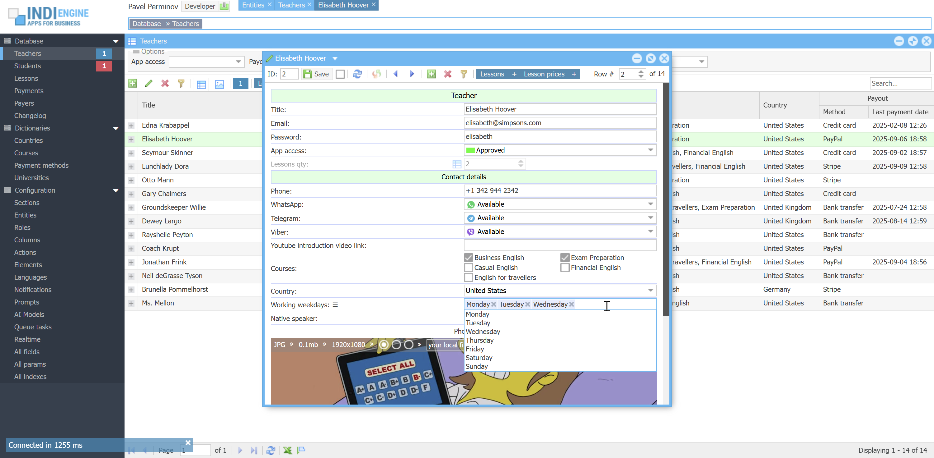 |
For all of the above 3 cases Indi Engine respects the ON DELETE rule as well, despite it not being natively supported by MySQL.
For example:
- If we delete Course-record (e.g Exam preparation) - then the background value for Courses-field in the above mentioned Teacher-record will be changed from
2,3to just2 - If we delete Enumset-record (e.g. Tuesday) - then the background value for Working weekdays-field in the above mentioned Teacher-record will be changed from
'mo,tu,we'to just'mo,we'
Localization
Basically, localization means that some strings should be auto-translated to the languages you need, and there is an integration with Google Cloud Translate API for that, but for this to work you have to obtain an API key from Google, and once done, the responsibility of Indi Engine is then to collect those strings in source language, get translations, and then append translations back into the same places where sources were collected from.
 ▶02:12 ▶02:12 | 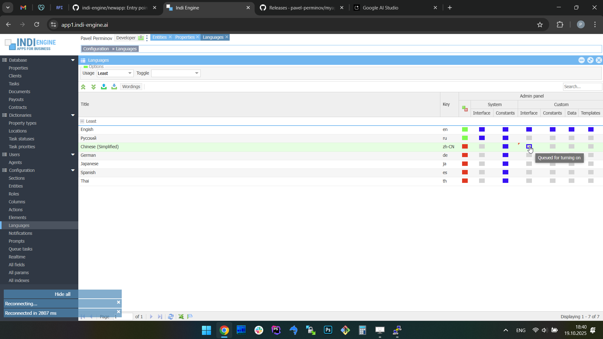 | 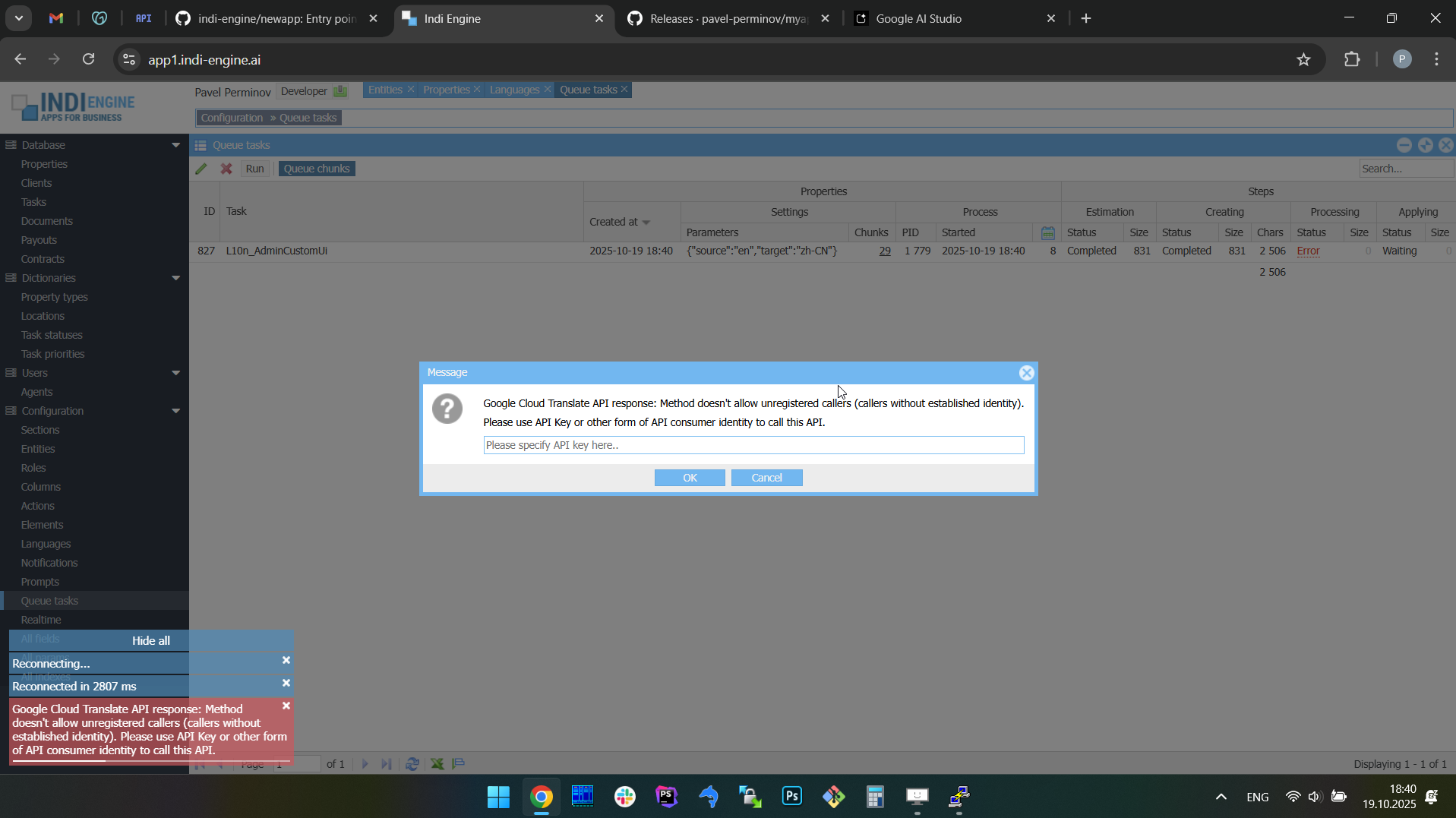 | 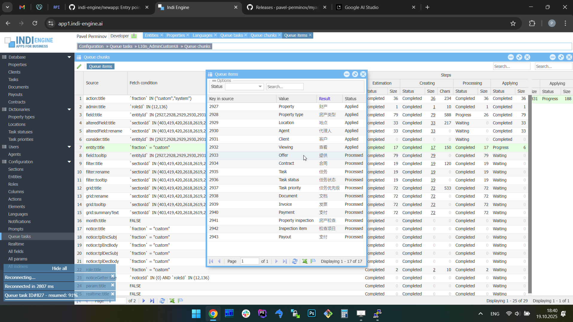 | 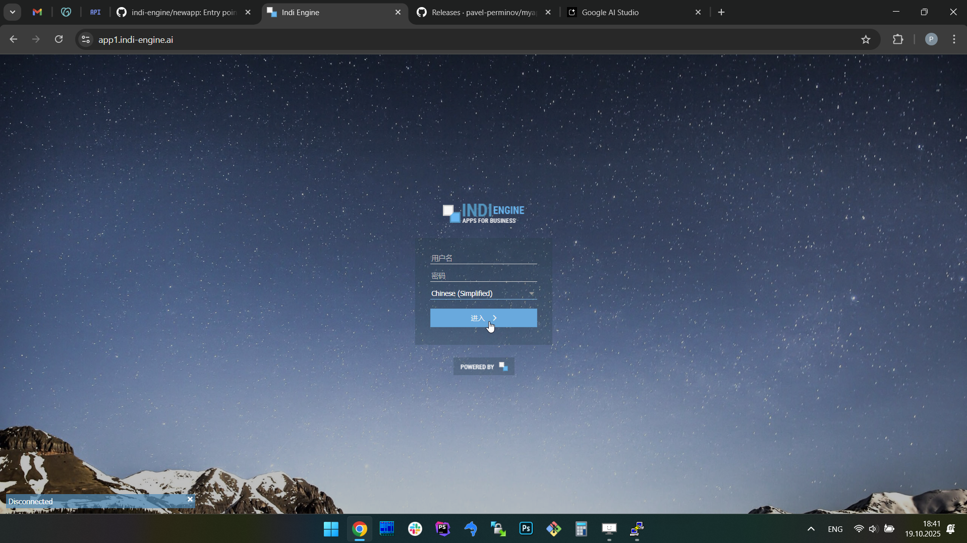 | 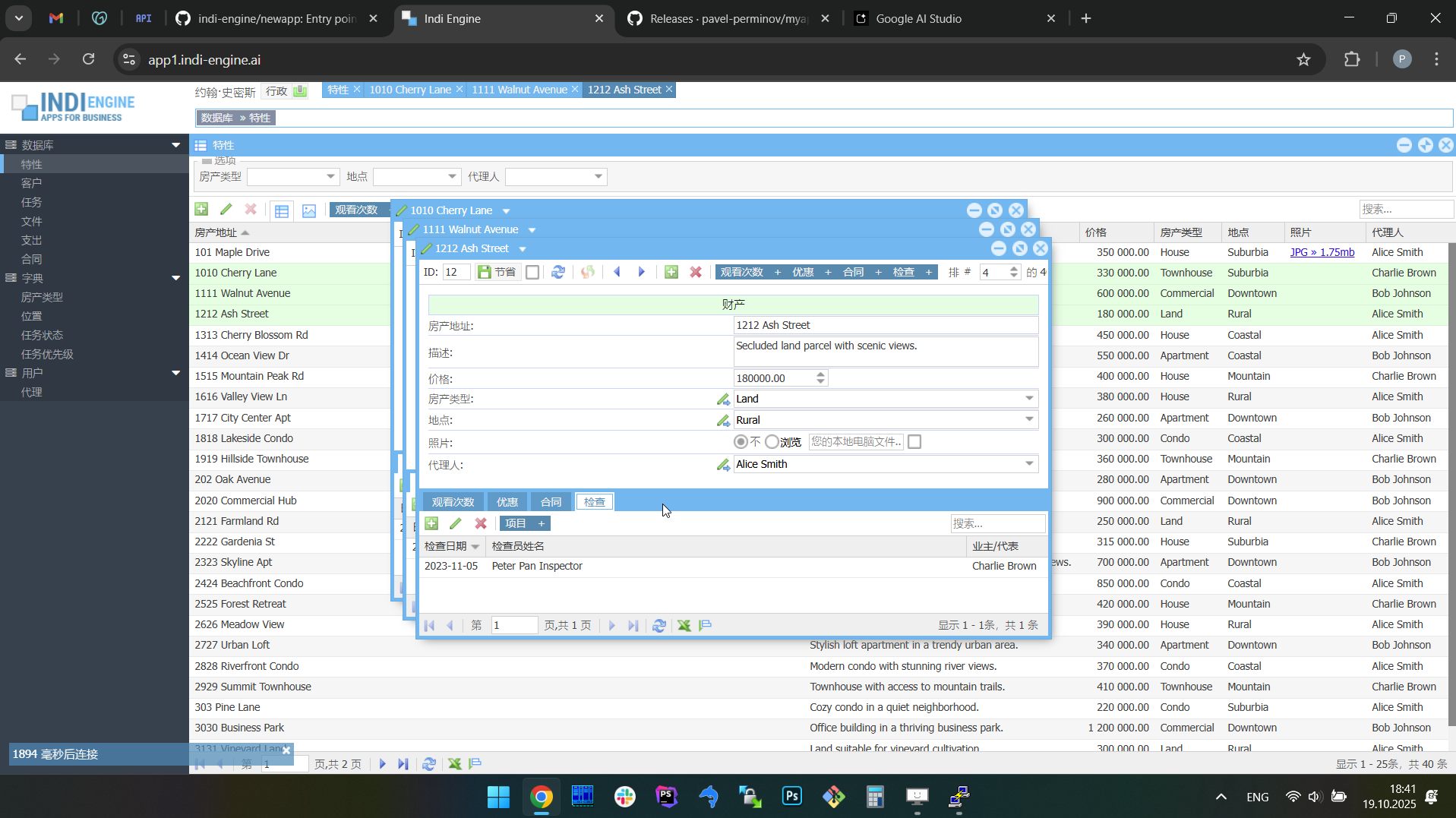 |
First thing here that you need to know is that Indi Engine has fractions, so that strings related to different fractions can be translated into different sets of languages, and there are two major fractions - System and Custom:
- System fraction is used to gather things that are specific to the Indi Engine itself
- Custom fraction is used to gather things that are specific to the custom app you're creating with Indi Engine
For example, Teacher-entity is an entity that belongs to a Custom fraction, as well as Lesson-entity and Student-entity. But Section-entity, Element-entity and Field-entity - all belong to System fraction and those are existing in every app built on Indi Engine.
Also, not only Entity-records can belong to a certain fraction, but Section-records and Role-records as well. Evenmore, some certain Action-records can belong to both fractions at the same time, for example Details-action, because it is used both in system and custom sections.
Another important thing about fractions is that fraction can be defined on record-level if its entity has a Fraction-field and this has the priority over what's defined for the entity that this record is of. For example, Indi Engine has a Role-entity, that is a data-structure and storage of all the Role-records that we may have, and this entity itself belongs to the System fraction. But, Role-records have Fraction-field, and Developer-role has Fraction=System, but all the others - Admin-role, Teacher-role and Student-role - have Fraction=Custom
Before you translate your app to some new language, you have to enable localization for the certain fields you need Indi Engine to collect the source strings from, and in most cases those will be Title-fields, which literally means the values of Title-field of the records from specific entities.
In Indi Engine, localization is already enabled (where needed) for the fields that belong to System fraction, so if you want to enable new language for System fraction, you can do that with no need of any preliminary steps. But for the Custom fraction, which gathers the things that are specific to the app you are creating - you have to decide by yourself which fields you need to be translated and enable localization for those fields.
For example, in our sample app you have Course-entity, and there are Title-field (single-line string) and Description-field (multi-line string), so each of 3 previously mentioned Course-records for sure have values in Title-field (Casual English, Business English, Exam preparation) and might have some values in their Description-field. You can do whatever step first: enable new language or enable localization for those fields, and vice versa, but you will get nothing translated until both steps are done:
Changes of background-values of Title-field during the recommended sequence of steps:
Step1: enable localization for Title-field | Step2: enable German-language | ||
Before | After | Before | After |
Casual English | {"en":"Casual English"} | {"en":"Casual English"} | {"en":"Casual English", "de":"Lässiges Englisch"} |
Business English | {"en":"Business English"} | {"en":"Business English"} | {"en":"Business English", "de":"Geschäftsenglisch"} |
Exam Preparation | {"en":"Exam Preparation"} | {"en":"Exam Preparation"} | {"en":"Exam Preparation", "de":"Prüfungsvorbereitung"} |
Changes of background-values of Title-field during the opposite sequence of steps
Step1: enable German language | Step2: enable localization for Title-field | ||
Before | After | Before | After |
Casual English | Casual English | Casual English | {"en":"Casual English", "de":"Lässiges Englisch"} |
Business English | Business English | Business English | {"en":"Business English", "de":"Geschäftsenglisch"} |
Exam Preparation | Exam Preparation | Exam Preparation | {"en":"Exam Preparation", "de":"Prüfungsvorbereitung"} |
Why is the first sequence of steps recommended and the second one is not? Because the first sequence assumes that your app is already prepared for being translated, which means you had already enabled localization for all the fields where you thought it is needed, so you'll start getting translations right after you enable new languages, instead of trying to get a clue on why there are no translations after some new language was enabled and then realizing, that the reason is that you forgot to choose the fields.
There are two major kinds of fields that you can enable localization for. The first kind is string fields (single- and multi-line), which are mentioned above, and the second kind is foreign key fields having enumerated values. For example, Status-field in Lesson-entity:
Changes of background values of Title-field in each of Enumset-record corresponding to certain possible value of Status-field:
Step1: enable localization for Status-field in Lesson-entity | Step2: enable German-language | ||||
Background values of Status-field | Background values of Title-field of corresponding Enumset-records | ||||
Before | After | Before | After | Before | After |
upcoming | Upcoming | {"en":"Upcoming"} | {"en":"Upcoming"} | {"en":"Upcoming", "de":"Demnächst"} | |
completed | Completed | {"en":"Completed"} | {"en":"Completed"} | {"en":"Completed", "de":"Abgeschlossen"} | |
cancelled | Cancelled | {"en":"Cancelled"} | {"en":"Cancelled"} | {"en":"Cancelled", "de":"Abgesagt"} | |
absence | Absence | {"en":"Absence"} | {"en":"Absence"} | {"en":"Absence", "de":"Abwesenheit"} | |
As you can see, the background values of the foreign key field itself - are not translated when you enable localization for that field, but instead, the values of Title-field of the corresponding Enumset-records are translated.
Another important aspect of localization is subfractions of Custom fraction:
- Interface - are titles and tooltips used in Sections, Entities, Fields and others, including titles stored in Enumset-records
- Constants - are titles that are defined as php-constants and stored in php-files, but this will be explained in SDK docs.
- Data - are strings that are the data and not the UI, for example titles and description for each course, teachers and students names, etc
Normally, you don't need Data subfraction to be translated. The only use case ever popped up so far - is when demo versions were prepared for already existing apps, and it was good for potential clients to be able to see everything (Interface + Constants + Data) translated to the language selected on the login page. And yeah, after you translate everything you need for a certain new language - you have to enable that language to be selectable on the login page. Read more in the Languages chapter.
Ok, let's guess we already translated the Custom fraction’s Interface and Data subfractions to German-language.
What will happen if we add Ongoing as a new possible value for Lesson-entity's Status-field, or if we add a new Financial English course? The answer is: those titles would be translated to German. For sure, if the user who added those new possible status or new course - is currently logged in using German language, then those titles would be treated as German, so they'll be used to translate to English.
What will happen if we change the value of some localized Field in an existing record? The answer is: translations won't be auto-updated unless you enable the Update translations for other languages-param for the field where you changed the value.
Other translations are not updated by default on change for one translation, because in most cases the localization is needed for System and/or Custom interface, and the real life usage is that at first you polish the existing/initial/source translations which mean you make them to look perfect, you try to use words and/or phrases that would exactly explain the meaning behind, with respect to the titles of surrounding UI elements, for example in case for multi-level column headings. And for sure, you don't want all those efforts to be just overwritten by auto-translation triggered when you'll be doing the same polishing but for another language.
However, there might be cases where auto-updating translations for other languages is useful, for example for Title-fields in Teacher-entity and Student-entity when full names are stored in those fields. Also, it can be relevant for Address-field in Student-entity if there would be such a field, which is not the case for our sample app though.
Keyboard shortcuts
Keyboard shortcuts are working only in Index-window with a grid (not always grid) and in Details-window with a form (always form):
- Same for grid and form
- Navigation to subsections inside the currently selected record(s) in grid or opened record in form
- ALT + 1..9 - open (sequence of) Index for 1st..9th subsection-window(s)
- ALT + SHIFT + 1..9 - open (sequence of) Create new in 1st..9th subsection-window(s)
- ALT + N - open Create new-window
- ESC - close current window
- Grid only
- ALT + E - export grid as an Excel-spreadsheet
- Actions for currently selected record(s)
- ENTER or F4 - open (sequence of) Details-window(s)
- DELETE - do Delete-action
- ALT + T - do Toggle-action
- ALT + UP - do Move up-action
- ALT + DOWN - do Move down-action
- Selection
- Single records
- DOWN - make next record to be selected instead of currently selected record
- UP - make previous record to be selected instead of currently selected record
- Multiple records
- SHIFT + DOWN - make next record to be selected in addition to currently selected record
- SHIFT + UP - make previous record to be selected in addition to currently selected record
- SHIFT + PAGE DOWN - select all records from the current until the last at the current page
- SHIFT + PAGE UP - select all records from the current and until the first at the current page
- CTRL + A - select all records on the current page
- Navigation to other pages
- PAGE DOWN - if last record is selected then load the next page and make the last record selected
- PAGE UP - if first record is selected then load the previous page and make the first record selected
- Form only
- ALT + RIGHT - open Details-window for next record
- ALT + LEFT - open Details-window for previous record
- ALT + N - open Create new-window e.g for new record
- ALT + R - reload Details-window for current record
- ALT + S - do Save-action for current record
- ALT + A - toggle Autosave before goto-mode, so that Save-action will be done automatically for current record
- On attempt to goto next, previous or any sibling record
- On attempt to goto Create new-window i.e for new record
- On attempt to goto any subsection of current record
- On attempt to goto any subsection's Create new-window
This might be useful when you need to sequentially amend some values in multiple records, so you can do:
Amend or setup > goto any or new > amend or setup > goto any or new > etc,
instead of
Amend or setup > save > open any or new > amend or setup > save > open any or new > etc
because the Details-window is closed when you press Save-action's button, so once saved but with no usage of Autosave before goto-mode you will have to select the next record in the grid and open Details-window again, and do so for each next record you need to amend
File uploads
Indi Engine stores all the uploaded files in custom/public/data/upload directory, which contains subdirectories for each entity having at least one file-upload field and having at least one record with a file really uploaded into that field. For example, if we have Photo-field in Teacher-entity, then the path to the uploaded file would be custom/public/data/upload/teacher/1_photo.jpg, where
- 1 - is the ID of that Teacher-record
- photo - is the Alias of Photo-field in Teacher-entity
If you configure resized copies to be created for images uploaded into that Photo-field, then additional files would appear there as custom/public/data/upload/teacher/1_photo,thumb.jpg and/or custom/public/data/upload/teacher/1_photo,large.jpg, where thumb and large - are background names that you can define for each of those resized copies, see Resized copies for more details.
Update and migrate
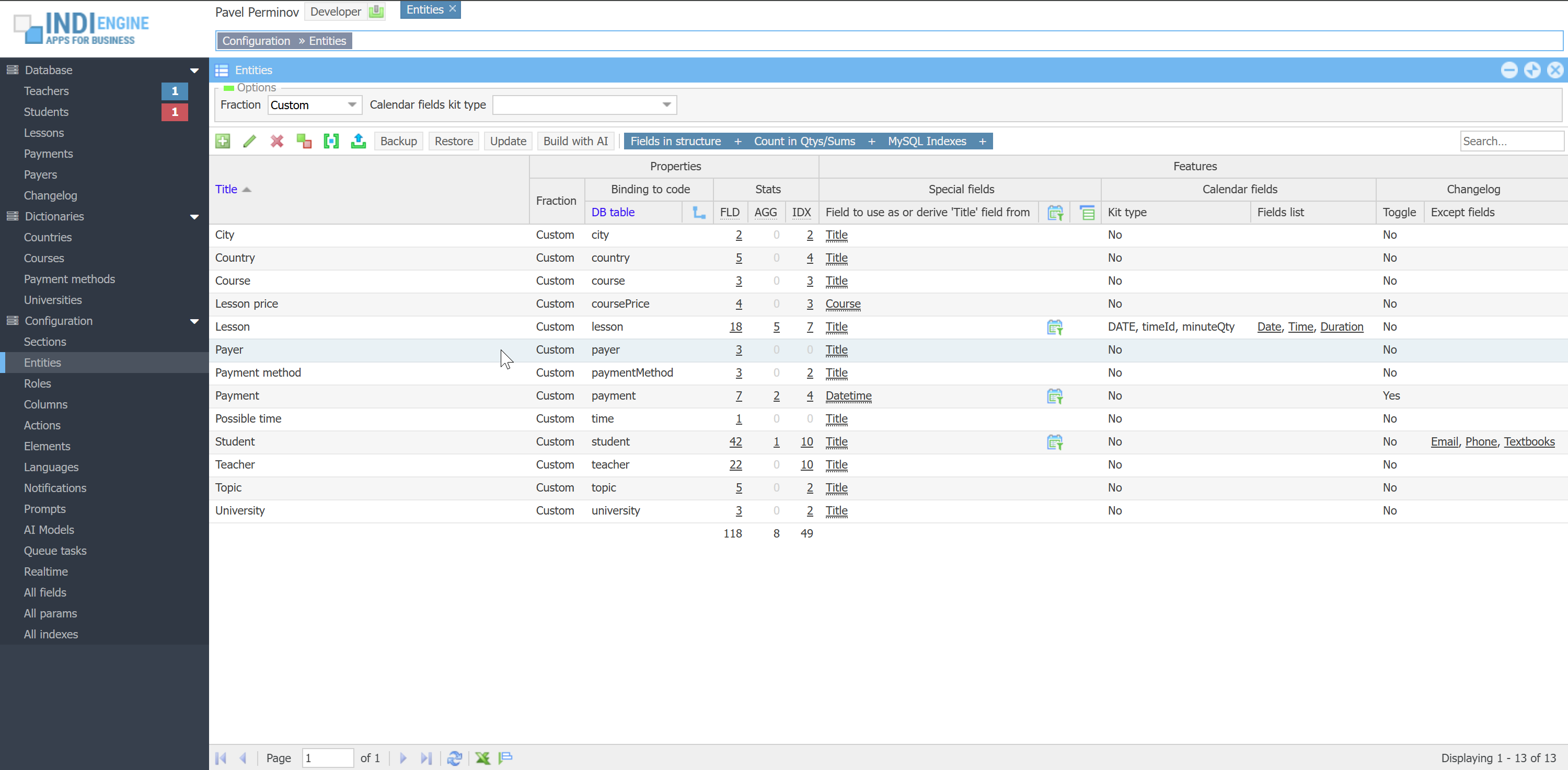 ▶00:53 ▶00:53 | 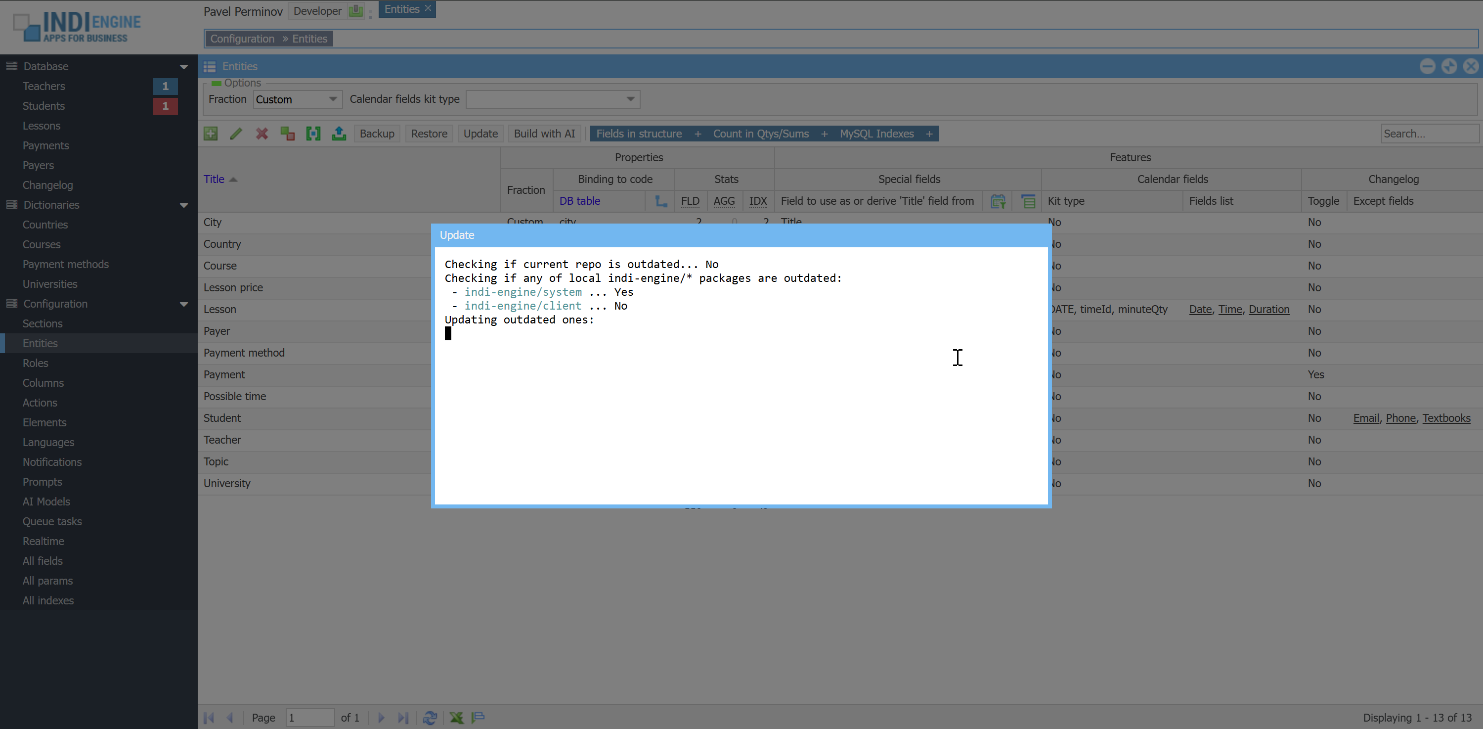 | 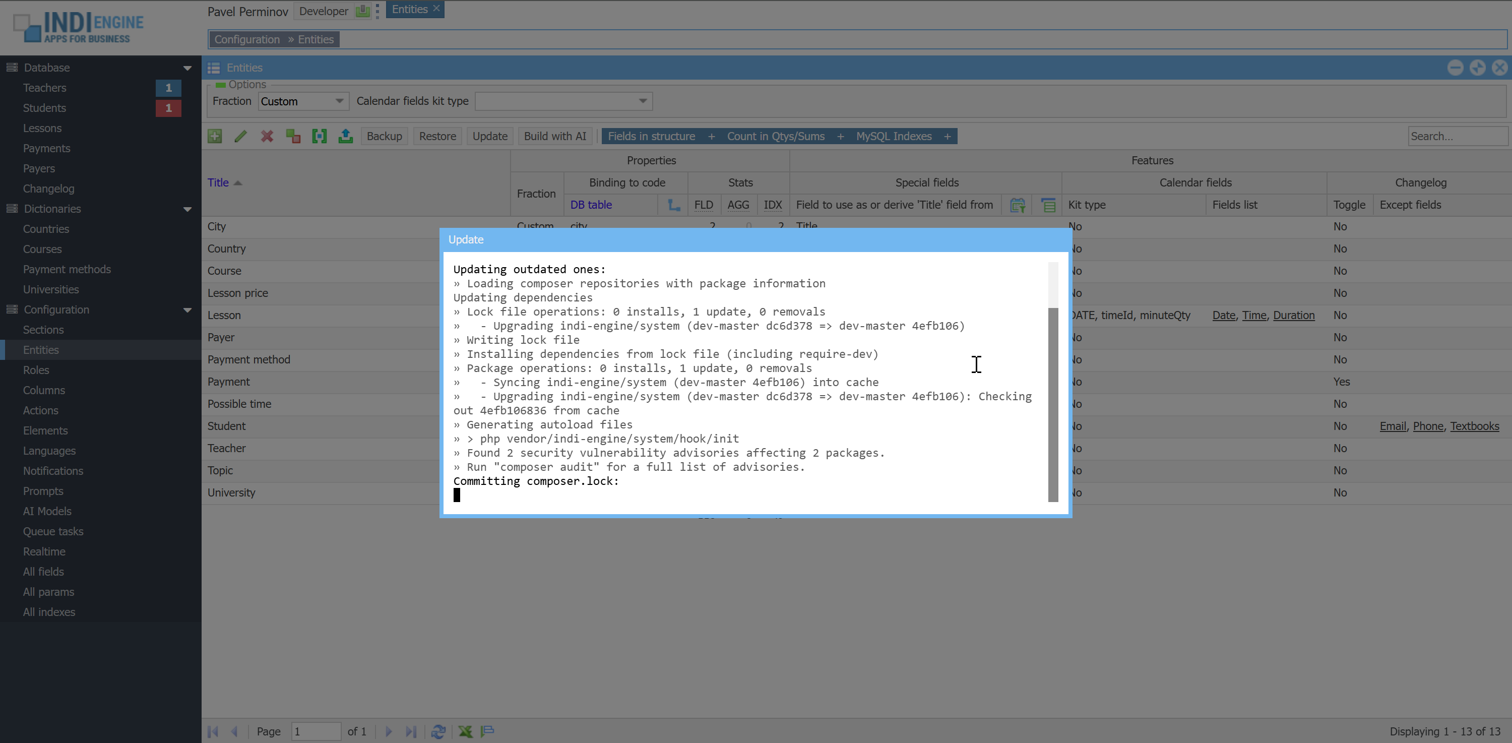 | 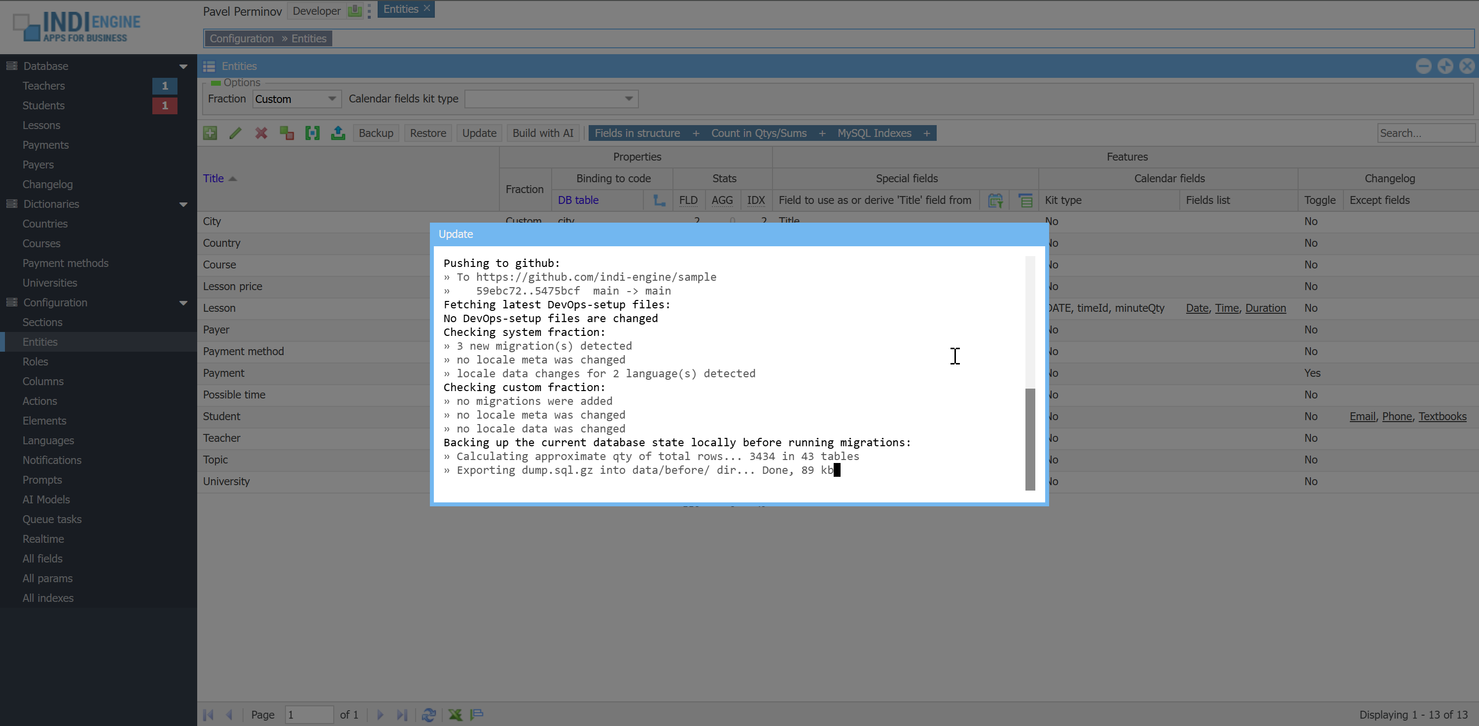 | 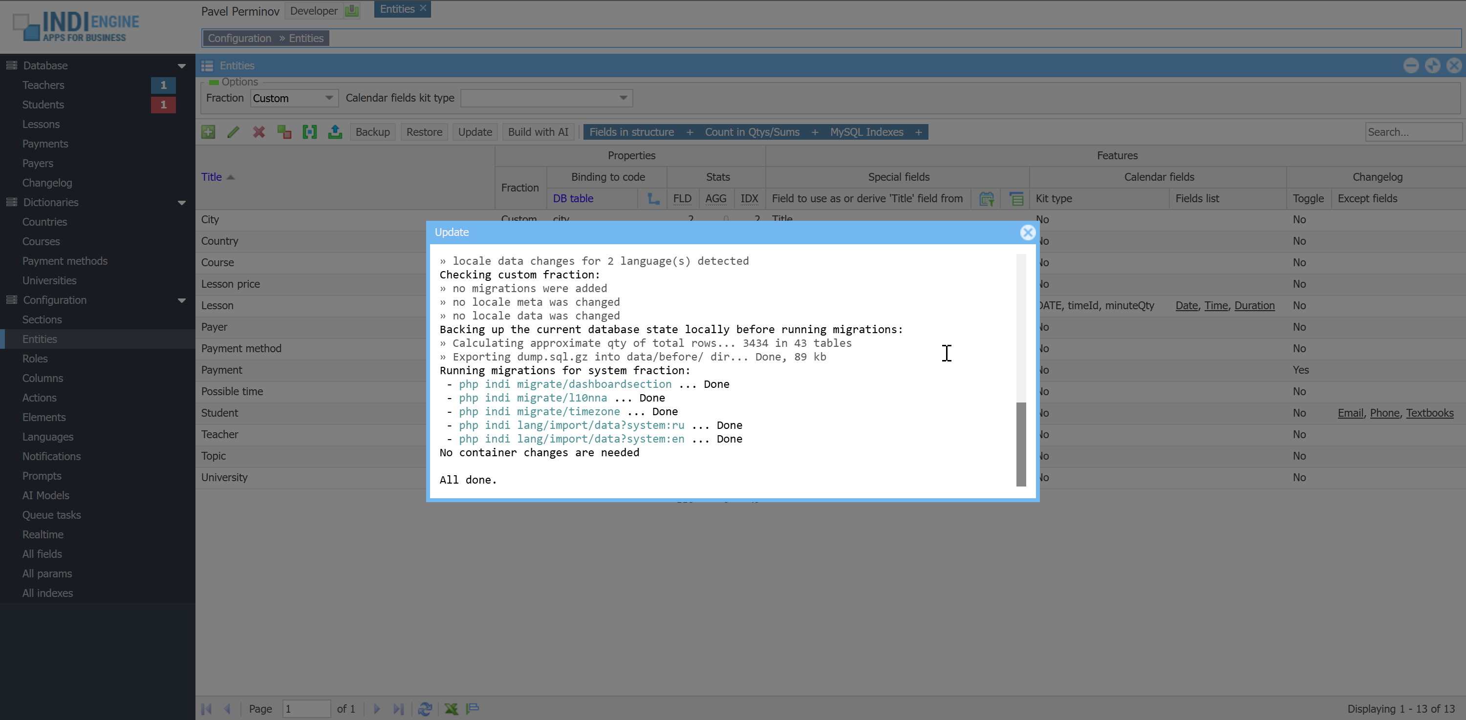 |
There is an Update-action in Entities-section, which is available for the Developer-users only, and once clicked, the update command will be executed consisting of the following steps:
- App-specific (custom) source code update - Checks whether the most recent commit for your repo on github does not exist on your current Indi Engine instance, and if yes - it means your app-specific source code is outdated, so Indi Engine executes
git pullandcomposer installcommands
- App-agnostic (system) source code update - Check whether the most recent commit for Indi Engine's system and/or client packages on github does not exist on your current instance, and if yes - it means some or both of those packages in your current instance are outdated, so Indi Engine executes:
composer update indi-engine/*git add composer.lockgit commit -F .git/COMMIT_EDITMSG
INFO: there is a prepare-commit-msg hook already set on your app repo which prepares the commit message contents based on combined git logs of updated Indi Engine packages, so you can see the summarized overview of Indi Engine's crucial source code changes right in your app repo log just to see where you are
git push- Push to your app repo on GitHub, if you’ve already have it along with GH_TOKEN_CUSTOM_RW token
- DevOps setup update - Checks whether any of your current DevOps setup files (everything except custom/ and .env paths) is outdated compared to https://github.com/indi-engine/newapp, and if yes - they will be updated, committed to your app's own repo with a "Updated DevOps-setup files from indi-engine/newapp"-message and pushed to GitHub. Then, Indi Engine will calculate the restart scenario for your instance if needed based on changed files, and write it to a temporary var/restart.plan file.
WARNING: do not change DevOps-files by yourself, as your changes will be overwritten on the next update.
- App-agnostic (system) database migrate - Checks whether new system migrations are coming since the last time Indi Engine system package repo was updated, and if yes - those are executed in the order they are defined in
vendor/indi-engine/system/library/Indi/Controller/Migrate.php
For example, there is a migration represented by noExcel4RoleIdsAction(), which adds Roles to disable Excel-export for-field into Section-entity, which is useful in cases like if you want to prevent Teacher-users from exporting all records from Students-section
- App-specific (custom) database migrate - Checks whether new custom migrations are coming since the last time your Indi Engine app repo was updated, and if yes - they are executed in the order they are defined in
application/controllers/admin/MigrateController.php
For example, there might be a migration that can add a new field into Student-entity, or can increase lesson price for all teachers by 10%, but for now let's assume there are no migrations, as it will be not in zero-code scope anymore, which is a separate topic to be explained in SDK docs.
Each of both above migration steps (app-agnostic and app-specific) may include localization migrations as well, if changes are detected in the following files both in app webroot dir custom/public/ and/or in custom/public/vendor/indi-engine/system/ directories:
application/lang/admin/ui.php- here is the list of fields to enable localization forapplication/lang/admin/ui/en.php- here are the titles for Englishapplication/lang/admin/ui/ru.php- here are the titles for Russian
Before migrations start - your current database state is backed up locally into data/before/dump.sql.gz so that if migrations fail for whatever reason - you'll be able to investigate, fix and re-run the migrations with preliminary restoring the database state at the point before the problematic migration attempt - via just a click on Update-action again.
- Instance refresh - once migrations succeeded, Indi Engine will check if there are var/restart.plan file, rename it to var/restart for it to be further picked by restart watcher process started (by Indi Engine) at the very first deploy and running on your host, so that your instance's images and/or containers will be refreshed, if needed based on changed files.
For example:
- If any of compose/*/Dockerfile.base files were changed - then base images will be re-pulled, own images will be re-built and containers will be recreated
- If any of compose/*/Dockerfile files were changed - then own images will be re-built, and containers will be recreated
- If any of docker-compose.yml or .env.dist were changed - then containers will be recreated
- If any of other files were changed (of course excluding custom/ and .env paths) - then containers will be restarted
CLI Reference
Indi Engine has a number of bash scripts that allow you to deploy, backup, restore and update your Indi Engine instance via command line (as well as to do some other things), and this is how Backup, Restore and Update actions are really work in Entities-section, so those actions are just the UI triggers for the inter-container API requests from php curl in apache-container to the Flask http server running in wrapper-container, which is, in its turn, executing the needed bash scripts, and having the root access to the cloned repo directory (i.e. myapp) shared as a bind volume with the docker host.
source start
This command is used to get your Indi Engine instance up and running, no matter if this will be a deployment from scratch (i.e. you've just cloned the repo) or it is an existing one which you've previously stopped. In the first case, the script will additionally ask you to define the values of at least 2 configuration variables which will be then written to the .env file.
source ./start (rather than source start) because of the reasons, previously explained in the Installation chapter.
source backup
This command allows you to create and upload on GitHub a full backup of your Indi Engine instance, or patch some of the backups already existing on GitHub with the database state or file uploads from your current instance. Here are the examples of command usage:
source backup
Create a new full custom backup, with rotation of existing custom ones, if any.
source backup yourtag
Create a new full custom backup under yourtag release tag, with no rotation.
If you run that command again, the existing backup under yourtag tag will be overwritten by the new one.
source backup dump
source backup uploads
Patch a backup already existing on GitHub with a database state or uploads from the current instance.
Before patching, the command will show you the list of already existing backups and ask to choose one.
source backup dump --recent
source backup uploads --recent
Same as previous, except that the list of choices won't be shown.
The most recent backup for the same APP_ENV (the one to be patched) will be detected automatically.
If not detected (i.e. does not exist yet), then the full backup will be created instead.
source ./backup (rather than source backup) as otherwise Git Bash terminal window will be suddenly closed with no obvious reason, but it seems like the problem is that Windows' own backup command has a priority over our same-named bash script, so the solution is to put ./ in front of the command to indicate it's a local script file.
source restore
This command allows you to restore your Indi Engine app instance from a certain backup among already existing ones on GitHub, or patch your instance with database state or uploads from any of those backups. For the first scenario, this command also allows you to commit or cancel the restore, or restore from other backups, if needed.
Here are the examples of command usage:
source restore
Restore from a backup you choose in the list of ones available on GitHub.
source restore yourtag
Restore from a backup tagged with yourtag release tag
source restore dump
source restore uploads
Patch your instance with the database dump or uploads from a backup you choose in the list of ones available on GitHub.
source restore dump yourtag
source restore uploads yourtag
Patch your instance with the database dump or uploads from a backup tagged with yourtag release tag
source ./restore (rather than source restore) as otherwise Git Bash terminal window will be suddenly closed, likely for the same reason as with backup command, i.e. due to the priority of Windows' own restore command unless local script file path is explicitly indicated with ./.
source update
This command allows you to update your Indi Engine app instance, and it's previously explained in the Update and migrate chapter.
source restart
This command allows you to restart your Indi Engine app instance, and there are 4 restart scenarios supported. Below, those scenarios are ordered from the longest to the fastest one.
source restart 1
Re-pull the base images, re-build own images and recreate the containers.
This scenario is used when new changes in compose/*/Dockerfile.base files are detected after update
source restart 2
Re-build own images and recreate the containers.
This scenario is used when new changes in compose/*/Dockerfile files are detected after update
source restoreorsource restore 3
Recreate the containers. This is the default restart scenario and is needed to make sure changes (if any) in the .env file take effect.
Also, this scenario is used when changes in .env.dist or docker-compose.yml files are detected after update
source restart 4
Restart the containers. This is used when bash scripts or something else is updated, except paths mentioned above plus custom/ and .env paths
source cleanup
This command allows you to completely remove your Indi Engine app instance from your VPS host, including the source code directory from the VPS host filesystem, as well as docker containers, volumes, images and docker build cache, so you'll get the VPS host state as if you've never deployed Indi Engine there.
This is useful in cases when you are using a single VPS host for temporary deployments of different Indi Engine apps, so you can deploy one, do or check something, backup on GitHub if needed, and then completely wipe out this one and deploy another one instead.
CONFIGURATION
In this chapter we'll walk through all the possible locations (i.e. sections) where you can go as a Developer-user, and you'll get the clue on the purpose of all the possible properties (i.e. fields) available in each section, and for the distinction between them, sections are indicated by ▶ icon and their fields are indicated by ⛭ icon.
All the grids in this left menu group (i.e. Configuration), including grids for direct and deeper sections - are designed in a way that in most cases there is no need to open Details-windows for records shown in those grids, because all the fields are editable either via grid cell-editors (for most fields) or via clickable color-boxes (for foreign-key fields having enumerated values styled with icons or color-boxes).
▶ Sections / data-views
Sections are the real time data-views that you communicate to the underlying data-structures through. Sections have lots of features designed to handle cases when there is lots of data that needs to be shown on the screen at the same time, and in most cases sections are organized into a hierarchy based on the foreign keys of their underlying data-structures. You can define a hierarchy consisting of multiple sections each connected to its dedicated data-structure or to the same data-structure but having different depth and/or position within the hierarchy, different filtering, sorting, access and appearance including different sets of view-columns available. When you use a certain Entity (i.e data-structure) in some Section, this data-structure becomes a data-source for that section.
<тут воткнуть скриншот дерева разделов>
⛭ Parent section
Parent section-field is a combobox where you can select the parent for the current section, and this defines the depth and position of the current section within the global sections hierarchy. For example, let's take a look at the following hierarchy which is in charge of navigation steps:
Database » Students » Bart Simpson » Payments
Here we have the Database-section which does neither have a parent nor data-source for itself, so it is a top/zero-level section which can only be used as a parent for 1st-level sections, and in our example it is used that way for Students-section, which is in its turn used as a parent for Payments-section, that is intended to be the place where Payment-records of a specific student are shown
Another examples of hierarchy and corresponding navigation steps:
- Database » Students » Bart Simpson » Payments » 2025-02-09 05:44:51 » Details
- Database » Payments
- Database » Payments » 2025-02-09 05:44:51 » Details
- Dictionaries » Courses » Casual English » Topics » Greetings & Small Talk
- Dictionaries » Countries » United Kingdom » Cities » London » Universities » Imperial College London » Details
Technically, the maximum possible depth of the hierarchy is not limited, but in most cases there would be no need for more than 4 or 5 levels of depth, including the top/zero-level. Also, keep in mind that only top/zero-level and 1st-level sections are shown in the Indi Engine's left menu - you can see that on the screenshot above.
⛭ Connector field
For sections that are at 2nd or deeper level within the hierarchy (e.g. Topics or Cities), the special SQL WHERE clause is auto-generated and applied by Indi Engine, so that the records shown in such sections are always limited to only the ones that belong to a previously selected parent record. For example, let's take a look at the already mentioned navigation steps over the hierarchy:
Database » Students » Bart Simpson » Payments
Those steps assume that you clicked on Database » Students in the left menu, waited until students grid loaded, clicked on the Bart Simpson row (to make it selected) in students grid, and then clicked on Payments subsection-button, so now you see the payments grid for that specific student. But under the hood, once you clicked Payments subsection-button, Indi Engine auto-generated and executed the following SQL query: SELECT * FROM `payment` WHERE `studentId` = X, to be able to show you the payments of that student, and X is the ID of the student you've selected in the students grid
This works out of the box as long as Student-field has Alias=studentId in your Payment-entity and Indi Engine rely on that, but if for some reason you need to use different Alias, for example student_id then you have to explicitly specify such Student-field as a value of Parent section connector field-field for Payments-section, to tell Indi Engine to use that field as a connector.
⛭ Data-source
⛭ Entity
This field is a combobox where you can select the entity to be the data-source for the current section. For example, if you want to create a Lessons-section, you have to choose the Lesson-entity in this field. Keep in mind that you have to create such an entity beforehand in the Entities-section, but if you haven't yet - click on Create new-button right in the Entity-field's combobox.
⛭ For owners - only owned records
For owners - only owned records-field is a part of the record ownership control system in Indi Engine, and you can use it to define the restrictions to be applied for the users who might possibly be the owners for certain record(s) in the current section, but who are in fact not the owners of those record(s). Please see the detailed explanation of the purpose of this field in What about the ownership? paragraph in Users, roles and access chapter of current documentation.
⛭ Filter by plain SQL WHERE
This field is a single-line text field where you can specify SQL WHERE clause to be directly applied as a pre-condition for any actions over any records in the current section. This might be useful when you need to, for example, prevent Teacher-records having Toggle=Waiting or Toggle=Turned off from being available to Student-users in My teachers-section as you don't want such teachers to be shown to Student-users, and if so, you can achieve that by putting `toggle` = "y" or `toggle` NOT IN ('p', 'n') into that field for My teachers-section, assuming Toggle is a foreign key field in Teacher-entity having the following possible enumerated values:
Title | Alias |
Pending | p |
Turned on | y |
Turned off | n |
⛭ Loading records
⛭ Page limit, loading mode
Page limit can be defined via Number of records per page-field which is 25 by default, and in most cases you won't need to change that.
Loading mode-field is a combobox-field where you can define whether records-data must be loaded via separate (i.e. additional) XHR-request, which is started only after the initial one responds with the meta-data sufficient to build the UI on the fly. There are 3 possible values for that field:
- Auto - Indi Engine will use separate XHR-request if any of the following conditions is met:
- Current section is at 1st-level of depth (e.g is accessible via left menu): Indi Engine always maximize the Index-action windows in such sections, so there is no attempt to calculate the width/height usage of the records-data, so no need to load that data within the initial XHR-request
- Current section has more than 10 data-columns (i.e. records in Grid columns subsection) accessible to current user
- Separate request. This might be useful for sections having many tens of data-columns, as the time consumed by the request itself to prepare both meta-data and records-data on server-side plus the time consumed by grid cell rendering, width usage and auto-sizing calculation on client-side might possibly cause a bad performance impression for the user who opened such a section.
- In the same request. From the other hand side, loading records-data within the same (e.g initial) XHR-request might be more fancy for cases when section window width/height usage (calculated with respect to UI plus data) is enough compact for window to be initially auto-sized to exactly fit its contents (instead of being initially maximized), as otherwise the user experience will be that the window size is "jumping" with a delay, because delay would be needed to load the data via separate XHR-request and to recalculate the size usage once again but this time respecting the data. In other words, loading records-data within the same request is needed to have everything for correct auto-sizing calculation from the very beginning.
⛭ Default sorting
There are two fields in Section-entity are responsible for default sorting of records in a certain section:
- Sort by - here you can select a field among the already existing ones within the Entity used as data-source by that section
- Sort direction - Ascending or Descending
For example, you can make records in Students-section to be sorted by values of their Title-field ascending (i.e. alphabetically), and/or make records in Payments-section to be sorted by Datetime-field (or ID-column) descending (i.e. most recent to be at the top of the list). If you wonder why Datetime is mentioned as a field, but ID as a column, please see Entities / data-structures ⛭ Title, DB table paragraph.
⛭ Displaying records
⛭ Show ID column
This is a combobox-field where you can make the ID column to be visible in the grid for the current section, because it's hidden by default. Record IDs will also be shown in the gallery and calendar panels, if those panels are enabled for the current section. For example, you might want to show the ID column in the Students-section to be able to distinguish between users having the same full names.
⛭ Enable numbering
This is a combobox-field where you can enable records numbering for the current section, and if you do that - additional column will be prepended in the grid to show the number for each record, starting from 1 and ending with the total quantity of records in the current section. Record numbers will also be shown in the gallery and calendar panels, if those panels are enabled for the current section. For example, you might want to enable records numbering for Dictionaries » Courses » Some course » Topics-section
⛭ Enable coloring
The main thing about records colors is: how do we know about a specific color to be used for a specific record? It's clear that color should be somehow based on the data inside of specific record, but in all cases color can only be defined in (and then picked from) a field having Element = Color picker, so the only question is where is that field, and here are the alternatives supported by Indi Engine:
- In the current record. For example, you have Dictionaries » Payment methods-section data-sourced by Payment method-entity having Title and Color fields so it's possible to define title and color for each possible payment method. So, if you need each record shown in that section to be colored as per defined in Color-field for that record, you have to set Row color ↴ Field = Color for that section
- In the record referenced by foreign key
- Example 1: you have Database » Payments-section, and you want records there to be colored according to payment methods, defined in Method-field which is a foreign key field pointing to Payment method-record. To achieve such a coloring, you must set the following details for that section:
- Row color ↴ Field = Method
- Row color ↴ Further field = Color
- Example 2: you have Database » Lessons-section, and you want records there to be colored according to lesson statuses, defined as enumerated values for Status-field in Lesson-entity (e.g ___ Upcoming, ___ Ongoing, ___ Completed, ___ Cancelled, Absence, remember?) and to achieve that, you must set the following details for that section:
- Row color ↴ Field = Status
- Row color ↴ Further field = Text color. (Text color - is a сolor picker field in Enumset-entity)
⛭ Grid panel
Grid panel is the mostly used type of rowset-panel to show the records list, and it's enabled and used as default one for all sections, unless you explicitly disable it using Grid ↴ Enable = No, and/or make another type of panel to be default for certain sections. All grid panels support multi-level column headings, cell-editors, sorting, grouping, excel-export and reset sorting to default.
⛭ Records grouping
Records grouping is implemented via Grid ↴ Group by-field for any Section-record, so if you want records in the grid to be grouped, you should specify the field to be used for grouping. For example, you might want to make Country-records in Countries-section to be grouped by Continent-field.
⛭ Export as an Excel spreadsheet
In Indi Engine there is by default a possibility to export any grid as an Excel spreadsheet, and almost all of the features that affect the look and feel of the grid - are supported, i.e. multi-level column headers, header icons, records colors, grouping and numbering, cell colors, icons and templates for cell values and tooltips, as well as the indication of breadcrumb trail, sorting, filtering, keyword involved and the total count of found records. The only things that are not supported are row expander and locked columns.
<тут воткнуть скриншот как выглядит эксельник, выбрать откуда сделать экспорт чтобы было по-наряднее>
However, you might want to disable that possibility, which is useful in cases when you, for example, don't want Teacher-users to be able to export all records from Students-section, and if so, you should add Teacher-role into Roles to disable Excel-export for-field in that section’s details.
⛭ Gallery panel
Gallery panel by itself is about showing thumbnails of image and/or non-image files that might have been uploaded into each record, so to enable this kind of panel for a specific section, you should define which File upload-field should be used for that, because there might be multiple file-upload fields existing within the single entity (i.e. entity used as a data-source for that section).
If the uploaded files are going to be images, then it's recommended to use resized copies auto-created for those images instead of original images to be shown as thumbnails, because original ones might have different aspect ratio each and can have several megabytes of file size each, so the thumbnails will look awkward relative to each other and might take longer time to load.
For example, if you want to enable gallery panel for Database » Teachers-section, then you should create Photo-field in Teacher-entity, and then you shout go to Configuration » Entities » Teacher » Fields in structure » Photo » Resized copies section and create new record there with the following details:
- Alias = thumb. This value will be part of resized copy filename on disk, i.e. data/upload/teachers/1_photo,thumb.jpg
- Size ↴ Width = 300
- Size ↴ Height = 200
- Size ↴ Set exactly = Both dimensions, crop if need
Now, the only remaining step is to go to Configuration » Sections » Teachers » Details and set the following details there:
- Display ↴ Default panel = Gallery. You can skip this if you don't want gallery to be default panel
- Gallery ↴ Enable = Yes
- Gallery ↴ Fileupload-field = Photo
- Gallery ↴ Resized copy = thumb
<тут воткнуть скриншот с галереей преподавателей, плюс как выглядит если нет картинки или файл не картинка>
As you can see on the above screenshot, not only photos are shown for each teacher there, but also
- Toggle - box at the top right of the image
- WhatsApp, Telegram and Viber - boxes (here those are icon-styled ones) under image
- Title, Email, Phone and Courses taught - text under image
This is an example of that you can enable any data-column to be shown and choose where exactly it should be shown in the gallery panel: Text under image, Box under image or Box at the right. See more details in Gallery paragraph in Grid columns chapter
⛭ Calendar panel
⛭ Fields kit types
If you want to enable calendar-panel for a certain section, it assumes the records there are going to be treated as events, and this requires the data-source entity of such a section to have the fields representing Date of event (at least) and it's Time and/or Duration as well (at most). This info can be represented by various kits of fields called Calendar fields ↴ Kit types, and here are the ones pre-defined in Indi Engine:
# | Kit type | Date | Time | Duration | Calendar panel types |
1 | DATE | DATE | - | - | Month only |
2 | TIMESTAMP | TIMESTAMP | |||
3 | DATE, TIME | DATE | TIME | ||
4 | DATE, timeId | ||||
5 | DATE, dayQty | - | dayQty | ||
6 | TIMESTAMP, minuteQty | TIMESTAMP | minuteQty | Month, Week, Day | |
7 | DATE, TIME, minuteQty | DATE | TIME | ||
8 | DATE, timeId, minuteQty | ||||
9 | DATE, hh:mm-hh:mm | hh:mm-hh:mm | |||
On an attempt to enable the calendar panel for a certain section, you will be prompted to select kit type, fields list matching that kit type, and calendar panel types to be enabled, so this means you must already have those fields created in your data-source entity.
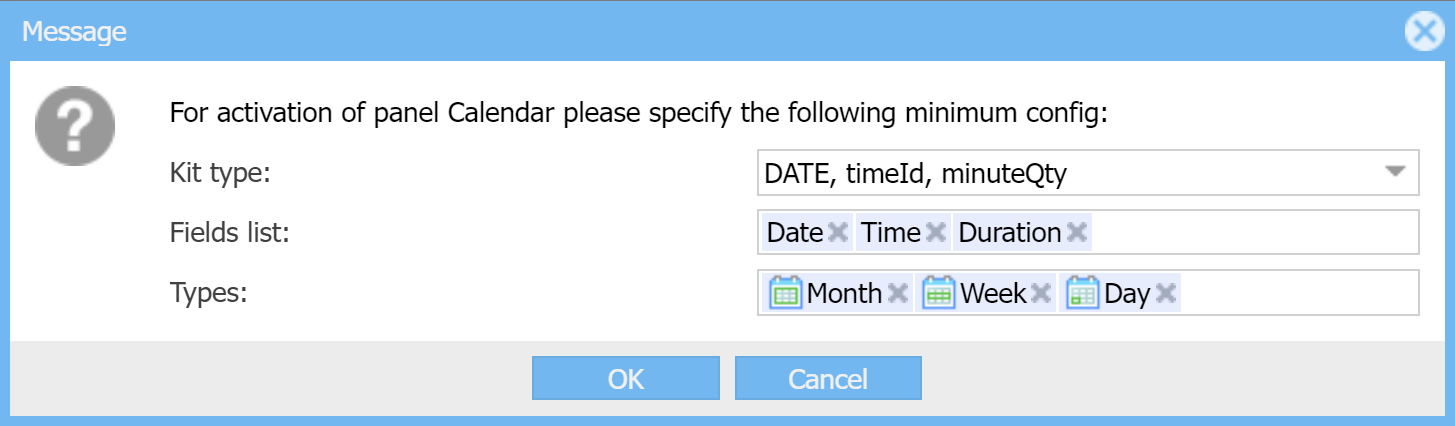
There are 3 types of calendar panels possible - Month, Week and Day calendars, but two latter ones are applicable only when your kit type has Duration measured in minutes, because the main idea of those types of calendar panels is that records in there are represented as blocks having heights reflecting their (possibly different) durations on the intraday timespace.
Keep in mind that Indi Engine so far does not auto exclude/disable:
- Options in Fields list that do not match the selected Kit type, so if you select wrong fields it will cause errors.
- Options in Types that do not match the selected Kit type, but it will not cause errors as this is additionally checked internally
Drag and drop is enabled in all types of calendars, so you can change Date of a certain record in month-calendar by dragging that record from one day to another within a month, and you can change Date and/or Time in Week and Day calendars by dragging that record within a week and/or day. Also, you can resize a record in Week and Day calendars to change the Duration of that record.
As you could see in the kits list table, for the first 5 kits only month-calendar is applicable, because those kit types either do not have Duration, or have but its measured in days rather than minutes so that is not applicable for Week and Day calendars as each record there would always be shown having 100% height of the Week and Day calendars intraday timespace.
If you are using kit type where Day calendar is applicable, and is enabled by you, then you can also enable grouping via Grid ↴ Group by-field, and in that case the records (events) in your Day calendar will be grouped by the field you've specified there. This might be useful in case when, for example, your app is designed to handle multiple offices (which is not the case for our sample app) each controlled by a user having Office admin-role and each having multiple rooms for lessons, and you want Lesson-records to be grouped by the rooms they're scheduled in, so that Day calendar will become something similar to kanban board where you'll be able to drag records for changing their rooms, if needed.
However, keep in mind that you will highly likely have to create a separate Lessons-section (having different/unique value of Alias-field, i.e. Alias = officeLessons) for this and enable such a grouping there, as it won't be useful for non-Office admin-users, because rooms of all offices will be shown to them as not filtered by specific office, and it won't be clear what office each room is at.
⛭ Event timeId
If you are using kit type having timeId, its assumed to be a Time-field (i.e. field having Title = Time) within your data-source entity (you can see it's mentioned on the prompt screenshot above) and is required to have the following details:
- Alias = timeId
- Foreign keys ↴ Store keys = Yes, single-value
- Foreign keys ↴ Which entity keys = Possible time
- Foreign keys ↴ ON DELETE = RESTRICT
- Display ↴ Element = Combo
- MySQL-column ↴ Type = INT(11)
As you can see, this field is required to be a single-value foreign key field of MySQL datatype INT, pointing to Possible time-entity, which belong to System fraction and contains Possible time-records for hh:mm values starting from 00:00 and ending at 23:45 with a 15 minutes step, and this is done that way to make event's time to be selectable from the list of values rather than typing that time manually when creating/editing the record (i.e. event), and this helps in overlap protection as Possible time-records available in the Time-field combobox dropdown can be made disabled when causing overlap.
`id` | `title` |
1 | 00:00 |
2 | 00:15 |
.. | .. |
95 | 23:30 |
96 | 23:45 |
⛭ Event duration
If you are using calendar fields kit type having dayQty or minuteQty for Duration, then your data-source entity is required to have Duration-field, which is in its turn required to have Alias = duration, Display ↴ Element = Number and MySQL-column ↴ Type = INT(11), because Indi Engine rely on that while validating your records (i.e. events) both on attempt to insert/update and on attempt to make draft changes (i.e. changes that are not saved so far) so that overlap protection inform you about the overlapping in advance
⛭ Overlap protection
Overlap protection is only applicable for calendars fields kit types containing duration, and those are:
- DATE, dayQty
- TIMESTAMP, minuteQty
- DATE, TIME, minuteQty
- DATE, timeId, minuteQty
- DATE, hh:mm-hh:mm
To enable overlap protection, you have to choose one or more foreign-key fields in Calendar fields ↴ Prevent overlap for. For example, in our sample app, this make sense to set the following value for this field for Lesson-entity:
- Calendar fields ↴ Prevent overlap for = Teacher, Student
This means that Indi Engine won’t allow you to neither create new nor modify existing Lesson-records if this would lead to conflict/overlap for the involved teacher and/or student, and therefore Indi Engine will fade down the areas in the calendar to prevent you from dragging/resizing the record into those areas in case if this would lead to overlapping.
<тут воткнуть скриншот где показано как фэйдятся области в недельном календаре>
Also, overlap protection works not only in calendar-panel, but in the Details-window and Create new-window as well, so Indi Engine won't allow you to specify the details for a record if those details will result in overlapping with other record(s). Field timeId from calendar fields kit type "DATE, timeId, minuteQty" is assumed to be field having Element = Combo because in that case Indi Engine is able to disable some values (i.e. choices) there, so they will be unavailable for selection when leading to overlapping with other records.
<тут воткнуть скриншот как какое-то время задизаблено>
▶ Actions
Configuration » Sections » Some section » Actions-section is using Action in the section-entity as the data-source, and it's there to give you the ability to define what actions are available in a certain section and for which users, so it's a crucial part of the access system, previously described in this chapter.
It's worth to mention that Indi Engine also has Configuration » Actions-section which is using Action-entity as the data-source, and it is a list of all possible actions that can be used across the entire app, i.e. Index, Detail, Save, Delete, Export, and others, so technically, each Action in the section-record serves as an association between certain Section-record and certain Action-record. Sometimes it may be useful to turn on/off that association, so there is Toggle-field for that.
⛭ Access roles
Each Action in the section-record has Access ↴ Roles-field, which is a combobox where you can choose the user roles that this action should be accessible for, which means the corresponding action button will be shown in the master toolbar of rowset-panels (i.e. Grid, Gallery, Calendar panels) and row-panel (i.e. Form panel) in this section, and the request to the corresponding URI will not be rejected.
Keep in mind that the action button itself is just a way to represent the action in the UI, but under the hood XHR-request is started when the button is clicked. For example, when you open Students-section, select some student and press Delete-button - Indi Engine makes a request to /students/delete/id/XXX/, and the access check is done during processing of such a request.
Another important point - is about Index-action, as it serves as a permission to open rowset-panel of a given section, so if there is no such action in given section - this section won't be shown anywhere: neither in the left menu, nor among the nested section-buttons in the master toolbars, if this section is a sub-section for some other section.
For example, if you don't assign an Index-action for Students-section, that section won't even be shown in the left menu, so this means you won't be able to get the list of students. However, you'll still be able to do other actions, but in most cases you'll have to do that via javascript console rather than via Indi Engine interface, for example using Indi.load() method
> Indi.load('/students/form/id/xxx/');
⛭ For owners - only owned records
By default, record ownership is not taken into consideration by the access system, but you can change this behaviour independently for each specific Action in the section-record, by using two special fields, and first one is For owners – only owned records-field which has the following possible enumerated values:
- No
- Yes, for all owner roles
- Yes, for certain owner roles
If the last value is selected then it's possible to define those 'certain owner' roles via For which certain owner roles-field, and yeah that's the second of those special fields. Please see this chapter as the whole ownership concept is explained there with examples.
⛭ Override batch-selection mode
Batch-selection mode is supported for only 7 of tens of actions on global level (i.e. Action-records), but is enabled by default only for 6 of those 7: Details, Move up, Move down, Toggle, Export and Copy, and the only action for which it's not by default enabled despite supported - is Delete-action, because it's a possibly destructive action which should be carefully used to prevent occasional unwanted deletions.
However, you can override that on section level if need, because each Action in the section-record have Override batch-selection mode-field which is a radio field with the following choices available:
- No, use default batch-selection mode
This is the default choice and in most cases you won't need to change that, unless you have the cases similar to explained below
- Yes, enable batch-selection for this section
This might be useful for Delete-action in some sections where you think default deletion of records one by one is annoying
- Yes, disable batch-selection for this section
You might want this if you, let’s say, have Export-action in some section where you created your own implementation of that action in the source code, but this implementation either does not assume or does not have batch-selection support so far.
For example, this is the case for Copy-action, because both the action itself and batch-support for it is implemented only for Sections-section to make it possible to copy data-views definitions to the different positions within the hierarchy, but if you add this action to some other section - it won't work there at all until you code that.
- Yes, enable, but process one record per request
This works as a sequence of synchronous (via async/await) XHR requests, where request for the next record within selection is started only after the request for the previous one got the response. This can be useful if you need action execution for an individual record (among selected ones) to be inside a request that is isolated from other records, for example when action execution takes significant time so that request timeout can happen on browser-side or server-side, so with using this approach you can split a single long request that process all selected records at once - into a sequence of shorter requests each processing a single record. In most cases you might need this only when some 3rd-party services are integrated, for example there was a use case where there was a special implementation of Confirm-action in Payments-section, so that it was possible to select multiple Payment-records and send info about each one to the government tax authorities system, but this goes out of zero-code docs scope.
Basically, in most cases you won't need to override batch-selection mode for any action, because if you make batch-selection to be enabled in some section for some action that Indi Engine does not support that out of the box - you will have to implement that support by coding on your own. Let's imagine we want to create custom implementation for Confirm-action we've added in Payments-section:
- Go to Configuration » Sections-section
- Find and make selected the record that represents Payments-section
- Do Create PHP-controller file-action for the selected record by clicking the corresponding button in the master toolbar
- Open
application/controllers/admin/PaymentsController.phpfile in your IDE (i.e. PHPStorm or other) - Append the following code inside
Admin_PaymentsControllerclass defined in that file:
public function confirmAction() {
// do something with the first or single selected row
echo t()->row->id;
// do something here for each selected row
foreach (t()->rows as $row) {
echo $row->id
}
}
However, this goes out of zero-code docs scope, so won't be much explained here.
⛭ South tabs display mode
South tabs are another type of UI containers where rowset-panels (i.e. grids, galleries, calendars) can be rendered into. For sure, windows are the primary container type, but still there might be the cases where south tabs can be used instead or in addition to windows. However, south tabs can only be enabled for Details-actions.
South tabs for Details-actions can be useful when your current section has subsections so you want their views (e.g rowset-panels) to be rendered in addition to row-panel - as tabs under that row-panel, but still within the same Details-window, so there is no need to open any of those subsections in separate windows because now there are tabs right here for each.
For example, in our sample app we have Database » Students » Some student » Payments-section and Database » Students » Some student » Lessons-section, so if you set South tabs display mode = Display for Details-action in Students-section and then open Database » Students » Some student » Details-window - this window will have Payments and Lessons tabs under the student details, and those tabs will show payments grid and lessons grid, respectively, or whatever rowset-panel types you enable for those subsections.
<тут воткнуть скриншот как это выглядит>
South tabs presence is controlled by South tabs display mode-field which is a combobox field with the following choices available:
- Auto
South tabs will be displayed if there are less than 10 fields shown in Details-panel, because if so - this will mean Details-panel's height usage is not that much, i.e. there is still enough vertical space for south tab(s) to be added under that Details-panel with no vertical scroller needed. For example, if you have Dictionaries » Countries » United Kingdom » Cities-section and you opened Dictionaries » Countries » United Kingdom » Details-window, then you'll have Cities-tab displayed under that Country-record's Details-panel, assuming this panel has just 1 field: Title = United Kingdom.
- Display
South tabs will be displayed anyway, i.e. no matter how many fields are shown in the Details-panel. If there are too many fields - vertical scrollbar will appear then to handle that. This might be useful when you want to have as much as possible about a certain record within a single Details-window (it’s shown how this looks on the screenshot above).
- Do not display
South tabs are disabled, so won't be displayed. This can be useful when you want to keep things simple and not to overcomplicate the UI in some specific sections
⛭ Rename
There is also Rename-field available, so you can set up a different foreground name (i.e. Title) for this action to be applied in that specific section only. This might be useful for cases when you want the action title to be more self-explaining than the original one. For example, if you've added Notify-action for Lessons-section, you may want to rename it to be Notify student instead.
▶ Grid columns
Configuration » Sections » Some section » Grid columns-section is using Grid column-entity as the data-source, and it's there to give you the ability to define the look and feel of the data shown in rowset-panels (Grids, Calleries, Calendars) of a certain section, i.e. you can select the exact fields among the ones existing in the data-source entity (and also the ones existing in the entities referenced by foreign keys, i.e. JOINed fields) to be shown per each type of rowset-panel you've enabled.
Technically, any Grid column-record by itself is an indication that data coming from a certain field is shown in the rowset-panel of a certain section. It's called Grid column instead of Data view column or View column or whatever else just because Grid-panel is the mostly used type of rowset-panel, compared to Gallery-panel and Calendar-panel.
⛭ Data-source field
In most cases, data source for a grid column can be defined by the Field-field, where you can choose the underlying field for a certain grid column. For example, in our sample app there is Database » Lessons-section with a grid of all lessons, and you may want values of Profit-field to be shown for each lesson as a column in that grid. Also, you may want to add Teacher and Student fields to be shown as columns in that grid as well, in addition to lesson Date, Time and Duration.
⛭ Further / JOINed field
It is also possible to add fields that do not directly belong to the current data-source entity, but are, however, reachable via foreign keys, and in that case you have to select that foreign key field in Data-source field-field and then select the final field in Further / JOINed field-field.
For example, you have a Student-entity which has a Phone-field, and you want students' phones to be also shown in the Lessons-section grid. This Phone-field does not belong to Lesson-entity, but is reachable via Student-field which is a foreign key field, so you can make students phones to be shown by adding new Grid column-record having the following details:
- Section = Lessons
- Data-source field = Student
- Further / JOINed field = Phone
For sure, you can add teachers' phones in the grid as well, and any other fields reachable via foreign keys.
Columns added into the grid using that way will appear with a little bit faded background (both for header cell and value cells) to visually indicate that they are from different data-source entities. Under the hood, native SQL JOIN feature is not used while fetching the data for those columns, because it's a well-known expensive operation to do this that way on big tables, so in Indi Engine the data for such columns is fetched afterwards - only for the foreign keys values available on the current page of results having 25 records by default, instead of doing that for all records in the table when using SQL JOIN. However, this makes such columns not sortable in the grid, but that's not a big price for performance improvement it gives. So, using 'JOINed' wording in the field title is just for making it clearer what this is for fetching data from a different database table than the one used as data-source for the current section.
<тут воткнуть скриншот как это выглядит в гриде Lessons>
⛭ Parent column
This field is used to make your grid to have multi-level column headings, and to achieve that you must select some other already existing grid column to be the parent for one you want to be the child. You can organise your headings into as many levels as you want, but in most cases you won't need more than 3 levels.
Any parent column is always acting as the group of its child columns, and it does not have its own data, so the only data that is shown in a group - is the data of child columns, except the childs having their own childs. At the same time, any grid column (incl. the one used as parent) requires a data-source field, and this means you have to create that field in your entity for that purpose, but such a field should not have its own data in the database, i.e. there will be a valid Field-record in your entity, but there will be no corresponding column in the structure of the underlying database table, and this can be achieved by setting up Display ↴ Element = Field group in such field details.
For example, let's imagine you have Students-section and you want to organise the multi-level column headings there as shown below:
ID | Name | Signup | Attendance | ||||
Date | Contact details | Lessons | Total qty | ||||
Phone | First | Last | |||||
1 | Bart Simpson | 2024-10-20 | bart@simpsons.com | +1 234 234 3456 | 2024-10-20 | 2024-10-25 | 3 |
2 | Lisa Simpson | 2024-10-21 | lisa@simpsons.com | 2024-10-20 | 2024-10-23 | 2 | |
Before doing that, you'll have to create the following fields in the Student-entity: Signup, Contact details, Attendance, Lessons, but all of those should have the following details (assuming other ones you do already have in that entity due to they are real data fields):
- Mode = Hidden
- Display ↴ Element = Field group
After this, you'll have to go to Configuration » Sections » Students » Grid columns-section and create the Grid column-records via Create new-button in the order assuming parent ones are created before child ones, so while creating child ones it will be possible to select the parent ones from the list of already existing ones in Parent column-field's combobox.
As an alternative and much quicker approach you can press Create new-button once, select all 12 fields in Data-source field-field (yeah, it's possible because that field type is temporarily changed by Indi Engine from single-value to multi-value) and press Save-button once. As a result, you'll see that 12 records appeared in Configuration » Sections » Students » Grid columns-section, so the only remaining thing will be to organise them into a hierarchy using drag and drop, because it's supported there.
After this, you can goto Database » Students-section and check the column headings hierarchy you've organised, and you can amend it via drag'n dropping headings right there.
⛭ Show in
This is a group of fields that allows you to define the presence of a certain column's data in each kind of rowset-panel, separately. For example, if you have a Teachers-section, you can make all possible columns to be shown in the grid, but only Title, Email and Phone - in the gallery.
Keep in mind that the order in which data from different columns is shown - is the same as the order of records in Configuration » Sections » Some section » Grid columns-section i.e. it is shared across all kinds of rowset panels. For example, if Email comes after Title - it will be that way in both (grid and gallery) panels.
However, you can achieve another order if you create additional Grid column-record having the same data-source field, so that you can make the original one to be shown only in grid, and the additional one - shown only in gallery. For example, you can have those 4 Grid column-records where 1st and 3rd ones are using same data-source field, so that grid will have this order of columns: Title, Email, Phone, but the gallery will have another order: Email, Title, Phone:
- Title - shown in grid only
- Email - shown everywhere
- Title - shown in calendar only
- Phone - shown everywhere
This approach will not only give you the ability to achieve the different order for different rowset panels, but also different styling, rendering and other settings.
⛭ Grid
Each Grid column-record has Show in ↴ Grid-field where you can define the way of presence within the grid, and there are the following choices available:
- Turned on
Data is shown in the visible column in the grid, and this is the most widely used and default choice.
- Hidden
Data is shown in the grid column, but that column itself is hidden. However, you can make that column to be visible via any other column’s menu, but this would be a temporary visibility change and it won't be preserved on reload of Index-window where this grid is rendered. Hidden columns are useful in cases when you don't want those columns to be visible in the grid, but you still need data for those columns to be fetched on server-side and available on browser-side, for example when you rely on values from those columns in some other columns values/tooltips templates, or when you need those columns to be hidden by default but shown when some button is clicked.
- Hidden, but shown in row expander
This is similar to the previous choice, except that the value from such a column is additionally shown in the row expander, which is enabled when at least one column is configured to be shown this way. This is useful in cases when you want the data to be still visible in the grid but not as a grid column because of too long text expected to be there for the grid to stay handy (or because of whatever reason).
For example, in our sample app there is Students-section with Personal details-column set up as a parent column for Birth date, Gender and Country columns, and you can make all of them to be visible in a row expander instead of visible as a column.
<тут воткнуть скриншот>
- Turned off
When this choice is active, the column is completely unavailable at both browser-side and server-side, so there is nothing to make visible via other columns menu or rely on it in value/tooltip templates for other columns. This choice might be useful in cases when you don't need some column to be in the grid anymore, but you're not sure at the moment about whether you'll need it in future, so you decided to exclude it from the grid for now, instead of deleting it.
⛭ Calendar
This is represented by Show in ↴ Calendar-field and it's a combobox having only two choices - Turned off (default) and Turned on.
Current implementation of all kinds of calendar panels (Month, Week and Day) supports just a single way of showing values - all inside a record/event block in the calendar, so the only question here is which columns you need the data to be shown from. For example, if you enabled the calendar for Lessons-section, you may want data from Student, Teacher and Course columns to be shown for each record/event in the calendar.
Also, you can still use values and/or tooltips templates to achieve the needed contents.
⛭ Gallery
Each Grid column-record has also Show in ↴ Gallery-field where you can define the way of presence within the gallery, and there are the following choices available:
- Turned off
By default, once you enable the gallery-panel for some section - images thumbnails will be shown there, but no data for any specific column is additionally shown for each thumbnail, so this is the default choice until you explicitly change it for the columns you need to be shown.
- Text under image
This choice is best suitable for short text values up to ~100 characters, because horizontally visible space for values shown this way is limited to thumbnail width, so the overflowing text is clipped but is scrolled on mouse hover, but this is not really usable for longer texts as those will be scrolled too fast on hover so won’t be recognizable, and therefore it's better to use this choice for titles, emails, etc.
For icon-headed columns (which might be the case for emails, phones), it's better to use Box under image or Box at the right, see below.
- Box under image
This choice is best suitable either for icon-headed columns or columns data-sourced by a single-value foreign key fields having enumerated values styled using icons or color-boxes:
- If you enable this choice for an icon-headed column, then a corresponding icon will appear under the thumbnail image and the column’s value will be shown as a tooltip for that icon on mouse hover.
- If you enable this choice for the column data-sourced by a foreign-key field of a kind mentioned above - the result will be the same except that the icons (or color boxes) will be different for different values.
For example, on our sample app there is Teachers-section with gallery-panel enabled, and a columns data-sourced by WhatsApp, Telegram and Viber fields each having 1 of 2 enumerated values styled by icons - and you can see whether a specific teacher has a specific messenger - under the image thumbnail, i.e.


- Box at the right
This choice is an alternative for the previous one, except that the icons and/or color-boxes will be shown on a faded background at the right side of the thumbnail. Keep in mind that this looks good for color-boxes, but might not look good enough for icons as it depends on the individual icon’s canvas background color and opacity defined in the icon file itself.
For example, on our sample app there is Teachers-section with gallery-panel enabled, and a column data-sourced by Toggle-field having
___ Pending, ___ Turned on or ___ Turned off as values - and you can see the value per teacher at the right side within the teacher’s thumbnail.
In general, it's not recommended to use each of the above choices for more than 5 columns to prevent gallery visual overcomplication.
<тут воткнуть гифку где галерея переключается на грид>
⛭ Header
It's a group of fields that control the appearance of the column header. See below which appearance settings are supported.
⛭ Locked / Normal
This is represented by Header ↴ Group-field where the following choices are available:
- Locked
This can be useful when all of the following conditions are in place:
- Your grid is wider than your screen, so that horizontal scrollbar appears, but you don't want some columns at the left side to be scrolled out of viewport when you scroll the grid to the right side
- You just want to visually divide the grid into left and right sides using tiny sexy vertical line
So, if you use this choice for some columns - those will be locked at the left side of the grid and won't be affected by horizontal scrolling, if any. When this choice is used for at least one column - the vertical line appears between locked and normal sides of the grid to help for visual distinction between the sides.
- Normal
This is the default choice, because grids are in most cases not enough big to have locked columns from the very beginning of grid creation, and also because grids can consist of normal columns only, but can not consist of locked columns only which would be the case when using Locked as a default choice.
In general this works in the same way as in Excel, but it's called Freeze there.
⛭ Icon
This field is a combobox-field where you can choose some icon to be shown inside the column header cell instead of column title, so the column title itself will then appear in the tooltip shown on the icon mouse hover. If you do that, this column will have a compact fixed width of 30 pixels, and all the actual values in that column will be shown as the same icon, so the presence of an icon in a specific row would mean non-empty value for that column in that row, and the value itself can be shown on icon mouse hover in the value cells.
This is useful for cases when you want to reduce the usage of horizontal space required by some columns in the grid.
For example, in our sample app there is Teachers-section with Youtube introduction video link-column having a header cell styled with icon, so the link itself is shown only on mouse hover on the same icon within a value cell, unless no value for that field is specified for a specific teacher.

<тут воткнуть гифку как мышь наводится на заголовок столбца, потом на ячейку где есть ссылка youtube>
Keep in mind that if you set up an icon-heading for a column having data-source field as enumerated values foreign key field - the column values will not be replaced with that icon, but instead - will be shown either as plain text (clipped by column 30px width and shown in full on value cell mouse hover), or as icon / color-box if set up for a specific enumerated value.
Currently, there are 150+ different icons available (see those in custom/public/vendor/indi-engine/client/resources/images/icons), but you can add your own ones by putting them into custom/public/i/admin/icons directory, which should be created by you as it does not initially exist. See here how to configure the list of directories to be scanned for icons.
<тут воткнуть скриншот на котором показан выпадающий список иконок в форме редактирования столбца>
You should be aware that in most cases you will have to preliminary edit the icon file using Adobe Photoshop or some other tool, because it's highly likely that the icon file that you've obtained somewhere will have the background color, aspect ratio or position within its own canvas that make it look quite imperfect when within the column header cell.
If the icon you want to use is in SVG-format, then you'll have to convert it to PNG-format, as otherwise you'll have to deep dive into how SVG format works to be able to get a clue on how to solve the imperfect things by direct changes in the SVG-code. Also, keep in mind that bigger icons are scaled by the browser to fit the header cell dimensions while keeping the original aspect ratio, but are not scaled by Excel when the grid is exported as an Excel-spreadsheet.
Also, while trying to reach the perfect look within the header cell, it's recommended to use incremental naming of icon files for each attempt, i.e. some-icon-1.png, some-icon-2.png, etc, as otherwise they will be cached by the browser so you'll be annoyed to often see the outdated version(s) of that icon unless you keep your browser's DeveloperTools panel opened and check the Disable cache checkbox.
Unfortunately, it is not possible to set up Font Awesome icons at the moment, but it is on the roadmap.
⛭ Rename
By default, columns headers titles are set up to be equal to their data-source fields titles, but for some columns you might want to use the alternative titles (with possibly keeping the initial ones in the tooltips), and that is why Header ↴ Rename-field is here.
Renaming can be useful for columns that are data-sourced from numeric fields, because values in such columns do not need too much horizontal space, so that shorter header title would make column horizontal space consumption (calculated as maximum among header width and values width) more efficient.
For example, in our sample app we have Students-section with a grid column data-sourced by Attendance ↴ Presences qty-field and showing quantity of attended lessons per student, but the column itself renamed to just PQ (i.e. abbreviation). In this case, that column’s original title auto-appears as a tooltip shown on column header mouse hover, and here is why.
Also, renaming columns can be useful when you're creating multi-level column headings out of a lesser/single-level headings. For example, if you have Students-section with the Date of first lesson-column and Date of last lesson-column, you can reorganize those columns by renaming them to First and Last, respectively, and then grouping them under Lesson dates-column, that should be specially created for that purpose.
ID | Name | Date of first lesson | Date of last lesson |
1 | Bart Simpson | 2024-10-20 | 2024-10-25 |
2 | Lisa Simpson | 2024-10-20 | 2024-10-23 |
ID | Name | Lessons dates | |
First | Last | ||
1 | Bart Simpson | 2024-10-20 | 2024-10-25 |
2 | Lisa Simpson | 2024-10-20 | 2024-10-23 |
⛭ Tooltip
By default, the column's header tooltip is empty and its data-source field’s tooltip is shown instead, but for some columns you might want to override that.
Column’s header tooltip by itself is used to clarify/explain the meaning, logic and/or purpose of that column, and in most cases there is no need to override the tooltip when it's set for the column's data-source field. At the same time, there are lots of cases when tooltip is needed to be shown for a column, but is not needed to be shown for its data-source field in the any given record's Details-window, and this is the most typical use case for Header ↴ Tooltip-field, as it allows to set up the column-level tooltip while keeping its field-level tooltip empty.
For example, you can take a look at the 2nd table shown in the previous chapter where multi-level column headings structure is represented: there are First and Last columns, and let's imagine you want to set up Date of first lesson and Date of last lesson as their tooltips, respectively. If so, you have the following ways to go:
- You can set those tooltips for the corresponding data-source fields, but in that case the tooltips of those fields will be equal to their titles, which may annoy users who will open any Student-record's Details-window and will see those fields having tooltips duplicating titles.
- You can re-phrase tooltips to be different than their fields titles, i.e. First lesson date and Last lesson date - but it will still make no sense, because the titles of those fields are already self-explaining enough, so there is no need for tooltips for those fields to be shown in any Student-record's Details-window, at all.
- You can set those tooltips for the columns themselves rather than for columns' data-source fields, and it is much better because those tooltips won't be shown in any Student-record's Details-window, as there are fields having titles that are self-explaining enough.
Also, Indi Engine can automatically use data-source field's title as a column's tooltip, but for this to work all of the following conditions should be met:
- Tooltip is empty both for the column itself and for its data-source field
- Column is renamed, but the new title is shorter than 30% of original title length, measured in characters. For example, it will work that way if we rename Presences qty-column into PQ, as 2 / 13 = 0,153 = ~15%
For sure, you can also set up bigger texts for tooltips, but keep in mind that the maximum tooltip width is 400px, which means bigger texts will appear as multi-line tooltips, and it's recommended to not use more than 6 lines of text, which approximately equals to 450 characters.
⛭ Value
This is a group of fields where you can make values to be editable right within the grid cells (i.e. with no need to open Details-window for a specific record), and make those values and/or their tooltips to be optionally composed from themselves and/or from the values picked from other columns of the same record.
⛭ Editable cells
Indi Engine has two ways of how values can be edited straight within the grid cells:
- First one is cycling-by-clicking and is only applicable for columns data-sourced by single-value foreign-key fields having enumerated values styled with icons or color-boxes, because each enumerated value by itself has a certain order of appearance among the others, so when you click on value's icon or color-box within the grid cell - this value is replaced with the next one among enumerated, if exists, or first one, so that you can cycle through all the possible values by clicking on each of them.
For example, you have a Courses-section grid with Toggle-column data-sourced by Toggle-field having ___ Turned on
and ___ Turned off as enumerated values styled with color-boxes, and this means you can turn on/off any course in the grid just by clicking on the color-box in this column. This can be useful if you rely on this on/off state somewhere else, for example in Teacher-entity's Courses-field - for grouping courses in the dropdown by their on/off state, or for filtering out the ones that are turned off.
<тут воткнуть гифку из раздела Courses где тыкается toggle>
Cycling-by-clicking is just working in any column where it's applicable, so you don't need to explicitly enable that, unless you've previously explicitly disabled that.
- Second one is cell-editor and it's applicable for columns data-sourced by all kinds of fields except Fields group and File-upload panel. When cell-editor is enabled for a column, it means a special editor component will be shown having size and position to visually cover the entire cell, but the component itself might be different for different columns - depending on the column data type. For example, combobox is used as a cell-editor component for columns data-sourced by foreign key fields, textfield - is for single-line text fields, numberfield - is for numeric fields and so on. When the cell-editor is enabled for a certain column - it's indicated by the blue color of that column's header title.
If you want to start editing a specific cell in a column having cell-editor enabled - you must do that by second click on that cell. This is a synthetic event introduced in Indi Engine especially for triggering the cell-editor components on cells, and this works in a way that assumes that the first click - is for adding a blue dotted border around the cell to indicate that the second click will activate the editor component there.
Second click event is used in Indi Engine for triggering the cell-editor component on a cell because other events are already in use:
- Single click is already in use for selecting a specific record, i.e. when you click on a record - it becomes selected; if you then do CTRL+Click or SHIFT+Click - this may increase or reduce the number of selected records
- Double click is already in use for opening Details-window of a record.
Despite there are two ways of cell editing - both are controlled via the single Value ↴ Cell-editor-field, which is a combobox with the following choices available:
- Turned off
With this choice, cycling-by-clicking is still enabled for all columns where applicable, but at the same time, cell-editor makes sense only for certain columns that you explicitly choose rather than for all columns you have in the grid, and this is the reason why Turned off-choice is the default one. Also, this choice can be useful in cases when you want to force users to open Details-window of a certain record to edit some field for that record, i.e. you don't want that field to be changeable too easily, so you want to reduce the probability of accidental change.
- Example 1: you have a Teachers-section with Email-column there, and you want teacher email to be editable only in the Teacher-record Details-window, as an accidental typo in the email will lead to that teacher not being able neither to log in nor to receive emails (if any) from Indi Engine app anymore.
- Example 2: you have a Payments-section with Amount-column there, and, again, you don't want payment amount to be accidentally changed right within the grid, but only via Details-window instead
- Turned on
You can use this choice when you think cell editing will be useful for a certain column.
For example, if you have Payments-section with Note-column there - you can enable cell editing for values in this column to be easily editable right within the grid. Or, if you have Teachers-section with Courses-column - you can enable cell editing here as well, so that it will be possible to change the courses list for a certain teacher via the combobox component shown in the cell.
- Turned off, including enum-values cycling-by-clicking
This choice is only applicable for columns data-sourced by foreign-key fields having enumerated values styled with icons or color-boxes, and it is here for cases when you want to not only disable cell-editor for a column, but disable cycling-by-clicking there as well. This might be useful if your app logic needs some more field(s) to be changed in addition to the current one, i.e. you don't want this field to be solely changed, which is the case for any kind of cell editing, as only a certain single cell can be edited at a time.
For example, let's imagine you have Students-section with the following columns:
- Social platform-column, data-sourced by Signup ↴ Social platform-field having Google and Facebook as enumerated values styled with those platforms icons
- Social user ID-column, data-sourced by Signup ↴ Social user ID-field represented by a simple textfield where user ID for the selected social platform can be stored
So, in this scenario, it should not be possible to solely change social platform neither by cell-editor, nor by cycling-by-clicking (i.e. clicking on the social platforms icons in the grid column), as the ID should be changed as well to match newly selected social platform, but this is not possible neither via cell-editor nor via cycling-by-clicking, because both are intended to change just one certain single cell at a time.
Keep in mind that all of the above ways of cell editing are only possible when all of the below requirements are met:
- Save-action must exist in the current section and must be accessible for the current user
- Field, that is used as a data-source for the column - should not have Mode = Readonly or Mode = Hidden:
- Neither in Data-source entity of the current section
- Nor in Adjusted fields for the current section
⛭ Composable cells and tooltips
In Indi Engine it's possible to make cell values and/or their tooltips to be composed from themselves and/or from the values of others cells of the same record, and that is why each Grid column-record has Value ↴ Value template and Value ↴ Tooltip template fields, so that you can define there a templates to be used to render cell value and/or its tooltip.
Template itself is a single-line text string with the support of some basic syntax that allows to setup the following things:
⛭ Columns and delimiters
If you want some column to be used within the value/tooltip template of some other column - you must add the corresponding Grid column-record for the used column (if not already added) in your grid, and in most cases you'll have to set up Show in ↴ Grid = Hidden for the used one, because the definition and data for the used one is still needed to be available in the grid, but it should be hidden, as otherwise the data for used column will be shown both inside its own separate UI-column and inside the value/tooltip of the other column, which would be just a visual data duplication that makes no sense.
If you want to include some columns into a template - you must specify their data-source fields aliases enclosed into curly brackets, i.e. {someField1}, as otherwise Indi Engine won't recognize them within a template. For sure, you can specify multiple aliases within a shared and/or separate pairs of curly brackets, i.e. {someField1 - someField2} / {someField3}{: someField4}, but the important point here is that everything between a certain single pair of curly brackets - is only shown if values for all of the fields specified within that pair - are not empty.
In the above example template, all character sequences other than fields aliases and curly brackets - are called delimiters, i.e. some punctuation and/or other characters (and even words/phrases) that you might want to use to visually separate the values with, as otherwise the values will be rendered with no any visual spacing in between, so from the user perspective it will be hard to distinguish between the values of different fields within the cell value rendered based on such a template.
In the above example template delimiters are:
-(whitespace dash whitespace) between someField1 and someField2 - is only shown if all of the values for both someField1 and someField2 are not empty, because this delimiter is within a pair of curly brackets having those fields specified inside./(whitespace slash whitespace) between someField2 and someField3 - is always shown, and it does not depend on the emptiness of any field, because this delimiter is not within any pair of curly brackets:(colon whitespace) between someField3 and someField4 - is only shown if value for someField4 is not empty
For example, in our sample app we have Database » Students » Some student » Payments-section grid with Title-column having {datetime - amount USD} / {paymentMethodId}{: note} as the value template, so the rendered value in that column will be like:
- 2025-02-09 05:44 - 150 USD / Bank card: debt for last 2 lessons - if value for Note-field is debt for last 2 lessons
- 2025-08-30 08:07 - 200 USD / Stripe - if value for Note-field is empty
This template relies on that any Payment-record always has non-empty values for datetime, amount and paymentMethodId fields, as otherwise the rendered value will be just / i.e. will consist of the only delimiter that does not depend on either field emptiness.
<тут воткнуть скриншот как это выглядит в гриде>
Where can you see the alias of a specific data-source field for a certain column you want to use in a template? You can discover that alias in a tooltip shown for each cell in Properties ↴ Data-source ↴ FIeld-column in Grid columns-section grid, so you can see there aliases for columns data-sourced not only by ordinary fields, but data-sourced by Further / JOINed fields as well (see next paragraph for more details).
For example, if you have Lessons-section grid with Student-column (turned on) and Age-column (hidden), you can go to
Configuration » Sections » Lessons » Grid columns-section grid and in the Properties ↴ Data-source ↴ FIeld-column you will see:
- Alias: studentId as a tooltip shown on mouse hover for Student
- Alias: studentId_age as a tooltip shown on mouse hover for Age
<тут воткнуть гифку где показаны алиасы>
⛭ Using Further / JOINed columns
If your grid have at least one Further / JOINed column, and you want to specify it within a template - you should use this syntax for that: {someForeignKeyField1_someFurtherField1}, i.e. the _ (underscore) character is used to distinguish between the alias of the joined field itself and the foreign key field it's joined from, because there might be multiple columns data-sourced by different Further / JOINed-fields coming from however same foreign key field.
For example, if you have Lessons-section grid with Student-column having {studentId}{, studentId_age}{ / studentId_email} as the value template, the rendered value in that column will be like:
- Bart Simpson, 36 / bart@simpsons.com - if values for Age and Email fields are 36 and bart@simpsons.com, respectively
- Bart Simpson - if value for Age and Email fields are empty
This template relies on that any Lesson-record certainly has non-empty value for studentId field, but age and email might be unspecified in the student details.
<тут воткнуть скриншот как это выглядит в гриде>
⛭ Using fields titles
In some cases, you might need fields titles to be also shown - as prefixes for fields values, and if so - you must uppercase the first char of field alias, i.e. {SomeField1} rather than {someField1}, but keep in mind that showing fields' titles for each grid column cell might be visually annoying for the users, so in most cases you might want to use that in tooltip templates rather than in value templates, because tooltips are working in a way that assumes that only some single tooltip is shown at an any given point of time, so this will not annoy the users.
For example, if you have Lessons-section grid with Student-column having {studentId}{, studentId_age} as the Value template, and having {StudentId_email}<br>{StudentId_phone} as the Tooltip template - the rendered value in that column will be like: Bart Simpson, 36, but if you hover the mouse on Bart Simpson you'll see the tooltip having the following contents:
Email: bart@simpsons.com Phone: 555-7334 |
Also, you can set up {StudentId_birthDate} as a tooltip template for the Age-column (i.e. the one identified as studentId_age), and if so - then the tooltip saying Birth date: 1956-05-12 will be shown on hover for 36 in the grid cell.
<тут воткнуть скриншот как это выглядит в гриде>
⛭ Using background values
Background values can be shown instead of (or in addition to) foreground values only for the columns that are data-sourced by foreign-key fields. In most cases this is useful when you want IDs to be shown for such columns, and if so - you must put $-character in front of foreign-key field alias within a template, i.e. {$someField1} rather than {someField1}
For example, if you have Lessons-section grid with Student-column having {studentId}{, ID: $studentId}{, StudentId_age} as the value template, the rendered value in that column will be like:
- Bart Simpson, ID: 1234, Age: 36 - if value for Age-field is 36
- Bart Simpson, ID: 1234 - if value for Age-field is empty/zero
<тут воткнуть скриншот как это выглядит в гриде>
The last thing about templates that worth to be mentioned is that color and navigation - if defined for the column - are still respected when this column is used in a template defined for another column, so you can compose bigger values out of smaller ones keeping rendering rules for smaller ones respected.
For example, if you have Lessons-section grid with Student-column having {studentId}{, studentId_age}{ / studentId_email} as the Value template, but at the same time you've set up green color for the values in Email-column - the rendered value in Student-column will be like: Bart Simpson, 10 / bart@simpsons.com
⛭ Sizing
Each Grid column-record has Features ↴ Sizing-field, which controls the width of the certain grid column, so it's applicable only for rowset panels of type Grid, and does not have any effect on rowset panels of types Gallery and Calendar. This field is a combobox with the following choices:
- Auto
This is the default value and in most cases you won't need to change this, as the logic behind this choice minds lots of things that may affect the column width usage and sizing, including appearance, contents and state of column header and values.
- Not less than cell contents
This choice can be useful in cases when you want contents of current column to be fully shown i.e. with no clipping via ellipsis, which may happen if your grid is wider than your screen so that auto-sizing mechanism reduces the width for the certain columns having flexible width, but you want to turn off such a width reduction for a specific column(s).
⛭ Summary
This feature is represented by Features ↴ Summary-field and allows to show something at the bottom of any grid column, so yes - it's applicable only for rowset panels of type Grid and do not take any effect for others. This field is titled as Summary just because in most cases it's used to show summary for the columns data-sourced by numeric fields, and it's a combobox with the following choices:
- None
Summary is not enabled for the column, and this is the default choice, so you have to explicitly decide for which columns it might be useful
- Summary
- Average
- Minimum
- Maximum
This choice as well as 3 choices above are self-explaining, but applicable only for columns data-sourced by numeric fields
In general, Minimum and Maximum choices could also be applicable for columns data-sourced by date and time fields, however it's not implemented at the moment, but it's on the roadmap.
⛭ Exclude from Excel-export
By default, when you export your grid as an Excel-spreadsheet - all columns that are visible in the grid are exported into Excel. But in some cases you might want to exclude some columns from being exported, and this is why each Grid column-record has Features ↴ Exclude from Excel-export-field, so that you can choose Yes in that field for the columns you don't want to be exported to Excel.
This might be useful for columns containing sensitive personal and/or commercial data that you don't want to be exportable. For example, if you have a Students-section grid with Email-column and/or Lessons-section grid with Self price, Sale price and Profit columns - you may want to prevent those columns from being exported to Excel.
⛭ Access roles
By default, any grid column in any rowset-panel type in any section - is accessible for any user who is able to open that rowset-panel, because such an ability means that the user has the role for which Index-action is accessible in that section, and in most cases this is how it should be.
However there might be cases when some fine-tuning of this behaviour is needed, and that is why each Grid column-record has Access-fieldgroup with the following fields:
- Roles-field having All and None as possible choices
- Except-field where you can invert the above defined behaviour for some specific roles you need
For example, if you have Lessons-section with Self price, Sale price and Profit columns, you can make:
- Self price-column to be inaccessible for Student-users, by setting up:
- Access ↴ Roles = All (this value is the default one, so you can just keep it as it is)
- Access ↴ Except = Student
- Sale price-column to be inaccessible for Teacher-users, by setting up:
- Access ↴ Roles = All (this value is the default one, so you can just keep it as it is)
- Access ↴ Except = Teacher
- Profit-column to be hidden for both, but all visible for Admin-users, by setting up:
- Access ↴ Roles = None
- Access ↴ Except = Admin
<тут воткнуть скриншот как это выглядит>
⛭ Color
This is a group of fields where you can set up the color to be applied to the data shown in the current column, and this is respected not only in the rowset-panel of type Grid, but in rowset-panels of types Gallery and Calendar as well. Setting up the color can be useful when you want to highlight some data to improve the visual distinction between the data shown in the same and/or different columns.
⛭ Grading by level
This feature is applicable only for columns data-sourced by numeric fields (i.e. fields having Display ↴ Element = Number, Price or Number .000), and in most cases it is used when there is a need to apply a visual distinction between the values that are above/below a certain level. By default, this level is 0 - so it means the positive values are green and negative values are red while 0 values are gray. To enable this feature you must set Color ↴ Grading by level = Turned on for your column.
For example, if you have Students-section grid with Balance-column showing the gap between the total sum of payments made by a certain student and the total cost of lessons already attended i.e. have to be paid by that student - then this gap can be positive if student has paid in advance, or negative if student attended some lessons but promised to pay later, and for those gap values you might want to apply the color grading so that negative gaps (i.e. debts) will have red color and positive gaps (i.e. reserves) will have green color.
In addition, you can enable the Summary feature for that column, and once you do that - the Summary feature will respect the color grading as well.
For example, if you set up Features ↴ Summary = Summary for the Balance-column in your Students-section - you will have the overall gap with the red or green color indicating it's a debt or reserve, respectively.
For sure, the default level (i.e. 0) can be overridden - by adding the Color grade-level param for your column's data-source numeric field. This can be useful in cases when you still need the color grading to be applied, but you want it to be based on a level other than 0, so that it will be usable for score or percentage values - to apply the visual distinction between the values that can be interpreted as normal or lower than normal based on the custom level. Read more here.
⛭ Manually defined
Column color can also be set up via Color ↴ Manually defined-field which is a color-picker where you can choose the color you need using your mouse, or set it up by its RGB code (e.g. #FF00FF) or html name supported by modern browsers (e.g. "magenta"). This can be useful in cases when you want values in some column to be shown in a color explicitly defined for this column and not dependent on anything.
For example, if you have a Teachers-section with Email-column, you may want to set up a blue color for the values in that column for the phones to be more noticeable in the rowset-panels of type Grid and Gallery, if enabled for that section.
⛭ Externally defined
This feature is useful for cases when you need to apply the same color for multiple columns in the same section and/or in multiple sections, assuming that the color you want to use - is already defined in the color-picker field of some already existing record of some already existing entity, and that is why this feature is represented by two fields:
- Color ↴ External source-field - is a combobox where all of the already existing color-picker fields are shown grouped by the entities they are existing in, so once you choose some color-picker field here - it will allow Indi Engine to identify the entity as well, because the next step will be to choose the certain already existing record of that entity (see below)
- Color ↴ External record-field - is a combobox where all of the records already existing for the previously selected field's entity are shown, so you can choose the record where to pick the color from, and once you do that - Indi Engine will know everything needed for the color to be picked: what entity, what record, what color-field.
This is implemented this way to give the ability to define the color itself just once - and then use the defined one in multiple places, so that if you change the color - it will be respected by all of the usages.
However, the sample app that is used here in this docs to explain the features - has no scenarios where externally defined column color would be useful, so here the use case from the Exchange rate hedging app is introduced instead. In that app, all values related to USD currency - are shown in orange, and all values related to EUR currency - are shown in magenta, and you can see that in the screenshots gallery for that app if you open the link mentioned above and click on View gallery button. So, in this app there is a Currency-entity having Title and Color fields, so that the color is assigned for each currency and then is used as externally defined color for the USD- and EUR-related columns in the Database » Contracts-section, Database » Contracts » Some contract » Client's requests-section and other sections of that app.
⛭ On click jump to
This feature allows you to define a location to navigate at when the value is clicked in the current column, so you can quickly jump to some place within your app, or open some custom URL outside of your app, but in both cases the exact destination depends on the record and/or column where you clicked the value.
This feature is represented by 3 fields, and the first two are required for cases when you want the destination to be somewhere within your app - those are Navigation ↴ Section-field and Navigation ↴ Action-field, because any in-app jump destination can be generally described with just those two fields. Almost all of the use cases described below are for in-app destinations, except the last one which is for destinations based on custom URLs.
⛭ Foreign record
This is useful if you have a section with some column data-sourced by foreign-key field, and you want the Details-window to be opened for the corresponding foreign key record when a value is clicked in that column.
For example, if you have Lessons-section with Student-column where students names are shown, you may want to make student Details-window to be opened when student name is clicked, and if so - you must set up the following details for the Student-column:
- Navigation ↴ Section = Students
- Navigation ↴ Action = Details
Under the hood, the URL that is constructed and navigated will look something like: /students/form/id/123/, assuming that:
students- is the value of Alias-field you've previously set up for Database » Students-sectionform- is the value of Alias-field for Details-action (it's already there, so it’s just FYI)123- is the background value for the Student-field (i.e. value of studentId) in the Lesson-record for which you clicked the foreground value (i.e. student name)
⛭ Child records
You can jump to child records for the clicked record, but it's also possible to jump to child records for the foreign record reachable via foreign-key field of the current record, see below.
⛭ For clicked record
This is useful if you have a section with some column data-sourced by a numeric field storing the quantity of child records i.e. the records shown in some child section for your current section, and you want to make it possible to click on the quantity and see the Index-window (e.g. grid, in most cases) showing those child records.
For example, if you have Students-section with Payments ↴ Total ↴ Qty-column showing the quantity of payments made by each student, and you have Payments-section as a child one for Students-section, you may want to make it possible to open payments grid for any student just by clicking on the quantity, and if so - you must set up the following details for the Payments ↴ Total ↴ Qty-column:
- Navigation ↴ Section = Payments (i.e. Database » Students » Some student » Payments)
- Navigation ↴ Action = Index
Under the hood, the URL that is constructed and navigated will look something like: /studentPayment/index/id/123/, assuming that:
studentPayment- is the value of Alias-field you've previously set up for Payments-section (the one that is a child for Database » Students-section)index- is the value of Alias-field for Index-action (it's already there, so it’s just FYI)123- is the ID of Student-record for which you clicked on the value in Payments ↴ Total ↴ Qty-column.
As you can see, the value in that column by itself is not used for URL construction for this use case. Even more - you can set such navigation details for any other column in the Students-section and it will still work, but it will not be reasonable anymore, because when you click on payments qty and the payments grid is shown - it is intuitive and does match the user expectations, but if you click on lessons qty and payments grid is shown, or vise versa - this is something dumb, so "don't do dat" (c) T-800.
⛭ For foreign record
This is useful if you have a section with some column data-sourced by a Further / JOINed numeric field storing the quantity of child records for the foreign record, and you want to make it possible to click on the quantity and see the Index-window (e.g. grid, in most cases) showing those child records.
For example, if you have Students-section with Summary ↴ Finance ↴ Payer-column, you may want to append there (i.e. append to the values in this column) the total quantity of students that the payer of current student is paying for (e.g. Mom brings two kids to school, so each kid is a Student but Mom is a Payer) and you want to make that quantity to be clickable so that a smaller grid pops up with only the students for the payer of the current student, because this might give more context about the students.
So, to make that possible, you should:
- Create a new column in Database » Students-section, with the following details:
- Field = Payer
- Further / JOINed field = Total students
- Parent column = Finance
- Navigation ↴ Section = Students (i.e. Database » Payers » Some payer » Students)
- Navigation ↴ Action = Index
- Set up the following details for the Summary ↴ Finance ↴ Payer-column in Database » Students-section
- Value ↴ Value template =
{payerId}{ (payerId_studentQty)} - Features ↴ Sizing = Not less than cell contents (to prevent clipping with ellipsis if column width usage will be more than 100px)
Under the hood, the URL that is constructed and navigated will look something like: /payerStudents/index/id/234/, assuming that:
payerStudents- is the value of Alias-field you've previously set up for Students-section (the one that is a child for Database » Payers-section)index- is the value of Alias-field for Index-action234- is the background value of clicked Student-record's foreign-key field Payer, for which, in its turn, Payer ↴ Total students-column is added as Further / JOINed column.
<тут воткнуть гифку показывающую клик и открытие маленького грида>
⛭ Default pre-filtering
Also, it's possible to pre-filter the child records mentioned in the use cases above with using Navigation ↴ Arguments-field by setting up the URL query string there that should look like:
?filter[someField1]=someValue&filter[someField2]=someValue2
However, keep in mind this will take effect only if you’ve already defined those filters for the destination child section.
For example, if you create filter for Status-field in Database » Students » Some student » Payments-section, you can then set up the following value in Navigation ↴ Arguments-field for the Payments ↴ Total ↴ Qty-column in Database » Students-section
?filter[status]=success
Once you do that - the click on the payments qty will open the grid showing successful payments, assuming that:
- You've already set up values for Navigation ↴ Section and Navigation ↴ Action fields for that ..Qty-column
status- is an alias of Status-field in Payment-entity and is a foreign key one having enumerated values.success- is the Alias of one of those enumerated values defined for Status-field
⛭ Custom URL
Also, it is possible to make a custom URL to be opened in a new browser tab each time a value is clicked in the certain column. This might be useful in cases when you have columns data-sourced by single-line text fields where whole URLs are stored or some other kind of values are stored that can be used to prepare the URLs, and in that case the only thing you need to set up for such a column - is the value for Navigation ↴ Arguments-field, that will be a template for the URL, so Navigation ↴ Section and Navigation ↴ Action fields can be just kept empty.
If values in your column are URLs by themselves - you can make them to be clickable just by setting up Navigation ↴ Arguments = {value}, or Navigation ↴ Arguments = {yourColumnAlias}. Using {value} is equivalent to using {yourColumnAlias} but is more convenient because of two reasons:
- When using
{value}you don't need to care about the real alias of your current column and about whether you typed it correctly and with no typos, because{value}is a some kind of a magic variable introduced to represent the value of the current column by itself for an any single record.
- If you change the alias of the column's data-source field - alias of the column will also be changed, because it's auto-generated based on the field's alias, but even if so -
{value}will keep working as it is, unlike{yourColumnAlias}that you'll have to manually change to{yourColumnRenamedAlias}in Navigation ↴ Arguments-field
For example, in our sample app there is Teachers-section with Youtube introduction video link-column, so if you click on the values there - a new browser tab will be opened with corresponding youtube video. This is done by setting up Navigation ↴ Arguments = {value} or can be done by Navigation ↴ Arguments = {youtubeLink}, assuming that youtubeLink is the Alias of Youtube introduction video link-field in Teacher-entity.
If values in your column are not URLs by themselves, but they can be used to construct ones - you can make such URLs to be constructed and clickable just by setting a URL template that can look like
https://some-website.com/some-page?whateverParam={value}
in Navigation ↴ Arguments-field for your column. Also, you can use values from other columns in the same template as well, and for doing that you need to use the aliases of those columns as additional variables in that template, including the {id} variable for ID-column.
For example, if you have Payments-section with Stripe ID-column (hidden), Charge ID-column (hidden) and Receipt ID-column (visible), and your 3rd-party payment system (e.g. Stripe) does support providing an online receipt via the URL containing some required params - you may want to make it possible to open such a receipt for any payment in a new browser tab when the value in Receipt ID-column of that Payment-record is clicked.
To do that, you will have to set up the value similar to the following one into the Navigation ↴ Arguments-field for your Receipt ID-column:
https://receipts.stripe.com/receipt/acct_{legalId_stripeID}/ch_{chargeID}/rcpt_{value}
This example assumes that:
- You may have multiple legal entities for accepting payments, and each one has it own ID at Stripe, so
legalId_stripeIDis the auto-generated alias of Stripe ID-column (data-sourced by Further / JOINed field) showing Stripe account ID for the legal entity on behalf of which any single payment was accepted
- Charge ID-column - is a column data-sourced by same-named field having Alias = chargeID, in Payment-entity
So, this example shows that in the URL template you can use not only the value of the current column, but values from all other columns, such as ordinary columns and columns data-sourced by Further / JOINed fields.
⛭ Reuse in form
By default, all fields that you can see in the Details-window of any record - are shown in the next-under-prev sequence, so they appear from the top to the bottom. However, this way of appearance might not be very fancy when you have tens of fields, especially if there are a lot of numeric or other fields with not very high width usage (e.g. date/time etc), because in such scenario it might be hard to get a clue on what is where for the user as the user will have to scroll the Details-window up and down while attempting to distinct between those fields, or it just may look way too vertical.
For example, let's guess you have the following fields in Details-window of some Student-record:
Bart Simpson (Details-window header) | |
Student | |
Title | Bart Simpson |
bart@simpsons.com | |
Password | bart |
App access | Turned on |
Registration date | 2024-10-20 |
Phone | +1 234 234 3456 |
Available | |
Telegram | Available |
Viber | Available |
Summary | |
Payer | Homer Simpson |
Balance | -130.00 |
Status | Archive |
Birth date | 1979-02-23 |
Gender | Male |
Country | Country |
Attendance | |
First lesson date | 2024-10-20 |
Last lesson date | 2024-10-25 |
Presences qty | 3 |
Absences qty | 2 |
Total lessons qty | 5 |
To be paid | |
Lessons | 300.00 |
Textbooks | 30.00 |
Total | 330.00 |
Payments | |
First payment date | 2024-10-20 |
Last payment date | 2024-10-25 |
Payment qty | 2 |
Payment sum | 200.00 |
Originally, there was the similar problem with the grids having tens of columns shown in a single-level grid headings structure, especially if there are lots of columns data-sourced by numeric or other fields with not very high width usage (e.g. date/time etc) because in most cases such columns will have header titles that are significantly longer than values, so you have to scroll the grid from the left to the right and back to see all the column headings you have while noticing the huge gaps of horizontal space usage between the values of those columns.
For example, let's guess you have Students-section grid with 20 columns as shown below:
ID | Title | Registration date | Phone | Payer | Balance | First lesson date | Last lesson date | Presences qty | Absences qty | Total lessons qty | To be paid for lessons | To be paid for textbooks | To be paid total | First payment date | Last payment date | Payment qty | Payment sum | |||||
1 | Bart Simpson | bart@simpsons.com | 2024-10-20 | +1 234 234 3456 | Homer Simpson | -130.00 | 2024-10-20 | 2024-10-25 | 3 | 2 | 5 | 300.00 | 30.00 | 330.00 | 2024-10-20 | 2024-10-25 | 2 | 200.00 |


The solution for that problem for the grid - was to restructure the headings from single-level into multi-level, but in most cases to be able to do that in a fancy way you will highly likely have to preliminary create additional fields having Element = Fields group and Mode = Hidden in your entity's structure, so that those fields won't affect the current appearance of Details-window but at the same time will be usable for creating Grid column-records data-sourced by those fields, and those Grid column-records can then be used as parents for other columns.
For example, to restructure single-level column headings shown above into the multi-level headings shown below - you'll have at first to create Signup1, Contact details2, Finance3, Personal details4, Lessons5, Total6, Purpose7, Dates8 and one more Total9 as new fields in Student-entity, and all those new fields should have Element = Fields group and Mode = Hidden, so that those fields won't be shown in the Details-window of an any Student-record, but will be usable for creating Grid column-records data-sourced by those fields, and those Grid column-records can then be used as parents for other columns as shown below:
ID | Title | Signup1 | Summary | Attendance | To be paid | Payments | ||||||||||||||||||||
Date | Contact details2 | Finance3 | Personal details4 | Lessons5 | Total6 | Purpose7 | Total | Dates8 | Total9 | |||||||||||||||||
Phone | Payer | Balance | Birth date | Gender | Country | First | Last | PQ | AQ | Qty | Lessons | Textbooks | First | Last | Qty | Sum | ||||||||||
1 | Bart Simpson | 2025-02-08 | bart@simpsons.com | +1 234 234 3456 | Homer Simpson | -130 | 1956-05-12 | Male | United States | 2024-10-20 | 2024-10-25 | 3 | 2 | 5 | 300.00 | 30.00 | 330.00 | 2024-10-20 | 2024-10-25 | 2 | 200.00 | |||||


As you can see, the grid with multi-level column headings looks much fancier, is much better recognizable and has horizontal space consumption around 25% less than the original grid.
At this point, you might think that we went too far from Reuse in form feature, but - no, we didn't, because this feature allows you to reuse the pre-configured grid columns so that they are shown instead of (or in addition to) their data-source fields in the Details-window.
⛭ Enable, Append more columns
So, to enable such a reuse, you should set up Reuse in form ↴ Enable = Yes for the column you need, and оnce you do that, the grid will be shown having only that column but with all its child columns (if any) in your Details-window, and this grid will have just one row representing the record for which you've opened the Details-window.
Also, you can choose other pre-configured columns to be added to the same grid shown in Details-windows, and for doing that you must choose those additional columns in the Reuse in form ↴ Append more columns-field of a Grid column-record where you enabled the reuse.
For example, if you have Students-section grid with multi-level column headings configured as shown above - you can set the following details for Attendance-column:
- Reuse in form ↴ Enable = Yes
- Reuse in form ↴ Append more columns = To be paid, Payments
and once you do that, you will see the following appearance of Details-window of any Student-record opened in that Students-section:
Bart Simpson (Details-window header) | ||||||||||||||||||||||||||||||||||||||||||||||||
Student | ||||||||||||||||||||||||||||||||||||||||||||||||
Title | Bart Simpson | |||||||||||||||||||||||||||||||||||||||||||||||
bart@simpsons.com | ||||||||||||||||||||||||||||||||||||||||||||||||
Password | bart | |||||||||||||||||||||||||||||||||||||||||||||||
App access | Turned on | |||||||||||||||||||||||||||||||||||||||||||||||
Registration date | 2024-10-20 | |||||||||||||||||||||||||||||||||||||||||||||||
Phone | +1 234 234 3456 | |||||||||||||||||||||||||||||||||||||||||||||||
Available | ||||||||||||||||||||||||||||||||||||||||||||||||
Telegram | Available | |||||||||||||||||||||||||||||||||||||||||||||||
Viber | Available | |||||||||||||||||||||||||||||||||||||||||||||||
Summary | ||||||||||||||||||||||||||||||||||||||||||||||||
Payer | Homer Simpson | |||||||||||||||||||||||||||||||||||||||||||||||
Balance | -130.00 | |||||||||||||||||||||||||||||||||||||||||||||||
Status | Archive | |||||||||||||||||||||||||||||||||||||||||||||||
Birth date | 1956-05-12 | |||||||||||||||||||||||||||||||||||||||||||||||
Gender | Male | |||||||||||||||||||||||||||||||||||||||||||||||
Country | Country | |||||||||||||||||||||||||||||||||||||||||||||||
| ||||||||||||||||||||||||||||||||||||||||||||||||
For sure, you can set up Reuse in form ↴ Enable = Yes for other pre-configured columns and you are not required to set up some value in Reuse in form ↴ Append more columns-field, but keep in mind that you should consider the horizontal space consumption both for the column you are enabling to be reused and the columns you append, so if the column you're going to reuse is wide enough to look well - there might be no need to append other columns.
Now, let's set Reuse in form ↴ Enable = Yes and Reuse in form ↴ Append more columns = Summary for Signup-column, and see how it affect the appearance of Details-window:
Bart Simpson (Details-window header) | |||||||||||||||||||||||||||||||||||||||||||||||||||||||||||||||||||||||||||||||||||||||||||||||||||||
Student | |||||||||||||||||||||||||||||||||||||||||||||||||||||||||||||||||||||||||||||||||||||||||||||||||||||
Name | Bart Simpson | ||||||||||||||||||||||||||||||||||||||||||||||||||||||||||||||||||||||||||||||||||||||||||||||||||||
Password | bart | ||||||||||||||||||||||||||||||||||||||||||||||||||||||||||||||||||||||||||||||||||||||||||||||||||||
| |||||||||||||||||||||||||||||||||||||||||||||||||||||||||||||||||||||||||||||||||||||||||||||||||||||

As you can see, when you enable the reuse for some column - this column (with it's all child columns, if any) is shown in Details-window as a separate grid and in fact it is a chunk of an original grid configured for your section, so there might be as many separate grids (chunks) as the columns for which you enable the reuse, but the order in which they are shown in the Details-window is the same as the order in which they are shown in the original grid.
When you have 2 or more grid chunks reused in Details-window, their widths are stretched up to the width of the one having maximum width usage, so that the widths of all columns inside the other chunks (except the icon-headed columns) are increased proportionally to fill the gaps. However, this may lead to that the visually noticeable data density might become too much different between the chunks, which may not look fancy, but this can be solved by reorganizing the chunks, and/or playing with Don’t hide which involved fields and Don’t show which involved columns - see below.
⛭ Don't hide which involved fields
It was previously mentioned that when you enable the reuse-feature for some column - the chunk of original grid is shown in Details-window instead of the data-source fields of that column itself and all of its child columns, if any. However, you might want to disable that behaviour for some certain fields, so they won't be hidden despite they're involved as data-source fields of some columns in the chunk. This might be useful for some major/important data you want to be shown as regular fields despite it might be duplicated in the grid chunk. To do that, you should specify those major/important fields in Reuse in form ↴ Don't hide which involved fields-field
For example, if you set Reuse in form ↴ Don't hide which involved fields = Email, App access for Signup-column, you'll see that those fields are not hidden anymore in Details-window, i.e. they are shown both as fields and as columns.
Bart Simpson (Details-window header) | ||||||||||||||||||||||||||||||||||||||||||||||||||||||||||||||||||||||||||||||||||||||||||||||||||||||
Student | ||||||||||||||||||||||||||||||||||||||||||||||||||||||||||||||||||||||||||||||||||||||||||||||||||||||
Name | Bart Simpson | |||||||||||||||||||||||||||||||||||||||||||||||||||||||||||||||||||||||||||||||||||||||||||||||||||||
bart@simpsons.com | ||||||||||||||||||||||||||||||||||||||||||||||||||||||||||||||||||||||||||||||||||||||||||||||||||||||
Password | bart | |||||||||||||||||||||||||||||||||||||||||||||||||||||||||||||||||||||||||||||||||||||||||||||||||||||
App access | ___ Turned on | ▼ | ||||||||||||||||||||||||||||||||||||||||||||||||||||||||||||||||||||||||||||||||||||||||||||||||||||
| ||||||||||||||||||||||||||||||||||||||||||||||||||||||||||||||||||||||||||||||||||||||||||||||||||||||
⛭ Don't show which involved columns
Also, it's possible to hide some columns involved in a chunk, and this might be useful when you don't want those columns to be shown in a chunk because of the following possible (or whatever) reasons:
- You still need those columns to be shown in the original grid so you can't delete them, but you don't want them being shown in a chunk in Details-window. This can be the case if you added their data-source fields in Don't hide which involved fields-field but you don't want the same data to be also shown in the chunk.
- Those columns just do not look well inside the chunk because they have too long header title or text value, especially multiline text value which will be clipped i.e. not shown in full as it's not currently supported.
For example, if you set Don't show which involved columns = Email, App access for Signup-column - you will see that those columns are not shown anymore in the first chunk in Details-window:
Bart Simpson (Details-window header) | |||||||||||||||||||||||||||||||||||||||||||||||||||||||||||||||||||||||||||||||||||||||||||||||
Student | |||||||||||||||||||||||||||||||||||||||||||||||||||||||||||||||||||||||||||||||||||||||||||||||
Name | Bart Simpson | ||||||||||||||||||||||||||||||||||||||||||||||||||||||||||||||||||||||||||||||||||||||||||||||
bart@simpsons.com | |||||||||||||||||||||||||||||||||||||||||||||||||||||||||||||||||||||||||||||||||||||||||||||||
Password | bart | ||||||||||||||||||||||||||||||||||||||||||||||||||||||||||||||||||||||||||||||||||||||||||||||
App access | ___ Turned on | ▼ | |||||||||||||||||||||||||||||||||||||||||||||||||||||||||||||||||||||||||||||||||||||||||||||
| |||||||||||||||||||||||||||||||||||||||||||||||||||||||||||||||||||||||||||||||||||||||||||||||
Now, you can notice that the first chunk’s data density became much more similar to the second, just because there are no Email and App access columns anymore in the first chunk, as we configured them to be shown as regular fields instead of as columns in the chunk - see the overall setup:
- Signup-column
- Reuse in form ↴ Enable = Yes
- Reuse in form ↴ Append more columns = Summary
- Reuse in form ↴ Don't hide which involved fields = Email, App access
- Reuse in form ↴ Don't show which involved columns = Email, App access
- Attendance-column
- Reuse in form ↴ Enable = Yes
- Reuse in form ↴ Append more columns = To be paid, Payments
Preventing some columns from being shown in a chunk - might be a solution for a disturbing difference in data density between the chunks, because it gives you ability to play around with chunks’ horizontal space consumption, so you can experiment and find the combination of chunks configs that lead to the smallest possible data density difference, and therefore - lead to a needed look and feel.
For sure, any value-cell shown inside any chunk - is editable if that cell belongs to a column data-sourced by an editable field, and in that case the editing is implemented via the cell-editor rather than directly via the corresponding data-source field itself, because that field is hidden by default due to it is involved into a chunk (unless it’s in Don’t hide ..). Editable columns are indicated with blue color header titles.
In the example above, all value-cells in the first chunk - are editable except:
- Summary ↴ Finance ↴ Payer phone-column which is data-sourced by a Phone-field, which is, in its turn, a Further / JOINed field via Payer-field - you can notice that this is indicated by a faded background.
- Summary ↴ Finance ↴ Balance-column which is data-sourced by the field that is assumed to have the read-only value auto-calculated by the app, i.e. no manual editing should be possible.
For the second chunk - only the value in To be paid ↴ Purpose ↴ Textbooks-column is editable, because all the others are assumed to be auto-calculated.
▶ Adjusted fields
In Indi Engine it is possible to apply customizations to any field that belongs to the data-source entity of a certain section, so that you can override the default appearance details and/or set up jump-on-click navigation to be applied when certain pre-conditions are met (e.g. for certain user roles) and all this will take effect only in the certain section you need.
Any customizations you define here - are primarily intended to take effect on form fields rather than on grid columns or grid filters, and this means that in most cases those customizations will be visible in Details-windows and Create new-windows only, because that's where fields are directly shown. However there are a number of exceptions:
- If you rename a field by setting up some other title in Override ↴ Title-field - this new title will be applied not only for the renamed field itself, but for the corresponding grid column and/or filter if any exists and data-sourced by that renamed field in this section, unless such a column and/or filter is renamed on itself.
- If you disable a field by setting up Override ↴ Mode = Readonly (or Hidden) - the cell-editing will not be possible anymore for the corresponding grid column, if any exists as data-sourced by this disabled field and having cell-editing enabled.
To adjust some field for some section, you should go to Configuration » Sections » Some section » Adjusted fields » Create new-window, select some field in Field to be adjusted-field, set up the adjustments themselves and the pre-conditions in which they should be applied, and press Save-button, so that Adjusted field-record will be created containing all the info about the adjustments of a certain field in a certain section.
⛭ Field to be adjusted
This is a combobox where you can select the field to be adjusted, and you can select any field that belongs to the data-source entity of your current section.
Also, it is possible to create multiple Adjusted field-records at once via selecting multiple fields in Field to be adjusted-field, because the multi-value selection is enabled for that field especially for Create new-window, and this might be useful when you know you need to adjust a number of fields, but you want to create all of the corresponding Adjusted field-records at once and then fine-tune the details for individual records via the cell editing in Adjusted fields-grid rather than doing that via opening Details-window for each of them.
<тут воткнуть гифку как создается пачка измененных полей за раз>
⛭ Pre-conditions
There are two types of pre-conditions that you can set up for any Adjusted field-record, so that the adjustments defined in that record will be applied only when those pre-conditions are met. See below.
⛭ Actions
This kind of pre-condition is represented by Toggle-field which is a radio-field with the following possible choices:
- Turned on
This is the default choice and it means there is no need for any pre-condition of this type, so the adjustments defined in the current Adjusted field-record - will take effect anyway, and it does not matter what exactly the user is doing in the current section.
- Turned off
This choice allows you to disable the adjustments defined in the current Adjusted field-record, so they will not take effect anymore until enabled back. This can be useful when you set up some temporary adjustments which you don't want to keep taking effect, but at the same time you don't want to delete that Adjusted field-record right now because you want to decide on that later.
- Turned on, but only when creating record
This choice is to make the adjustments to be applied only when a Create new-window is opened (or saved). This might be useful in cases when you want to prevent some fields from being shown in that window because they were planned to be read-only and to have auto-calculated values, so right now there is no any sense for those fields to be shown for a not yet existing record.
- Turned on, but only when editing record
This choice is to make the adjustments to be applied only when a Details-window is opened (or saved). This might be useful in more tricky cases when you have defined that field to be editable and you want to keep it like that, but at the same time you want it to be non-editable when users of a specific role(s) are editing an existing record.
For example, if you have Lessons-section data-sourced by Lesson-entity having Student-field inside - you may want to prevent Teacher-user from changing the value of that Student-field for already existing Lesson-record, but still keeping it possible for Teacher-user to set up the student when creating Lesson-record, and still possible for Admin-user to set up the student when creating or updating Lesson-record.
⛭ Access roles
This is a 2nd kind of a pre-condition that can be set up for field adjustment, and that is why each Adjusted field-record has Access-fieldgroup with:
- Roles-field having All and None as possible choices
- Except-field where you can invert the above defined behaviour for some specific roles you need
For example, if you have Lessons-section data-sourced by Lesson-entity having Student, Self price, Sale price and Profit fields, you can set up any of the following adjustments by creating Adjusted field-records with the following details each:
- Prevent Teacher-user from changing Student for an any already existing Lesson-record
- Section = Lessons
- Field to be adjusted = Student
- Toggle = Turned on, but only when editing record
- Access ↴ Roles = None
- Access ↴ Except = Teacher
- Override ↴ Mode = Readonly
- Make Self price-field to be inaccessible for Student-users:
- Section = Lessons
- Field to be adjusted = Self price
- Access ↴ Roles = None
- Access ↴ Except = Student
- Override ↴ Mode = Hidden
- Make Sale price-field to be inaccessible for Teacher-users:
- Section = Lessons
- Field to be adjusted = Sale price
- Access ↴ Roles = None
- Access ↴ Except = Teacher
- Override ↴ Mode = Hidden
- Make Profit-field to be hidden for all users except Admin-users:
- Section = Lessons
- Field to be adjusted = Profit
- Access ↴ Roles = All
- Access ↴ Except = Admin
- Override ↴ Mode = Hidden
⛭ What to adjust
This is represented by Override-fieldgroup, which consists of 4 fields for you to be able to adjust Title, Mode, Element and/or Default value for a needed field, respectively, in the current section. See below.
⛭ Title, Mode
This allows you to override the Title and/or Mode for the field which is being adjusted, and it can be useful in cases when you need that field to appear differently for a specific user role(s), let's say due to that field's title or the whole field - is not relevant for that specific user role(s).
For example, you have Lessons-section data-sourced by Lesson-entity having Self price, Sale price and Profit fields under Money-fieldgroup, so the Lesson-record Details-window looks like this for Admin-user:
2025-10-23 18:00'60 Bart Simpson - Casual English (Details-window header) | ||
Lesson | ||
Student | Lisa Simpson | ▼ |
Teacher | Edna Krabappel | ▼ |
Course | Business English | ▼ |
Topic | Introduction | ▼ |
Date | 2025-10-23 | |
Time | 18:00 | |
Duration | 60 | |
Status | 🔘 Upcoming 🔘 Ongoing 🔘 Completed 🔘 Completed | |
Money | ||
Self price | 40 | |
Sale price | 60 | |
Profit | 20 | |
But for Teacher-user, the only relevant field among the ones starting from Money-fieldgroup - is Self price-field, because we don't want others to be visible, so we set the Override ↴ Mode = Hidden for all of them, and in addition - we also set Override ↴ Title = Lesson price for Self price-field, because 'Self price' as a title - is only relevant for Admin-user but not for Teacher-user.
Also, if you've previously configured ownership restriction for Lessons-section to make Teacher-users to see their own lessons only - then it makes sense to hide Teacher-field for Teacher-users, because value in that Teacher-field will be always matching to the Teacher-user who opened Details-window for the Lesson-record. You can achieve that by creating one more Adjusted field-record with the following details:
- Section = Lessons
- Field to be adjusted = Teacher
- Override ↴ Mode = Hidden
- Access ↴ Roles = None
- Access ↴ Except = Teacher
So now the Details-window for Lesson-record will look like this for Teacher-user:
2025-10-23 18:00'60 Bart Simpson - Casual English (Details-window header) | ||
Lesson | ||
Student | Lisa Simpson | ▼ |
Course | Business English | ▼ |
Topic | Introduction | ▼ |
Date | 2025-10-23 | |
Time | 18:00 | |
Duration | 60 | |
Status | 🔘 Upcoming 🔘 Ongoing 🔘 Completed 🔘 Completed 🔘 Absence | |
Lesson price | 40 | |
⛭ Element
This allows you to override the form element used to represent the field that is being adjusted. This might be useful in cases when:
- You want to prevent the vertical scrollbar from being shown in Details-window, by reducing overall height usage via using Combobox as form element instead of Radio buttons.
For example, if you have Status-field shown in Details-window of Lesson-record for Admin-user - you can create new Adjusted field-record with the following details:
- Section = Lessons
- Field to be adjusted = Status
- Override ↴ Element = Combo
- Access ↴ Roles = None
- Access ↴ Except = Admin
2025-10-23 18:00'60 Bart Simpson - Casual English (Details-window header) | ||
Lesson | ||
Date | 2025-10-23 | |
Time | 18:00 | |
Duration | 60 | |
Status | ___ Upcoming | ▼ |
Student | Lisa Simpson | ▼ |
Teacher | Edna Krabappel | ▼ |
Course | Business English | ▼ |
Money | ||
Self price | 40 | |
Sale price | 60 | |
Profit | 20 | |
- You have some fields where you need raw HTML values to be allowed, and the only way to achieve that is to use HTML editor-element for such a field, as otherwise HTML tags will be stripped from those values. But at the same time - you want those raw values to be shown as plain text within String or Text elements, because of, let's say, values are not really long (e.g. up to couple hundreds of characters) so it does not make sense to show HTML editor component which itself is quite large and contains lots of functionality that is not needed here
For example, if you have Brief description-field shown in Details-window of Course-record - you can create new Adjusted field-record with the following details:
- Section = Courses
- Field = Brief description
- Override ↴ Element = Text
Business English (Details-window header) | ||
Course | ||
Title | Business English | |
Brief description | This course will give you a <strong class="custom-style">very</strong> sharp knowledge of business terms, rules and area in general | |
For sure, you can just initially use Text as a form element for that field, with no need to create an Adjusted field-record, but in that case you'll have to explicitly specify the list of tags to be allowed as a comma-separated tag names in Allowed tags-param for that field.
Also, there are two other use cases when the ability to override the form element used to represent a given field in Details-window - might be useful, but both are outside of zero-code scope, so you can skip that:
- You have multi-value foreign key field shown as Checkboxes or Combobox, but you want background value to be shown for that field instead, and if so - you can set Override ↴ Element = String
For example, you have Courses-field shown as a Checkboxes-element in Details-window of a Teacher-record:
Edna Krabappel (Details-window header) | |
Teacher | |
Title | Edna Krabappel |
edna@simpsons.com | |
Password | ************** |
Courses | ◻ Casual English ◼ Business English ◼ Exam Preparation |
Then, you can make the background value to be shown as comma-separated list of courses IDs instead of Checkboxes by creating Adjusted field-record with the following details:
- Section = Teachers
- Field = Courses
- Override ↴ Element = String
Edna Krabappel (Details-window header) | |
Teacher | |
Title | Edna Krabappel |
edna@simpsons.com | |
Password | ************** |
Courses | 2,3 |
- You have some field that you want to be visually hidden but still editable on browser-side (e.g via some javascript handlers) and non-ignored on server-side when submitted, and if so - then you can override the element for that field for it to be Hidden-element
⛭ Default value
This allows to override the default value for the field that is being adjusted, and this can be useful in cases when you have some entity used as a data-source for more than one section, and you need to change default value for some field in some of those sections, because original default value is not relevant there.
For example, let’s imagine you have Payment-entity which is used as data-source for 3 sections:
- Database » Payments
- Database » Students » Some student » Payments
- Database » Corporate clients » Some corporate client » Payments
This example assumes that Payment-entity is used to store info about payments coming from both sources - regular students and corporate clients, but to distinguish between those sources - there is From-field with two possible choices: Student and Client, looking like
`from` ENUM('student','client') DEFAULT 'student' in the `payment` table structure in the database.
As you can see, From-field's default value is 'student', which is relevant in first two sections mentioned above, but is NOT relevant in 3rd one, as that section assumes payments shown and being created there - are payments for the certain corporate client, so the right thing here will be to create Adjusted field-record with the following details:
- Section = Payments (i.e. Database » Corporate clients » Some corporate client » Payments)
- Field to be adjusted = From
- Override ↴ Mode = Readonly (or Hidden)
- Override ↴ Default value = client
Once you do that, it will not be possible anymore to create Payment-record for any corporate client there with irrelevant value of From-field, and this is important because otherwise you will get, for example, incorrect filtering results when using From-filter in Database » Payments-section, if such a filter would have been added there.
⛭ On click jump to
This feature allows you to define a location to navigate at when the jump-button (at the left side of the field's input element) is clicked, so you can quickly jump to some place within your app, or open some custom URL outside of your app, but in both cases the exact destination depends on the record and/or field where you clicked this button.
<тут воткнуть скриншот как это выглядит в форме>
This feature is represented by 4 fields, and the first two are required for cases when you want the destination to be somewhere within your app - those are Navigation ↴ Section-field and Navigation ↴ Action-field, because any in-app destination can be generally described with just those two fields. Almost all of the use cases described below are for in-app destinations, except the last one which is for destinations based on custom URLs.
⛭ Foreign record
Unlike for grid columns, here (i.e. for adjusted fields) there are two kinds of in-app jump destinations both based on foreign-key fields.
⛭ Details-window
This kind of in-app jump destinations works the similar way as the one previously described for grid columns data-sourced by foreign-key fields, and this is useful in the similar cases - i.e. when you have a section data-sourced by some entity having some foreign-key field, and you want the Details-window to be opened for the corresponding foreign key record when a jump-button is clicked in that foreign-key field.
For example, if you have Lessons-section data-sourced by Lesson-entity having Student-field where certain student is selected you may want to make student Details-window to be opened when jump-button is clicked for that Student-field, and if so - you must create Adjusted field-record with the following details:
- Section = Lessons
- Field to be adjusted = Student
- Navigation ↴ Section = Students
- Navigation ↴ Action = Details
Under the hood, the URL that is constructed and navigated will look something like: /students/form/id/123/, assuming that:
students- is the value of Alias-field you've previously set up for Database » Students-sectionform- is the value of Alias-field for Details-action (it's already there, so this point is just FYI)123- is the background value for the Student-field (i.e. value of studentId) where you clicked the jump-button at within the Details-window of the Lesson-record
Once this jump-button is set up - it is shown anyway, but is clickable only when something is selected in that foreign-key field.
⛭ Create new-window
This kind of in-app jump destinations is useful if you have a section data-sourced by some entity having some foreign-key field, but the foreign record you would like to select in that field - does not yet exists so far, so you want to be able click on some button right there to open the Create new-window and create such a foreign record, which will then (i.e. once you press Save-button in that Create new-window) be added to the list of possible values and auto-set as a selected value in that foreign-key field.
For example, if you have Students-section data-sourced by Student-entity having Country-field there, you may want to make it possible to create a new country right away if it is missing right now in the list of countries available for selection in that field. If so, you can create Adjusted field-record with the following details:
- Section = Students
- Field = Country
- Navigation ↴ Section = Countries
- Navigation ↴ 'Create new'-button = Enabled
Now, you are able to open Dictionaries » Countries » Create new-window right from Student-record Details-window with just a single click
Under the hood, the URL that is constructed and navigated will look something like: /countries/form/, assuming that:
countries- is the value of Alias-field you've previously set up for Dictionaries » Countries-sectionform- is the value of Alias-field for Details-action (it's already there, so this point is just FYI)
⛭ Child records
When you're in the Details-window of some record - you can jump to the list of its child records. This might be useful in cases when you have a section data-sourced by entity having some numeric field used as a counter of child records i.e. the records shown in some child section for your current section, and you want to make it possible to quickly open Index-window (e.g. grid, in most cases) showing those child records via click on the jump-button shown near the counter field.
For example, if you have Teachers-section data-sourced by Teacher-entity having Lessons qty-field showing the quantity of lessons for the teacher, and you have Lessons-section as a child one for Teachers-section, you may want to make it possible to open lessons grid for any teacher that you've opened Details-window for - just by clicking on the button at the left side of the quantity field, and if so - you must create Adjusted field-record with the following details:
- Section = Teachers (i.e. Database » Teachers)
- Field to be adjusted = Lessons qty
- Navigation ↴ Section = Lessons (i.e. Database » Teachers » Some teacher » Lessons)
- Navigation ↴ Action = Index
Under the hood, the URL that is constructed and navigated will look something like: /teacherLesson/index/id/123/, assuming that:
teacherLesson- is the value of Alias-field set up for Lessons-section (the one that is a child for Database » Teachers-section)index- is the value of Alias-field for Index-action (it's already there, so it's just FYI)123- is the ID of Student-record for which you've opened Details-window
As you can see, the value in Lessons qty-field by itself is not used for URL construction for this use case. Even more - you can set such navigation details for any other field in the Teachers-section and it will still work, but it will not be reasonable anymore, because when you click on a button shown near lessons qty and the lessons grid is shown - it is intuitive and does match the user expectations, but if you click on lessons qty and something else is shown, or vise versa - this is something dumb.
⛭ Default pre-filtering
Also, it's possible to pre-filter the child records mentioned in the use case above with using Navigation ↴ Arguments-field by setting up the URL query string there that should look like:
?filter[someField1]=someValue&filter[someField2]=someValue2
But keep in mind this will take effect only if you have already defined those filters for the destination child section.
For example, if you created a filter for Status-field in Database » Teachers » Some teacher » Lessons-section, you can create Adjusted field-record with the following details:
- Section = Teachers
- Field to be adjusted = Lessons qty
- Navigation ↴ Section = Lessons (i.e. Database » Teachers » Some teacher » Lessons)
- Navigation ↴ Action = Index
- Navigation ↴ Arguments =
?filter[status]=upcoming
Once you do that - the click on the jump-button at the left of the Lessons qty-field will open the grid showing upcoming lessons, assuming that:
status- is the alias of Status-field (in Lesson-entity) and is a foreign key one with its own list of enumerated values.upcoming- is the Alias of one of those enumerated values defined for Status-field
⛭ Custom URL
Also, it is possible to make a custom URL to be opened in a new browser tab each time a jump-button is clicked for the needed field. This might be useful for sections data-sourced by entities having single-line text fields where whole URLs are stored, or some other kind of values are stored that can be used to prepare the URLs, and in that case the only thing you need to set up for such a field - is to create Adjusted field-record and set the value for Navigation ↴ Arguments-field there as a template for the needed URL, so Navigation ↴ Section and Navigation ↴ Action fields can be just kept empty.
If values in your field are URLs by themselves - you can make that field to be jumpable just by setting up Navigation ↴ Arguments = {value}, or Navigation ↴ Arguments = {yourFieldAlias}. Using {value} is equivalent to using {yourColumnAlias} but is more convenient because of two reasons:
- When using
{value}you don't need to care about the real alias of your current field and about whether you typed it correctly and with no typos, because{value}is some kind of a magic variable introduced to represent the value of the field that is being adjusted.
- If you change the Alias of the field -
{value}will keep working as it is, unlike{yourFieldAlias}that you'll have to manually change to{yourFieldRenamedAlias}in Navigation ↴ Arguments-field
For example, in our sample app we have Teachers-section data-sourced by Teacher-entity having Youtube introduction video link-field, and you may want to show the jump-button for that field, so that once it is clicked - a new browser tab will be opened with corresponding youtube video. To do that, you have to create Adjusted field-record with the following details:
- Section = Teachers
- Field to be adjusted = Youtube introduction video link
- Navigation ↴ Arguments =
{value}(or{youtubeLink}, assuming thatyoutubeLinkis the Alias of that field)
If values in your field are not URLs by themselves, but they can be used to construct ones - you can make such URLs to be constructed just by setting a URL template that can look like
https://some-website.com/some-resources?whateverParam={value}
in Navigation ↴ Arguments-field for your adjusted field. Also, you can use values from other columns in the same template as well, and for doing that you need to use the aliases of those fields as additional variables in that template, including the {id} variable for system ID-field.
For example, in our sample app we have Teachers-section data-sourced by Teacher-entity having WhatsApp-field (with Available and Unavailable as enumerated values), and you may want to make it possible to open a WhatsApp chat just by clicking on the jump-button for that field, and if so - you can do that by creating an Adjusted field-record with the following details:
- Section = Teachers
- Field to be adjusted = WhatsApp
- Navigation ↴ Arguments =
https://wa.me/{phone}?text=Hello {title}
Once you do that, the click on the jump-button for WhatsApp-field in Details-window of Teacher-record - will open a new WhatsApp chat with teacher's phone number and the pre-filled message looking like Hello Edna Krabappel, assuming title - is the alias of Title-field in Teacher-entity. So, this example shows that in the URL template you can use not only the value of the current field, but values from other fields as well.
▶ Filters
In Indi Engine, you can make the rowset-panel (i.e. grid, gallery and/or calendar) in any section to be filterable by any fields that do exist in the corresponding data-source entity, except fileupload-fields (because their values i.e. files - are not stored in the mysql database so are not queried), and except fieldgroup-fields as those don't have their own values.
If you define at least one filter for the some section - the special filter-toolbar will appear above the rowset-panel in that section. Also each filter-toolbar has a reset-button which also serves as a usage indicator so that its color is lime when at least one filter is currently used.
Filters - are stateful, so their last used values are saved in session data by Indi Engine - separately for each section, so if you close the Index-window in some section where you had grid panel with some filters set up - those filters will be re-applied once you re-open the same section again, However, keep in mind that this won’t be preserved on re-login.
⛭ For which field
This is a combobox where you can select the field for which you want to create a Filter-record in a certain section, and you can select any field that belongs to the data-source entity of that section, except fileupload-fields and fieldgroup-fields due to the reasons that are previously explained above.
Also, it is possible to create multiple Filter-records at once via selecting multiple fields in Field-field, because the multi-value selection is enabled for that field especially for Create new-window, and this might be useful when you know you need to create filters for a number of fields, but you want to create all of the corresponding Filter-records at once and then fine-tune the details for individual Filter-records via the cell-editing in Filters-grid rather than doing that via opening Details-window for each of them.
For example, if you have Payments-section data-sourced by Payment-entity having Student, Method and Status fields, you may want to create filters for all of those fields to be able to filter payment by those fields.
<тут воткнуть гифку как создается пачка фильтров за раз>
⛭ Further / JOINed field
It is also possible to create filters for fields that do not directly belong to the current data-source entity, but are, however, reachable via foreign keys, and in that case you have to select that foreign key field in Data-source field-field and then select the final field in Further / JOINed field-field.
For example, in our sample app we have Student-entity with Country-field, so this field does not belong to Lesson-entity, but is reachable in Lessons-section via Student-field which is a foreign-key field, so lessons are filterable by students’ countries via Filter-record having the following details:
- Section = Lessons
- For which field = Student
- Further / JOINed field = Country
For sure, you can filter for teachers' countries in the grid as well, and any other fields directly reachable via foreign keys, but in that case it would make sense to rename the filters to Student country and Teacher country, respectively.
Under the hood, native SQL JOIN feature is not used while filtering the data using those kind of filters, because it's a well-known expensive operation to do this that way on big tables, so Indi Engine does it differently and therefore using 'JOINed' wording in the field title is just for making it clearer what this is for filtering data using a field from a different database table than the one used as data-source for the current section. At the same time, the way Indi Engine currently does that under the hood - is not much more performant compared to using JOINs, but is just simpler.
⛭ Field is a foreign key?
This is a group of features that are applicable only when filter is data-sourced by a foreign-key field no matter whether it's an native foreign-key field or the foreign-key field with enumerated values, and no matter whether it's a single-value or a multi-value one. The field that any Filter-record is data-sourced by - is considered as either the one specified in Further / JOINed field-field, if any specified, or the one specified in For which field-field.
For example, you can take a look at the details of Filter-record shown on the previous paragraph, as there is an example of case when Lessons-section was made filterable by student's country despite student's country is not directly available in lessons but is reachable via Student-field which is a foreign key.
⛭ Exclude choices via SQL WHERE
This is a single line text field where you can specify SQL WHERE clause to be additionally applied when fetching choices list for the filter, which means that the choices not matching this clause - will be excluded from the final list of available choices shown in that filter.
This can be useful in cases when you want to reduce the list of possible choices down to the whitelisted values, or to exclude some choices based on their own properties.
For example, in our sample app we have Lessons-section filterable by Teacher-field, but at the same time you may want to prevent teachers that are not working anymore from being shown in the list of choices in Teacher-filter as you don't want irrelevant teachers to distract your eyes when using that filter, and if so, you can achieve that by amending the Filter-record we already have there - with the following detail:
- Section = Lessons
- For which field = Teacher
- Exclude choices via SQL WHERE = `toggle` = "y"
assuming 'y' - is an alias of enumerated Turned on-value defined for Toggle-field in Teacher-entity, and this value indicates that any teacher having such value in that field - is active and able to login and work in the app.
⛭ Don't exclude resultless choices
By default, Indi Engine excludes resultless choices from the list of choices shown and available for any filter data-sourced by a foreign-key field. This is done that way for usability improvement, because there can be lots of choices in the filter's dropdown, but not all of them might lead to any results, and this might be quite senseless and annoying for the user to get zero results when selecting such choices in the filter.
To solve that, Indi Engine detects the choices that have at least one result and then excludes all other choices from the list of visible and therefore selectable.
For example, let's imagine you have:
- Countries-section with 195 countries (i.e. Country-records - instances of Country-entity)
- Teachers-section with 20 teachers (i.e. Teacher-records - instances of Teacher-entity) and Country-filter (data-sourced by Country-field in Teacher-entity)
- First 15 of Teacher-records having Country = United Kingdom, remaining 5 - having Country = United States
How many countries will be shown in Country-filter's dropdown in the Teachers-section? - Only two, because there are no teachers from any other countries except the two countries mentioned above. This is how it works by default, because in most cases there is no sense to show other countries as there are no teachers from those countries, so clicking through them will just be a waste of time for the user.
However, if you have sections with at least millions of records then, in conjunction with insufficient RAM size and slow Disk I/O on your VPS/VDS where you deployed your app - this feature might slow down the filtering performance in such sections, especially in the ones where you have multiple filters for which this feature is applicable and is not explicitly disabled.
The reason is that the pre-calculation that stands behind this feature - is an expensive operation based on an SQL query that is collecting distinct values of the filter's data-source field - across the whole data surface, which is, though, might be reduced by the usage of any other filters, if any.
SELECT `countryId` FROM `teacher` GROUP BY `countryId` HAVING `countryId` IS NOT NULL
So, if you start getting the performance problems - you can disable that pre-calculation by setting up
- Don't exclude resultless choices = Yes
for the needed Filter-record(s) in the needed sections there, and once you do that, Indi Engine will skip calculation of really-in-use choices there.
⛭ If yes, unless filters are in use for fields
This feature provides an additional fine-tuning for the resultless choices behaviour, and allows to make them to be excluded only when search surface is reduced by pre-filtering via using of some certain other filters which you can define, so this is some kind of an intermediate solution that allows you to reach the balance between performance and usability, when needed.
To illustrate this feature, we'll take another example, because the one mentioned above - is not really relevant here. For relevant example, let's imagine we have some other app that is collecting millions of events (e.g. logs) coming from different hosts, and each event has:
- Month -
monthId: native foreign-key field, auto calculated based on the timestamp of when event happened - Host -
hostId: native foreign-key field auto calculated based on the host where event happened - Level -
level: foreign-key field with enumerated values: DEBUG, INFO, WARN, ERROR and FATAL - Code -
eventCodeId: native foreign-key field which identify the code of the event, which can be like E0000...E9999 each having some description/solution notes
In this scenario, you can set up If yes, unless filters are in use for fields = Month, Host for both Level and Code filters, and once you do that - the resultful choices will be pre-calculated to exclude the resultless ones for those filters - but only when Month and Host filters are in use, as the usage of those filters will reduce the search surface for the pre-calculation.
⛭ Flags
This is a group of yes/no fields, which are applicable only for filters that are data-sourced by foreign-key fields, see below.
⛭ Deny clearing choice
This feature is used in conjunction with filter's Default value and allows filter to be always in use, so that the records list in a section having such a filter - is always filtered with at least this filter. This can be useful in cases when you want to prevent the full list of records from being shown, but instead - only the chunk of the full list to be shown matching the current choice in this filter at any certain point of time.
For example, if you have Payments-section data-sourced by Payment-entity having Month-field, you may want to create a filter for this field that will allow users to see payments happened in some certain month only, and the month to be the current one by default. If so, you can achieve that by creating Filter-record with the following details:
- Section = Payments
- For which field = Month
- Default value =
{::monthId} - Deny clearing choice = Yes
The value '{::monthId}' mentioned above is a magic value introduced especially for cases when an ID of Month-record representing the current month is needed. FYI: such a Month-record is auto-created when it does not yet exist.
Another use case:
If the records shown in a section - are of a different types defined in, let's say, Type-field (or Kind-field or whatever), and you want the records to be shown separately by type either because you just don't want to mix up the things, or because you have some other fields that are relevant only for records of a certain type, but are not relevant for records of other types.
In that case, as long as all those records are still stored in the same entity (i.e. database table) and shown in the same section - you might need to show/hide different grid columns based on different record types, and if so - this will require:
- Creating a FiIter-record for Type-field in that section with the following details:
- For which field = Type
- Deny clearing choice = Yes
- Default value = Type X
- Creating a javascript handler for change-event for that filter in your app source code, that will show/hide needed grid columns based in the current choice in the filter
However, this goes out of zero-code docs scope, so will be explained in separate SDK docs, unless ability to show/hide grid columns based on a filter's certain choice will be implemented as a zero-code feature.
⛭ Ignore choice template
This feature tells the filter to ignore Choices content template-param, which might be defined for the filter's data-source field to make dropdown options for that field to have some custom appearance and/or markup, as each option is then rendered based on that template, and this respected not only by the dropdown of that field itself, but, by default, also by the dropdowns of any filters data-sourced by that field.
Ignoring the template for the dropdown options (choices) when they are shown in Index-window's filter panel - might be useful in cases when template usage makes the dropdown look too large or awkward there despite still being good in Details-window's form panel.
This may happen because fields in Details-window are shown from the top to the bottom, and are having full width each - total for field label element and field input element, which means the dropdown there has the same width as the field input element and - it's basically a half of the total width of Details-window, i.e. there is enough horizontal space for the templated dropdown options to look good.
However, the layout of filter fields in Index-window - is that they are shown from the left to the right, and this can make templated choices to look not good, and if so - you can solve that by setting up Ignore choice template = Yes for the corresponding Filter-record
⛭ Enable multi-value selection
When you create a Filter-record data-sourced by a foreign-key field - that filter will be single-value no matter if it's data-source field is single-value or multi-value, and this is done that way by default because in most cases you won't need the filter to be multi-value.
For example, if you have Teachers-section data-sourced by Teacher-entity having Courses as multi-value foreign-key field and you want that section to be filterable by that field - you can create a Filter-record with the following details:
- Section = Teachers
- For which field = Courses
- Display ↴ Rename = Course (renamed to comply with single-value mode which is applied by default)
Once you do that - you'll be able to select any single course in that filter to get the list of teachers who are having such a course in their Courses-field. Also, please note that in the above details we renamed the filter for its title to be 'Course' instead of 'Courses'.
<тут воткнуть скриншот как это выглядит в гриде преподов>
However, if you want to make your filter to be multi-value - you can enable that by setting up Enable multi-value selection = Yes for the corresponding Filter-record, and this will make that filter to be multi-value no matter if it's data-source field is single-value or multi-value.
For example, let's imagine we've applied the following details to our existing Courses-filter:
- Enable multi-value selection = Yes
- Display ↴ Rename = <empty string> (we don't need it to be renamed anymore so filter title will get back to 'Courses')
Once you do that - you'll be able to select multiple courses in that filter, but keep in mind it works in 'any of values' mode rather than in 'all of values' mode, so that if you select more than one value in such a filter - you will get records having at least one of those values in their data-source field for that filter.
<тут воткнуть скриншот как это выглядит в гриде преподов c включенной опцией для фильтра>
⛭ Default value
This allows to define a default value for a filter, which can be useful in cases when you want that value to be auto-applied for that filter once you open the rowset-panel in a certain section.
Example 1: if you have Teachers-section data-sourced by Teacher-entity having App access-field as a foreign-key field with Turned on and Turned off as enumerated values that are responsible for whether certain teacher is able to login in the app - you may want to make only teachers with enabled access to be by default shown in Teachers-section. If so, you can achieve that by creating Filter-record with the following details:
- Section = Teachers
- For which field = App access
- Default value = y
assuming that 'y' - is the value of Alias-field for enumerated Turned on-value defined for App access-field in Teacher-entity.
<тут воткнуть скриншот на котором видно как это выглядит в гриде Teachers>
Example 2: if you have Payments-section data-sourced by Payment-entity having Month-field derived from Date-field, you may want to add the ability for payments list to be filterable by months and by default filtered by the current month. If so, you don't need to do anything, because Filter-record with the following details was already auto-created:
- Section = Payments
- For which field = Month
- Default value = {::monthId}
The value '{::monthId}' mentioned above is a magic value introduced especially for cases when an ID of Month-record representing the current month is needed. FYI: this record is auto-created if it does not yet exist.
⛭ Access roles
By default, any filter in any section - is accessible for any user who is able to open rowset-panel in that section, because such an ability means that the user has the role granted with access for Index-action in that section, and in most cases this is how it should be.
However there might be cases when some fine-tuning of this behaviour is needed, and that is why each Filter-record has Access-fieldgroup with:
- Roles-field having All and None as possible choices
- Except-field where you can invert the above defined behaviour for some specific roles you need
For example, if you have Lessons-section data-sourced by Lesson-entity having Teacher-field, you may want to add a filter for that field in that section, but at the same time you may decide to make this filter unavailable for Teacher-user as it's not relevant for that role. If so, you can achieve that by creating Filter-record with the following details:
- Section = Lessons
- For which field = Teacher
- Access ↴ Roles = All (this value is the default one, so you can just keep it as it is)
- Access ↴ Except = Teacher
<тут воткнуть скриншот как это выглядит>
⛭ Display
Appearance features are represented by Display-fieldgroup, which consists of Rename and Tooltip fields that you can set up for the given filter in the current section. See below.
⛭ Rename
By default, any filter title is auto-set to be equal to its data-source field title, but for some filters you might want to use the alternative titles (with possibly showing the original ones in the tooltips), and that is why Display ↴ Rename-field is here.
One of the cases when such a renaming can be useful - is when you want the filter title to be shorter than its data-source field title, including cases when the field title consists of several words, but you want the filter title to be an abbreviation of field title. In that case, the original title will be highly likely shown in a tooltip for that filter, unless the tooltip is set explicitly in Tooltip-field for that filter.
For example, if you have Teachers-section data-sourced by Teacher-entity having WhatsApp, Telegram and Viber fields intended to indicate whether a teacher has an account on those messengers, you may want to make those fields filterable in that section, but at the same time you may want to shorten the titles for the corresponding filters with WA, TG and VB, respectively.
<тут воткнуть скриншот как это выглядит в гриде учителей>
Another possible use case for renaming the filter - is when you want the filter title to be longer than its data-source field. This might make sense if this field itself does visually belong to some fieldgroup when shown in Details-window, so the fieldgroup title adds the context for the user who sees a field group title plus field title and therefore gets a clue on what is this about. But, when the field is visually shown as not a part of a fieldgroup - the context previously given by fieldgroup-title - is then missing, so it might be not enough self-explaining anymore.
For example, if you have Teachers-section data-sourced by Teacher-entity having Payout ↴ Method-field, and you've created Filter-record to make that section to be filterable by that field - the filter title will be just Method, so it will make sense to rename it to Payout method.
Edna Krabappel (Details-window header) | ||
Teacher | ||
Title | Edna Krabappel | |
edna@simpsons.com | ||
Password | ************** | |
Courses | ◻ Casual English ◼ Business English ◼ Exam Preparation | |
Payout | ||
Method | Bank card | ▼ |
Account | 2034 2134 3023 4525 | |
Last payment date | 2025-02-02 | |
Tax number | 2839128383992839123234 | |
⛭ Tooltip
By default, filter tooltip is empty and the tooltip of its data-source field is shown instead, if any defined, and in most cases this is sufficient. Also, Indi Engine automatically uses data-source field's title as a filter tooltip, but for this to work all of the following conditions should be met:
- Tooltip is empty both for the filter itself and for its data-source field
- Filter is renamed to a value shorter than 30% of data-source field title length, measured in characters. For example, it will work that way if we rename filter for Last payment date-field into LPD, because 3 / 17 = 0,176 = ~18%
However, there might be some rare cases when you might want to define the filter tooltip explicitly, especially when you renamed the filter title to an abbreviation, but the data-source field title which is then auto-shown instead by Indi Engine as a tooltip - is not enough self-explaining, so you can also set up bigger texts for the tooltip, but keep in mind that the maximum tooltip width is 400px, which means bigger texts will appear as multi-line tooltips, and it's recommended to not use more than 6 lines of text, which approximately equals to 450 characters.
▶ Entities / Data structures
In Indi Engine, Entities-section along with it's child sections serve as a place where you can do things similar to ones that phpMyAdmin tool does, i.e. you can define the structure of your Indi Engine app's underlying MySQL database (tables, columns, indexes, foreign keys), but with the major focus on the things related to the app look, feel and data from the perspective of end users who are not expected to be really experienced DBAs.
Beside that, it also serves as a place where you can define the values to be auto-calculated based on data aggregation and formulas, do updates, backups and restores, define the behaviour to be applied to the uploaded files, control localization, field-specific settings and dependencies and enable changelog where needed.
⛭ Title, DB table
Title-field is a single-line text field which is used to store the foreground name of an entity, so it is shown in any places where an entity is mentioned in Indi Engine's System UI, for example in Records ↴ Data-source ↴ Entity-column in Configuration » Sections-section.
DB table-field - is also a single-line text field, which is, in its turn, used to store the background name of the entity, and this name is used to:
- Create the MySQL table to be used as a storage of all the instances (i.e. records) of an entity.
- Create the directory in the filesystem where uploaded files (if any) are stored for the entity instances
- Auto-declare PHP model class name to be further used internally by Indi Engine itself and externally by developer via SDK as well.
Values for both Title and DB table fields should be defined in singular format, but the value in DB table-field should additionally be in camelCase format rather than in snake_case format. For example:
- Title = Payment method
- DB table = paymentMethod
When you create an Entity-record, internally Indi Engine creates a database table with an `id` column, for example:
|
This `id` column is a crucial one because it serves as a primary key with auto-incremented values, and this is why it is not represented by Field-record unlike all other columns.
⛭ Calendar fields: Kit type, Fields list
This is a group of fields which are required to be set when you need the instances (e.g. records) of current entity to be treated as events, and this, in its turn, will make it possible to use calendar panel for showing such records in sections data-sourced by this entity, and to apply additional validation for such records.
They way of how this works was already explained previously - by Calendar panel chapter, but still some additional thing is worth to be mentioned: once you select values for Calendar fields ↴ Kit type and Calendar fields ↴ Fields list fields and save the entity - Indi Engine will automatically create hidden Space-fieldgroup with 3 additional fields:
- Space ↴ Since-field - event start date and time in YYYY-MM-DD HH:MM:SS format. If current kit type has just date i.e. with no time - then the values will be in YYYY-MM-DD 00:00:00 format
- Space ↴ Until-field as Date - event end date and time in same format as Space ↴ Since-field. If current kit type has no duration then value in this field will always be the same as in Space ↴ Since-field
- Space ↴ Frame-field - event duration measured in seconds. If current kit type has no duration then value in this field is always 0
Those fields will be then filled with data converted from the calendar fields according to kit type, so that those hidden fields are then used internally by Indi Engine to control the schedule canvas along with events loaded into there as 'busy' spaces for further validation, overlap protection, respecting working hours and other things, but all this will be more explained in SDK docs.
⛭ Field to use as or derive 'Title' field from
From the conceptual point of view, the title of a record ideally should be a human-recognizable string that is relatively short and therefore usable to represent this record in any places where needed, including both Indi Engine app UI and SDK, so it's important to decide which field is expected to contain such human-recognizable values and therefore should be used as title-field.
⛭ Use scalar field
Scalar fields - are any non foreign-key fields having string or numeric values.
For example, let's imagine you have Countries-section data-sourced by Country-entity having Title and Code fields both represented as grid columns in Index-window in that section, and let's assume you already have couple of records there as below:
Countries (Index-window header) | ||
ID | Title | Code |
1 | United Kingdom | UK |
2 | United States | US |
In Indi Engine, when you create Title-field (i.e. the Field-record having Title = Title and Alias = title) in some entity - this field is then automatically selected to be in use as the title-field for that entity - by auto-setting Field to use as or derive 'Title' field from = Title in that Entity-record details, unless some other field is already in use there. This means that since then the value of Title-field of any record of that entity will be considered as record title in a number of places shown in app UI:
- If you open Details-window for some record, the value of title-field will be shown in the header of that window. Also, it will be shown inside the button associated with that window in the 'taskbar' located at the very top of the Indi Engine app UI, and in the breadcrumb trail shown under that 'taskbar' for that window if that window is maximized.
For example, if you opened the Details-window for the Country-record having ID=2 - the title in the Details-window header and in its taskbar-button - will be United States. At the same time, the breadcrumb trail for that Details-window will be Dictionaries » Countries » United States » Details when maximized.
United States (Details-window header) | |
Country | |
Title | United States |
Code | US |
- Also, the values from title-field are used as foreground values for foreign-key fields, if any are defined in some other entities and are pointing to the current entity. This means those foreground values are shown in grid columns (data-sourced by those foreign-key fields) and form fields (representing those foreign-key fields) in any other sections in Index and Details windows.
For example, if you have Teachers-section data-sourced by Teacher-entity having Country-field as a foreign-key field pointing to Country-entity and represented by Country-column in that section - then the country title will be shown instead of country ID in that column - for each Teacher-record.
Teachers (Index-window header) | ||
ID | Title | Country |
1 | Edna Krabappel | United States |
2 | Elizabeth Hoover | United States |
3 | Dewey Largo | United Kingdom |
Within the same example, if you open Details-window for Teacher-record having ID=1 - the foreground value in the Country-field will be United States. Even more, the foreground values for all choices available in Country-field - will also be from that field of the corresponding Country-records.
Edna Krabappel (Details-window header) | ||
Teacher | ||
Title | Edna Krabappel | |
Country | United States | ▼ |
United Kingdom | ||
United States | ||
For sure, you can select another field to be used as title-field, and it will be respected by all the places shown above.
For example, if you set Field to use as or derive 'Title' field from = Code for Country-entity details, then country code will be shown instead of country title in all the places accordingly:
US (Details-window header) | |
Country | |
Title | United States |
Code | US |
Teachers (Index-window header) | ||
ID | Title | Country |
1 | Edna Krabappel | US |
2 | Elizabeth Hoover | US |
3 | Dewey Largo | UK |
Edna Krabappel (Details-window header) | ||
Teacher | ||
Title | Edna Krabappel | |
Country | US | ▼ |
UK | ||
US | ||
⛭ Derive from foreign-key field
There might also be use cases, when you have some entity where you don't have any scalar (plain text) fields relevant for use as title-field for that entity, but at the same time you have foreign-key field that plays the major role in that entity, so any given record of that entity has sense only when some non-empty value is really set for that foreign-key field of that record.
If so - it might make sense to derive titles for that entity records from the foreign records i.e. records reachable via such a foreign-key field. Deriving here means that Indi Engine automatically creates a hidden plaintext Auto-title-field for such an entity, and then makes sure value in that field for any record - is updated each time the corresponding foreign record title is updated, so the title is replicated and is always up to date.
Right now, there are no relevant zero-code use cases in the sample app to demonstrate that, except the system ones that are used internally by Indi Engine, and the ones that are requiring some coding to be done i.e that are outside of zero-code docs scope:
App-agnostic (system) examples:
Example 1: As you already know, in Indi Engine it is possible to create Action in the section-records to make needed actions to be available in any needed section, but any record of Action in the section-entity makes sense only when the value of Action-field is really set for that record, as we need to know which action the whole record is about, so Action-field is a foreign-key field that plays a major role in Action in the section-entity, and that is why the following detail had been set for this entity
- Field to use as or derive 'Title' field from = Action
This, in its turn, led to that hidden Auto-title-field was automatically created by Indi Engine in Action in the section-entity and its value is updated each time the title of the corresponding Action-record is updated. If you want to see how it works, you can go to Configuration » Actions » Delete » Details, rename "Delete" to "Delete selected record(s)" there and press Save-button. Once you do that, Indi Engine will start the background process which will collect all the Action in the section-records having Action = Delete into a queue and set Auto-title = Delete selected record(s) for each.
Example 2: As you also already know, in Indi Engine it is also possible to create Grid column, Adjusted field and Filter records for any needed section, but any of those records in fact have sense only when data-sourced by some fields existing in a section's data-source entity, e.g. there is no sense in Country-filter for Teachers-section if there is no Country-field in Teacher-entity. That is why title-fields for those 3 entities had been set up to be derived from Field, Field to be adjusted and Which field fields, respectively, with the same replication behaviour on update as described above in Example 1.
App-specific (custom) examples:
Example 1: Let's imagine you want to implement an ability to define different lesson prices for different courses per each teacher, and if so, you'll have to do the following steps:
- Create Lesson price-entity (lessonPrice) with the following fields:
- Teacher (teacherId) - foreign-key field
- Course (courseId) - foreign-key field
- Price (price) - numeric field
- Create Lesson prices-section with the following details:
- Title = Lesson prices
- Controller = lessonPrices
- Parent section = Teachers
- Data source ↴ Entity = Lesson price
- Create Action in the section-records in Lesson prices-section for CRUD actions to be available at least for Admin and Developer roles
This example assumes that Course-field is a foreign-key field that plays a major role in Lesson price-entity, because in this scenario any given price exists only for the certain course it's dedicated for, and that is why it makes sense to use Course-field as title-field for that entity.
However, this example also requires some manual coding to be done - to make the value of Money ↴ Self price-field in any given Lesson-record - to be really picked from the right Lesson price-record which should be detected based on teacher and course defined in Lesson-record.
Also, manual coding is required to make the list of courses in Courses-field in any given Teacher-record - to be auto-synced with Lesson price-records for that Teacher-record, so that for each course added/removed into/from that field - the corresponding Lesson price-record should be created/deleted for that teacher and course. But, all this goes out of zero-code docs scope, so it will be explained in SDK docs.
Example 2: Let's imagine you want to be able to specify more than one student for a single lesson and to be able to track attendance (i.e. status, grades and teacher comment) separately for each student per lesson. If so, you'll have to do the following steps:
- Set up the following details for the Student-field you already have in Lesson-entity
- Title = Students
- Foreign keys ↴ Store keys = Yes, multiple keys
- MySQL-column ↴ Type =
VARCHAR(255)
- Create Attendance-entity with the following fields:
- Lesson (lessonId) - foreign-key field
- Student (studentId) - foreign-key field
- Status (status) - foreign-key field with enumerated values: Absence, Paid presence, Paid absence
- Score (score) - numeric field
- Comment (comment) - string field
- Create Attendance-section with the following details:
- Title = Attendance
- Controller = attendance
- Parent section = Students
- Data source ↴ Entity = Attendance
- Create Action in the section-records in Attendance-section for CRUD actions to be available at least for Admin, Developer and Teacher roles
This example assumes that Student-field is a foreign-key field that plays a major role in Attendance-entity, because in this scenario any given Attendance-record exists only for the certain student it's dedicated for, and that is why it makes sense to use Student-field as title-field for that entity.
However, the summaries we have in Students-section should now be redefined to rely on Attendance-records rather than on Lesson-records, because this example assumes that the data about whether a certain student has to pay for a certain lesson - is not stored in Lesson-record anymore, but in Attendance-record instead.
Also, this example requires some manual coding to be done - to make the list of students specified in Students-field in any given Lesson-record to be auto-synced with Attendance-records for that Lesson-record, so that for each student added/removed into/from that field - the corresponding Attendance-record should be created/deleted for that lesson. But, all this goes out of zero-code docs scope, so it will be explained in SDK docs.
⛭ Field to setup and derive 'Month' field from
This feature is intended for cases when you have some section data-sourced by an entity having at least one field of type DATE or DATETIME, and you want to be able to filter records in that section by a month matching the values of that field. If so, you can choose that field to be the value for Field to setup and derive 'Month' field from-field in that Entity-record details, and once you do that - a separate background process will be started and the following things will happen:
- Month-field will be created as a foreign-key field in the same entity where the chosen DATE or DATETIME field exists
- Values for that Month-field will be calculated and applied for all existing records of that entity, with realtime progress indication.
- Month-filter will be created for all top-level sections data-sourced by that entity. If you have deeper-level sections data-sourced by this entity and you want such a filter(s) to be created for those as well - you should do it by yourself, as it's not automatically done by default due to it not being relevant there in most cases.
For sure, any further changes of values in that DATE or DATETIME field will be respected by Month-field, so if you change the date to some other date that belongs to another month - the value in Month-field will be changed accordingly, and the needed Month-record will be automatically created, if does not exist.
For example, if you have Payments-section data-sourced by Payment-entity having Datetime-field, and you want this section to be filterable by the month of when payments were created - you can achieve that by setting up the following details for that entity:
- Field to setup and derive 'Month' field from = Datetime
Once you do that, hidden Month-field will be created in Payment-entity, values will be set for that field for all Payment-records currently existing in the database, and Month-filter will be created in Payments-section
INFO: Month-field is a single-value foreign-key field pointing to Month-entity, which is, in its turn, having Year-field which is also a single-value foreign-key field pointing then to Year-entity. Both of those entities are the system ones, and are maintained internally by Indi Engine. Here is how they look under the hood:
Year | Month | ||||
id | id | yearId | month | title | |
2024 | 1 | 2024 | 11 | {"en":"November 2024","de":"November 2024"} | |
2025 | 2 | 2024 | 12 | {"en":"December 2024","de":"Dezember 2024"} | |
3 | 2025 | 01 | {"en":"January 2025","de":"Januar 2025"} | ||
4 | 2025 | 02 | {"en":"February 2025","de":"Februar 2025"} | ||
⛭ Changelog: Yes/No, Except fields
This is a group of fields that allows you to enable logging for changes made for any records of the current entity. This might be useful if you need to be able to see who changed what fields when and for what records.
There are two fields in this group:
- Changelog ↴ Toggle-field having Yes and No as possible choices
- Changelog ↴ Except fields-field where you can invert the above defined behaviour for some specific fields you need, if need
For example, if you have Payments-section data-sourced by Payment-entity and you want to enable logging for changes made in any field for any Payment-record - you can achieve that by setting up the following detail for that entity:
- Changelog ↴ Toggle = Yes
Once you do that, any change made to any field in any Payment-record will be logged as Changelog-record no matter the change was made by some user via Indi Engine UI or SDK.
However, you then also need to create a section data-sourced by that Changelog-entity so that you will have the place where you'll be able to see the list of Changelog-records, if any created so far, and here you have two major approaches of how this can be done:
Approach 1: you can create a Changelog-section as a child one for the section data-sourced by the entity for which you've enabled the logging, so that the Changelog-records shown there - will be only the ones that belong to some certain record you select in the parent section.
Within the above example, this would mean you have to create the Database » Payments » Some payment » Changelog-section with the following details:
- Title = Changelog
- Controller = paymentChanges
- Parent section = Payments
- Data source ↴ Entity = Changelog
Once you do that, Indi Engine will automatically create Action in the section-record to make Index-action to be accessible for Developer and Admin roles in that section by default, but if you need some other roles - you'll have to set those by yourself instead of or in addition to the default ones.
At this point you'll have Changelog-section as a child one for Payments-section, so you'll be able to see the history of changes for any selected payment.
Approach 2: you can create a Changelog-section as a child one to some top-level section, so that the changelog will be directly accessible through the main menu of the Indi Engine app, and will be showing all the logs for all the records of all the entities for which you've enabled the changelog. Also, filters for Month, Entity, Field, User and Role fields will be automatically created for that section.
For example, let's imagine you want not only to track changes in payments, but also changes in students - specifically the changes of their contact info, so that you've enabled the changelog for Student-entity via setting up the following details there:
- Changelog ↴ Toggle = No
- Changelog ↴ Except fields = Email, Phone
Now, the only remaining step will be to create Database » Changelog-section with the following details:
- Title = Changelog
- Controller = allChanges
- Parent section = Database
- Data source ↴ Entity = Changelog
Once you do that, Indi Engine will also create Action in the section-record in the same way as described in Approach 1, but in addition, the filters for Month, Entity, Field, User and Role fields will be also created in that section, so you'll be able to see and filter the whole list of changes made in any fields of Payment-records and changes made in specific fields of Student-records.
If you need, you can create multiple Changelog-sections residing at different points in the sections hierarchy at the same time, but for sure having unique values of Controller-field.
For example:
- Database » Payments » Some payment » Changelog-section, having Controller = paymentChanges
- Database » Students » Some student » Changelog-section, having Controller = studentChanges
- Database » Changelog-section, having Controller = allChanges
As a side hint, it is also worth mentioning that in most cases the changelog is relevant for something that is allowed to be changeable but at the same time is important enough to keep the track, which might be helpful for internal audit and/or investigation as it gives the context and history.
⛭ Group files in subfolders named by value of field
This feature allows you to group all the files ever uploaded and still kept in the filesystem for all records of the current entity, so that the files will be moved into subfolders named as the background value of the certain field in records those files belong to. This can be useful in cases when there are just too many files in the current entity's directory in the filesystem, because filesystem performance may degrade even for the filesystem types where the maximum supported files quantity per directory is unlimited.
However, the sample app that is used here in this docs to explain the features - has no scenarios where such a grouping of uploaded files would be relevant for at least one entity, so here the use case from the Event agencies contest app is introduced instead. In that app, there are a lot of images uploaded by contest participants for their projects submitted into various nominations to be further judged by jury members, annually. So, in that app, those images are set up to be grouped by year to make the images files to be, so to say, partitioned, as this makes the whole filesystem directory tree more well-structured for such scenario and opens the possibility to purge older years' images or move them somewhere into less expensive disk storage.
Also, it's important to mention that only foreign-key fields are supported by this feature, so you can't set up the uploaded files to be grouped by some text field, numeric field or any other non-foreign-key field.
Getting back to our sample app, if we imagine you need teachers photo image files to be grouped by country, for some reason, then this can be achieved by setting up the following details for the Teacher-entity:
- Group files in subfolders named by value of field = Country
Once you do that, the filesystem structure will be changed as shown below, assuming 111 and 113 are IDs of Country-records having Title = United States and Title = United Kingdom, respectively:
Before | After |
data/ upload/ teacher/ 1_photo.jpg 1_photo,large.jpg 1_photo,thumb.jpg 2_photo.jpg 2_photo,large.jpg 2_photo,thumb.jpg 3_photo.jpg 3_photo,large.jpg 3_photo,thumb.jpg | data/ upload/ teacher/ 111/ 1_photo.jpg 1_photo,large.jpg 1_photo,thumb.jpg 2_photo.jpg 2_photo,large.jpg 2_photo,thumb.jpg 113/ 3_photo.jpg 3_photo,large.jpg 3_photo,thumb.jpg |
In general, this feature might help if you have some uploads constantly growing so the disk space usage and cost becomes significant, and if so - this feature can be used to 'split' the files into chunks to be further rotated or moved to some less expensive storage.
▶ Fields in structure
This section is a place where you can define the list of fields that you think are needed for the current entity, and for most of them the corresponding MySQL columns will be automatically created in that entity's underlying database table, so that those fields are then automatically data-sourced by those MySQL columns. This is a vital part of the Indi Engine, because it allows to define how the data is structured on MySQL level, and at the same time allows to define the default behaviour and appearance for that data in any Indi Engine sections data-sourced by that entity.
⛭ Title, Alias
Those two fields are single-line text fields where you can define the foreground and background names for the field, respectively.
Foreground name (i.e. Title) - is expected to be a string ideally up to 40-50 characters length, that is able to succinctly describe what this field will contain, and this foreground name will be then used as a default label for that field when it is shown in form panels, grid columns headings and grid filters, unless explicitly renamed for those specific places in specific sections. Also, this foreground name is being translated when you turn on some additional language for the fraction where that field belongs to.
Background name (i.e. Alias) - is also expected to be a string ideally up to 40-50 characters length, but unlike the foreground one it serves as a string identifier for the field within the entity it belongs to, so there should be no other fields having the same background name within the same entity, because such a background name is used by Indi Engine to identify that field internally when working with:
- Entity's MySQL table, including:
- Column name for the field, if column is needed for that field which is always true unless is has Element = Field group or File upload
- Foreign key constraint name for the field, if it's a single-value foreign-key field having non-enumerated values
- Index name, if the field is involved into an index of type
FULLTEXT,UNIQUEorINDEX- covering just this one or also some other fields - Data retrieving and modification via
SELECT,INSERT,UPDATEandDELETEqueries
- Entity's filesystem directory - filenames of the files uploaded into the field, if the field has Element = File upload. Recall here how it works
The background name of the field should be in camelCase format rather than in snake_case format. For example let's take Payment method-field in Payment-entity:
- Title = Payment method
- Alias = paymentMethodId
Also, background name is involved to identify ExtJS components and their DOM-nodes for the fields, and in the Indi Engine SDK as well, but this goes out of zero-code docs scope, so will be explained in a separate document.
⛭ Mode: Regular, Required, Readonly, Hidden
This allows to define the default level of interactiveness of the field within Create new and Details windows in any sections data-sourced by the entity that the field belongs to, and there are the following choices possible:
- Regular
This is the default choice, and it makes sense when the field should be visible, editable, but it's ok if no value is given.
For example, such a choice might make sense for Note-field in Payment-entity
- Required
This choice is useful when the app logic assumes that some value is always needed for the field, so the field should be visible, editable and mandatory.
For example, such a choice might make sense for Title-field in Student-entity, because you will highly likely want to prevent Student-records from being saved with empty student names
- Readonly
This choice is useful when the field should be visible, but should not be editable by the users due to the value being set automatically, including cases when the value is calculated based on values of other fields. Also, with this choice - the field is NOT respected (i.e. ignored) during Save-action on server-side, if any triggered by Save-button or by other way.
For example, such a choice can make sense for Money ↴ Profit-field in Lesson-entity in case if value for that field is set to be calculated automatically based on values of Money ↴ Self price and Money ↴ Sale price fields.
- Hidden
This choice is useful in cases when you want the field to be neither shown in Create new and/or Details windows, nor respected during Save-action on server-side (including cases when saving is triggered by Save-button in those windows), and there might be minimum couple of use cases when it's applicable:
- Field was auto created and is further auto maintained by Indi Engine.
For example, in our sample app we have Month-field which was automatically created as derived one from Datetime-field in Payment-entity, and there is no any need to show that Month-field in Create new or Details windows of any Payment-record because we do already have Datetime-field shown there, so the value there already contains the info about the month.
- Field was created having Element = Field group for being used as the data-source field for a grid column used (in its turn) as a parent for other columns - to make it possible to set up multi-level column headings in the section data-sourced by the entity where that field belongs to. This is useful when you want to have 3 or more levels of column headings in some section, but for some reason you don't want to show this field in Details-window, and that's why you might want to prevent this 'auxiliary' field from being shown because its presence might be visually unwanted/messy.
For example, in our sample app we've added Signup-field into Student-entity for being used as a data-source field for Signup-column in Students-section, for this column to be then used as the top-level parent for other columns, and this is looking good, but at the same time the presence of Signup-field in Create new or Details windows of any Student-record is not looking good, and that's why it would make sense to make this field to be hidden.
However, in our sample app we don't face this problem in Students-section because we're re-using pre-configured multi-level column headings (as fieldsets) instead of their data-source fields, but you might face that problem in your own app, so to see what this problem is about you can temporarily turn off re-usage by setting up Features ↴ Reuse in form ↴ Reuse = No for Signup-column in Students-section and set Mode = Regular for Signup-field
⛭ Foreign key?
Actually, the way of how foreign keys are working in Indi Engine - is previously explained in Foreign keys / ORM chapter with a number of examples, so below those examples will be still used to demonstrate the things, but at this time each of those examples will be provided with the exact details for clarity and because some of those examples - are usable to explain multiple features at once.
Here are those examples:
- Example 1: Single-value foreign key field with ordinary values: Teacher-field in Lesson-entity:
- Entity = Lesson
- Title = Teacher
- Alias = teacherId
- Mode = Required
- Foreign keys ↴ Status = Yes, single-value
- Foreign keys ↴ Target entity = Teacher
- Foreign keys ↴ Filtering choices with SQL WHERE =
`toggle` = "y" - Foreign keys ↴ ON DELETE =
RESTRICT - Display ↴ Element = Combo
- MySQL-column ↴ Type =
INT(11)
- Example 2: Single-value foreign key field with enumerated values: Status-field in Lesson-entity:
- Entity = Lesson
- Title = Status
- Alias = status
- Mode = Regular
- Foreign keys ↴ Status = Yes, single-value
- Foreign keys ↴ Target entity = Enumerated value
- Foreign keys ↴ ON DELETE =
RESTRICT - Display ↴ Element = Radio buttons
- MySQL-column ↴ Type =
ENUM
(with upcoming, ongoing, completed, cancelled and absence as possible background values
defined in Configuration » Entities » Lesson » Fields in structure » Status » Enumerated values-section)
- MySQL-column ↴ Default value = upcoming
- Example 3: Multi-value foreign-key field with ordinary values: Courses-field in Teacher-entity
- Entity = Teacher
- Title = Courses
- Alias = courseIds
- Mode = Regular
- Foreign keys ↴ Status = Yes, multi-value
- Foreign keys ↴ Target entity = Course
- Foreign keys ↴ Filtering choices with SQL WHERE =
`toggle` = "y" - Foreign keys ↴ ON DELETE =
SET NULL - Display ↴ Element = Checkboxes
- MySQL-column ↴ Type =
VARCHAR(255)
- Example 4: Multi-value foreign-key field with enumerated values: Working weekdays-field in Teacher-entity
- Entity = Teacher
- Title = Working weekdays
- Alias = wdays
- Mode = Regular
- Foreign keys ↴ Status = Yes, multi-value
- Foreign keys ↴ Target entity = Enumerated value
- Foreign keys ↴ ON DELETE =
RESTRICT - Display ↴ Element = Combo
- MySQL-column ↴ Type =
SET
(with mo, tu, we, th, fr, sa and su as possible background values
defined in Configuration » Entities » Teacher » Fields in structure » Working weekdays » Enumerated values-section)
- Example 5: Single-value foreign key field with ordinary values: Course-field in Lesson-entity
- Entity = Lesson
- Title = Course
- Alias = courseId
- Mode = Required
- Foreign keys ↴ Status = Yes, single-value
- Foreign keys ↴ Target entity = Course
- Foreign keys ↴ Filtering choices with SQL WHERE =
`toggle` = "y" - Foreign keys ↴ ON DELETE =
RESTRICT - Display ↴ Element = Combo
- MySQL-column ↴ Type =
INT(11)
⛭ Status: No / Yes, single-value / Yes, multi-value
This allows to define whether some field should be a foreign-key field, and if yes - how many values it should be able to handle, and there are three possible choices available:
- No - this is a default choice and it means that the field is NOT a foreign key field
- Yes, single-value - this choice means that the field is a single-value foreign-key field. See Example 1, Example 2 and Example 5 for reference.
- Yes, multi-value - this choice means that the field is a multi-value foreign-key field so values are stored as a comma-separated list. See Example 3 and Example 4 for reference.
⛭ Target entity
This allows to define the entity that foreign records are of, and there are two possibilities of how this can be used:
- Any ordinary entity. See Example 1, Example 3 and Example 5 for reference.
- Enumerated value-entity. See Example 2 and Example 4 for reference
⛭ Filtering choices with SQL WHERE
This allows to prevent some choices from being shown and selectable in the foreign-key field, so all the choices that do not match the given SQL WHERE clause - will be unavailable, except cases when some choices had been already in use before began to mismatch that SQL WHERE clause.
To explain how that works on practice, let's take Example 1, as there we have Teacher-field as a foreign-key field in Lesson-entity, and that field has Foreign keys ↴ Filtering choices with SQL WHERE = `toggle` = "y". Such an SQL WHERE clause assumes that only active teachers should be shown and selectable in Teacher-field, and this means the inactive ones (e.g. fired or not yet approved) - should not be selectable during creation of any new Lesson-record or when changing the teacher for any existing one.
At the same time, if such an SQL WHERE clause was applied to Teacher-field after some teacher was fired, then the fired teacher will still be shown and available in all past Lesson-records this teacher have already had, so the history is kept unaffected.
This can be applied not only to single-value foreign-key fields, but for multi-value ones as well - see Example 3 above for reference, because there we have Courses-field as a multi-value foreign key field in Teacher-entity, and there `toggle` = "y" is applied as SQL WHERE clause to make sure inactive courses (e.g. draft or obsolete ones) are neither shown nor selectable in that field.
⛭ ON DELETE: RESTRICT, CASCADE, SET NULL
This feature gives an ability to define the behaviour to be triggered on an attempt to delete the record in case if this record is being referenced by some foreign-key fields in some other records, so in other words it gives an answer on what should happen with the usages of the record we're trying to delete. BTW, this has been also already explained in Foreign keys / ORM chapter with a number of examples, but still some things need to be additionally mentioned.
First thing is that the default value for ON DELETE rule is RESTRICT, so it won't be possible to delete a record if it's used somewhere as a target for a foreign key in some other record(s), and in most cases this is how it should be. For example, if you try to delete a teacher who already had at least one lesson - Indi Engine won't allow you to do that, because Teacher-field in Lesson-entity has Foreign keys ↴ ON DELETE = RESTRICT, see Example 1 above.
Also, you should keep in mind that a single record might be used (i.e. referenced) in multiple fields each belong to different entities and each having its own value for ON DELETE rule, and this means that at least one usage of a record in at least one field having Foreign keys ↴ ON DELETE = RESTRICT - is sufficient for deletion to be prevented for such a record by Indi Engine, because this works that way natively in MySQL as well.
For example, if you will try to delete some Course-record which is being referenced in Courses-field in some Teacher-record - the deletion will really happen only if there are no Lesson-records having such a course selected in Course-field so far, and such a behaviour is caused by SET NULL for Courses-field in Teacher-entity in conjunction with RESTRICT for Course-field in Lesson-entity, see Example 3 and Example 5, respectively.
Second thing is that ON DELETE rule is respected on PHP-level instead of on MySQL-level despite applied there as well if natively supported, and this is done that way because when MySQL internally do deletions caused by ON DELETE = CASCADE rule - those deletions are not written to MySQL binary log (see the last line on this official MySQL docs page), so they are not trackable by Indi Engine and this means it's not possible to:
- Synchronously update any quantities and/or summaries in database if the deleted records were counted in
- Synchronously delete the files if any had ever been uploaded and still kept for the deleted records
- Asynchronously trigger notifications and prepare and push real-time updates into Indi Engine UI
In some cases, all the above processing steps might slow down the deletion to the unwanted performance, and if so - you can make those steps to be skipped to speed up the cascade deletion which will be then done purely by MySQL InnoDB storage engine. However, to enable such a speed up you'll have set up protected $_nativeCascade = true; in the entity's PHP-model file, which, in its turn, should be preliminary created by doing Create PHP-model files-action for the needed Entity-record in Configuration » Entities-section, but this goes out of zero-code docs scope so won't be explained here.
⛭ Element: Textfield, Combobox, Radio and others
Here you can choose the UI component that should be used to represent the field, and the available choices depend on whether it's a foreign-key field, and if yes - whether it's a multi-value or single-value one, so the list of choices depends on the value of Foreign keys ↴ Store keys-field:
- Foreign keys ↴ Store keys = No
All elements are choosable except Combo, Radio-buttons and Checkboxes, as those are compatible only with foreign-keys fields
- Foreign keys ↴ Store keys = Yes, single-value - only Combo, Radio-buttons and Number elements are available:
Combo - is compatible with any foreign keys
Radio-buttons - usable only for single-value foreign-key fields having enumerated values, like statuses, etc
Number - rarely usable, only for single-value foreign-key fields having ordinary values, i.e. integer IDs, and makes sense only when you want the raw background value of a foreign-key field to be shown.
- Foreign keys ↴ Store keys = Yes, multi-value - only Combo, Checkboxes, String and Text elements are available
Combo - is compatible with any foreign keys
Checkboxes - usable only for multi-value foreign-key fields having enumerated or ordinary values. For ordinary values it's recommended to mind vertical space consumption by this element, as you might need to arrange the checkboxes into multiple columns to reduce total height, or just use Combo if you have too many possible choices (i.e. checkboxes) in that field.
String - relevant for multi-value foreign-key fields where you want the background value of the field to be shown just as a list of comma-separated IDs (or Aliases) for ordinary (or enumerated) values.
Text - same as above, but values are shown in multi-line text field, so longer values are supported
Most of the elements have one or more possible params supported, and those then can be set up for the fields (having those elements) - in Configuration » Entities » Some entity » Fields in structure » Some field » Element-specific params » Create new, but this will be explained in more details in the corresponding chapters, so here are just couple of examples of those possible params:
- For Element = Combo
- Group options by value of column
- Title-field
- For owners – only owned choices
and others..
- For Element = File-upload panel
- Allowed types
- Maximum size
and others..
⛭ Tooltip
Here you can define the tooltip for the field, which will then be shown for that field in the Create new and Details windows, and will also be shown in Index-window for the grid columns (and/or filters), if any exist and data-sourced by that field and having tooltip not explicitly overridden.
In most cases, field-level tooltips make sense when the field is used in multiple sections so you don't want to copy and paste the tooltip text for the corresponding grid columns (and/or filters) in each of those sections and then update that text in each as well in case if you decide to re-phrase it.
For example, in our sample app it would be relevant to set up the following tooltip for Money ↴ Self price-field in Lesson-entity:
Display ↴ Tooltip = This is the lesson price that is paid by us as the salary to the teacher
Once you do that - this value will be shown as a tooltip for the Self-price-column in:
- Database » Lessons-section
- Database » Students » Some student » Lessons-section
because both of those sections are data-sourced by Lesson-entity and having Self-price-column data-sourced by that field
<тут воткнуть скриншот как это выглядит>
⛭ MySQL-column
In Indi Engine, the value that is set into a field - is then stored either in the MySQL database or in the filesystem, and the latter case is only true for fields having Display ↴ Element = File-upload panel. So, MySQL-column is a group of fields that are applicable in cases when you need a field's value to be stored in a column of a certain table in the MySQL database, and Indi Engine uses the field's alias as the name of such a column.
For example, in our sample app this would mean email addresses of teachers are stored in the `email` column in the `teacher` table, assuming Teacher-entity have DB Table = teacher and Email-field have Alias = email, so that the column name is always equal to field alias.
⛭ Data type
This is a combobox where you can choose the datatype for the field's underlying MySQL column, and Indi Engine has a global list of predefined data types that are available for choice, but keep in mind that the list of choices available for a specific field - is filtered based on whether it's a foreign key field and based on the element used for that field, i.e. the choices are shown only if they are compatible with foreign key status and element used for the current field.
For example, in our sample app we have Datetime-field in Payment-entity, and this field has Element = Datetime, but the only MySQL data type that is compatible here - is DATETIME, so this data type is used for that field.
You can see the full list of possible MySQL datatypes and their compatibility with foreign keys and elements in Configuration » Columns-section, as well as add new data types and/or amend existing ones there when needed.
⛭ Default value
This is a textfield where you can set up the default value for the field. In most cases, you don't need to touch that because this is set automatically by Indi Engine based on the current choice in MySQL-column ↴ Data type-field, but there are cases when you might need to define the default value explicitly.
Example 1: We have Duration-field in Lesson-entity, which is a numeric field having MySQL-column ↴ Data type = INT(11), and for this field it will be relevant to set up 60 as the default value, so any new Lesson-record will have default duration of 60 minutes.
Example 2: We have Continent-field in Country-entity, and Status-field in Lesson-entity, and both are foreign-key fields each with its own list of enumerated values, so this means one per each list must be used as the default one, and those are europe and upcoming, respectively.
Also, for fields having MySQL-column ↴ Data type = DATETIME you can set up MySQL-column ↴ Default value = CURRENT_TIMESTAMP, as this is a feature that is natively supported by MySQL, so if you do that then the date and time in 'YYYY-MM-DD HH:MM:SS' format will be set up as a default value for that field.
For example, this can be relevant for Datetime-field in Payment-entity, so each time you open Create new-window in Database » Payments-section, this field will be pre-filled with current date and time, so you won't need to set the current date and time there by yourself.
▶ Enumerated values
This section is relevant only for foreign-key fields with enumerated values, and it allows to define the actual list of those enumerated values with foreground and background names along with styling if needed for any, no matter whether the field itself is a single-value or a multi-value one.
⛭ Title, Alias
Those two fields are single-line text fields where you can define the foreground and background names for the enumerated value.
Foreground name (i.e. Title) - is expected to be a string ideally up to 20-30 characters length, that is able to succinctly outline the human recognizable meaning of this enumerated value, and this foreground name will be then used as a label for the corresponding choice when shown in field's Combo, Radio-buttons or Checkboxes element in form panels and/or grid filters, and also when shown as values in grid columns if any exist and data-sourced by this field. Also, the foreground name is being translated when you turn on localization for the field.
Background name (i.e. Alias) - is also expected to be a string, ideally up to 10-20 characters length, but unlike the foreground one it serves as a string identifier for the enumerated value within the field it belongs to, so there should be no other enumerated values having the same background name within the same field, because such a background name is used by Indi Engine to identify the enumerated value internally when setting up the definition on the MySQL-level and when working via SDK.
Example 1: In our sample app we have Continent-field in Country-entity, which is a single-value foreign-key field having
- MySQL-column ↴ Data type =
ENUM - MySQL-column ↴ Default value = europe
with the following possible values:
Enumerated values (Index-window header) | |||||
Title | Alias | Features | |||
CSS styles | |||||
Asia | asia | ||||
Africa | africa | ||||
Europe | europe | ||||
North America | north-america | ||||
South America | south-america | ||||
Oceania | oceania | ||||


Such a definition in Indi Engine, in its turn, results into the following definition for the field's underlying column in MySQL `country`-table:
`continent` ENUM('europe','asia','africa','north-america','south-america','oceania') NOT NULL DEFAULT 'europe'
Example 2: In our sample app we have Working weekdays-field in Teacher-entity, which is a multi-value foreign-key field having
- MySQL-column ↴ Data type =
SET - MySQL-column ↴ Default value = '' (i.e. empty)
with the following possible values:
Enumerated values (Index-window header) | |||||
Title | Alias | Features | |||
CSS styles | |||||
Monday | mo | ||||
Tuesday | tu | ||||
Wednesday | we | ||||
Thursday | th | ||||
Friday | fr | ||||
Saturday | sa | ||||
Sunday | su | ||||
Such a definition in Indi Engine, in its turn, results into the following definition for the field's underlying column in MySQL `teacher`-table:
`wdays` SET('mo','tu','we','th','fr','sa','su') NOT NULL DEFAULT ''
If you need some weekdays to be enabled as a working ones for a teacher by default, you can set the list of their comma-separated background values into MySQL-column ↴ Default value-field. For example if you set
- MySQL-column ↴ Default value = mo,we,fr
then Monday, Wednesday and Friday will be the default working days for an any newly created Teacher-record, and this, in its turn will lead into the following definition in MySQL:
`wdays` SET('mo','tu','we','th','fr','sa','su') NOT NULL DEFAULT 'mo,we,fr'
As you can see, background names for the enumerated values - are vital for the definition of the field's underlying MySQL-column, and they are required to be unique within the field. Also, you can reorder those values by using drag'n'drop and/or Move up and Move down actions if needed, and if you do that - this will be respected not only in Indi Engine UI but in MySQL as well.
⛭ Styling
This is a group of fields that allow to apply the styling to the foreground name of the enumerated value, and such a styling will be then respected wherever enumerated value is shown. However, keep in mind that all of those features except the last one - are exclusive to others, so you can use only one certain single feature for an individual enumerated value.
⛭ Box icon
This feature allows to define an icon for the enumerated value, and this icon will be prepended to the foreground name when shown as a choice in a field in form panels and grid filters, and will be used instead of the foreground name when shown in a cell of a grid column, so the foreground name will be then shown in a tooltip for that cell.
In most cases such a grid column will be thin due to containing only icons (and possibly color-boxes), so it is recommended to use some icon or short abbreviation as a header for that column, to make sure column header width usage is relatively similar to column values width usage, as otherwise this will not look fancy.
There are two major use cases when this feature is relevant:
Use case 1: you already have an appropriate icon-file for each of the enumerated values, and those icons are in the similar design (see Example 1) and/or are minimal enough self-explaining so it makes sense to use them (see Example 2).
Example 1: in our sample app we have Status-field in Student-entity, and this field has the following list of enumerated values with icons:
Enumerated values (Index-window header) | ||||||
Title | Alias | Features | ||||
CSS styles | ||||||
Signup only | signup | |||||
Active | active | |||||
Stalled | stalled | |||||

Those values then have the following appearance when shown in Summary ↴ (Status)-column in Index-window of Students-section, so the actual status foreground name will be displayed in a tooltip shown on box icon mouseover in this column, i.e. the tooltips will be: Archived for Lisa Simpson and Active for Lisa Simpson
Students (Index-window header) | |||||||||||||||||||||||
| Title | Signup | Summary | Attendance | To be paid | Payments | |||||||||||||||||
Date | Contact details | Finance | Lessons | Total | Purpose | Total | Dates | Total | |||||||||||||||
Phone | Payer | Balance | First | Last | PQ | AQ | Qty | Lessons | Books | First | Last | Qty | Sum | ||||||||||
Bart Simpson, 10 | 2025-02-08 | lisa@simpsons.com | +1 234 234 3456 | Homer Simpson | -130 | 2025-02-04 | 2025-02-08 | 1 | 0 | 1 | 60 | 30 | 90 | 2024-10-20 | 2024-10-20 | 2 | 150 | ||||||
Lisa Simpson, 8 | 2025-02-09 | lisa@simpsons.com | +1 234 234 1111 | Homer Simpson | 0 | 2025-02-09 | 2025-02-09 | 0 | 1 | 1 | 60 | 0 | 60 | 2025-02-09 | 2025-02-09 | 1 | 60 | ||||||

However, in this particular example, in the Details-window of Students-section those enumerated values will appear exactly in the same way as in Index-window, because grid columns from Index-window - are reused to represent their data-source fields in Details-window instead of those fields themselves, see below:
Bart Simpson (Details-window header) | |||||||||||||||||||||||||||||||||||||||||||||||||||||||||||||||||||||||||||||||||||||||||||||||
Student | |||||||||||||||||||||||||||||||||||||||||||||||||||||||||||||||||||||||||||||||||||||||||||||||
Title | Lisa Simpson | ||||||||||||||||||||||||||||||||||||||||||||||||||||||||||||||||||||||||||||||||||||||||||||||
lisa@simpsons.com | |||||||||||||||||||||||||||||||||||||||||||||||||||||||||||||||||||||||||||||||||||||||||||||||
Password | lisa | ||||||||||||||||||||||||||||||||||||||||||||||||||||||||||||||||||||||||||||||||||||||||||||||
App access | ___ Turned on | ▼ | |||||||||||||||||||||||||||||||||||||||||||||||||||||||||||||||||||||||||||||||||||||||||||||
| |||||||||||||||||||||||||||||||||||||||||||||||||||||||||||||||||||||||||||||||||||||||||||||||
Example 2: in our sample app we could have Method-field in Payment-entity, and this field could have the following list of enumerated values with icons:
Enumerated values (Index-window header) | ||||||
Title | Alias | Features | ||||
CSS styles | ||||||
Cash at the office | cash | |||||
Card at the office | card | |||||
Website | site | |||||
Website | bank | |||||


Those values then could have the following appearance when shown in (Method)-column in Index-window of Payments-section, so the actual status foreground name would be displayed in a tooltip shown on box icon mouseover in this column, i.e. the tooltips could be: Card at the office for Payment-record #1, and Cash in the office for Payment-records #2 and #3 from the left hand side on the below mock up. Also, in the Details-window of Payments-section, those enumerated values could then appear as shown at the right side on the mock up below.
|
| |||||||||||||||||||||||||||||||||||||||||||||||||||||
However, all the content in this example would be more relevant for the app dealing with offline lessons for multiple students in the offices' classrooms, so this particular example it's not relevant enough to be live in our sample app, but at the same time is relevant enough to demonstrate the general idea of the use case.
Use case 2: almost the same as Use case 1, but here the first one of the enumerated values - serves as an empty one and as a default one, so is intended to indicate that either none of other values are applicable (see Example 1), or to indicate a falsy/inactive/disabled/etc value out of at least two enumerated values defined for the field (see Example 2).
Example 1: in system fraction of any Indi Engine app (including our sample app) we have Foreign keys ↴ ON DELETE-field in Field-entity, and this field has the following list of enumerated values:
Enumerated values (Index-window header) | ||||||
Title | Alias | Features | ||||
CSS styles | ||||||
Not applicable | - | |||||
CASCADE | CASCADE | |||||
SET NULL | SET NULL | |||||
RESTRICT | RESTRICT | |||||


As you can see, first value in the above list of enumerated values is styled with color box having color #FFFFFF (i.e.white color) instead of any icon, and this is done that way because we need to show something for non-foreign-key fields in Properties ↴ Foreign keys ↴ (ON DELETE)-column in Configuration » Entities » Some entity » Fields in structure-section, so the best solution here is just to make the cells appear visually empty, and this is achieved by showing white color box.

Here is how the fields list looks in Configuration » Entities » Course » Fields in structure-section:
Title | Alias | Properties | |||||||||
Foreign keys | Display | MySQL-column | |||||||||
Entity | Element | Data type | DEFAULT | ||||||||
Title | title | String | VARCHAR(255) | ||||||||
Toggle | toggle | Enumerated value | Combo | ENUM | y | ||||||
Brief description | desc | HTML editor | TEXT | ||||||||


In the Details-window of Fields-section, the enumerated value that is a current one for the Foreign keys ↴ ON DELETE-field will appear in the following way:
Toggle (Details-window header) | ||||
Field | ||||
Entity | Course | ▼ | ||
Title | Toggle | |||
Alias | toggle | |||
Mode | Regular | ▼ | ||
Foreign keys | ||||
Status | Yes, single-value | ▼ | ||
Target entity | Enumerated value | ▼ | ||
Filtering choices with SQL WHERE | ||||
ON DELETE | Restrict | ▼ | ||
Display | ||||
Element | Combo | ▼ | ||
Tooltip | ||||
MySQL-column | ||||
Data type | ENUM | ▼ | ||
Default value | y | |||
Localization | Turned off | ▼ | ||

By the way, on the mockup above you may notice other fields with enumerated values styled with box icons: Mode and Foreign keys ↴ Store keys
Example 2: in custom fraction of our sample app we have WhatsApp, Telegram and Viber fields in Student-entity, and those fields have the following lists of enumerated values, respectively:
Enumerated values (Index-window header) | Enumerated values (Index-window header) | Enumerated values (Index-window header) | ||||||||||||||||||||
Title | Alias | Features | Title | Alias | Features | Title | Alias | Features | ||||||||||||||
CSS | CSS | CSS | ||||||||||||||||||||
Not available | n | Not available | n | Not available | n | |||||||||||||||||
Available | y | Available | y | Available | y | |||||||||||||||||
As you can see, first values in the above lists of enumerated values - are also styled with color box having color #FFFFFF (i.e.white color) instead of any icon, and this is done to be used when a student does not have an account in a certain messenger registered using the phone number specified in Phone-field.
This is useful because in most cases people use the same single phone number for regular calls and for the global messenger apps, and in that case the only question then is whether a certain student has WhatsApp (and Telegram and VIber as well) accounts registered with the phone number we have in our db for that student, and if yes - it's then possible to just click on the corresponding cell in the Signup ↴ Contact details ↴ WhatsApp-column (and .. ↴ Telegram and .. ↴ VIber as well) in Students-section for changing the value from Not available to Available so the messenger's icon will then appear instead of the white color box, as a result.
You can see how this looks in Index and Details windows of Students-section - in Example 1 for Use case 1 above, as grid columns data-sourced by WhatsApp, Telegram and Viber fields are shown there as well.
⛭ Box color
This feature allows to define a color-box for the enumerated value, and this color-box will be prepended to the foreground name when shown as a choice in a field in form panels and grid filters, and will be used instead of the foreground name when shown in a cell of a grid column, so the foreground name will be then shown in a tooltip for that cell, so - yes: the way of how it appears is pretty same as for box icon explained in previous chapter.
In most cases such a grid column will be thin (i.e. 30px) due to containing only color-boxes, so it is recommended to use some icon or short abbreviation as a header for that column, to make sure column header width usage is relatively similar to column values width usage, as otherwise this will not look fancy.
It's important to mention that this styling feature is used much more often than the previous one because it is much easier to setup a color for each of the enumerated values rather than to find and adjust (or create from scratch) the icon file in Photoshop (or elsewhere) for each of the enumerated values you need for a certain field.
There are two major use cases when this feature can be handy:
Use case 1: you want some entity to have a Toggle-field where it would be possible to define whether a certain record is turned on/off. Keep in mind that such a field and different values in there for any records - do not take any effect on anything by themselves, so you have to explicitly configure Indi Engine to rely on that where needed, for example when you want to filter the list of choices shown in some other foreign-key field - and do such a filtering via the current foreign-key field field.
Example 1: in our sample app we have Toggle-field in Course-entity, and this field has the following list of enumerated values with color-boxes:
Enumerated values (Index-window header) | ||||||
Title | Alias | Features | ||||
CSS styles | ||||||
Turned on | y | |||||
Turned off | n | |||||


Those values then have the following appearance in Courses-section when shown in grid column in Index-window and in form field in Details-window, respectively, but in Index-window it is additionally by default possible to change the value just by clicking on the color-box
|
| ||||||||||||||||||||||||||||||||||||||||||
At the same time, in our sample app we rely on the above Toggle-field via SQL WHERE clause defined for Course-field in Lesson-entity and Courses-field in Teacher-entity, as for both we have:
- Foreign keys ↴ Filtering choices with SQL WHERE =
`toggle` = "y"
(see Example 3 and Example 5, respectively, in Foreign key? chapter)
so that the courses that are turned off - are excluded from choices lists available in those fields, and this means Some draft course-course will be excluded because it has Toggle = Turned off in the foreground i.e. has `toggle` = "y" in the background.
Example 2: in our sample app we have Toggle-field also in Payment method-entity, and this field has exactly the same list of enumerated values with color-boxes:
Enumerated values (Index-window header) | ||||||
Title | Alias | Features | ||||
CSS styles | ||||||
Turned on | y | |||||
Turned off | n | |||||
Those values then have the following appearance in Payment methods-section when shown in Index-window and Details-window, respectively, and in Index-window it is possible to change the value just by clicking on the color-box, which is, however, might be disabled via setting
- Value ↴ Cell-editor = Turned off, including enum-values cycling-by-clicking
for Toggle-column in that section - to prevent accidental change as it might happen when grid cells are clicked, but it is unwanted to be that easy possible. However, it will still be possible via Details-window, so if the value was changed there - it's assumed it was an intended rather than accidental change.
|
| ||||||||||||||||||||||||||||||||||||
At the same time, in our sample app we rely on the this Toggle-field via SQL WHERE clause defined for Payment method-field in Payment-entity and Payout method-field in Teacher-entity, as for both we have:
- Foreign keys ↴ Filtering choices with SQL WHERE =
`toggle` = "y"
so that the payment methods that are turned off - are excluded from choices lists available in those fields, and this means Some not yet supported method-method will be excluded because it has Toggle = Turned off in the foreground and `toggle` = "y" in the background.
Use case 2: the list of enumerated values you have for some field - is bigger than just two values (see Example 1) and/or values in that list have completely different meanings behind compared to just Turned on/off (see Example 2), and you think color-box styling will be more relevant than icon styling, for whatever reason.
Example 1: in our sample app we have Toggle-field in Teacher-entity, and this field has the following list of enumerated values with color-boxes:
Enumerated values (Index-window header) | ||||||
Title | Alias | Features | ||||
CSS styles | ||||||
Waiting | w | |||||
Turned on | y | |||||
Turned off | n | |||||

Those values then have the following appearance in Teachers-section when shown in (App access)-column of Index-window
Teachers (Index-window header) | |||||||||||||
Title | Contact details | Courses | Country | Payout | |||||||||
Phone | Method | Account | Last payment date | Tax number | |||||||||
Edna Krabappel | enda@simpsons.com | +1 234 234 3456 | Business English, Exam Preparation | United States | Bank card | 2034 2134 3023 4525 | 2025-02-08 12:26 | 2839128383992839123234 | |||||

In the Details-window of Teachers-section, those enumerated values will appear in the same way as in the previous use case:
Edna Krabappel (Details-window header) | ||||
Teacher | ||||
Title | Edna Krabappel | |||
edna@simpsons.com | ||||
Password | ***** | |||
App access | Turned on | ▼ | ||
Waiting | ||||
Turned on | ||||
Turned off | ||||
Example 2: in our sample app we have Status-field in Lesson-entity, and this field has the following list of enumerated values with color-boxes:
Enumerated values (Index-window header) | ||||||
Title | Alias | Features | ||||
CSS styles | ||||||
Upcoming | upcoming | |||||
Ongoing | ongoing | |||||
Completed | completed | |||||
Cancelled | cancelled | |||||
Absense | absence | |||||


Those values then have the following appearance in the Lessons-section when shown in Index-window, and there it is also possible to change the current value to the next value just by clicking on the color-box. In addition, in that particular case some semi-automated status change should be implemented via SDK to make sure status to be automatically changed from Upcoming to Ongoing when lesson start time is reached and from Ongoing to Completed when lesson finish time is reached, at least, but this will be explained in SDK docs.
Lessons (Index-window header) | ||||
Title | Self price | Sale price | Profit | |
2025-02-08 11:30'60 - Bart Simpson / Business English (Edna Krabappel) | 40 | 60 | 20 | |
2025-02-09 11:15'60 - Lisa Simpson / Business English (Edna Krabappel) | 40 | 60 | 20 | |
In the Details-window of Lessons-section, those enumerated values will appear in the same way as in the previous use case with the only difference being that the list of choices is longer, because there are 5 choices available
2025-02-09 11:15'60 Lisa Simpson - Business English (Details-window header) | ||||
Lesson | ||||
Student | Lisa Simpson | ▼ | ||
Teacher | Edna Krabappel | ▼ | ||
Course | Business English | ▼ | ||
Date | 2025-10-23 | |||
Time | 18:00 | |||
Duration | 60 | |||
Status | Upcoming | ▼ | ||
Upcoming | ||||
Ongoing | ||||
Completed | ||||
Cancelled | ||||
Absense | ||||
⛭ Text color
This feature allows you to apply colors to the foreground names of enumerated values, and those names are then fully visible in the grid cells with no usage of tooltips, unlike when box icon/color styling is used. This can be useful in cases when you need the foreground names to be not moved into a tooltip but instead to be kept fully visible within their grid cells. Also, it might be relevant when you have, let's say, 8 possible enumerated values but you want to apply colors only for, for example, 3 or 4 of them, so for all of the remaining ones you want to keep the default color (i.e. black color).
Example 1: as mentioned in Localization chapter, any Indi Engine app (including our sample app) has Fraction-field in Section-entity (as well as in Entity, Role and other entities), and this field has the following list of enumerated values:
Enumerated values (Index-window header) | |||||
Title | Alias | Features | |||
CSS styles | |||||
Custom | custom | ||||
System | system | ||||
Those values then have the following appearance Sections-section when shown in Fraction-column of Index-window
Sections (Index-window header) | |||||||||||||||||||||||
Title | Properties | Records | Features | Panels | |||||||||||||||||||
Fraction | BInding to code | Data source | Loading | Color | Display | Grid | Others | ||||||||||||||||
Controller | Entity | Sort by | |||||||||||||||||||||
Configuration | System | configuration | 25 | ||||||||||||||||||||
Sections | System | sections | Section | Order | 50 | ||||||||||||||||||


In the Details-window of Lessons-section, those enumerated values will appear in the same way as in the previous use case.
Sections (Details-window header) | ||||
Section | ||||
Title | Sections | |||
Controller | sections | |||
Toggle | Turned on | ▼ | ||
Fraction | System | ▼ | ||
Custom | ||||
System | ||||
Example 2: unfortunately, there are no relevant examples in our sample app, so below, the example from one of production apps will be explained. That app was built for the voice ads recording company, and there is Enquiry-entity with Status-field having the following enumerated values:
Enumerated values (Index-window header) | |||||
Title | Alias | Features | |||
CSS styles | |||||
New | pending | ||||
Processed | done | ||||
Get in touch | touch | ||||
Refused | refused | ||||
Duplicate | duplicate | ||||
Manually added | manual | ||||
Unqualified | unqualified | ||||
Cancelled | cancelled | ||||
No response | noresponse | ||||
Deferred demand | deferred | ||||


As you can see above, only 4 of 10 enumerated values have any colors applied, and the remaining 6 have default color, and this was the client's requirement to use those colors for those values.
⛭ CSS styles
This is a single-line text field that allows to define CSS styles to be applied to the enumerated value's foreground name itself, by default, but if box icon/color styling is in use - then those CSS styles are applied directly to the icon or color-box rather than the foreground name.
Use case 1: You have some enumerated value styled with icon, but this icon does not fit well within a grid cell and other UI elements, so there is a need to slightly adjust the size and/or positioning
For example, in system fraction of any Indi Engine app (including our sample app) we have Loading records ↴ Sort direction-field in Section-entity, and this field has the following list of enumerated values, styled with icons indicating sort directions and with positioning adjusted via CSS styles:
Enumerated values (Index-window header) | ||||||
Title | Alias | Features | ||||
CSS styles | ||||||
Descending | DESC | background-position: -3px -1px; | ||||
Ascending | ASC | background-position: -3px -1px; | ||||

As you can see, the icons are not centered within their icon-files canvases, and this (in that specific case) looks not fancy in the Indi Engine UI, so the CSS styles is a workaround that can solve this problem here.
Use case 2: You have some enumerated value styled with color-box, but for some reason you need to apply additional styles to this color box
For example, in system fraction of any Indi Engine app (including our sample app) we have MySQL ↴ Localization-field in Field-entity, and this field has the following list of enumerated values, styled with color-boxes to indicate 4 different localization statuses for a field.
Enumerated values (Index-window header) | ||||||
Title | Alias | Features | ||||
CSS styles | ||||||
Turned off | n | |||||
Queued for turning on | qy | border: 3px solid blue; | ||||
Turned on | y | |||||
Queued for turning off | qn | border: 3px solid lightgray; | ||||


Here the key thing is that when you turn on/off localization for a field - it takes time to be completed, for example because Indi Engine has to communicate to Google Cloud Translate API, so there is a need to indicate the intermediate states when turning on/off the localization for the field, for it to be clear that turning on/off has been triggered but has not yet completed so far, and in that particular case using such a styling is more fancy than just using other colors for the intermediate statuses.
▶ Resized copies
This section is relevant only for the file-upload fields because it allows to define the list of thumbnails to be created for any images that have been already uploaded and will ever be uploaded into a certain file-upload field. There are two major use cases when this might be useful:
Use case 1: You want Gallery-panel to be enabled for a section data-sourced by the entity having at least one file-upload field, but you want all the images thumbnails shown in that panel to have the same size and aspect ratio, because otherwise the original versions of the uploaded images will be shown i.e. having their original aspect ratios which might be different for different images, and some of them can be wider or taller than others.
Example 1: in our sample app we have Gallery-panel enabled for Teachers-section data-sourced by Teacher-entity having Photo-field, and that is why it was an obvious step to create Resized copy-record for that field with the following details:
- Field = Photo
- Alias = thumb
- Note = '' (i.e. empty)
- Size ↴ Width = 300
- Size ↴ Height = 200
- Size ↴ Set exactly = Both dimensions, crop if need
to make it then possible to set the following details for the Teachers-section
- Gallery ↴ Enable = Yes
- Gallery ↴ File-upload field = Photo
- Gallery ↴ Resized copy = thumb
Example 2: let's imagine some of your clients asked you to build an app that is able to parse and keep the contents of some e-commerce website, and one of the todos there is to not only parse products text info, but the product images as well, and if so - it will be good to enable a Gallery-panel for Products-section in such an app, which means the thumbnails for product images should be created, and to achieve that you can create Resized copy-record having the same details as in Example 1
Use case 2: You want the uploaded images to be used somewhere outside of the Indi Engine UI, for example on the public website, and if so - you will still need the displayed images to have equal dimensions and aspect ratio, but 300x200 that we have already - will be not enough for that purpose, especially if you want those images to be shown on multiple different screens, and in that case you will need to create multiple Resized copy-records for multiple thumbnails having certain needed dimensions and/or aspect ratios to be created for each uploaded image.
For example, let's imagine you need teacher photos to be additionally shown on the public website, so you need the originally uploaded photos to be additionally resized to 800x600, and if so - it can be achieved by creating Resized copy-record for Photo-field with the following details:
- Field = Photo
- Alias = large
- Note = For website
- Size ↴ Width = 800
- Size ↴ Height = 600
- Size ↴ Set exactly = Both dimensions, crop if need
⛭ Alias, Note
Those two fields are single-line text fields where you can define the background name and an optional note for the thumbnail.
Background name (i.e. Alias) - is expected to be a string, ideally up to 5-10 characters length, and it serves as a string identifier for the resized copy within the file-upload field it belongs to, so there should be no other resized copies having the same background name within the same field, because such a background name is used by Indi Engine to identify the resized copy internally when generating filenames for those copies and when working via SDK.
As you can see in the examples above, aliases are: thumb for 300x200 copy, and large for 800x600 copy, so the originally uploaded images and their resized copies are structured in the following way in the filesystem (see on the left), unless grouped by teacher's countryId (see on the right):
data/ upload/ teacher/ 1_photo.jpg 1_photo,large.jpg 1_photo,thumb.jpg 2_photo.jpg 2_photo,large.jpg 2_photo,thumb.jpg 3_photo.jpg 3_photo,large.jpg 3_photo,thumb.jpg | data/ upload/ teacher/ 111/ 1_photo.jpg 1_photo,large.jpg 1_photo,thumb.jpg 2_photo.jpg 2_photo,large.jpg 2_photo,thumb.jpg 113/ 3_photo.jpg 3_photo,large.jpg 3_photo,thumb.jpg |
Optional note (i.e. Note) - is expected to be a string ideally up to 10-30 characters length, that is able to succinctly outline the human recognizable purpose of this resized copy, but it won't be shown anywhere except here because it's intended to be just a reminder for a developer to not to forget which resized copy needs for which purpose.
As you can see in the examples above, only the 2nd one of two described Resized copy-records have non-empty value of Note-field, because for the 1st one it's not really needed.
⛭ Width, Height
Those two fields are just the number-fields where you can define the dimensions (measured in pixels) of the resized copy that should be created for the uploaded image. At the same time, the resulting aspect ratio can be exactly calculated as Width / Height only when Resize type = Both dimensions, crop if needed. See below.
⛭ Resize type
This is the radio-field with 4 possible choices of how the image should be resized, and to explain the differences of those choices, let's take the image uploaded into:
- Edna Krabappel's Teacher-record's Photo-field, which is 960x720 i.e. having 1.33 as aspect ratio.
- Elisabeth Hoover's Teacher-record's Photo-field, which is 960x540 i.e. having 1.77 as aspect ratio.
⛭ Both dimensions, crop if need
This resize type requires both Width and Height to be specified because the target thumbnail will have exactly these dimensions while keeping the image undistorted, and assume edge areas might be cropped when source image's aspect ratio is not equal to target aspect ratio.
Example 1: Width = 300, Height = 200 - the target aspect ratio (1.5) is wider than the source one (1.33), and that's why some areas have been cut from both top and bottom.


Example 2: Width = 200, Height = 300 - the target aspect ratio (0.75) is taller than the source one (1.33), and that's why some areas have been cut from both left and right.


This resize type is a default one, because the thumbnails created using this resize type are having exactly the same dimensions across all the uploaded images, and that is why it is the best choice for use in Gallery-panels and it's the major use case for thumbnails in Indi Engine.
⛭ Fixed width, auto-fit height
This resize type requires only Width to be given, so the Height (if any given as well) is ignored because it will be calculated individually for each image based on image's original aspect ratio, and this means nothing will be cropped during resize.
Example 1 (1st image below): Width = 300 for source image 960x720 with aspect ratio 1.33, so target height is calculated as 300 / 1.33 = 225, i.e the final size is 300x225.
Example 2 (2nd image below): Width = 300 for source image 960x540 with aspect ratio 1.77, so target height is calculated as 300 / 1.77 = 169, i.e. the final size is 300x169.
This resize type is useful when you need all images to have a certain fixed width, and in most cases this is needed for vertical masonry galleries, and you can see such a gallery on pinterest.com website homepage.


⛭ Fixed height, auto-fit width
This resize type requires only Height to be given, so the Width (if any given as well) is ignored because it will be calculated individually for each image based on its original aspect ratio, and this means nothing will be cropped during resize.
Example 1 (1st image below): Height = 200 for source image 960x720 with aspect ratio 1.33, so target width is calculated as 200 * 1.33 = 267, i.e. the final size is 267x200.
Example 2 (2nd image below): Height = 200 for source image 960x540 with aspect ratio 1.77, so target width is calculated as 200 * 1.77 = 354, i.e. the final size is 354x200
|


This resize type is useful when you need all images to have a certain fixed height, and in most cases this is needed for horizontal masonry galleries, and you can see such a gallery at images.google.com search results page
⛭ Fit into limits, no cropping
This resize type requires both Width and Height to be specified, but (unlike for Both dimensions, crop if need resize type) here those values will be used as maximums for each side, so both sides will be scaled down until they match or are smaller than the maximum given for the side, i.e. the resulting thumbnail will have width and height less or equal to given values, with nothing cropped.
Example 1 (1st image below): Width = 300, Height = 200 for source image 960x720 with aspect ratio 1.33
If we imagine we're scaling down the source image, the first limit we'll reach is Width = 300, but for such a width the height should be 255 (i.e. 300 / 1.33) which exceeds the maximum Height = 200, and that is why the image is scaled down further - until its height is 200, and for such a height the width should be 267 (i.e. 200 * 1.33), so the final size is 267x200.
Example 2 (2nd image below): Width = 300, Height = 200 for source image 960x540 with aspect ratio 1.77
If we imagine we're scaling down the source image, the first limit we'll reach is Width = 300, and for such a width the height should be 169 (i.e. 300 / 1.77) which does not exceed the maximum Height = 200, and that is why the image is not scaled down further, so the final size is 300x169


This resize type is useful when you need all images to be kept uncropped and to have a maximum possible width and height under a certain limits (3rd image above), and in most cases this is relevant for e-commerce websites having product pages with uncropped images expected to fit into an area of a certain size on a page.
▶ Element-specific params
This section allows to define the params to fine-tune a certain field's behaviour and appearance, and those params can be only the ones that are specific for the element which is currently in use to represent this field. Indi Engine has 20 possible elements and 13 of them have from 1 to 11 params, see below:
1. String | 2. Combo |
⛭ Shading ⛭ Update translations for other languages | ⛭ Group choices by value of column ⛭ Fetch more fields for each choice |
3. Price | |
⛭ Shading | |
4. Text | 5. Number |
⛭ Shading | ⛭ Maximum length in characters ⛭ Shading |
6. Date picker | 7. Checkboxes |
8. HTML editor | 9. Datetime picker |
⛭ Width ⛭ Height | |
10. File-upload panel | 11. Number .000 |
12. Icon | |
13. Radio-buttons | |
You can click on any of the links above to see the description and examples of any certain param.
▶ Dependencies
This section gives an ability to define the list of some certain other fields that the current field should depend on, if needed. This is relevant only for foreign-key fields with ordinary (i.e. non-enumerated) values, and can be useful when you want choices in the current field to be filtered using values from certain other fields each time the user changes the values in those other fields. This feature is also known as ‘Cascading selects’.
Each dependency is represented by Dependency-record, which has 4 fields where it's possible to define the dependency behaviour for tricky cases, but at least you have to specify a value for Depend on field-field and this will be sufficient for simple dependency cases, see below.
⛭ Depends on field
This is a combobox where you should choose some other field which belongs to the same entity, and for which you want to track the event of value change, so that each time such an event happens - the list of choices in the dependent field is reloaded and filtered using the new value of the other field.
Example 1: in our sample app we have Universities-section data-sourced by University-entity having Country and City fields, which both are foreign-key fields where it's possible to choose the country and city from the lists of choices, respectively, and it's totally make sense here for choices list in City-field to be refreshed each time user changes the value in Country-field, and that's why a Dependency-record was created for City-field with the following details:
- Field = City
- Depend on field = Country
- Required = Yes (it's a default value)
so the only cities are shown there that are from the currently selected country, and this is achieved with using the following SQL WHERE clause automatically constructed and executed by Indi Engine in the background for filtering the cities list:
SELECT * FROM `city` WHERE `countryId` = 'XXX'
Assuming that:
- city - is the name of the MySQL table where choices for City-field are coming from, because City-field (i.e. dependent field) is a foreign-key field pointing to City-entity, which is storing records in the
`city`table because DB Table = city for that entity - countryId - is the background name (i.e. Alias) of University-record's Country-field which is specified as Depend on field-field
- XXX - is the currently selected value of Country-field in University-record for which we've opened Create new or Details window
The interesting point here is that in this example we have two Country-fields both having equal background names (i.e. Alias = countryId) - first one in City-entity and the second one in University-entity, and this makes things much easier, because it allows Indi Engine to pick column name (i.e. `countryId`) from `university` table and use it in the WHERE clause for `city` table, because if names would not match - then Connector field-field had to be used, but this will be explained a bit later.
<тут воткнуть скриншот>
Example 2: in our sample app we have Lessons-section data-sourced by Lesson-entity having Course and Topic fields, which both are foreign-key fields where it's possible to choose the course and topic from the lists of choices, respectively, and it's totally make sense here for choices list in Topic-field to be refreshed each time user changes the value in Course-field, and that's why a Dependency-record was created for Topic-field with the following details:
- Field = Topic
- Depend on field = Course
- Required = Yes (it's a default value)
so the only topics are shown there that belong to the currently selected course, and this is achieved with using the following SQL query automatically constructed and executed by Indi Engine in the background for filtering the topics list:
SELECT * FROM `topic` WHERE `courseId` = 'XXX'
Assuming that:
- topic - is the name of the MySQL table where choices for Topic-field are coming from, because Topic-field (i.e. dependent field) is a foreign-key field pointing to Topic-entity, which is storing records in the
`topic`table because DB Table = topic for that entity - courseId - is the background name (i.e. Alias) of Lesson-record's Course-field which is specified as Depend on field-field
- XXX - is the currently selected value of Course-field in Lesson-record for which we've opened Create new or Details window
This example is conceptually equal to the previous one: here we have two Course-fields both having equal background names (i.e. Alias = courseId) - first one in Topic-entity and the second one in Lesson-entity, and this makes things much easier, because it allows Indi Engine to pick column name (i.e. `courseId`) from the `lesson` table and use it in the WHERE clause for `topic` table, because if names would not match - then Connector field-field had to be used, but, again, this will be explained a bit later.
<тут воткнуть скриншот>
⛭ Required: Yes, No
This field allows to define the dependent-field's behaviour in case when no value is currently set for the dependency-field. So, 'Required' here means whether the dependency-field is required to have some non-empty value for the dependent-field to be active, and there are two possible choices:
- Yes
This is a default choice meaning it's a strict dependency, so dependent-field should be disabled unless some non-empty value is set for dependency-field, and in most cases this is how it should be so it's the expected behaviour. From the dependent-field's choices list perspective it means that the list is always filtered according to the currently selected value in the dependency-field.
- No
This choice means it's an optional dependency, so dependent-field should be always enabled no matter what is the current value in dependency-field, and from the dependent-field's choices list perspective it means that the list is unfiltered unless some value is set in the consider-field. This can be useful in cases when you want to keep the dependent-field enabled despite no value being set for dependency-field.
For example, in our sample app this might be relevant for Dependency-record created for Course-field to depend on Teacher-field in Lesson-entity, so that the only courses are shown there that currently selected teacher is able to teach, but this example will be explained in detail later because Further field and Connector field fields are also needed for such a dependency to work as described, see below.
⛭ Depends on further / JOINed field
This feature brings the support for indirect dependencies, which means the dependent-field in fact depends not on dependency-field itself, but on some further / JOINed field of a record reachable via the current value of dependency-field, and this, in its turn, means that this feature is applicable only for the foreign-key ones among all possible dependency-fields.
Example 1: in system fraction of any Indi Engine app (including our sample app) we have Grid columns-section data-sourced by Grid column-entity having Section and Field fields, which both are foreign-key fields where it's possible to choose the section, and choose the field to be added as a grid column for that section, respectively. At the same time, it's totally clear that the choices in Field-field should be only the relevant ones, i.e. only the ones that belong to the entity, which is used as the data-source for the current section (i.e. the currently selected in Section-field), because otherwise all fields across the whole Indi Engine app - will be shown as choices.
To achieve that, the following Dependency-record was created for Grid column-entity's Field-field with the following details:
- Entity = Grid column
- Field = Field
- Depend on field = Section
- Depend on further / JOINed field = Entity
- Required = Yes (it's a default value)
As a result, the fields shown as choices - are only the ones that belong to the data-source entity of the currently selected section, and this is achieved with using the following SQL query automatically constructed and executed by Indi Engine in the background:
SELECT * FROM `field` WHERE `entityId`= 'XXX'
Assuming that:
- field - is the name of the MySQL table where choices for Field-field are coming from, because Field-field (i.e. dependent field) is a foreign-key field pointing to Field-entity, which is storing records in the
`field`table because DB Table = field for that entity - entityId - is the background name (i.e. Alias) of Section-record's Data source ↴ Entity-field which is selected in Depend on further / JOINed field-field
- XXX - is the ID of an entity, that is used as a data-source for the currently selected section, i.e. it is the current value of Data source ↴ Entity-field in the Section-record currently selected in Section-field in Grid column-record for which we've opened Create new or Details window
<тут воткнуть скриншот>
Example 2: in our sample app we have Lessons-section data-sourced by Lesson-entity having Teacher and Course fields, which both are foreign-key fields where it's possible to choose the teacher and course from the lists of choices, respectively. Also, we have Courses-field in Teacher-entity where we store the comma-separated list of courses a certain teacher is able to teach. That is why it makes sense to show the only choices in Course-field of any Lesson-record - that are specified in Courses-field for the teacher currently selected in Teacher-field for that Lesson-record. To achieve that, the following Dependency-record was created for Lesson-entity's Course-field in with the following details:
- Entity = Lesson
- Field = Course
- Depend on field = Teacher
- Depend on further / JOINed field = Courses
- Connector = ID
- Required = No
So, the only courses are shown as choices that the currently selected teacher is able to teach, and this is achieved with using the following SQL query automatically constructed and executed by Indi Engine in the background:
SELECT * FROM `course` WHERE `id` IN (1,2)
Assuming that:
- course - is the name of the MySQL table where choices for Course-field are coming from, because Course-field (i.e. dependent field) is a foreign-key field pointing to Course-entity, which is storing records in the
`course`table because DB Table = course for that entity - id - is the column specified in Connector field-field (is explained here in more detail)
- 1,2 - are the comma-separated ids of courses, that the currently selected teacher is able to teach, i.e. those are the current value of Courses-field in the Teacher-record currently selected in Teacher-field in some Lesson-record for which we've opened Create new or Details window
<тут воткнуть скриншот>
The interesting point here is that the dependency explained in this example - would not work if no Connector field is used, see below why.
⛭ Connector field
This feature allows to define the MySQL column name which should be used in an SQL query to filter choices for dependent-field, instead of the name of the MySQL column where the filter values are coming from. This is vital in cases when the name of the column to be searched for filter values - does not match the name of the column where those filter values were picked from.
In the Example 2 above, we have Course-field with background name (i.e. Alias) = courseId in Lesson-entity, and we also have Courses-field with background name (i.e. Alias) = courseIds in Teacher-entity, and without using Connector field = ID, the SQL query automatically constructed and executed by Indi Engine to filter choices list would be:
SELECT * FROM `course` WHERE `courseIds` IN (1,2)
instead of
SELECT * FROM `course` WHERE `id` IN (1,2)
The upper query would lead to an error, because `courseIds` column does not exist in `course` table, and even if it would - the query would still not be correct because 1,2 - are the IDs of certain records in `course` table, so the SQL WHERE clause should use `id` column to search those filter values in.
Here the term 'column' is used instead of the term 'field', because of combination of two reasons: it is more relevant for SQL queries plus not all the choices shown in Connector field-field - are really Field-records, due to ID-choice is dynamically prepended to the list of those choices despite there is no any corresponding Field-record for that choice.
▶ Count in Qtys/Sums
This section allows to configure aggregation rules for all of the records of the current entity, so that each time a record is created, updated or deleted - Indi Engine will check whether such a record started, stopped or still comply with those rules, and will then update aggregation results accordingly, if needed.
However, records are not aggregated globally, but instead - aggregated based on values of a certain foreign-key field which you should choose, and the aggregation results then are written into the foreign record's field which you should choose as well.
In our sample app there are multiple relevant examples and some of them can be used to explain more than one capabilities, and that is why those examples are outlined below all at once, to be further used to explain this feature's specific capabilities.
Example 1: Total sum of all payments per student
- Source entity = Payment
- Foreign-key field pointing to target record = Student
- Target field to update value in = Payments sum
- Count type = Sum
- Source field to append/deduct to/from target field = Amount
Example 2: Total quantity of all payments per student
- Source entity = Payment
- Foreign-key field pointing to target record = Student
- Target field to update value in = Payments qty
- Count type = Qty
Example 3: Total price of all lessons to be paid per student
- Source entity = Lesson
- Foreign-key field pointing to target record = Student
- Target field to update value in = Lessons (i.e. To be paid ↴ Lessons-field in Student-entity)
- Count type = Sum
- Source field to append/deduct to/from target field = Sale price
- SQL WHERE that source record should match =
`status` != "cancelled"
Example 4: First lesson date per student
- Source entity = Lesson
- Foreign-key field pointing to target record = Student
- Target field to update value in = First lesson date (i.e. Attendance ↴ First lesson date-field in Student-entity)
- Count type = Min
- Source field to append/deduct to/from target field = Date
- SQL WHERE that source record should match =
`status` != "cancelled"
Example 5: Last lesson date per student
- Source entity = Lesson
- Foreign-key field pointing to target record = Student
- Target field to update value in = Last lesson date (i.e. Attendance ↴ Last lesson date-field in Student-entity)
- Count type = Max
- Source field to append/deduct to/from target field = Date
- SQL WHERE that source record should match =
`status` != "cancelled"
Example 6: Comma-separated list of courses that teacher is able to teach
- Source entity = Lesson price
- Foreign-key field pointing to target record = Teacher
- Target field to update value in = Courses
- Count type = Concat
- Source field to append/deduct to/from target field = Course
Example 7: Lessons presences quantity per student
- Source entity = Lesson
- Foreign-key field pointing to target record = Student
- Target field to update value in = Presences qty (i.e. Attendance ↴ Presences qty-field in Student-entity)
- Count type = Qty
- SQL WHERE that source record should match =
`status` != "cancelled" AND `status` != "absence"
⛭ Foreign-key field pointing to target record
This is a combobox where you must choose a source entity's foreign-key field that will be used for aggregation, and that will point to a certain target entity's record so the aggregation result will be written into some field of that target record.
In the above examples we are aggregating Lesson and Payment records by students, identified using values in those records' Student-field which is a foreign-key field existing for both source entities, and you can see in all of those examples (except Example 6) that:
- Foreign-key field pointing to target record = Student
The cool thing here is that Indi Engine keeps an eye on reattaching source record to different target record, and if reattaching happens - Indi Engine will deduct the source from the old target and append to the new target.
For example, if you change the value of Student-field in some Payment-record - that payment's amount will be deducted from the old student and appended to the new student. Even more, if you change not only the student, but also the amount in that Payment-record - the original amount will be deducted from the old student and modified amount will be appended to the new student.
⛭ Target field to update value in
This is a combobox where you must choose some target entity's field for aggregation result to be written to. In most cases this will be some numeric field where quantities and sums will be written (see Example 1, Example 2, Example 3 and Example 7), but it also can be date (see Example 4 and Example 5) or string (see Example 6) fields.
For example, in our sample app, payments sum per student is written to Student-record's Payments sum-field, because of
- Target field to update value in = Payments sum
is set for this aggregation, see Example 1 for more details.
⛭ Count type: Qty / Sum / Min / Max / Concat
This is a radio field where you can choose the aggregation type you need, and there are the following choices possible:
- Qty
This aggregation type is useful in cases when you need to track the quantity of source records per target record. If target record is changed for some source record - then Indi Engine will decrement the aggregation result for the old target record and increment it for the new one.
See Example 2 above as there the quantity of payments are counted per student. If you change the value of Student-field for some Payment-record then Indi Engine will decrement the value for old Student-record's Payments qty-field and increment the value for new one.
- Sum
This aggregation type is useful in cases when you need to track the total sum for some certain field across the source records per target record. If target record is changed for some source record - then Indi Engine will deduct the value of source record's source field from the old target record's target field, and append to the new target record's target field.
See Example 1 and Example 3 above, as there the total payments sum and total lessons price are tracked per each student, respectively. As already mentioned earlier, if you change a student for some payment, this payment's amount will be deducted from the old student's Payments sum-field and appended to the new student's Payments sum-field. If payment's amount was also changed during that change then the original amount will be deducted from the old student and modified amount will be appended to the new student.
- Min
This aggregation type allows to track the minimum value for some certain field across the source records per target record. If the source record where the minimum value was coming from - was deleted, or changed in a way that this value is not the minimum anymore - then Indi Engine will re-evaluate the aggregation result.
See Example 4 above as there the date of first lesson is tracked per student, because the first lesson has the earliest (i.e. minimum) date among other lessons. If the first lesson is deleted or moved to another date for some reason, then Indi Engine will try to find the earliest one among remaining lessons.
- Max
This aggregation type allows to track the maximum value for some certain field across the source records per target record. If the source record where the maximum value was coming from - was deleted, or changed in a way that this value is not the maximum anymore - then Indi Engine will re-evaluate the aggregation result.
See Example 5 above as there the date of the last lesson is tracked per student, because the last lesson has the latest (i.e. maximum) date among other lessons. If the last lesson is deleted or moved to another date for some reason, then Indi Engine will try to find the date of the latest one among remaining lessons.
- Concat
This aggregation type is inspired by the MySQL GROUP_CONCAT() function, and allows to collect the values of the source field across the source records - into a comma-separated string, and then write that string into the certain target field of the target record.
See Example 6 above as there the comma-separated list of courses ID are collected from Course-field of Lesson price-records, and are then written as a background value for Courses-field of their Teacher-records, and this made it then possible to use that field as an indirect dependency of Course-field on Teacher-field in Lesson-entity.
⛭ Source field to append/deduct to/from target field
This is a combobox that is applicable and required for all aggregation types except Qty, because it allows you to choose the source field from where the value should be picked to be further appended/deducted to/from the target field (i.e. the certain field in target record).
In other words, source fields are the fields whose values are aggregated, so the aggregation result is calculated using a certain aggregation type, and then this result is written into the target field of the target record, which is a foreign-record for the source record.
Among the 6 examples above, there are 5 ones where source field is applicable, and in 4 of those 5 examples the values of source fields are aggregated by Student-field, see below:
- Summary value of Amount-field among Payment-records is written into Payments ↴ Payments sum-field of their Student-records
(see Example 1 above)
- Summary value of Sale price-field among Lesson-records is written into To be paid ↴ Lessons-field of their Student-records
(see Example 3 above)
- Minimum value of Date-field among Lesson-records is written into Attendance ↴ First lesson date-field of their Student-records
(see Example 4 above)
- Maximum value of Date-field among Lesson-records is written into Attendance ↴ Last lesson date-field of their Student-records
(see Example 5 above)
As you can see, the same source field can be involved in multiple aggregations. In our examples this is Date-field of Lesson-entity, because it is used as a source field for 2 aggregations.
⛭ SQL WHERE that source record should match
This is a single-line text field where you can specify an SQL WHERE clause that the source record should match to be involved in aggregation, and this is useful in cases when you need to setup multiple aggregations of the same type for the records coming from the same source entity, because this assumes that you need to be able to define a conditions for a certain record to match - to be counted within a certain aggregation, as otherwise you'll get the duplicated aggregation results.
In the Example 3, Example 4 and Example 5 above, we are counting the total lessons price, first and last lesson dates per student, respectively, and it make sense there to exclude cancelled lessons during such a calculations, and that is why we have the following SQL WHERE clause in all of those aggregations:
- SQL WHERE that source record should match =
`status` != "cancelled"
So, such a condition makes sure that cancelled lessons are excluded from aggregations described in those examples.
Also, in the Example 7 above, we are counting the quantity of lessons having any status except Cancelled or Absence, and that is why we have the following SQL WHERE clause there:
- SQL WHERE that source record should match =
`status` != "cancelled" AND `status` != "absence"
So, such a condition makes sure that the lessons having those statuses are excluded from this aggregation, and that is why the aggregation result is relevant to be written into Presence qty-field per each Student-record.
⛭ Toggle: Turned on/off
This field allows you to turn on/off the specific aggregation, but in most cases this is useful during development and debugging. Also, keep in mind that when you turn off the specific aggregation, the results of this aggregation that were written into the target fields for all target records - will become zero, i.e.:
- 0 for numeric fields,
- 0.00 for decimal fields,
- 0000-00-00 for date fields
- 0000-00-00 00:00:00 for datetime fields
- '' (empty string) for string fields
▶ MySQL indexes
This section allows you to set up MySQL indexes to cover one or more fields of the current entity, if those fields have data-source columns in the corresponding DB table, so this section is just an UI to create indexes on MySQL level.
Indexes are used to find rows with specific column values quickly. Without an index, MySQL must begin with the first row and then read through the entire table to find the relevant rows. The larger the table, the more this costs. If the table has an index for the columns in question, MySQL can quickly determine the position to seek to in the middle of the data file without having to look at all the data. This is much faster than reading every row sequentially. Read more from this page https://dev.mysql.com/doc/refman/8.4/en/mysql-indexes.html
Also, indexes can be used when there is a need to make values of some columns to be unique, but this will be explained further.
⛭ Covered fields
This is a combobox where you can choose the fields to be covered with an index. If more than one field is covered, the index is called composite, and you can read more about that on this page https://dev.mysql.com/doc/refman/8.4/en/multiple-column-indexes.html
There are two major use cases for composite indexes:
- You have some SQL query that is complex enough to slow down performance when no indexes are used, and you need to run that query often enough so you feel the negative performance impact on the user experience. However, to solve this, you must be familiar with how indexes work in MySQL, and you can dive deeper into that topic here https://dev.mysql.com/doc/refman/8.4/en/optimization-indexes.html
- You have some columns for whose values you want to apply the uniqueness check for the combination of values across those columns, but this will be explained a bit further.
⛭ Index name
This is a readonly text field where you can see the index name, automatically generated by Indi Engine based on the fields you've added into an index, so this field is just for your information which might be useful during development and debugging.
⛭ Index type: KEY, FULLTEXT, UNIQUE
This is a combobox where you can choose the index type, and there are the following choices available:
KEY (or INDEX)
Default choice. It's a generic index used to speed up searches, and it is automatically created by Indi Engine for each foreign-key field no matter if it's a single-value or multi-value one with ordinary or enumerated values. However, this does not prevent you from creating composite indexes on some combination of those foreign-key fields and/or other fields.
FULLTEXT
This index allows full-text searching on the covered columns, and it is applicable only for fields having MySQL ↴ Data type = VARCHAR or TEXT, but for the latter ones it is automatically created by Indi Engine, because full-text searching is used by Indi Engine's filters if any data-sourced by those fields in any sections.
UNIQUE
This index allows you to make sure that values in a certain column or combination of values across the certain columns - are unique. On the one hand, the uniqueness is guaranteed by Indi Engine, because any attempt to save any record will be rejected if it comes with the duplicate values, so the validation error message will be shown in Indi Engine UI. On the other hand, the uniqueness is guaranteed by MySQL, as any attempt to run the inappropriate SQL INSERT or UPDATE query - will be blocked with 'Duplicate entry ...' error message from MySQL.
There are two major use cases for UNIQUE indexes in Indi Engine:
Use case 1: preventing duplicates on usernames or top-level dictionaries - via UNIQUE index per individual columns
Example 1: in our sample app we have Email-field in Student-entity and in Teacher-entity, and for both entities it for sure makes sense to add a UNIQUE index for that field in each of those entities, because values of those fields are used as usernames in Indi Engine, and that is why they should be unique, so the following MySQL Index-record was created to achieve that for Student-entity:
- Entity = Student
- Covered fields = Email
- Index name = email
- Index type =
UNIQUE
For Teacher-entity - the same details as above except Entity = Teacher
Example 2: in our sample app we have Title-field in Country, Course and Payment method entities, and for each of those entities it also makes sense to add that index for that field. For sure, the uniqueness here is not that crucial compared to the usernames from Example 1, but it is still needed to prevent duplicates here as well.
Use case 2: preventing duplicates on inner dictionaries or associations - via composite UNIQUE index (i.e. on multiple columns)
Example 1: in our sample app we have Title-field in City-entity, and it might make sense to prevent duplicated cities within their countries, and that is why MySQL Index-record was created with the following details:
- Entity = City
- Covered fields = Country, Title
- Index name = countryId,title
- Index type =
UNIQUE
The important thing here is the order of covered fields: when a duplicate is detected - the corresponding error message must be shown somewhere saying something like 'Hey, this value of this field is not unique', but for which of two covered fields this error should be shown? The logic is that it should be shown for the last field covered by such a composite index, and in our example this is Title-field, so this will be clear for the user in which field the value should be amended to solve that error.
Example 2: in our sample app we have Lesson price-entity with Teacher, Course and Price fields, intended to give an ability to setup different prices per course per teacher, and here it make sense to prevent Lesson price-records from having the same combination of teacher and course, and what's why MySQL Index-record was created with the following details:
- Entity = Lesson price
- Covered fields = Teacher, Course
- Index name = teacherId,courseId
- Index type =
UNIQUE
Now, it won't be possible to create more than one Lesson price-record for the same teacher and course.
▶ Roles
This is a section where it's possible to define the list of user roles which will be known to Indi Engine, and for which it will be possible to create user accounts. Conceptually, roles have already been previously described in User, roles and access chapter as a part of Indi Engine access system, so here the additional things will be described to give a bit deeper view.
By default, any Indi Engine app comes with two predefined roles:
- Developer-role that belongs to System fraction
- Admin-role that belongs to Custom fraction.
You can create other roles, but all of them must belong to the Custom fraction.
For example, in our sample app Student-role and Teacher-role were also created, because they are relevant for such an app, and they will be further used to describe the general settings configurable for roles in Indi Engine.
⛭ Title, Alias, Toggle
First two fields are single-line text fields where you can define the foreground and background names for the role, respectively.
Foreground name (i.e. Title) - is expected to be a string ideally not longer than just a single word that is able to answer the question "Who?", and this foreground name will be then used as a default label for that role wherever shown. Also, this foreground name is being translated when you turn on some additional language for the fraction where that role belongs to.
Background name (i.e. Alias) - is expected to be a lowercase, possibly shortened version of foreground name, but unlike the foreground one it serves as a string identifier for the role across the Indi Engine app, so there should be no other roles having the same background name, because such a background name is used by Indi Engine to identify that role internally when doing access checks.
For example, you can see the following [Title => Alias] pairs are used for different roles in our sample app:
- Developer => dev
- Admin => admin
- Teacher => teacher
- Student => student
So, both foreground and background names should be in singular form, e.g. Student instead of Students
Toggle: Turned on/off
This is a combobox where you can completely disable the access to the whole Indi Engine app for all the users having the specific role. This can be useful when you set up a clone of your app somewhere but you want to prevent existing users from being able to access the clone, maybe except Developer-users, as for that role you will in most cases have just a single user account for yourself.
⛭ Entity of users
This is a combobox where you can choose the entity to be used as a storage for user accounts having the current role, and such an entity is required to have at least 4 specific fields to be minimum compatible with Indi Engine access system's expectations, so you have to create those fields in advance for such an entity.
Here are those fields:
- Field #1: displayed name or first name and last name
- Title = Title
- Alias = title
- Display ↴ Element = String
- MySQL ↴ Data type =
VARCHAR(255)
- Field #2: login or email
- Title = Email
- Alias = email
- Display ↴ Element = String
- MySQL ↴ Data type =
VARCHAR(255)
- Field #3: password
- Title = Password
- Alias = password
- Display ↴ Element = String
- MySQL ↴ Data type =
VARCHAR(255)
- Field #4: app access toggle on/off
- Title = Toggle
- Alias = toggle
- Foreign keys ↴ Store keys = Yes, single-value
- Foreign keys ↴ Target entity = Enumerated value
- Display ↴ Element = Combo (or Radio)
- MySQL ↴ Data type =
ENUM - MySQL ↴ Default value = n
Also, for the last one of the above 4 fields, the following enumerated values must be created:
- Enumerated value 1:
- Title = Turned on
- Alias = y
- Styling ↴ Box color = lime
- Enumerated value 2:
- Title = Turned off
- Alias = n
- Styling ↴ Box color = red
Keep in mind, that you can use any foreground names (i.e. Title) for those fields and enumerated values, but you must use exactly these background names (i.e. Alias), because the Indi Engine access system relies on that.
For example, in our sample app we have Student and Teacher roles where Student and Teacher entities are used as a storage for user accounts, respectively, and both of those entities have all the minimum required fields mentioned above.
<тут воткнуть скриншоты со списками полей в обоих сущностях>
It is also possible to use same entity for more than one role, but in that case you have to also create Role-field in that entity with the exactly same details as the Role-field in Admin-entity, as Admin-entity is used as a storage for user accounts for Developer-role and Admin-role.
<тут воткнуть скриншот со списком полей для Admin-entity и выделенным полем Role>
⛭ Demo-mode: No, Yes
This is a combobox where you can enable demo-mode for all users of this role, so the warning message "This action is turned Off in demo-mode" will be shown on attempt to do Save, Delete, Toggle, Move up, Move down actions, as well as some other actions, so the access for the user affected by the demo-mode - will be in fact a read-only access.
This can be useful when you want to temporarily prevent all users of some role from doing any changes in the app, but you don't want to turn off the access completely, so the read-only access is some kind of an intermediate solution here, e.g. this can be applied when you need to run some updates and/or data migrations, or you did set up a demo instance of your app to show to potential customers, but keep in mind that in the latter case you should add Shading-param to all fields that are containing sensitive data, i.e. emails, phones, addresses, etc.
⛭ Dashboard
This is a combobox where you can choose the section within the app to be automatically navigated each time a user logs in into the app or refreshes the browser tab. This can be useful when you want some window to be auto-opened for a user of a certain role.
For example, in our sample app it make sense to set up the Students-section to be auto-opened for Admin-users, and Lessons-section to be auto-opened for Teacher-users and Student-users, and that's why those sections are set as values in Features ↴ Dashboard-field of the corresponding Role-records.
<тут воткнуть скриншот>
⛭ Maximum number of windows
This is a number-field where you can set up the maximum number of Index and Details windows that can be opened by the user and kept in mind by Indi Engine for that user at the same time, so each window receives real time updates until closed. By default, the limit is 15, so if you open 16th one, the 1st one will be auto-closed.
This feature might be useful in cases when you want to reduce the maximum number of simultaneously opened windows, for example because you want to prevent users from being distracted by the too many opened windows, or when realtime updates for too many windows slow down a user's device performance. However, it seems like the latter reason is not true anymore since years ago, and this was actually the reason this feature was implemented back then.
▶ Users
This section allows you to manage the list of user accounts for the current role, but is applicable only for roles having Entity of users = Admin, so you have to create separate sections each data-sourced by an other (i.e. other than Admin-entity) entity used as Entity of users.
For example, in our sample app we have Developer and Admin roles both having Admin-entity used as Entity of users, so user accounts for those two roles can be managed here in this section, i.e. Configuration » Roles » Developer (or Admin) » Users-section
<тут воткнуть скриншот окон со списками пользователей для этих двух ролей>
At the same time, we also have Teacher and Student roles having Teacher and Student entities used as Entity of users, respectively, but for each of those roles user accounts are managed in different sections - Teachers-section and Students-section.
⛭ Title, Login, Password, Phone
First two of those 4 fields are single-line text fields where you can define the foreground and background names for the user, respectively.
Foreground name (i.e. Title) - is expected to be a string ideally consisting of first name or combination of whitespace-separated first and last names of the user, and this foreground name will be then used as a default label for that user wherever shown. Also, this foreground name is being translated when you turn on some additional language for the fraction where that user belongs to.
Background name (i.e. Login) - is expected to be an email or a lowercase, possibly shortened version of foreground name, but unlike the foreground one it serves as a string identifier for the user across the Indi Engine app, so there should be no other users having the same background name, because such a background name is used by Indi Engine to identify that user internally when doing access checks.
For example, in our sample app we have the following foreground and background names for users of different roles:
- User having Developer-role:
- Title: Developer
- Email: dev
- User having Admin-role:
- Title: John Doe
- Email: admin (or it also could be john.doe@sampleapp.com)
Password
This is also a single-line text field where you can enter the password, but once you save user's details - this password will be encoded using equivalent of MySQL's OLD_PASSWORD() function: SELECT CONCAT("*", UPPER(SHA1(UNHEX(SHA1("your-password"))))), and then stored that way, so when you next time open the Details-window for that user, the value of Password-field will be encoded version of the original value, because the original plaintext-version is not stored by Indi Engine.
Phone
This is also a single-line text field, but it is not involved in any way for authentication, so it's just the optional field that can help you to get in touch with the user when having some phone number specified there. Also, it can be further used for SMS notifications for some events, but this will be described in Recipients settings by roles chapter.
⛭ Toggle: Turned on/off
This is a combobox where you can completely disable the access to the whole Indi Engine app for the specific user. This can be useful when you want to deactivate a user without deleting, because there might be some data associated with that user.
For example, in our sample app, when some teacher does not work anymore, you can disable the app access rather than deleting that teacher, because deleting a teacher might lead to deleting the corresponding lessons, if any, or those lessons becoming orphaned at least, which is still the unwanted consequence.
For sure, the above example is not really relevant for Configuration » Roles » Developer (or Admin) » Users-section, because users having Teacher-role are not managed here, but in Teachers-section instead. However, any Teacher-record has Toggle-field as well, so the general idea of the use case is still relevant.
⛭ Demo-mode: No, Yes
This is a combobox where you can enable demo-mode for the specific user, so the warning message "This action is turned Off in demo-mode" will be shown if that user attempts to do Save, Delete, Toggle, Move up, Move down actions, as well as some other actions, so the user's access will become a read-only access until you disable the demo-mode back.
This can be useful when you want to temporarily prevent some user from doing any changes in the app, but you don't want to turn off the access completely, so the read-only access is some kind of an intermediate solution here. However, keep in mind that you should add Shading-param to all fields that are containing sensitive data, i.e. emails, phones, addresses, etc.
⛭ UI editing: Turned off / Turned on
This is a combobox where you can enable UI editing for the specific user, so that this user will be able to edit Indi Engine UI right where this user currently is or via quick jump straight to the right window where configuring is possible. See Quick UI editing chapter as this feature has been already described there in detail.
▶ Columns
This section allows you to manage the list of possible MySQL data types available for use in Indi Engine, so that this list is then shown as choices list in MySQL column ↴ Data type-field in Field-entity and Default MySQL column type-field in Element-entity.
⛭ MySQL data type
This is the single-line text field where you can specify the MySQL data type definition. See some examples:
- VARCHAR(255)
- INT(11)
- TEXT
- DATETIME
Indi Engine already has 13 pre-existing ones, but you can create additional ones if you need. However, keep in mind that it's strongly not recommended to make any changes for MySQL data type-field of the pre-existing ones, because if you do - this can at least lead to mismatch between expected and actual data types, and at most can break the Indi Engine due to those changes are not auto-applied to the MySQL schema.
⛭ Compatible with form elements
This is a combobox where you can choose form elements that are compatible with this MySQL column data type. When you create new or edit some already existing Field-record, the list of choices available in MySQL column ↴ Data type-field - depends on the element currently selected in Display ↴ Element-field of that Field-record, and such a dependency directly rely on the compatibility defined.
Right now there are the following data types pre-existing in any Indi Engine app, each compatible with the following elements:
MySQL data type | Compatible with form elements |
VARCHAR(255) | String, Checkboxes, Hidden field, Combo, Icon |
INT(11) | Number, Order, Combo, String |
TEXT | Text, Checkboxes, HTML editor, String |
DECIMAL(13,2) | Price |
DATE | Date picker |
YEAR | Number |
TIME | Time |
DATETIME | Datetime picker |
ENUM | Radio-buttons, Combo |
SET | Combo, Checkboxes |
BOOLEAN | Checkbox |
VARCHAR(10) | Color picker |
DECIMAL(14,3) | Number .000 |
Some of the compatibilities shown above may seem strange/unclear, but at the same time can be self-explaining if we take a deeper look at the background values written by the compatible elements into MySQL columns having those data types and/or at some usage examples:
Example 1: Checkboxes-element writes comma-separated of IDs or Aliases, so the VARCHAR type is needed for storage. In some cases, the total string length of such a comma-separated list may go far beyond 255 characters, and if so - TEXT type is needed for storage then, and that is why this element is also compatible with that type as well. As an alternative, you can create and use your own type instead, e.g. VARCHAR(512).
Example 2: Icon-element is set to be compatible with VARCHAR(255) type, because the background values of this element are icon paths, e.g. resources/images/icons/btn-icon-delete.png, and such paths are far below the limit of 255 characters.
Example 3: String-element is set to be compatible with INT(11) type, because this element can be used instead of Number-element when you want to prevent numeric value from being shown using the thousands-separator, and/or you want to prevent the field from being shown with short input having increase/decrease triggers at the right, which is true for Number-element.
▶ Actions
This section allows you to manage the list of actions that are known by Indi Engine, so that are shown as choices in Action-field in Action in the section-entity. From the UI perspective, actions are just the buttons shown in the main toolbar of any Indi Engine window, but at the same time they are the rights that can be granted for some roles in some sections, so that if no right is granted - no button is shown, but here we won't go deeper into that topic because it have been previously explained in Users, roles and access chapter.
There are 35 actions pre-existing in any Indi Engine app, including 20 that are absolutely crucial for Indi Engine so should not be edited, and remaining 14 that are casual ones i.e. can be possibly used and edited if needed for app-specific purposes.
- Crucial:
- Used for most of sections: Index, Details, Save, Delete, Toggle, Move up, Move down
- Used for specific sections: Update, Backup, Restore, Build, Export, Import, JS, PHP, DNS, Copy, Run, Wordings, Author, Login
- Casual:
- Payment-related ones: Pay, Receipt, Refund
- Workflow-related ones: Confirm, Cancel, Activate, Deactivate, Start, Restart, Revert, Reset
- Some other ones: Goto, Print, Notify
Keep in mind that to make any action (except the ones from point 1.a) to really do something when its button is pressed - you will have to create PHP controller class file if it does not yet exist for the section where you need that action, and create a method there that will be called when that action is triggered. It was described how to do that previously for the Confirm-action in Override batch-selection mode paragraph in Actions chapter, but this goes out of zero-code docs scope so will be explained in SDK docs.
Also, another important point is that all those actions (except the ones from point 1.a) - are just the labels, and this means the same action can have different logic behind for different sections.
⛭ Title, Alias, Toggle
First two fields are single-line text fields where you can define the foreground and background names for the action, respectively.
Foreground name (i.e. Title) - is expected to be a string ideally not longer than just a single verb or a phrase that is able to answer the question "Do what?", and this foreground name will be then used as a default label for that action wherever shown. Also, this foreground name is being translated when you turn on some additional language for the fraction where that action belongs to.
Background name (i.e. Alias) - is expected to be a lowercase, possibly shortened version of foreground name, but unlike the foreground one it serves as a string identifier for the action across the Indi Engine app, so there should be no other actions having the same background name, because such a background name is used by Indi Engine to identify that action internally when doing access checks, and when checking whether the corresponding action-method exist in php controller class file of a section where this action was added via Action in the section-record.
For example, see the following [Title => Alias] pairs that are used for different actions in our sample app:
- Index => index
- Form => form
- Save => save
- Delete => delete
Toggle: Turned on/off
This is a combobox where you can completely disable the specific action across the whole Indi Engine app for all users of all roles. This can be useful when you need to disable some action globally for developing/debugging purposes or for some other reason but you don't want to search the usages of that action in all sections and disable each usage individually.
⛭ Has window: No, Yes
This is a readonly combobox where it's shown whether this action has an UI window, and Indi Engine rely on that and invoke different behaviour internally, compared to when the action has no UI window.
Indi Engine has 5 actions with UI windows, but for only 2 of them (Index and Form) UI windows are supported right away, because for the others php code needs to be written, but this goes out of zero-code docs scope so will be explained in separate SDK docs, so the field itself is set to be read only until then.
⛭ Icon
This is an icon-picker field, where you can choose the icon file to be used for the current action across the whole app. If you want to use some custom icon you have to preliminary copy that icon's file into the root or any subfolder of /i/admin/icons/ directory. Also, there are multiple important things to remember about the icons, and they have been already described starting from the middle of Header ↴ Icon paragraph of Grid columns chapter.
⛭ Selection required: Yes, No
This is a radio-feld where you can define whether at least one record is required to be selected for the action to be triggered, and there are the following choices available:
- Yes
This is a default choice which means the action is executed for some specific record(s), so at least one record must be selected in a section where this action has been added and is going to be triggered, because otherwise a warning message will be shown saying 'Select a record'.
For example, in our sample app we have Details-action added for almost all sections including Students-section, so to trigger that action in that section you have to select some Student-record(s) for which you want Details-window(s) to be opened once you click Details-action's button.
- No
This choice means the action can be triggered with no need for any records to be preliminary selected. This is useful when the behaviour of the action assumes that it should be triggered in some section in general, i.e. not for some specific records(s).
For example, in any Indi Engine app (including our sample app) we have Backup-action in Entities-section, and this action here is not relevant for some individual entities because it is intended to do the backup for the whole app. For sure, we could add that action into any other section, but Entities-section is much more relevant because the 'Backup' is about the data, and the data is stored in entities.
⛭ Batch-selection supported
This is a radio-field where you can define whether batch-selection should be supported for this action, and the following choices are available:
⛭ No, only single record must be selected
This is a default choice, and it means this action's button (in the main toolbar of Index or Details windows) - will be disabled when more than 1 records are selected in the grid (or other rowset panel used) in some section where this action was added.
For example, in our sample app we have Delete-action added to almost every section, and for this action support of batch-selection was disabled to prevent accidental batch deletions of records, but for sure you can change that either right here - globally, or for individual sections (see Override batch-selection mode paragraph) where you think the ability of batch-deletions should not be prevented.
<тут воткнуть гифку где показано что кнопка дизаблится при выборе двух записей в гриде>
⛭ Yes, multiple records can be selected
This choice means this action's button - will not be disabled when more than 1 records are selected in the grid (or other rowset panel used) in some section where this action was added, so it will be possible to trigger this action for multiple records at once.
For example, in our sample app we have Details-action added to almost every section, and for this action support for batch-selection is enabled to give the ability to open Details-window for multiple records at once.
<тут воткнуть гифку где показано как окна лесенкой открываются>
▶ Elements
This section allows you to see the list of form elements that are known by Indi Engine, so that are shown as choices in Display ↴ Element-field in Field-entity and in couple of other places. From the UI perspective, form elements are the components that are representing different fields in the form panel of any Details-window, and in the filters toolbar and grid cell editors of any Index-window.
There are 19 elements pre-existing in any Indi Engine app, but the only thing that is ok to be changed - is the foreground name of the elements, i.e. the value of their Title-field, because the changes of all other properties can break the app, unless you really know what you are doing. In fact, this section is just for your reference to get a bit deeper understanding of how Indi Engine works under the hood.
It is possible to create your own form elements, but this will require coding so won't be explained here.
⛭ Title, Alias
Those two fields are single-line text fields where the foreground and background names for the form element are defined, respectively.
Foreground name (i.e. Title) - is expected to be a string ideally not longer than just a single word or a phrase that is able to describe that element, and this foreground name will be then used as a default label for that element wherever shown. Also, this foreground name is being translated when you turn on some additional language for the System fraction, because all elements belong to that fraction.
Background name (i.e. Alias) - is expected to be a lowercase, possibly shortened version of foreground name, but unlike the foreground one it serves as a string identifier for the element across the Indi Engine app, so there should be no other elements having the same background name, because such a background name is used by Indi Engine to identify that element internally when instantiating the element's component in javascript file, and when doing a validation checks for the data submitted from this element's component to server side.
For example, see the following [Title => Alias] pairs that are used for different elements in our sample app:
- String => string
- Radio-buttons => radio
- Number => number
- Number .000 => decimal143
⛭ Foreign keys compatibility
This is a combobox where it's shown whether the element is compatible to work with single-value and/or multi-value foreign-key fields, and this info is used as indirect dependency of Display ↴ Element-field on Foreign keys ↴ Status-field in any Field-record, so that the only choices are shown in Display ↴ Element-field that are relevant for the current value of Foreign keys ↴ Status-field in any given Field-record.
Indi Engine has 3 elements that are really compatible with foreign-key fields, see below:
- Combobox - compatible with both single-value and multi-value foreign-key fields
- Radio buttons - compatible only with single-value ones
- Checkboxes - compatible only with multi-value ones
Also, there are another 3 elements that are also defined as compatible, but in fact it was done that way only for ability to see the background values of the foreign-key field using those elements, which might be rarely needed only for development/debugging purposes.
- String - compatible only with multi-value foreign-key fields
- Text - same as above, but relevant for comma-separated values with total length longer than 255 characters
- Number - compatible only with single-value foreign-key fields
⛭ Default MySQL data type
This is a combobox where it's shown which MySQL data type should be a default choice in MySQL column ↴ Data type-field when you select this element in Display ↴ Element-field, so this is just the convenience feature for developer, who is creating or editing some field.
See below the the list of elements and their default mysql data types
Element | Default MySQL data type | Element | Default MySQL data type | |
String | VARCHAR(255) | Field group | - | |
Order | INT | Time | TIME | |
Radio-buttons | ENUM | Number | INT | |
Text | TEXT | Datetime picker | DATETIME | |
Checkboxes | VARCHAR(255) | Hidden field | VARCHAR(255) | |
Checkbox | BOOLEAN | Combo | INT | |
Color picker | VARCHAR(10) | Price | DECIMAL(13,2) | |
Date picker | DATE | Number .000 | DECIMAL(14,3) | |
HTML Editor | TEXT | Icon | VARCHAR(255) | |
File-upload panel | - |
<тут воткнуть гифку на которой видно как при выборе String появляется VARCHAR>
▶ Possible params
This is a readonly section where you can see what params are available for you to fine-tune a field which is using a certain element.
See the Element-specific params chapter above, and the list of pre-existing elements and their possible params below.
⛭ String
In most cases this element is useful for relatively short strings, e.g. Titles, Emails, Addresses, etc.
For example, in our sample app we have the following fields which are using this element:
- Title, Email and Phone fields in Student-entity
- Title-field in in City and Country entities
⛭ Shading
This param is a checkbox that takes effect only for users for which demo-mode is enabled (either directly for individual users or for all users of a certain role), and makes sure that values of sensitive fields are replaced with '*private data*' so the real values are not shown for those users, and this is respected wherever those values are shown, i.e. grid columns, form fields and in Excel-export.
For example, in our sample app it make sense to enable this param for Title, Email, Phone, Payout ↴ Account and Payout ↴ Tax number fields in Teacher-entity, as well as for Title, Email and Phone fields in Student-entity.
<тут воткнуть карусель где показано как это выглядит в гриде и в форме в разделе students>
Also, if values from this field are shown via foreign-keys in some other places - those values are 'shaded' as well.
For example, in our sample app we have Shading-param enabled for Title-field in Student-entity, and at the same time student titles are shown in Student-column in Payments-section which is data-sourced by Payment-entity having Student-field as a foreign-key field. So, the values in that Student-column - are also 'shaded' i.e. '*private data*' is shown instead of student titles there as well.
<тут воткнуть карусель где показано как это выглядит в гриде и в форме в разделе payments>
⛭ Input mask
This param is a textfield that allows to define an input mask for the field, so that the value is forced to have a certain format. This can be useful when you need all values in this field to have the same structure across all records, and this might be useful for phone numbers, credit card numbers, postal codes, product codes, serial numbers, etc.
Input mask itself can consist of various punctuation characters and/or whitespaces plus mask-characters, and the latter ones can be:
- 9 - means any single digit, i.e. from 0 to 9
- a - means any alphabetical character, i.e. from a to z and from A to Z
- A - same as above, but will be converted to uppercase if given lowercase
- * - means any single digit or letter
- & - means any single digit or letter, but letter will be converted to uppercase if is given lowercase
Also, you can define some mask-characters as optional ones by wrapping them into square brackets, e.g. [9]
For example, in our sample app it makes sense to set up the following mask +9[99] (999) 999-99-99 for the Phone-field in Student, Teacher and Payer entities, because the international phone numbers are expected to be in those fields, and the country code can consist from 1 to 3 digits.
In Indi Engine, input mask implementation is based on https://github.com/RobinHerbots/Inputmask package and you can see the detailed documentation on this page https://robinherbots.github.io/Inputmask/#/documentation with lots of use cases, so below just some of them are given:
Purpose | Mask expression |
International phone number | +9[99] (999) 999-99-99 |
Credit card number | 9999 9999 9999 9999 |
US Social security number | 999-99-9999 |
Germany Steuer-ID | 99 999 999 999 |
US ZIP code | 99999[-9999] |
UK Postal code | AA9A 9AA |
License Plate Number | AAA-9999 |
Product Codes & Serial Numbers | AA-999-AAAA |
Time span | 99:99 - 99:99 |
Aliases that can be used instead of expressions | |
IP address | ip |
URL address | url |
Email address | |
MAC address | mac |
VIN (Vehicle identification number) | vin |
SSN (Social security number) | ssn |
⛭ Update translations for other languages
This param is applicable only for localized fields, and it is a checkbox which allows you to define whether field's value translations should be updated for all other languages (if any) each time field's value is updated for some certain language, because the default behaviour is that the translations won't be updated unless you explicitly enable this param.
As previously said in Localization chapter, other translations are not updated by default on change for one translation, because in most cases the localization is needed for app interface titles rather than for the data, and the real life usage is that at first you polish the existing/initial/source translations which mean you make them to look perfect, you try to use words and/or phrases that would exactly explain the meaning behind, with respect to the titles of surrounding UI elements, for example in case for multi-level column headings. And for sure, you don't want all those efforts to be just overwritten by auto-translation triggered when you'll be doing the same polishing but for another language.
However, auto-updating translations for other languages might be useful for fields intended to keep some kinds of personal details e.g. first/last names, addresses, etc. For example, in our sample app it makes sense to enable this param for Title-field in Teacher, Student and Payer entities due to personal names being stored in those fields.
⛭ Maximum length in characters
This param is a number-field where you can set up the maximum quantity of characters that the values are allowed to consist of in this field, and the default maximum is 255 characters. Keep in mind that if you will set a higher maximum for some field, but still keep the underlying MySQL column data type as VARCHAR(255) - your values will be truncated to 255 characters, so if you want to prevent truncation, you will have to either change MySQL data type to TEXT or to create a new data type having the size you need, e.g VARCHAR(512) and use that instead.
⛭ Allowed tags
This param is a single-line text-field where you can specify the list of names of HTML tags that should not be stripped from the values of this field, and such a list should be specified as a comma-separated string with no < and > characters, i.e. just tag1,tag2,tag3
For example, in our sample app it might make sense to set up Allowed tags = strong,i for Excerpt-field in Topic-entity to allow strong and i tags for that field, so that it will be possible to highlight certain words within the excerpts of courses' topics. See below how this may look:
Topics (Index-window header) | |
Title | Excerpt |
Greetings and Small Talk | How to start and maintain casual conversations |
Everyday expressions | Common phrases used in daily life |
Slang & Informal Language | Understanding and using slang naturally |
⛭ Placeholder
This param is a single-line text-field where you can set up the placeholder for the field, so that this placeholder will be shown in the field when there is no actual value set for that field yet. This can be useful in cases when you want to add some hint to be shown in the field instead of an empty value.
For example, in our sample app it might make sense to set up Placeholder = Please input teacher's first and last names here... for Title-field in Teacher-entity.
Create new | |
Teacher | |
Title | Please input teacher's first and last names here... |
some@teacher.com | |
⛭ Text
Textarea element is useful when you need to create multi-line text input field, allowing users to enter and edit large amounts of text, so it's possible to write several sentences about something, as well as some comment, notes and descriptions, and the textarea's input element will grow down as you enter more text down to 300px height, so afterwards the scrollbar will appear for the textarea allowing you to enter more text if needed.
⛭ Allowed tags
This param is the same as the one for String-element, and is a single-line text-field where you can specify the list of names of HTML tags that should not be stripped from the values of this field, and such a list should be specified as a comma-separated string with no < and > characters, i.e. just tag1,tag2,tag3
For example, in our sample app it might make sense to set up Allowed tags = strong,a for Brief description-field in Course-entity to allow strong and a tags for that field, so that it will be possible to highlight certain words and put external links within the courses' brief descriptions. See below how this may look during editing:
Exam Preparation (Details-window header) | ||||
Course | ||||
Title | Exam Preparation | |||
Toggle | Turned on | ▼ | ||
Brief description | ||||
Exam Preparation is a <strong>focused course</strong> designed to help students succeed in English language exams.<br>It covers key skills like reading comprehension, listening, writing, and speaking, with strategies for answering different question types effectively.<br>Through practice tests, time management techniques, and vocabulary building, students will gain confidence and improve their performance.<br>Ideal for those preparing for <a href="https://www.ets.org/toefl.html" target="_blank">TOEFL</a>, <a href="https://www.ets.org/toefl.html" target="_blank">IELTS</a>, Cambridge exams, or school assessments. | ||||
And now, see how this will look in a grid:
Courses (Index-window header) | |
Title | Brief description |
Casual English | ..... |
Business English | ..... |
Exam Preparation | Exam Preparation is a focused course designed to help students succeed in English language exams. It covers key skills like reading comprehension, listening, writing, and speaking, with strategies for answering different question types effectively. Through practice tests, time management techniques, and vocabulary building, students will gain confidence and improve their performance. Ideal for those preparing for TOEFL, IELTS, Cambridge exams, or school assessments. |
⛭ Shading
This param works exactly in the same way as the one for String-element, so it is a checkbox that takes effect only for users for which demo-mode is enabled (either directly for individual users or for all users of a certain role), and makes sure that values of this field are replaced with '*private data*' so the real values are not shown for those users, and this is respected wherever those values are shown, i.e. grid columns, form fields and in Excel-export.
For example, in our sample app it makes sense to enable this param for Passport details-field in Teacher-entity, as this is a textarea field that is expected to contain teacher's identity info i.e. passport number, issue date and place - all as a raw text.
⛭ Full width
This param is a checkbox that allows you to make the field's label to be shown above field's input (instead of at the left of field's input), and this means that both label and input do not need to divide the available width into 2 equal halves anymore, so both are shown in full width instead of in half width.
This is useful in cases when the field is expected to have more than 4-6 lines of text, because in that case the horizontal space usage looks clumsy and inefficient.
For example, this might make sense for Brief description-field in Course-entity, because this field is a textarea-field that can contain hundreds of characters, and with no Full width-param enabled this field will look not really good due to that the left-side-placed label leads to half-width usage, but the left half of that field gives an impression of an almost empty as it contains just the label, and the much bigger height compared to other fields makes that much more noticeable. See below:
Casual English (Details-window header) | ||||
Course | ||||
Title | Casual English | |||
Toggle | Turned on | ▼ | ||
Brief description | Casual English is a practical course designed to help learners communicate naturally in everyday situations. Through engaging topics like small talk, slang, social media language, and storytelling, students will develop confidence in speaking and understanding informal English. The course focuses on real-life conversations, improving fluency, and mastering expressions used in casual settings, from chatting with friends to ordering food or making plans. Perfect for learners of all levels! | |||
So, utilizing the whole available width is a more appropriate solution from the usability and appearance point of view, see below:
Casual English (Details-window header) | ||||
Course | ||||
Title | Casual English | |||
Toggle | Turned on | ▼ | ||
Brief description | ||||
Casual English is a practical course designed to help learners communicate naturally in everyday situations. Through engaging topics like small talk, slang, social media language, and storytelling, students will develop confidence in speaking and understanding informal English. The course focuses on real-life conversations, improving fluency, and mastering expressions used in casual settings, from chatting with friends to ordering food or making plans. Perfect for learners of all levels! | ||||
⛭ Checkboxes
Checkboxes is an element that is compatible only with multi-value foreign-key fields having ordinary (or enumerated) values, and this element uses comma-separated IDs (or aliases) as background value, so such a value is written to the underlying MySQL column of data type VARCHAR(255) (or SET) of a field using this element. For sure, another data type can be used if longer values are expected.
This element is relevant when the number of choices is reasonably limited (let’s say, under 20–30) and each item is distinct and doesn't require search or autocomplete.
Example 1: in our sample app we have Courses-field in Teacher-entity and this field is using Checkboxes-element for ability to check some specific ones among all existing courses, as this field is a multi-value foreign-key field having ordinary values.
<тут воткнуть скриншот как это выглядит>
Example 2: in our sample app we also have Working weekdays-field in Teacher-entity and this field could be using Checkboxes-element for ability to check some specific weekdays, as this field is a multi-value foreign-key field having enumerated values. See below how that could look like, but keep in mind that Combobox-element looks better in this specific case and that's why it's used instead of Checkboxes-element, so this example is just for your information.
<тут воткнуть скриншот как это выглядит>
⛭ Title field
This param is applicable only for multi-value foreign-key fields having ordinary values (i.e. non-enumerated values) and allows to define a field within a foreign entity to pick labels for checkboxes from. This can be useful when you want those labels to be picked from some other field instead of the default one. Default means defined as title-field for that foreign entity.
In our sample app there are no relevant examples for this param, so let's imagine we have a project management app for a small company where we have Project-entity with Team members-field which is a foreign-key field using Checkboxes-element and pointing to Team member-entity having Full name-field (used as title-field for that entity), and Username-field. So, if you want usernames to be used as checkboxes' labels instead of full names - you can achieve that by adding param Title-field = Username for Team members-field.
⛭ Number of columns
By default, all checkboxes you have in the field - are shown in a single column, which looks ok when you have 2-4 checkboxes, but if you have more then the height usage of the field will grow and this will look awkward and inefficient, and in that case it's recommended to use this param to define how many columns the list of checkboxes should be split into.
For example, in our sample app we have Teacher-entity with Courses-field using Checkboxes-element, and for this field it make sense to make courses to be shown in 2 columns, see below:
Edna Krabappel (Details-window header) | ||
Teacher | ||
Title | Edna Krabappel | |
edna@simpsons.com | ||
Password | ************** | |
Courses | ◻ Casual English ◼ Business English ◼ Exam Preparation | ◻ English for travellers ◻ Financial English |
Payout | ||
Method | Bank Card | ▼ |
Account | 2034 2134 3023 4525 | |
Last payment date | 2025-02-02 | |
Tax number | 2839128383992839123234 | |
<тут воткнуть скриншот как это выглядит>
⛭ Checkbox
This element can be used for the field where you want just the binary option to be available, but keep in mind that any grid column data-sourced by such a field will have just the plain unstyled 'Yes' and 'No' values in foreground, with 1 and 0 values in background, respectively, and the only MySQL data type compatible with that element - is BOOLEAN.
In most cases, it's recommended to use Radio or Combobox elements instead of Checkbox-element, and this means the field will then be a single-value foreign-key field with 2 enumerated values having Yes / No and 1 / 0 as foreground and background names, respectively, i.e. will have ENUM(1,0) as MySQL data type.
However, in some cases you might still want to use Checkbox-element, for example when you need BOOLEAN data type to be used for some reason and/or you want the field to be visually represented by the checkbox rather than radio buttons or combobox and you don't need any styling and you're sure there will be no need for any additional possible values apart from Yes and No.
For example, we have Native speaker-field in Teacher-entity, and the Checkbox-element is relevant for this field as we need a simple boolean flag indicating whether a certain teacher is native speaker or not.
This element has no possible params.
⛭ Color-picker
This element can be used for the field where you need to be able to specify the color in RGB, HSV or HEX formats. The only MySQL data type that is compatible with this field - is VARCHAR(10), because the background values will be stored as HUE#RRGGBB where HUE - is the hue value of the color and it can be from 000 to 355, and it is automatically calculated based on hex value after # char.
The main reason why hue value is automatically calculated and prepended to hex value is that the hue value - is the only relevant value for sorting, which works well for organizing colors in a spectrum, but for sure - similar hues may look very different for different brightness or saturation.
For example, in our sample app we have Payment methods-section data-sourced by Payment method-entity having Color-field using Color picker-element, so it's possible to define color per each Payment method-record and then use it for coloring records not only in that section, but also in Payments-section, and this was explained in Displaying records ⛭ Enable coloring paragraph of Sections / data-views chapter.
Also, Color picker-element plays a significant role in styling the enumerated values for various fields across the Indi Engine app, because Enumerated value-entity have Box color and Text color fields using this element, so it's possible to define those two kinds of styling for any enumerated value.
For example, we have Lessons-section data-sourced by Lesson-entity having Status-field, which is a single-value foreign-key field with enumerated values each having Box color defined so different lesson statues are indicated by different colors wherever shown.
This element has no possible params.
⛭ Date picker
This element can only be used for the field where you want some date to be selectable and kept, and the only MySQL data type compatible with that element - is DATE, so the field's background value is stored in YYYY-MM-DD format, but if no any date is set then 0000-00-00 is used as the background value with empty string as the foreground one.
For example, in our sample app we have Registration date and Birth date fields in Student-entity, as well as some other fields using this element.
⛭ Display format
This param is used to define the format to be applied to the foreground values of fields using this element, and the default display format is Y-m-d, i.e. the date parsing and formatting syntax contains a subset of PHP's date() function, and the formats that are supported will provide results equivalent to their PHP versions. See below the list of all currently supported date formats:
Format | Description | Example returned values |
d | Day of the month, 2 digits with leading zeros | 01 to 31 |
D | A short textual representation of the day of the week | Mon to Sun |
j | Day of the month without leading zeros | 1 to 31 |
l | A full textual representation of the day of the week | Sunday to Saturday |
N | ISO-8601 numeric representation of the day of the week | 1 (for Monday) through 7 (for Sunday) |
S | English ordinal suffix for the day of the month, 2 characters | st, nd, rd or th. Works well with j |
w | Numeric representation of the day of the week | 0 (for Sunday) to 6 (for Saturday) |
z | The day of the year (starting from 0) | 0 to 364 (365 in leap years) |
W | ISO-8601 week number of year, weeks starting on Monday | 01 to 53 |
F | A full textual representation of a month, such as January or March | January to December |
m | Numeric representation of a month, with leading zeros | 01 to 12 |
M | A short textual representation of a month | Jan to Dec |
n | Numeric representation of a month, without leading zeros | 1 to 12 |
t | Number of days in the given month | 28 to 31 |
L | Whether it's a leap year | 1 if it is a leap year, 0 otherwise. |
o | ISO-8601 year number (identical to (Y), but if the ISO week number (W) belongs to the previous or next year, that year is used instead) | Examples: 1998 or 2004 |
Y | A full numeric representation of a year, 4 digits | Examples: 1999 or 2003 |
y | A two digit representation of a year | Examples: 99 or 03 |
See below some example values of Display format-param and their results
Display format | Result |
Y-m-d | 2025-02-09 |
D, j M y | Sun, 9 Feb 25 |
d.m.Y | 09.02.2025 |
If you want a certain display format to be applied globally across your Indi Engine app for all fields that are using Date picker-element - then you need to change default value of this param to the desired one in Default value-field for that possible param definition which is editable in Configuration » Elements » Date picker » Possible params » Display format » Details
⛭ Radio-buttons
This element can be used only with single-value foreign-key fields having enumerated values, and it is useful in cases when you want all possible choices (i.e. enumerated values) to be shown right away with no need for one more click, which would be needed when using Combobox-element instead, because only currently selected choice would be shown and the click would be required to expand the full list of choices.
However, if you have more than 3-6 choices then it's recommended to use Combobox-element instead of Radio buttons-element because each additional choice in the list of choices consume additional height, so at some point the height usage of the full list of choices may start appearing as awkward and inefficient.
For example, in our sample app we have Countries-section data-sourced by Country-entity having Continent-field using Radio-buttons-element because it's a single-value foreign-key field having 6 enumerated values for each possible continent.
⛭ Number of columns
By default, all choices (i.e. radio buttons) you have in the field - are shown in a single column, which looks ok when you have 2-4 choices, but if you have more then the height usage of the field will grow and this will look awkward and inefficient, and in that case it's recommended to use this param to define how many columns the list of choices should be split into.
For example, in our sample app we have Country-entity with Continent-field using Radio buttons-element, and for this field it make sense to make continents to be shown in 2 columns, see below:
United Kingdom (Details-window header) | ||
Country | ||
Title | United Kingdom | |
Code | UK | |
Phone code | +44 | |
Continent | 🔘 Asia 🔘 Africa 🔘 Europe | 🔘 North America 🔘 South america 🔘 Oceania |
<тут воткнуть скриншот как это выглядит>
⛭ HTML editor
This element is a WYSIWYG editor, which is an acronym for "What You See Is What You Get" so it refers to software that allows users to edit content in a way that closely resembles its final appearance, such as in a printed document or web page, without needing to type commands or markup, so it's similar to editing a Microsoft Word document.
In Indi Engine, this element is based on CKEditor and is intended to be used by any field where relatively large and complex HTML contents is expected, and that's why the only MySQL data type compatible with this element - is TEXT. However, in most cases this element is really needed only if such a field's contents is going to be used somewhere outside of the Indi Engine UI, for example on the public website.
⛭ Width, Height
Those two params are just number-fields where you can define the width and height for the editor, respectively. This can be useful in cases when the editor contents is going to be shown within some block on the public website, but such a block has a certain size so it will be good for the editor to have the same size for the user to be able to judge on whether the contents fits well.
⛭ Full width
This param does exactly the same thing as the Full width param explained above for Text-element.
⛭ File-upload panel
This element is designed to give an ability to upload a file into a field and to view some basic info about that file once uploaded (i.e. extension, mime type and size), and ability to download, delete or replace it with another file. Also, if the uploaded file is an image then this element also shows the preview for that image along with its dimensions and link for opening it in a new browser tab.
For example, in our sample app we have Teachers-section data-sourced by Teacher-entity having Photo-field using File-upload panel-element so that it's possible to upload a photo for each Teacher-record, see the preview of that photo with some basic info, and download, delete or replace it with another photo.
In most cases users upload files from their local devices, but it is also possible to fetch the file via URL, so you can find some image on google or elsewhere, copy that image's URL into clipboard, put a check into Use an URL to pick a file-checkbox, paste the URL into the text field located at the left side of that checkbox and press Save-button in the master toolbar in the Create new or Details window opened for some new or already existing record.
Any entity can have multiple fields using File-upload panel-element, e.g. Teacher-entity can additionally have Passport photo-field if that would be required for teacher identity verification, but none of those fields need any MySQL data type to be specified, because the uploaded files are stored as files in the filesystem rather than as blobs in the database, and this was previously explained in File uploads chapter.
⛭ Minimum and maximum size
Those two params are text fields where you can specify the minimum and maximum sizes that the files must have to be uploaded into a field, and the expected values for those params can be like 1K, 2M and 3G assuming K, M or G are kilobytes, megabytes and gigabytes, respectively.
In Indi Engine there is no global default minimum size limit for the uploaded file, unlike the global default maximum size limit which is set to 5M, but if needed you can change that globally in Default value-field for that possible param definition which is editable in Configuration » Elements » File-upload panel » Possible params » Minimum size (or Maximum size) » Details
For sure, you can also override those defaults for some specific field you need. For example, you can create param Maximum size = 10M for Photo-field in Teacher-entity, so that photos up to ten megabytes will be uploadable into that field.
However, keep in mind that the maximum size should comply with the following default values set by Indi Engine in compose/apache/php.ini for the PHP settings related to file-upload limits:
- upload_max_filesize = 64M
- post_max_size = 64M
For sure, you can override those by creating a custom/compose/apache/php.ini file and setting up your own values for these settings in there.
⛭ Allowed types
This param is a text field where you can specify which types of files are allowed to be uploaded, and the expected value for this param is a comma-separated list of file extensions possibly mixed with predefined file extension presets, see below:
Preset | Extensions included |
image | gif,png,jpeg,jpg |
office | doc,pdf,docx,xls,xlsx,txt,odt,ppt,pptx |
draw | psd,ai,cdr |
archive | zip,rar,7z,gz,tar |
audio | wav,mp3,m4a,flac,wma,aac,aiff,ogg,pcm,cda,mp4,m4 |
Globally, the default value of this param is image, so only the files having gif, png, jpeg or jpg extensions are allowed to be uploaded into any fields across the whole Indi Engine app, but for sure you can change that either globally or for the specific field.
For example, if you want webp-images to be also allowed to be uploaded, you can set Allowed types = image,webp so that all extensions from image-preset plus webp-extension are allowed.
⛭ Full width
This param does exactly the same thing as the Full width param explained above for Text and HTML Editor elements, so it allows to significantly improve the horizontal space usage for the field, and this might be useful for fields where image files are expected to be uploaded having original width and/or height greater than 400 - 600 px.
For example, in our sample app we have Teachers-section data-sourced by Teacher-entity having Photo-field using File-upload panel-element, and for this field it make sense to enable this param: see below how the Details-window of an any Teacher-record looks like when this param is not enable compared to when enabled.
<тут воткнуть слайдер из двух скриншотов до/после>
⛭ Time
This element is represented by a pair of tiny number-fields for hours and minutes, respectively. This can be useful in cases when you need to store the time without date, e.g. video, audio and phone call durations, opening and closing hours, bus/train departure/arrival times and flight check-in/boarding times.
This element has no possible params, and the only MySQL data type compatible is TIME.
⛭ Number
This element can be used for fields where you need numeric values to be stored having no decimal fractions, and this is useful for quantities, summaries and prices having no fractional parts.
Example 1: in our sample app we have Students-section data-sourced by Student-entity having the following fields using this element:
- Age
- Summary ↴ Balance
- To be paid ↴ Lessons
- To be paid ↴ Textbooks
- Tobe paid ↴ Total
- Payments ↴ Payments qty
- Payments ↴ Payments sum
Example 2: in our sample app we also have Lessons-section data-sourced by Lesson-entity having the following fields using this element:
- Duration
- Self price
- Sale price
- Profit
For sure, our sample app has many more fields using this element, but the above ones are enough to demonstrate that this element can be used for the fields no matter whether their values are going to be entered manually by users or automatically calculated by the Indi Engine.
⛭ Color grade-level
This param is intended to be used in conjunction with Color ↴ Grading by level feature for grid columns, and allows to override the default level used to distinct the 'below-that-level' numeric values from the 'equal-or-above-that-level' so red and green colors can be applied for those values, respectively.
This can be useful in cases when you still need the color grading to be applied, but you want it to be based on a level other than 0, so that it will be usable for score or percentage values - to apply the visual distinction between the values that can be interpreted as normal or lower than normal based on the custom level.
For example, let's imagine you have Teachers-section grid with Profile completion-column showing the percentage value calculated out of completion of Education, Experience, Working week-days, Courses and Youtube introduction video link fields, assuming non-empty value in each of those fields adds 20 to the completion which can be 100 at maximum. So, in that case you might want to turn on color grading for that Profile completion-column and set up the grade-level for its data-source field to be, let's say, 80, which will mean lower values will be shown with red color indicating the profile completion level is too low for some teachers.
Overriding the default level is implemented not for a column itself but for its data-source field, and this means it will affect all other columns data-sourced by that field, but keep in mind it won't have any visible effect until you explicitly turn on the grading feature for each of those columns, if any exists in other sections data-sourced by the same entity.
For example, this can be the case if you have both of the following sections with Balance-column in each, and you want to set up the color grading level for it to reflect some reasonable debt limit (e.g. "-200" USD), so that only debts exceeding that limit to be shown with red color:
- Students-section accessible for Admin-users but not accessible for Teacher-users
- My students-section accessible for Teacher-users but not accessible for Admin-users
When grade-level is overridden, the values that are exactly equal to it - will be colored as if they were above that level, so the gray color is only applied for 0-values, and there is no relation to grade-level. Also, for now there is no way to define other colors to be used instead of red and green.
⛭ Maximum length in characters
This param allows to define how many numeric characters are allowed for the field, and the default limit is 5, so the default maximum value of a field is 99999. If you need more, you can adjust the limit globally or override it for some specific fields, but keep in mind that the only compatible MySQL data type is INT, which means the limit should not be greater than 11.
This can be useful, for example, for fields where percentage values or year numbers are stored, so limits 3 and 4 may make sense.
⛭ Unit of measurement
This param allows to define a hint that is shown at the right side of the field's input component, and this hint is expected to be the name of the unit that the value in this field is measured in. For monetary values this can be currency name, and for some other numeric values it can be other units.
Example 1: in our sample app we have Payments-section data-sourced by Payment-entity having Amount-field using Number-element, and for this field it make sense to set up Unit of measurement = USD, so that it will be shown for the user that the payment amount is measured in US dollars.
Example 2: in our sample app we have Lessons-section data-sourced by Lesson-entity having Duration-field using Number-element, and for this field it make sense to set up Unit of measurement = minutes, so that it will be shown for the user that the lesson duration is measured in minutes.
For example, if you set up Unit of measurement = USD for Balance-field in Student-entity - this won't take any effect in Student-section, because this field will be hidden there due to being replaced with Balance-column contained in a grid chunk enabled for reuse in form panels in that section.
⛭ Shading
The purpose of this param is exactly the same as for the ones for String and Text elements, so it is a checkbox that takes effect only for users for which demo-mode is enabled, and makes sure the values of this field are replaced with dummy numeric value 1234567, so the real values are not shown for those users, and this is respected wherever those values are shown, i.e. grid columns, form fields and in Excel-export.
For example, in our sample app it might make sense to enable this param for Money ↴ Self price and Money ↴ Profit fields in Lesson-entity, so the app owner earnings won't be visible for demo users.
⛭ Datetime picker
This element is used to represent the fields where a certain point of time of a certain date should be stored within a single field with up to seconds precision. This is useful for fields where you need to be able to store not only the date but the time as well for some entities where it's needed e.g. events, logs, payments, login history, hotel bookings, restaurant reservations, etc.
For example, in our sample app we have Payments-section data-sourced by Payment-entity having Datetime-field using Datetime picker-element
⛭ Time display format
This param is used to define the format to be applied to the time-part of foreground values of fields using this element, and the default display format is H:i, so hours and minutes are shown without seconds, as in most cases seconds are not so important, but for sure you can make them to be shown by adjusting the format.
Time parsing and formatting syntax contains a subset of PHP's date() function, and the formats that are supported will provide results equivalent to their PHP versions. See below the list of all currently supported time formats:
Format | Description | Example returned values |
a | Lowercase Ante meridiem and Post meridiem | am or pm |
A | Uppercase Ante meridiem and Post meridiem | AM or PM |
g | 12-hour format of an hour without leading zeros | 1 to 12 |
G | 24-hour format of an hour without leading zeros | 0 to 23 |
h | 12-hour format of an hour with leading zeros | 01 to 12 |
H | 24-hour format of an hour with leading zeros | 00 to 23 |
i | Minutes, with leading zeros | 00 to 59 |
s | Seconds, with leading zeros | 00 to 59 |
See below some example values of Time display format-param and their results:
Display format | Result |
H:i | 15:44 |
H:i:s | 15:44:20 |
g:i a | 3:44 am |
If you want a certain default format to be applied globally across your Indi Engine app for all fields that are using Datetime picker-element - then you need to change default value of this param to the desired one in Default value-field for that possible param definition which is editable in Configuration » Elements » Datetime picker » Possible params » Time display format » Details
⛭ Date display format
This param is used to define the format to be applied to the date-part of foreground values of fields using this element, and the default display format is Y-m-d, i.e. is the same as for Display format-param for Date picker-element, so you can navigate there to all the supported formats and their examples.
⛭ Hidden field
This element can be used for fields that are needed to be invisibly present in form panels, but in most cases this is relevant only when you need their values to be set programmatically, so this won't be explained here as this goes out of zero-code docs scope.
This element has no possible params.
⛭ Combo
This element plays a crucial role in any Indi Engine app, because it is able to work with all possible kinds of foreign-key fields, i.e. single-value or multi-value ones having ordinary or enumerated values, but the most important among them are the single-values ones having ordinary values, because each of those has the corresponding foreign-key constraint on MySQL level, so combined they are the backbone that is connecting different chunks of the data to be operated over and is giving ability to organize those chunks into a hierarchy to be accessible for users.
⛭ Choice content template
This param allows to define a template to be used for rendering the contents of any individual choices shown in the dropdown list of choices of the current foreign-key field, and it is possible to use a syntax similar to the one described in Composable cells and tooltips paragraph in Grid columns chapter.
However, such a template is respected only for choices shown in the choices list, but is not respected for the currently selected choice(s) additionally shown outside of the list, i.e. in the field itself, because the layout of the Combobox-element is intended to be able to show only the titles of selected choices but not the custom contents rendered based on a template.
Templates can be useful in cases when you need a bit more complex content to be shown for each choice rather than just a choice title.
Example 1: in our sample app we have Lessons-section data-sourced by Lesson-entity having Teacher-field using Combobox-element, and for this field it may make sense to set up the following template for choices content:
|
The above template assumes that:
- photo - is the Alias of Photo-field in Teacher-entity
- small - is the Alias of Resized copy-record additionally created for that Photo-field with the following details:
- Alias = small
- Size ↴ Width = 60
- Size ↴ Height = 40
- Size ↴ Set exactly = Both dimensions, crop if needed
- title - is the Alias of Title-field in Teacher-entity
- email - is the Alias of Email-field in Teacher-entity
So as you can see from such a template, each choice in the dropdown list of Teacher-field in any Lesson-record will contain teacher title, email and a small thumbnail of teacher photo, and this will make it simpler for the users to choose the right teacher for the lesson.
<тут воткнуть скриншот как это выглядит>
Also, in order to make the dropdown list in that field to be really usable, it is also needed to set up Choice height-param to be 40 for Teacher-field in Lesson-entity, because otherwise each of the choices will not be fully visible due to default height of 14 (pixels) which is strictly applied to the choice so any excessive content is just visually clipped. Read more here.
Example 2: in our sample app we have Payments-section data-sourced by Payment-entity having Month-field derived from Datetime-field and using Combobox-element and for this field the following template for choices content has been set up:
|
The above template assumes that:
- monthId - is the Alias of Month-field in Payment-entity which is a foreign-key field having ordinary values each pointing to some Month-record
- month - is the Alias of Month-field in Month-entity which is a foreign-key field having enumerated values each representing one of 12 possible months, e.g. January, February, etc
Such a template makes sense because otherwise each choice in the dropdown list will appear as January 2025, February 2025, etc which is not that we need because the choices are grouped by year so it's clear which year some choice (i.e. month) belongs to, and that's why we don't need the year to be additionally specified for each choice so the usage of a template is solving this problem. See below how the choices lists look like when no template is used and when template is used:
Choices lists in Month-field of Payment-entity | |||||||||||||||||||||||||||||
No template used, so just Month-record's title is used | Template | ||||||||||||||||||||||||||||
|
| ||||||||||||||||||||||||||||
<тут воткнуть скриншот как это выглядит>
Example 3: in some other app also built on Indi Engine, there is Events-section data-sourced by Event-entity having Event code-field using Combobox-element, and this field is a foreign-key field having ordinary values each pointing to some Event code-record having Code and Description fields, but the values of Title-field are quite short as they look like E1234, E2345, etc, i.e. they are just the codes and that's why the following template was set up for the Event code-field in Event-entity
|
The above template assumes that:
- code - is the Alias of Code-field in Event code-entity
- desc - is the Alias of Description-field in Event code-entity
Such a template makes sense there because otherwise the choices in the dropdown list for Event code-field in any Event-record will contain only the event code itself, which is not really self-explaining enough for the users, and that is why the event code description is also added to be shown.
<тут воткнуть скриншот как это выглядит>
⛭ Full width
This param does exactly the same thing as the Full width-param explained above for Text and other elements, but for the current element (i.e. Combobox) this can be useful only for the multi-value foreign-key fields having ordinary values, and only when there are at least tens of selected choices are expected and/or lots of them are longer than 20 - 30 characters, because in both cases such a choices will consume bigger horizontal space when simultaneously selected.
For example, in our sample app we have Countries-section data-sourced by Country-entity having Countries where visa required for entry-field which is a multi-value foreign-key field having ordinary values each pointing to some Country-record, so that it's possible to define the list of countries that require a citizen of current country to get the visa for entry into those countries, and for that field it make sense to enable Full width-param because there might be lots of countries selected in this field.
See below how it looks like before Full width-param is enabled for that field:
United Kingdom (Details-window header) | ||
Country | ||
Title | United Kingdom | |
Code | UK | |
Phone code | +44 | |
Countries where visa required for entry | Afghanistan ✖ Algeria ✖ Central African Republic ✖ China ✖ Congo (Congo-Brazzaville) ✖ Congo (Congo-Kinshasa) ✖ Eritrea ✖ Ghana ✖ Honduras ✖ Iran ✖ Liberia ✖ Mali ✖ Niger ✖ North Korea ✖ Russia ✖ Samoa ✖ Sudan ✖ Turkmenistan ✖ Yemen ✖ Nauru ✖ | |
And now see below how it looks like after Full width-param is enabled for that field:
United Kingdom (Details-window header) | ||
Country | ||
Title | United Kingdom | |
Code | UK | |
Phone code | +44 | |
Countries where visa required for entry | ||
Afghanistan ✖ Algeria ✖ Central African Republic ✖ China ✖ Congo (Congo-Brazzaville) ✖ Congo (Congo-Kinshasa) ✖ Eritrea ✖ Ghana ✖ Honduras ✖ Iran ✖ Liberia ✖ Mali ✖ Niger ✖ North Korea ✖ Russia ✖ Samoa ✖ Sudan ✖ Turkmenistan ✖ Yemen ✖ Nauru ✖ | ||
<тут воткнуть скриншот как это выглядит>
⛭ Title field
This param is applicable only for foreign-key fields having ordinary (i.e. non-enumerated) values and allows to define a field within a foreign entity to pick labels for choices from. This can be useful when you want those labels to be picked from some other field instead of the default one. Default means defined as title-field for that foreign entity.
The general concept of title-fields has been previously explained in Field to use as or derive 'Title' field from chapter, but back then it was about title-fields defined on entity-level, so forth here this param does the same but on foreign-key field level which means you can override the default title-field for a specific foreign-key field.
For example, in our sample app we have Countries-section data-sourced by Country-entity having Countries where visa required for entry-field that was previously used to explain Full width-param above, and for that field it is possible to set up Code-field to be used as title-field for any choices (i.e. Country-records) shown in Countries where visa required for entry-field. Any country code consists of just two uppercase characters so is much shorter than country title and this means the horizontal space consumed by tens of selected choices will be much smaller, and this, in its turn, means that in such a scenario we won't need Full width-param for that field anymore. See below how it will look like:
United Kingdom (Details-window header) | ||
Country | ||
Title | United Kingdom | |
Code | UK | |
Phone code | +44 | |
Countries where visa required for entry | AF ✖ DZ ✖ CF ✖ CN ✖ CG ✖ CD ✖ ER ✖ GH ✖ HN ✖ IR ✖ LR ✖ ML ✖ NR ✖ KP ✖ RU ✖ WS ✖ SD ✖ TM ✖ YE ✖ NR ✖ | |
However, it's important to mention that in this specific example you might also want to set up Choices content template = {title} for this field as well, because otherwise the country codes will be also shown for all possible choices in the dropdown list instead of country titles, but there this won't be really convenient for the users as the most of users don't know which code belongs to which country, maybe except US, UK and some others.
⛭ Choice height
This param is intended to be used in conjunction with Choices content template-param, and it allows to define a fixed height (in pixels) to be applied to each individual choice shown in the dropdown list of choices for some foreign-key field where Combobox-element is used. By default, the global value of this param is 14 because this is the height needed for relatively short single-line plain text choices' labels. However, if choice content template is used then the height might be different for different choices and this will lead to problems with sizing, scrolling and pagination of the dropdown list because Combobox-element strictly rely on that each choice in the list has some certain known height which is same for all choices.
In the Example 1 for Choices content template-param there is a template defined for choices in Teacher-field of any Lesson-record so that each choice shown in the dropdown list for that field has a small photo of the teacher, as well as teacher title, email and phone. So, in order to make the dropdown list in that field to be really usable, it is also needed to set up Choice height = 40 for that field, because otherwise each of the choices will not be fully visible due to default height of 14px which is strictly applied to the choice so any excessive content is just visually clipped.
Also, another important point - is the logic behind the proper height: the height should be set based on how many lines of text are expected to be contained in each choice. In our example, we have 3 lines of text in our template, and those lines are all shown at the right side of the small teacher photo, see below:
|
So, 3 lines of text consume 40px of height, and this is the reason of why Choice height-param is set to 40 (for Teacher-field in Lesson-entity), and also the reason of why Resized copy-record having Alias = small had been created (for Photo-field in Teacher-entity) with Size ↴ Height = 40
⛭ Placeholder
This param works exactly the same as the Placeholder-param for String-element, so it is a single-line text-field where you can set up the placeholder for the field for such a placeholder to be shown in the field when there is no actual value set for that field. This can be useful in cases when you want to add some hint to be shown in the field instead of an empty value.
For example, in our sample app it might make sense to set up Placeholder = Please select teacher's country of citizenship... for Country-field in Teacher-entity.
Create new | |
Teacher | |
Title | Please input teacher's first and last names here... |
some@teacher.com | |
...some other fields... | |
Country | Please select teacher's country of citizenship... |
So, the general idea behind the placeholders is that they should give some additional info about the value expected for the field, i.e. the placeholder saying just Please select a country... - will not make sense in the above example, because it's already clear enough that some country should be selected. However, it might be not clear for the user whether it should be a country of teacher's permanent or temporary residence or the country of citizenship, so the placeholder is intended to clarify that if needed.
⛭ Group choices by field
This param is applicable only for single-value and multi-value foreign-key fields having ordinary (i.e. non-enumerated) values, and allows to enable grouping for choices shown in the dropdown list for the field which is using Combobox-element. This can be useful in cases when the foreign entity i.e. the entity where choices are coming from - has at least one other field which can be used for grouping those choices by.
In Indi Engine, almost any field can be used for grouping the choices, but in most cases this will be some foreign-key field in the foreign entity.
Example 1: in our sample app we have Teachers-section data-sourced by Teacher-entity having Country-field which is a single-value foreign-key field having ordinary values each pointing to some Country-record, and for this field it make sense to set up Group choices by field = Continent, to enable grouping countries by their continents when shown in the dropdown list of choices for that field
Edna Krabappel (Details-window header) | |||
Teacher | |||
Title | Edna Krabappel | ||
edna@simpsons.com | |||
...some other fields... | |||
Country | Un | ▼ | |
Africa | |||
Burundi | |||
Asia | |||
Brunei | |||
Europe | |||
Hungary | |||
United Kingdom | |||
North America | |||
United States | |||
In this example you can notice that the current foreground value of the Country-field is "Un", and this demonstrates that this value is used as a keyword to search among the choices, and in this specific case only 5 countries do match such a keyword.
Example 2: in our sample app we have Payments-section data-sourced by Payment-entity having Month-field for which grouping by year is enabled via setting Group choices by field = Year to make choices in Month-filter in that section - to be grouped by values of Year-field of the corresponding Month-records. See below how it looks:
April 2025 | ▼ |
2025 | |
April | |
March | |
2024 | |
March | |
February | |
Such a grouping makes sense there because the choices themselves there consist of just the month names (because of template usage, see this example) with no hint about which year each month belongs to, so such a grouping solves this problem. Sure, we could stop using choice content template for this field and also could not start using grouping, but in that case the same year number would be repeated for up to each 12 choices, and this would not be a fancy solution.
⛭ Fetch more fields for each choice
This param allows to define the fields whose values should be additionally fetched for each choice shown in the dropdown list of a foreign-key field, so that those values are then programmatically accessible with JavaScript using Indi Engine SDK - for the selected choice(s) or any other choices, but this goes outside of zero-code docs scope so won't be explained here.
⛭ Color field
This param allows you to apply colors to the choices shown in the dropdown list of a foreign-key field. However, this param is applicable only when the foreign-entity (i.e. the entity where the choices are fetched from) has color-field, because otherwise we won't have info about which color should be applied to which choice. Also, this param is respected in the dropdown list of choices of filters if any created and data-sourced by the field where this param is enabled.
In most cases, this param is used in conjunction with Displaying records ⛭ Enable coloring feature, so that the records in some section's grid are colored based on colors defined for choices in some foreign-key field, which is existing in the entity used as a data-source for that section. In such a scenario, it is a good usability thing to give an explanation for the users on why certain colors are applied to certain records, and in that case the hint can be represented as the Filter data-sourced by such a field and added to such a section.
For example, in our sample app we have Payments-section data-sourced by Payment-entity having Method-field which is a single-value foreign-key field having ordinary values each pointing to some Payment method-record having Color-field. In that section we have records coloring enabled via setting up the following details:
- Row color ↴ Field = Method
- Row color ↴ Further field = Color
So, in such a scenario it make sense to give users an ability to see what each color means, and we can achieve that in two steps:
- Add Color field-param for Method-field in Payment-entity:
- Goto Configuration » Entities » Payment » Fields in structure » Method » Element-specific params » Create new
- Input Param-record details:
- Entity = Payment
- Field = Method
- Param = Color field
- Value = Color (i.e. Color-field in Payment method-entity)
- Save Param-record
See below a result for the appearance of Method-field in Payment-entity
2025-02-09 07:40:52 (Details-window header) | |||
Payment | |||
Student | Lisa Simpson | ||
Method | E-check | ▼ | |
Amount | Bank card | ||
Datetime | E-check | ||
Note | Stripe | ||
- Add Method-filter in Payments-section:
- Goto Configuration » Sections » Payments » Filters » Create new
- Input Filter-record details:
- Section = Payments
- Field = Method
- Save Filter-record
Appearance | |||||||||||||||||||||||||||||||||||||||||||||||||||||||||||||
Records in Payments-section's grid | Choices in Method-filter | ||||||||||||||||||||||||||||||||||||||||||||||||||||||||||||
|
| ||||||||||||||||||||||||||||||||||||||||||||||||||||||||||||
<тут воткнуть скриншот как это выглядит в гриде>
Keep in mind that Color field-param is not respected in the grid column if any exists and data-sourced by the foreign-key field where this param is enabled, so if you need it to be respected you have to set up a value in Color ↴ External source-field for such a grid column.
For example, in our sample app this can be the case for Method-column in Payments-section grid, so you can set up the following detail for that column:
- Color ↴ External source = Color
This would mean Color-field in Payment method-entity should be used. Note that you will be able to choose the correct field because color fields are grouped by entities they belong to - in the list of choices in Color ↴ External source-field. See below the appearance in such a scenario:
Records in Payments-section's grid | Choices in Method-filter | ||||||||||||||||||||||||||||||||||||||||||||||||||||||||||||
|
| ||||||||||||||||||||||||||||||||||||||||||||||||||||||||||||
However, column coloring makes sense only when you either don't use record coloring at all, or use, but with different color source, as otherwise the same colors are applied not only for values in this column, but also for values in all other columns, which does not hurt, but does not make sense either.
⛭ Choice max length
This param allows to define the maximum length (measured in characters) for choices labels, and it does not take effect if Choices content template-param is in use for the same foreign-key field. Globally, the default value is 50, but you can override that for specific fields where you need that, and this can be useful in cases when longer labels for choices are needed.
In our sample app, there are no relevant examples for this param, so the example explained below will be from the School branches scheduling app as there exist Study group and Contract entities, so that any student can join to multiple study groups each having separate course, weekly schedule, quantity of planned lessons and student's individual regular and discount prices per lesson. Also, each Payment-record in that app has Contract-field so it's possible to make different payments to be counted for the different contracts so that the attendance, payments and debts are aggregated on a per-contract basis.
So, in that app, Choice max length-param is set to 100 for Contract-field in Payment-entity because choices labels in that single-value foreign-key field - are longer than 50 characters. See below the example of choice label for some Contract-record shown as a choice in Contract-field’s dropdown:
- Contract ID#7 at 2024-10-25 306-313'60 Upper-Intermediate TU 16:30'60, TH 16:30'60
There are the following chunks in such a title:
- Contract ID#7 at 2024-10-25 - is the contract ID and signed date
- 306 - is the discount price
- 313 - is the regular price
- 60 - is the lesson duration
- Upper-Intermediate TU 16:30'60, TH 16:30'60 - is the title and schedule of the study group where student joined based on the contract
As you can see, such a choice label contains 84 characters, and that is why the default limit 50 was overridden to 100 characters for this field
⛭ For owners – only owned choices
This param is a part of Indi Engine access system, and it allows to enable ownership restriction for the choices shown in the dropdown list for the foreign-key field where this param is enabled, so that only the choices that are owned by the current user - are shown in that dropdown list, and you can recall the concept of ownership here as it has been already explained.
In our sample app there are no relevant examples for this param, so the further explained one will be from the School branches scheduling app, as there Branch, Room and Study group entities exist, so that the students of a certain study group are attending lessons in a certain room of a certain branch. In addition, that app has Branch admin-role having Entity of users = Branch, and this entity, in its turn, has Email and Password fields which means any single Branch-record not only has address, etc, but is also representing a certain single Branch admin-user.
So, in this scenario, the ownership restriction is enabled for the Room-field in Study group-record, so that any Branch admin-user is able to set up study groups to be attended only in the rooms that belong to the branch that such a user is in charge of, and not in the rooms that belong to any other branches.
⛭ Which entities
This param is a part of Indi Engine foreign keys system, but it is intended only for internal use by Indi Engine to make it possible for the ON DELETE rule to work for variable-entity foreign-key fields. This kind of foreign keys require two fields: one to directly store foreign record ID, and another one to directly or indirectly store foreign record's entity ID.
Right now this is used only for Changelog-entity, because each Changelog-record should store the info about what field of what record in what entity was changed from what old value to what new value, and who did such a change and when. Here is how the fields list looks in Configuration » Entities » Changelog » Fields in structure-section:
Title | Alias | Properties | |||||||||
Foreign keys | Display | MySQL-column | |||||||||
Entity | Element | Data type | DEFAULT | ||||||||
Entity | entityId | Entity | Combo | INT(11) | 0 | ||||||
Record | recordId | Combo | INT(11) | 0 | |||||||
Field | fieldId | Field | Combo | INT(11) | 0 | ||||||
Was value | was | HTML editor | TEXT | ||||||||
Now value | now | HTML editor | TEXT | ||||||||
Who | roleId | Role | Combo | INT(11) | 0 | ||||||
Who exactly | adminId | Combo | INT(11) | 0 | |||||||
When | datetime | Datetime picker | DATETIME | CURRENT_TIMESTAMP | |||||||
Month | monthId | Month | Combo | INT(11) | 0 | ||||||
As you can see above, the are two foreign-key fields (recordId and adminId) directly storing IDs of foreign records, but you may notice that both have no value in Properties ↴ Foreign keys ↴ Entity-column in the list above, because foreign records (referenced by those foreign-key fields) may belong to different foreign entities per any given Changelog-record, so those fields are called variable-entity foreign-key fields.
This is why there are also two additional foreign-key fields (entityId and roleId), which are used as auxiliary ones for the previous ones, respectively, so they store the info that allow Indi Engine to know in which foreign entity the changed record and change author belongs to, and each of previous ones (i.e. recordId and adminId) has a Dependency-record that indicates their dependency on the latter ones, respectively.
As you may notice, the auxiliary field in the first pair - directly stores the ID of foreign entity where the foreign record belongs to. At the same time, the auxiliary field in the second pair - stores the role ID of the user who did the change, instead of storing the ID of Entity of users for that role. This is done that way because the user role is much more convenient for filtering the Changelog-section's grid as any role's Entity of users is automatically detected based on role ID, which won't be possible vice versa because multiple roles can share the same Entity of users.
Why do we need Which entities-param if we already have an auxiliary field for each variable-entity foreign-key field? We need that for the ON DELETE rule to work much faster due to knowing the records of which entities can be referenced by which fields. Otherwise each time when any record of any entity is going to be deleted - we'll have to check whether this record is mentioned in any variable-entity foreign-key fields.
Also, as long as variable-entity foreign-key fields are not supported by MySQL - they don't have CONSTRAINTs there.
However, in most cases you won't need to use Which entities-param by yourself, so here it is explained just because it's anyway still in the list of possible params, it can't be deleted due to used internally by Indi Engine, and because it gives a bit deeper overview of how the changelog works compared to the previous explanation given in Changelog: Yes/No, Except fields-paragraph.
⛭ Price
This element can be used for fields that require numeric values with two decimal places, typically for monetary amounts or summaries involving fractional values — common in pricing strategies (e.g., $1.99 instead of $2.00), and the only compatible MySQL data type is DECIMAL(13,2).
Example 1: in our sample app we have Students-section data-sourced by Student-entity having the following fields which could use this element:
- Summary ↴ Balance
- To be paid ↴ Lessons
- To be paid ↴ Textbooks
- To be paid ↴ Total
- Payments ↴ Payments sum
Example 2: in our sample app we also have Lessons-section data-sourced by Lesson-entity having the following which could use this element:
- Self price
- Sale price
- Profit
For sure, in our sample app this element is not really used by those fields, but it could be used in case if the support for fractional prices/amounts is needed for some of them, no matter whether their values are going to be entered manually by users or automatically calculated by the Indi Engine.
⛭ Color grade-level
This param has exactly the same purpose as the Color grade-level-param for Number-element, so it is intended to be used in conjunction with Color ↴ Grading by level feature for grid columns, and allows to override the default level used to distinct the 'below-that-level' numeric values from the 'equal-or-above-that-level' so red and green colors can be applied for those values, respectively.
This can be useful in cases when you still need the color grading to be applied, but you want it to be based on a level other than 0.00, so that it will be usable for monetary values having fractional parts or values representing some balances or differences - to apply the visual distinction between the values that can be interpreted as normal or lower than normal based on the custom level.
Overriding the default level is implemented not for a column itself but for its data-source field, and this means it will affect all other columns data-sourced by that field, but keep in mind it won't have any visible effect until you explicitly turn on the grading feature for each of those columns, if any exists in other sections data-sourced by the same entity.
For example, in our sample app this could be the case for both of the following sections with Balance-column in each, so you could want to set up the color grading level for it to reflect some reasonable debt limit (e.g. "-200.00" USD), so that only debts exceeding that limit (i.e. -200.12 USD) to be shown with red color:
- Students-section accessible for Admin-users but not accessible for Teacher-users
- My students-section accessible for Teacher-users but not accessible for Admin-users
When grade-level is overridden, the values that are exactly equal to it - will be colored as if they were above that level, so the gray color is only applied for 0.00-values, and there is no relation to grade-level. Also, for now there is no way to define other colors to be used instead of red and green.
For sure, in our sample app there are no relevant examples for this param, unless you decide to use Price-element instead of Number-element in case you need to enable support for fractional monetary values for some fields.
⛭ Unit of measurement
This param has exactly the same purpose as the Unit of measurement-param for Number-element, so it allows to define a hint that is shown at the right side of the field's input component, and this hint is expected to be the name of the unit that the value in this field is measured in. For fractional monetary values this can be currency name, and for some other numeric values having 2 decimal places it can be other units - see below:
Weight & Size: | Scientific & Environmental Data: |
Length: e.g., 12.34 cm, 5.67 in, 2.45 m Weight/Mass: e.g., 1.25 kg, 0.75 lb, 12.50 g Area: e.g., 10.50 m², 2.25 acres Volume: e.g., 3.75 L, 1.20 gal | Temperature: e.g., 36.58 °C, 98.60 °F pH levels: e.g., 7.25 pH Concentration: e.g., 0.45 mol/L |
Fitness & Sports: | Statistical & Grading Systems: |
Time durations: e.g., 9.58 s, 1.23 min Distance: e.g., 5.75 km, 2.50 miles Speed: e.g., 27.89 km/h | Percentages: e.g., 87.50%, 99.99% GPA/Score averages: e.g., 3.75 GPA, 89.45 / 100 Conversion rates or ratios: e.g., 1.25x, 0.95 multiplier |
Engineering & Manufacturing: | Inventory & Product Specs: |
Tolerances: e.g., ±0.05 mm Angles: e.g., 45.75° | Dimensions or packaging weight: e.g., 0.25 kg/package Dosage or formulation values: e.g., 2.50 mL, 0.75 mg |
⛭ Shading
This param has exactly the same purpose as the Shading-param for Number-element, so it is a checkbox that takes effect only for users for which demo-mode is enabled, and makes sure the values of this field are replaced with dummy numeric value 1234567.00, so the real values are not shown for those users, and this is respected wherever those values are shown, i.e. grid columns, form fields and in Excel-export.
For example, in our sample app, if Price-element would have been used instead of Number-element for Money ↴ Self price and Money ↴ Profit fields in Lesson-entity - it could make sense to enable this param for those fields to prevent app owner earnings from being visible for demo users.
⛭ Number .000
Historically, this element was added to Indi Engine to make it possible to work with currency exchange rates, but it can be also used when higher precision is needed for the same kinds of values as described in the table above, and the only compatible MySQL data type is DECIMAL(14,3).
⛭ Color grade-level
This param has exactly the same purpose as the Color grade-level-param for Price-element, see there for description.
⛭ Unit of measurement
This param has exactly the same purpose as the Unit of measurement-param for Price-element, see there for description.
⛭ Icon picker
This element allows you to pick an icon from the dropdown list of icons where a preview plus a path to the icon file are shown for each icon. This can be used for fields where you want a certain icon-file's path to be stored, so the MySQL data type VARCHAR(255) should be used for such fields, as icon-file paths are usually not longer than 255 characters, so this data type is set up to be the only one compatible with this element.
Any field using such an element can then be used as a data-source for a grid column, no matter whether that will be a visible column, or a hidden one used though in a composable value template for some other column in the same grid. In either case, you'll need this element only if you have some entity where this would be really relevant. This means you had some thoughts and then decided that a 16x16 icon/logo - is sufficient for your needs due to it's a perfect size to be shown in a grid column.
Example 1: in any Indi Engine app (including our sample app) this element is used to define icons for grid column headings and action buttons:
- Grid column-entity: Header ↴ Icon-field (this usage has already been explained here)
- Action-entity: Features ↴ Icon-field
In fact, those two usages historically were the major reason for this element to be added to Indi Engine, because it is applicable only when the really small 16x16 icons are sufficient, which is true for the both cases mentioned above.
Keep in mind that any grid column data-sourced by a Icon picker-field will have a fixed width 30px, and it's recommended to set up resources/images/icons/icon-image.png as the header icon for those grid columns, which is already true for the ones data-sourced by the both fields mentioned above.
Example 2: in some other app built on Indi Engine, there is Contracts-sections data-sourced by Contract-entity having Client-field which is a single-value foreign-key field having ordinary values each pointing to some Client-record, each having, in its turn, Icon-field, which is used as a data-source for a hidden grid column involved in a composable value template for Client - Contract-column in that section:
{clientId.icon }{clientId} - {title}
You can see how the result looks like in Client - Contract-column here on this screenshot.
⛭ Scan directories
This param allows to define a comma-separated list of directories to be scanned by Icon picker-element so that any icon files existing in those directories will be shown in the dropdown list, grouped by directory path. By default, those paths are resources/images/icons,i/admin/icons so the following directories are scanned:
custom/public/vendor/indi-engine/client/resources/images/iconscustom/public/i/admin/icons
The first one contains all the icons initially coming with indi-engine/client composer package, and resources/images/icons is the only path that is assumed to be relative to that package, so any other paths defined in Scan directories-param are assumed to be relative to the webroot dir of your Indi Engine app, i.e. custom/public/. By default, there is only one other path defined there - i/admin/icons, and it's intended to be used for custom icons, but keep in mind this directory does not exist initially so you'll have to create it if you need to use your own icons.
For sure, you can override the default value of Scan directories-param for a specific Icon picker-field, so that you can use custom icon paths instead of or in addition to default paths, and this can be useful if you want to use the icons from some icon pack you've obtained somewhere. If so, you can create a directory like custom/public/some/icon/pack, copy or move the icons into that directory and then set up either of the following values for Scan directories-param for the needed Icon picker-field:
- Scan directories = resources/images/icons,i/admin/icons,some/icon/pack
- Scan directories = some/icon/pack
The first value can be used if you want your icon pack to be used in addition to existing icons, and the latter value - instead of existing ones.
▶ Languages
This section is a crucial part of the Indi Engine localization system as it allows you to see the list of all possible languages, to define the availability of those languages for the users, to trigger various steps to prepare those languages for availability, and to track statuses of such preparation steps.
The concept of how localization works has been partially explained in the Localization chapter, but still there are a lot of things remaining to be mentioned.
First, let's take a look at the below mockup of how the grid in Languages-section looks like. You may notice there are only 7 languages shown despite there being a total of 111 languages, and you can see all 111 if you clear the Usage-filter which is set by default to Least to make sure that totally unused languages are hidden from the list by default, so that only the ones with at least one preparation step done (or started) - are shown.
Languages (Index-window header) | |||||||||||||
| |||||||||||||
Title | Key | Admin panel | |||||||||||
System | Custom | ||||||||||||
Interface | Constants | Interface | Constants | Data | |||||||||
🈩 Least | |||||||||||||
English | en | ||||||||||||
Русский | ru | ||||||||||||
Chinese (Simplified) | zh-CN | ||||||||||||
German | de | ||||||||||||
Japanese | ja | ||||||||||||
Spanish | es | ||||||||||||
Thai | th | ||||||||||||


⛭ Enable
To enable some language for users, i.e. to make it available in the dropdown list on Indi Engine login page - you have to trigger a number of preparation steps and wait until all completed, so afterwards you can set Toggle = ___ Turned on for the needed language by clicking on the ___ color box in the Admin panel ↴ Toggle-column in the corresponding Language-record in the grid.
The logic behind any preparation step assumes that Indi Engine will collect the needed strings in source language from preliminary localized fields or from php-constants files, then will get translations via Google Cloud Translate API, and then will append translations back as neighbours for the sources. In fact, the purpose of each preparation step is to enable a certain language for a certain subfraction of either Custom or System fraction, and there are 3 distinct ones:
- Interface - are titles and tooltips used in Sections, Entities, Fields and others, including foreground names of Enumset-records
- Constants - are titles that are defined as php-constants and stored in php-files, but this will be explained in SDK docs.
- Data - are strings that are the data and not the UI, for example titles and description for each course, teachers and students names, etc
As said, to localize any subfraction except Constants (in either fraction) you have to preliminary enable localization for the fields you want to be translated. At the same time, localization is already enabled for all needed fields in System fraction, so you only have to do that for the ones in Custom fraction (i.e. your app-specific fields), which should be at least foreign-key fields having enumerated values, for Interface subfraction.
For example, in our sample app, let's imagine you would like to enable German language. To achieve that, you should at least trigger the preparation step Admin panel ↴ Custom ↴ Interface by clicking at ___ color box in that column for that language, so Indi Engine will ask you to confirm this by pressing Yes button, and once confirmed - to choose a language to be used as a source one, so after that Indi Engine will start a background process trackable via the progress bar shown at the left bottom corner of Indi Engine UI, so you will able to see how it goes.
<тут воткнуть гифку>
Once the preparation step is completed, the color box will become ___ in that column for that language. BTW, until then you can also open the Queue tasks-section to see much more info about how the background process goes, but anyway, once completed, you can make this new language to be available (i.e. in the dropdown list on Indi Engine login page) by clicking on ___ red color box to make it ___ green in the Admin panel ↴ Toggle-column for that Language-record.
At this point, the sufficient minimum is done, so you can logout, choose German, re-login back and see that the all app-specific UI titles/tooltips of buttons, columns, filters, fields and menu items - are now in German for all users who select that language on login page, no matter of role.
However, if you want not only app-specific (i.e. Custom) but also app-agnostic (i.e. System) UI wordings to be translated to German as well, you must additionally enable that language for the Admin panel ↴ System ↴ Interface and Admin panel ↴ System ↴ Constants subfractions, but this will be really needed only if you are a Developer-user who wants to work using German UI.
Enabling the needed language for only 1 subfraction (i.e. Admin panel ↴ Custom ↴ Interface) of total 5 ones - is a sufficient minimum because of multiple reasons:
- Normally, you as a Developer-user don't want to develop the app while using any other language than English, and if so then there is no need to trigger preparation steps for any of two subfractions in System fraction. So just 3 left of 5.
- Preparation step for subfraction Admin panel ↴ Custom ↴ Constants - is also not needed because there is no any app-specific php-constants so far, as they will be explained in SDK docs and will be needed only when you'll be at the step where you've written some php code to achieve some things not achievable with zero-code. So just 2 left of 5.
- Normally, preparation step for Admin panel ↴ Custom ↴ Data - is also not needed (so just 1 left of 5), unless you are preparing demo version of an already existing app so you want potential clients to be able to see everything (Interface + Constants + Data) translated to the language selected on the login page.
However, it is anyway important to mention for which kind of fields localization should be preliminary turned on to be further able to enable any number of new languages, and for which subfraction:
- Admin panel ↴ Custom ↴ Interface - all app-specific single-value and multi-value foreign-key fields having enumerated values.
For example, in our sample app we have more than 10 of such fields, here are some of them:
- Teacher-entity: App access and Working weekdays fields
- Lesson-entity: Status-field
- Course-entity: Toggle-field
- Admin panel ↴ Custom ↴ Data - all app-specific fields using Text and Textarea elements, except fields where you think translations are not needed, e.g. some temporary, experimental fields or fields created for development or auxiliary purposes.
For example, in our sample app we have more than 20 of such fields, here are some of them:
- Payment method-entity: Title-field
- Payment-entity: Note-field
- Course-entity: Title and Brief description fields
⛭ Reorder
There are Move up and Move down actions available along with drag and drop functionality in this section so you can define the order in which the enabled languages are shown in the dropdown on the login page.
<тут воткнуть скриншот>
Also, the same order is applied to the choices list in the dropdown shown in the dialog where Indi Engine suggests you choose the source language to be used for translation to some new language you are going to enable.
<тут воткнуть скриншот>
⛭ Export
This action allows you to export your current localization state into php files, so that it will be further possible to restore that state back when needed, and this might be useful if you did some changes to the localization status of an individual fields and/or to the individual translations but now you want to revert them without re-importing the whole database dump from some backup.
When you do an export, Indi Engine will ask you to make 2 choices to clarify what exactly should be exported:
First, you should select the export source, which can be:
- System - Interface - means all the app-agnostic localized fields storing UI labels, titles, tooltips, etc.
- Custom - Interface - means all the app-specific localized fields storing UI labels, titles, tooltips, etc.
- Custom - Data - means all the app-specific localized fields storing actual data values, e.g. courses titles, descriptions, etc
Then, you should select the export step, which can be:
- Prepare fields - means the list of localized fields will be exported rather than the actual translations stored in those fields. Translations can't be imported into the fields for which localization is not enabled so far, so this export step is solving that problem by writing the list of fields to a certain php-file where each field is represented as a separate line of php-code that will programmatically enable localization for that field.
- Migrate titles - means the actual translations for a certain selected language(s) will be exported from the localized fields into php-file(s) where each translation is represented as a separate line of php-code that will programmatically apply a translation for a certain language into a certain field of a certain record
See below the list of all possible combinations of those two choices with relevant examples and resulting php files paths and lines
Combination of export source and export step | Resulting php-file |
Relevant example(s) | Line of php-code |
System - Interface » Prepare fields | vendor/indi-engine/system/application/lang/admin/ui.php |
Title-field in Element-entity | field('element', 'title')->toggleL10n('qy', $lang, false); |
System - Interface » Migrate titles for German language | vendor/indi-engine/system/application/lang/admin/ui/de.php |
Title-field in certain Element-record | element('calendar', ['title' => 'Datumsauswahl']); |
Custom - Interface » Prepare fields | application/lang/admin/ui.php |
Title-field in Teacher-entity -- Status-field in Lesson-entity | field('teacher', 'title')->toggleL10n('qy', $lang, false); -- enumset('lesson', 'status')->toggleL10n('qy', $lang, false); |
Custom - Interface » Migrate titles for German language | application/lang/admin/ui/de.php |
Certain enumerated value in Status-field in Lesson-entity | enumset('lesson', 'status', 'upcoming', ['title' => 'Demnächst']); |
Custom - Data » Prepare fields | application/lang/admin/data.php |
Title-field in Course-entity | field('course', 'title')->toggleL10n('qy', $lang, false); |
Custom - Data » Migrate titles for German language | Not supported |
Title-field in certain Course-record |
For System fraction, it is not recommended to do any changes and export them unless you have set up your own fork of indi-engine/system package to be used in composer.json file, as otherwise you won't be able to push the changes into remote repository and therefore won't be able to pull and apply those changes to any other Indi Engine app you have, including other instance(s) of your current app, if any.
For Custom fraction, you can commit the resulting php files to your app's Git repository, and this means you can import them later into the current instance, and/or into some other instance of the same app. This can be useful when you amend some UI labels for some language(s) and/or enable localization for some new fields in your app's local development instance, and then you want to be able to apply those amendments in your production instance, or vice versa.
In general, a localization state exported into php-files which are then pushed to Github - is considered by Indi Engine as currently reliable state, which means Indi Engine will automatically apply that state when running Update-action, if triggered by user in Entities-section, and this is the primary way to replicate locales from one instance of the app to another one. Recall more in Update and migrate chapter.
⛭ Import
This action allows you to import a localization state from pre-exported php files mentioned above, but in fact it is relevant only when you made some temporary or experimental changes in the localization state of a certain single instance of Indi Engine app, and now you want to discard those changes, but you don't want to re-import the whole database dump to achieve that due to it may take a while or for whatever reason, so re-importing just the reliable UI translations and/or fields localization statuses from php-files - is a more convenient and quicker solution in that case.
Import will also require you to make 2 choices to clarify what exactly should be imported, i.e. you need to specify the import source and import step which both are conceptually equal to export source and export step explained previously, respectively. However, in most cases Prepare fields step will not be needed, unless you are sure you've changed (i.e. enabled or disabled) localization status for some fields so there is a need to get their original status back.
This means the importable/exportable localization state does not contain any info about which languages are enabled for which fractions and subfractions.
▶ Notifications and counters
Here you can set up events to be listened for, so when they happen - the notifications pop up in the bottom-left corner (and/or in your mailbox), plus - counters to appear and increment/decrement for the needed left menu items. This can be useful in cases when you want, let's say, an online shop manager to be notified about a new order submitted by a customer and need to be processed by a manager, and/or see the total quantity of unprocessed orders to appear at the 'Orders' left menu item for a manager.
In our sample app there are multiple relevant examples and some of them can be used to explain more than one fine-tune option, and that is why those examples are outlined below all at once, to be further used to explain the usage and purpose of those specific options.
Example 1: Notification for cases when a new teacher profile is created, plus the counter at 'Teachers' menu item indicating how many are willing to join and waiting for review.
- Title / Counter tooltip = Teachers willing to join
- Alias = waiting
- Data-source ↴ Entity = Teacher
- Data-source ↴ Event / SQL WHERE =
`toggle` = 'waiting' - Data-source ↴ Recipient roles = Developer, Admin
- Display ↴ Background color = ___ #008dbc
- Display ↴ Enable counter at menu items = Teachers
- Message ↴ For event type = Incremented
- Message ↴ Subject = Teacher join request
- Message ↴ Body = {title} have just submitted their request to join as a teacher. Click [a jump="/teachers/form/id/{id}/"]here[/a] to see the details
<тут воткнуть скриншот как это выглядит>
`toggle` column, or, the value of that column should be UPDATEd to that value (i.e. from some other value) for some already existing record in that table.
So, It does not matter how this is initially triggered, so you can:
- Create new Teacher-record having Toggle = Waiting
- Modify some existing Teacher-record by updating the value of Toggle-field to Waiting (including via cycling-by-clicking using color-boxed enumerated values of this field - in Toggle-column in Teachers-section)
Example 2: Total quantity of debtors shown at 'Students' menu item
- Title / Counter tooltip = Debtors
- Alias = debtors
- Data-source ↴ Entity = Student
- Data-source ↴ Event / SQL WHERE =
`balance` < 0 - Data-source ↴ Recipient roles = Developer, Admin
- Display ↴ Background color = ___ #e3495a
- Display ↴ Enable counter at menu items = Students
Example 3: Notification for a teacher when a new upcoming lesson is assigned to that teacher, or some existing upcoming lesson is re-assigned to this teacher from another teacher. Plus, the counter of how many upcoming lessons are currently assigned - individually for each teacher who is currently online.
- Title / Counter tooltip = Upcoming lessons
- Alias = upcoming
- Data-source ↴ Entity = Lesson
- Data-source ↴ Event / SQL WHERE =
`status` = 'upcoming' - Data-source ↴ Recipient roles = Teacher
- Data-source ↴ For owners - only owned records = Yes
- Display ↴ Background color = ___ #00c300
- Display ↴ Enable counter at menu items = Lessons
- Message ↴ For event type = Incremented
- Message ↴ Subject = New lesson scheduled
- Message ↴ Body = Lesson with {studentId.title} from {studentId.countryId.title} have been just scheduled for you on {date} at {timeId.title}. Click [a jump="/lessons/form/id/{id}/"]here[/a] to see the details
⛭ Title / Counter tooltip
This is a foreground name (i.e. Title) - and it is expected to be a string ideally up to mid-length phrase to be used as a tooltip shown in menu item's counter mouseover - to be an explanation for the user about counter's meaning. However, in case if you just need only a bottom-left notification (i.e. need no counter for a left menu item) - then this foreground name will be shown only for Developer-users just as an internal hint for the notification.
⛭ Alias
This is a background name (i.e. Alias) - and it is expected to be a lowercase, ideally a single word (or couple of dash-separated words) which would be used as a developer-recognizable string identifier - unique within the notifications defined for the same entity, and used by Indi Engine internally to identify that notification during export/import, when needed.
⛭ Data-source
This is a group of fields where you can define what kind of changes should be listened for, and who should be notified about that. See below.
⛭ Entity
Basically, the whole 'Notifications and counters' feature is about listening for needed events happening with the records that belong to needed entities. So, the Data-source ↴ Entity-field is a way to define which entity should that be - for a specific notification/counter.
In our sample app, we're listening for specific events happening with records of Teacher (see Example 1), Student (see Example 2) or Lesson (see Example 3) entities, and this will be explained a bit further.
⛭ Event / SQL WHERE
This is a single-line text field. Each time users sign-in or reload the Indi Engine app, the SQL WHERE clause if any defined in this field - is used to count the total records matching that clause, and the resulting quantity is then shown at the certain left menu items for those users, if enabled for those users and for those items.
For example, in our sample app there are the following use cases:
- Quantity of teachers willing to join i.e. having App access = Waiting
SELECT COUNT(*) FROM `teacher` WHERE `toggle` = 'waiting'
- Quantity of students who are debtors, i.e. having negative value of Summary ↴ Finance ↴ Balance-field
SELECT COUNT(*) FROM `student` WHERE `balance` < 0
- Quantity of upcoming lessons, i.e. having Status = Upcoming
SELECT COUNT(*) FROM `lesson` WHERE `status` = 'upcoming'
Also, this SQL WHERE clause is checked against an affected (i.e. affected by INSERT/UPDATE/DELETE) record to get the info about whether that record started or stopped to match that clause, and if yes - deliver notification and/or increment/decrement the left menu item's counter, if enabled.
For example, in our sample app, let's take a look at the Data-source ↴ Event / SQL WHERE = `toggle` = 'waiting' (see Example 1 above) to explain how it works:
- If we create a new Teacher-record having App access = Waiting
- Match result before creation is false (forcibly, no check really happens because record doesn't exist yet at this point)
- Match result after creation is true
- So, the event type is "Incremented", which means we now have one more (than before) teacher waiting for review
- If we update an existing Teacher-record (having App access = Waiting) by setting up App access = Approved
- Match result before update is true
- Match result after update is false
- So, the event type is "Decremented", which means we now have one less (than before) teacher waiting for review
- If we update an existing Teacher-record (having App access = Approved) by setting up App access = Declined
- Match result before creation is false
- Match result after creation is false
- So, event is NOT triggered
- If we delete an existing Teacher-record having App access equal to any value except Waiting
- Match result before deletion is false
- Match result after deletion is false (forcibly, no check really happens because record doesn't exist anymore at this point)
- So, event is NOT triggered
- If we delete an existing Teacher-record having App access = Waiting
- Match result before deletion is true
- Match result after deletion is false (forcibly, no check really happens because record doesn't exist anymore at this point)
- So, the event type is "Decremented", which means we now have one less (than before) teacher waiting for review - at this time just because there is no that teacher anymore in the database
If event type is Incremented:
- If you define at least one menu item to show counter at, and at least one user role to show counter for
- Then it will be shown (if not already shown) and incremented
- If you define at least the value of Message ↴ Body-field along with Message ↴ For event type = Incremented
- Then this message will be shown as a notification in the bottom-left corner
Else if event type is Decremented:
- If you defined at least one menu item to show counter at, and at least one user role to show counter for
- Then counter's value will be decremented (and hidden - if decremented to 0)
- If you defined at least the value of Message ↴ Body-field along with Message ↴ For event type = Decremented
- Then this message will be shown as a notification in the bottom-left corner
Also, 'waiting' - is an Alias of Waiting, which is, in its turn, a foreground value of the one of App access-field's enumerated values.
⛭ Recipient roles
Here you must define at least one role for the notification and/or counter to be enabled for, so that all users (or only owners, see below) having that role will see the counter and/or receive the notifications.
⛭ For owners - only owned records
Here you can define whether only the owned records should be counted for the users during notifications handling. This can be useful when you need users to be notified only about their own records rather than records owned by other users.
For example, in our sample app we have the notification shown to teachers about their own lessons - see Example 3. In that example, each teacher sees the quantity of their own lessons in the counter shown at the 'Lessons' left menu item, and the bottom-left notification about a new lesson is shown only for that lesson's teacher.
Also, if a lesson is re-assigned from one teacher to another then the 'Upcoming lessons'-counter for the previous teacher - will be decremented, and for the new (i.e. now current) teacher - will be incremented.
⛭ Display
⛭ Background and foreground colors
Here you can define background and foreground colors to be used for counter and notification.
For background colors, it's recommended to use:
- ___ #00c300 - for something new or active (e.g. teachers join requests, upcoming lessons)
- ___ #e3495a - for something problematic (e.g. students having debts)
- ___ #ffa500 - for something that needs to keep an eye (e.g. deadlines or todos)
- ___ #008dbc - for something new or neutral (e.g teachers join request, upcoming lessons)
- ___ #00e4ff - up to you
- ___ #35baf6 - up to you
- ___ #8f61da - up to you
For foreground colors, in most cases there is no need to use any other than white one, but still possible, so if you do - mind how it looks within a combination with a background color.
⛭ Enable counter at menu items
Here you can choose one or more menu items where you want a counter to appear at, and for sure those can only be the ones that represent sections data-sourced by the same entity - yeah, the one defined in Data-source ↴ Entity-field. The reason behind the ability to choose more than one menu item here is that there might be cases when you have separate sections for separate user roles.
For example, in our sample app those could be organized as outlined below:
- Lessons-section accessible for Admin-user
- My lessons-section accessible for Teacher and Student users
However, it's not implemented that way in our sample app - just for simplicity, but still possible.
⛭ Message
This is a group of fields where you can set up a Subject (optional) and Body for the message - separately for Incremented and Decremented event types, so that this message will be shown as a notification in the bottom-left corner (by default) and (optionally) sent to email addresses of the recipients who are using a valid email addresses as their usernames in Indi Engine app.
⛭ For event type: Incremented / Decremented
This is a combobox-field which is used just as a switcher to display the Subject and Body fields for a certain event type at a time - just to improve visual usability, i.e. to prevent showing them all at once, because for event type Decremented - those fields are rarely used.
⛭ Subject, Body
Those two fields combined are representing the notification to be shown as a bottom-left corner notification, and as an email optionally sent to recipient users' mailboxes. For both of those fields basic templating is supported, and this means can invoke the values from affected record's properties, including values reachable via chain of foreign keys.
For example, in our sample app we have Example 1 and Example 3 demonstrating such templating, but here we'll take a look at the latter one:
Lesson with {studentId.title} from {studentId.countryId.title} have been just scheduled for you on {date} at {timeId.title}. Click [a jump="/lessons/form/id/{id}/"]here[/a] to see the details |
As you can see, here we not only use student title - reachable via {studentId.title}, but also student's country title - reachable via {studentId.countryId.title}, in addition to Lesson-record's own properties {date} and {id}
⛭ Audio
Here you can upload a short audio file in wav, mp3, aac (or other formats) - to be played as a sound indication of the event detection, but this is supported only for event type Incremented. See the full list of supported formats at 'audio' preset in the Allowed types paragraph.
▶ Recipients settings by roles
This section gives an ability to disable the current notification for a certain recipient user role, to filter recipient users via SQL WHERE clause, or to enable/disable certain delivery methods for the notification message.
⛭ Toggle
This is a combobox where you can prevent counter/message from being shown for a specific recipient user role. This can be useful when you set up some notification and added Developer-role to the list of recipient roles to get equal behaviour compared to other recipients, and you did played around with delivery methods for your role to check if everything is ok, but afterwards you decided to at least temporarily disable this notification for yourself, still keeping it enabled for other recipients.
⛭ Filter recipients by plain SQL WHERE
This is a single-line text field where you can define a criteria that recipient users must match to receive the current notification. This can be useful in cases when you have some kind of availability status field for your users, and you want to prevent notification from being delivered to the users who set their status as unavailable.
⛭ Delivery
This is a group of fields where you can enable/disable different delivery methods for notification messages, see below.
⛭ Side message (WebSocket)
This is a default delivery method, and it's represented by a neat popup shown at a bottom-left corner of the Indi Engine interface.This popup respects the background and foreground color as well as the Subject (if given) and Body defined for the notification.
This is an additional delivery method, which is disabled by default, though, because to be enabled there are the following conditions should be met:
- You should set up at least one domain name for the EMAIL_SENDER_DOMAIN variable in your .env file, located in the root of your Indi Engine app directory at your VPS host filesystem. If you've set that up after you got your Indi Engine app instance app and running - you'll have to recreate the containers using
source restart 3command on the Bash CLI - You should run
source maintain/mail-config.shcommand and make sure all the needed DNS records are added for that domain in your domain provider account, e.g. GoDaddy, etc, as otherwise your outgoing emails will be recognized as spam - You should run
source maintain/mail-check.shcommand and make sure the test email (sent by that command) has really reached the mailbox you've specified for the GIT_COMMIT_EMAIL variable in your .env file, otherwise specified when prompted by that command. If not reached, you can check email validity score with specialized services like https://www.mail-tester.com/ by sending test email on their phantom mailboxes, e.g
source maintain/mail-check.sh test-xxxxxxxxx@srv1.mail-tester.com
- Recipients for which the notification is set up - must use their real emails as usernames for Indi Engine app, as otherwise there would be no attempt to send emails to recipient users having non-email usernames
⛭ SMS, Telegram, Web-hook / URL
Those delivery methods are planned but not yet implemented